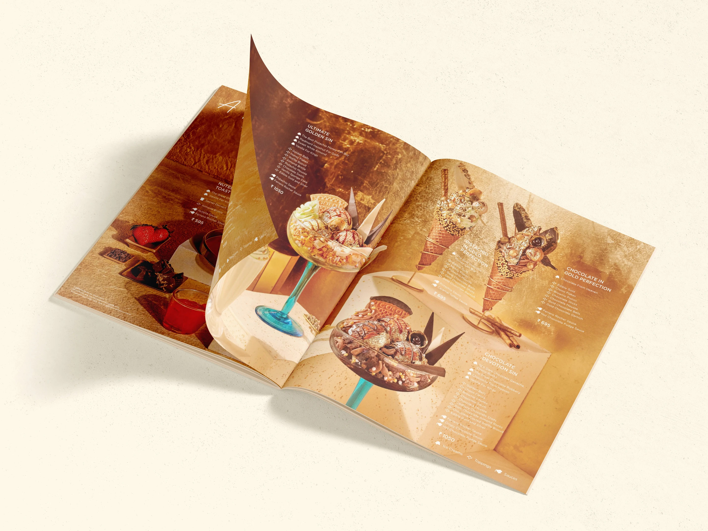
Made with premium ingredients sourced from Italy and crafted for a more refined palate, GOLD was positioned as an elevated experience rather than just a dessert.
We developed the brand from the ground up, shaping its positioning, identity, packaging system, and retail environment.
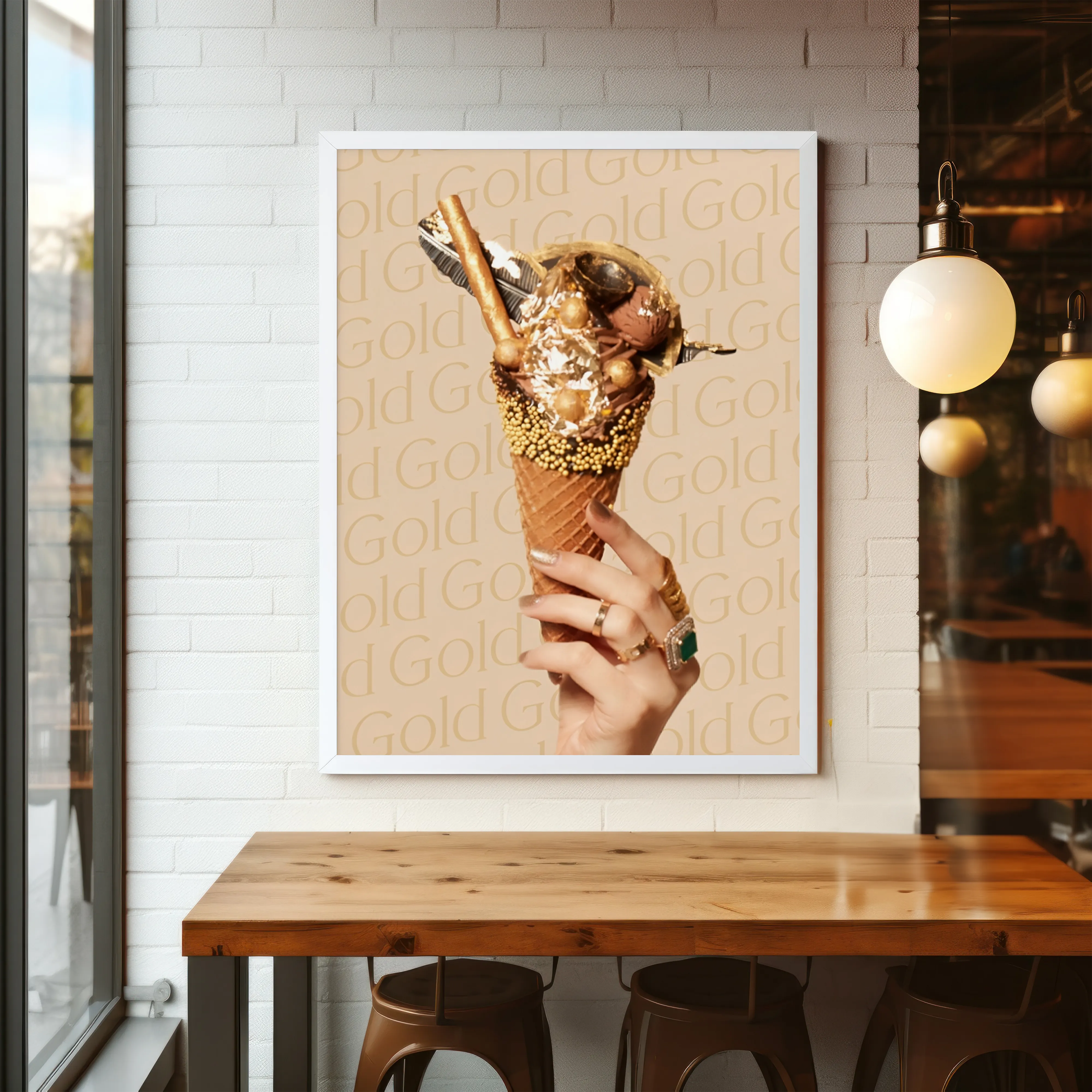
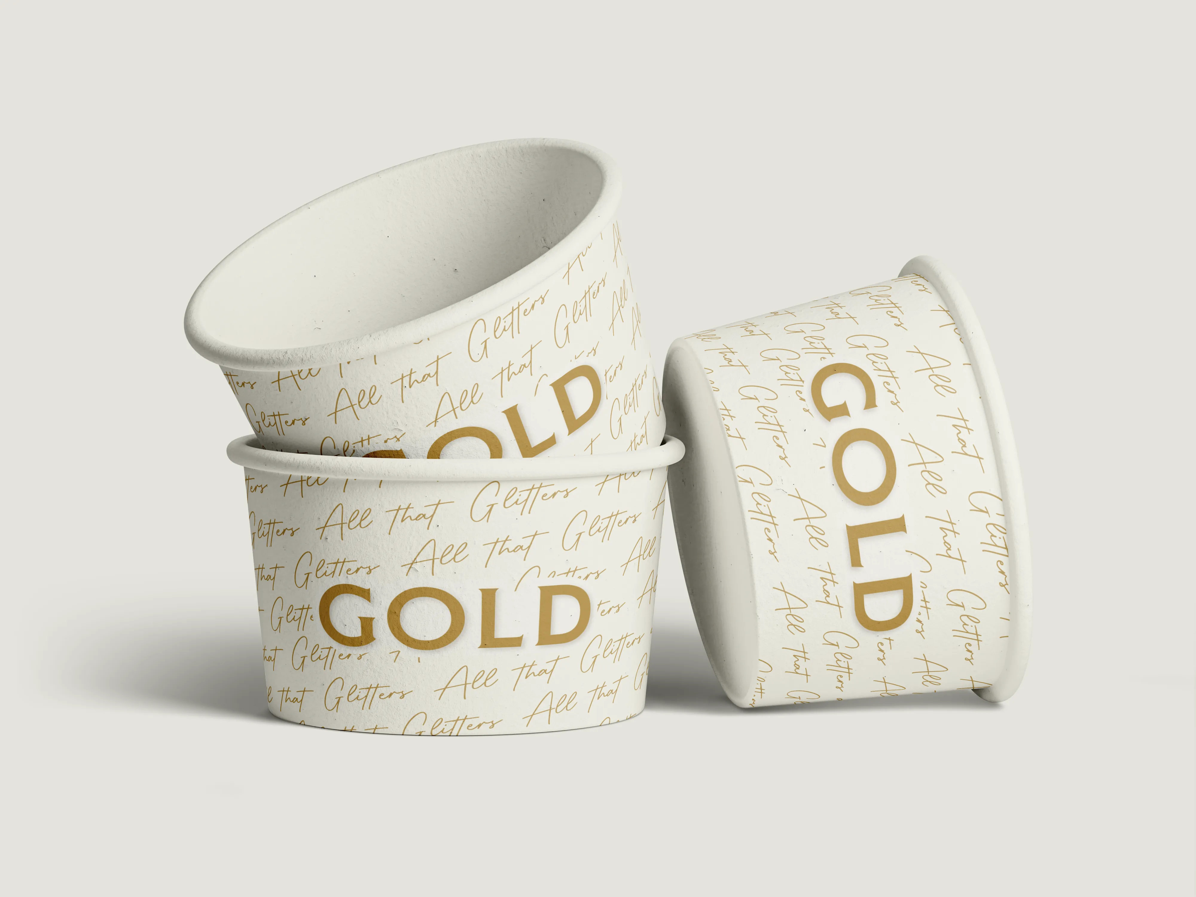
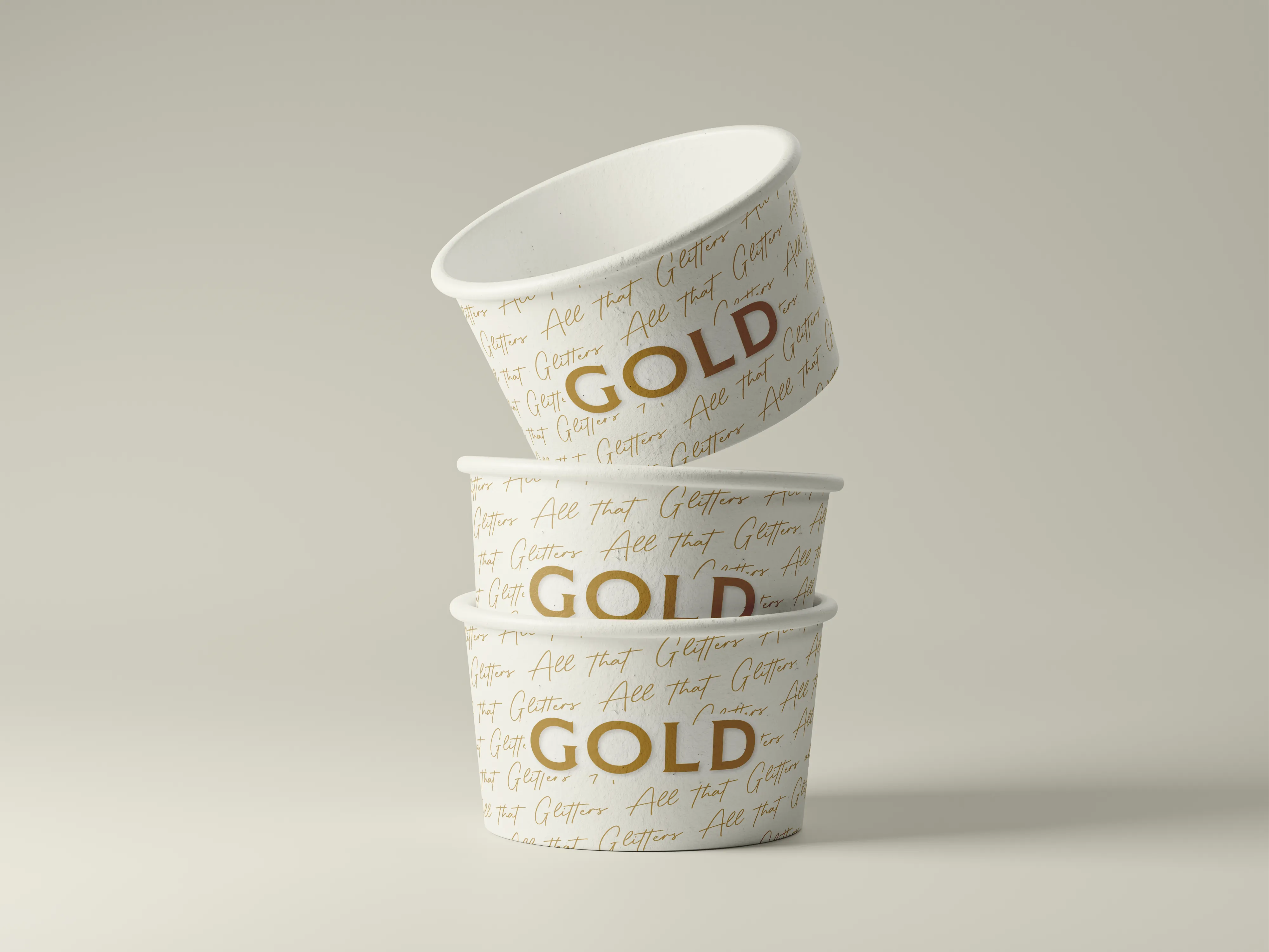
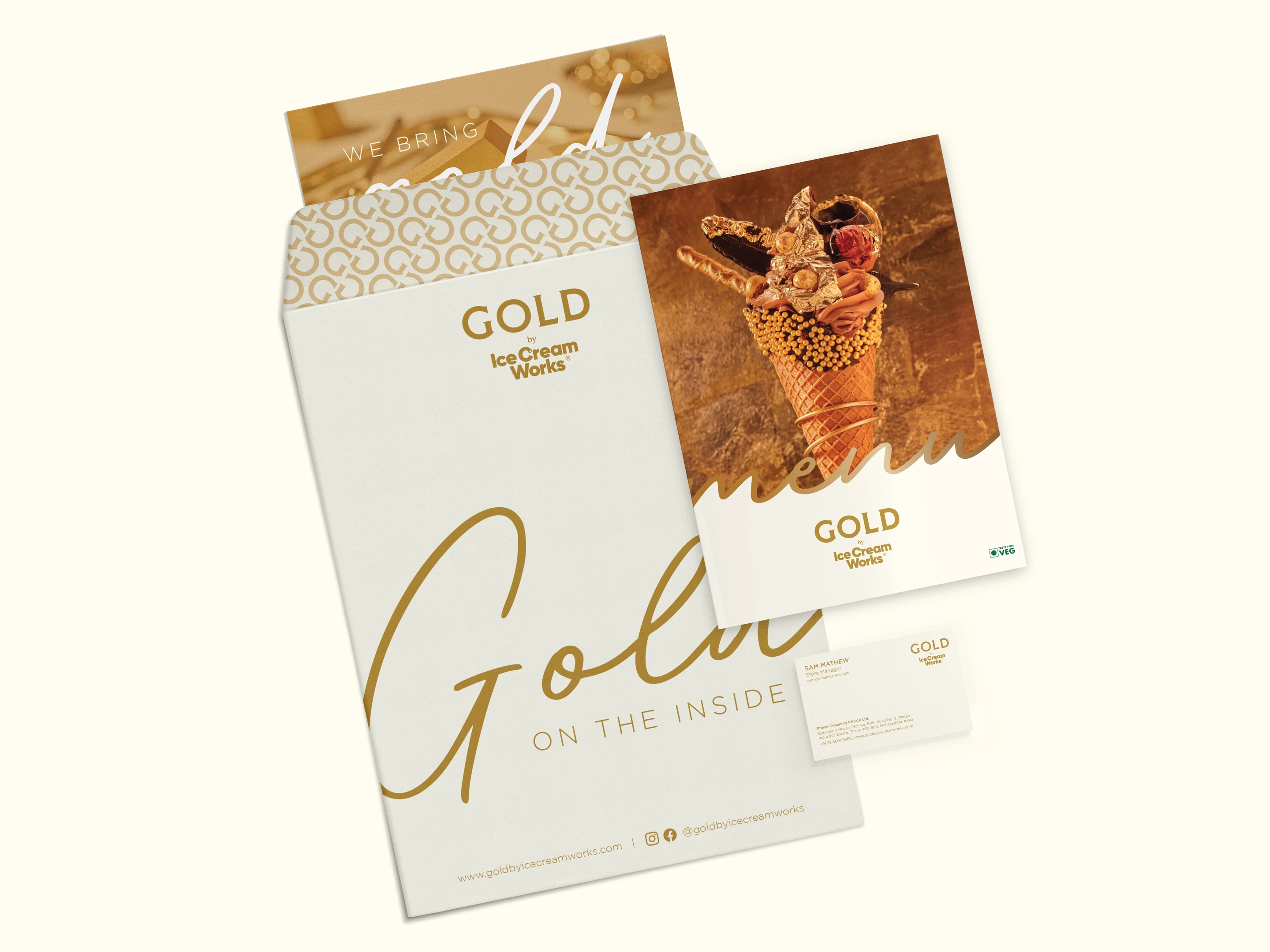
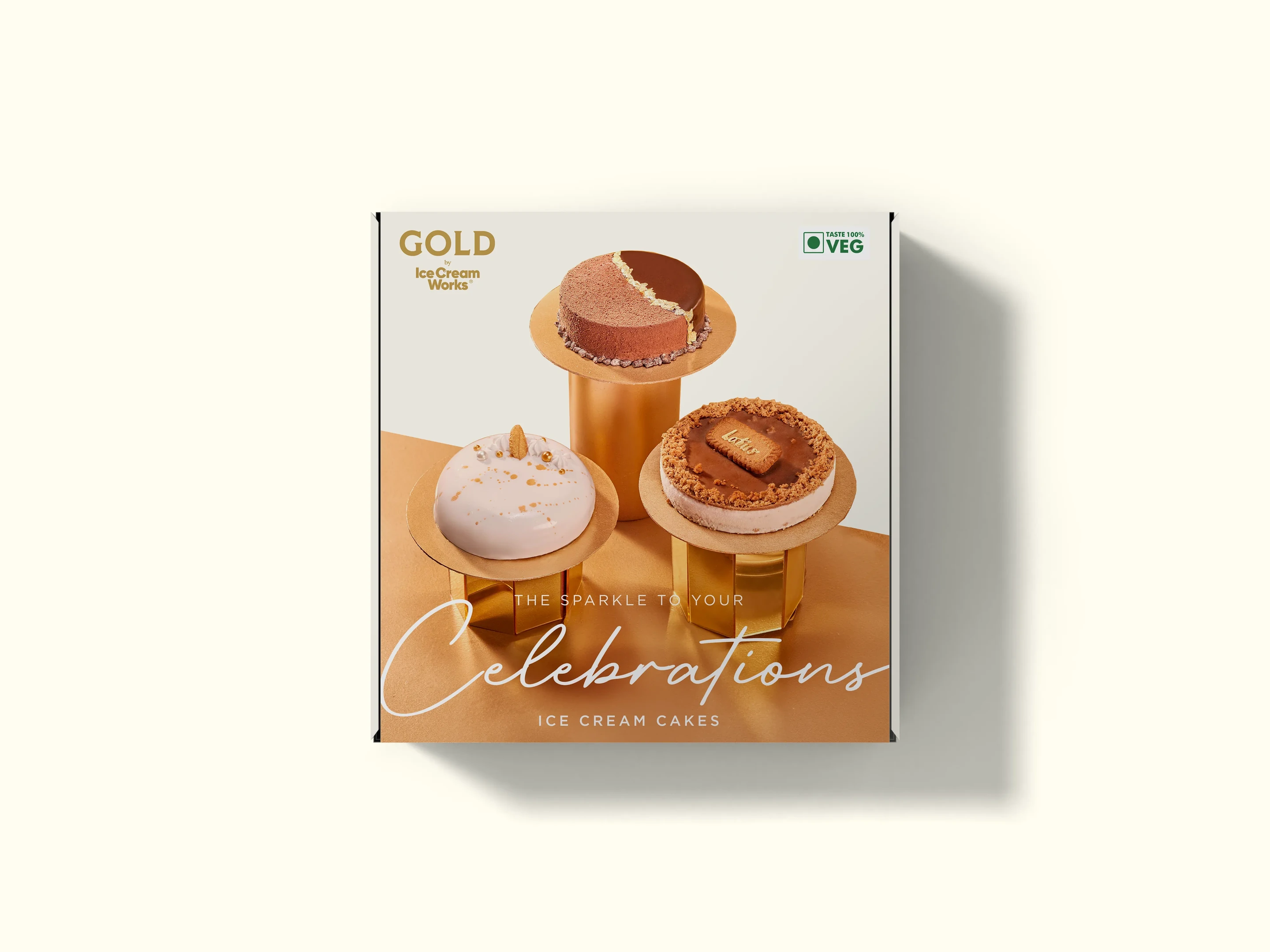
The visual language drew from the timeless elegance of gold, combining classic sophistication with a contemporary edge through a bespoke logo, rich palette, custom patterns, and a distinctive retail experience.
#1A1A1A
#C9A961
A bespoke logo, rich colour palette and custom patterns give the range its own language. Gold reads as heritage and craft; the near-black ground lets the metallic detail carry the shelf. Classic sophistication with a contemporary edge.
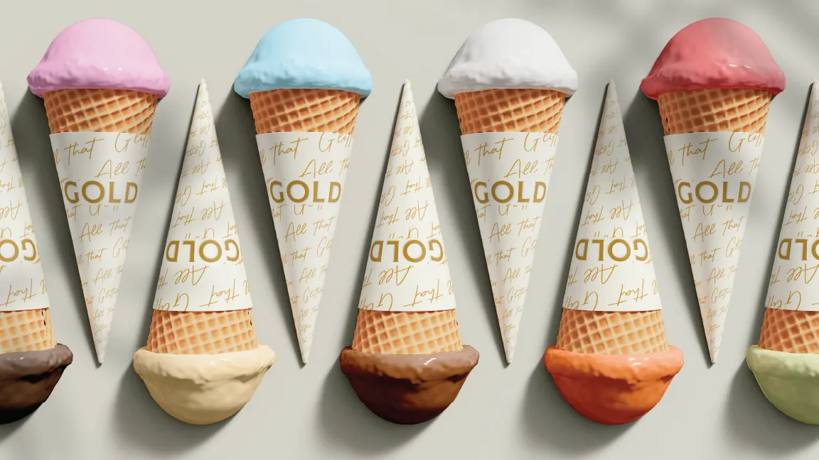
A short film brings the world of GOLD to life, translating the elegance of the pack into movement, light and indulgence. The same restraint on shelf carries through to screen.
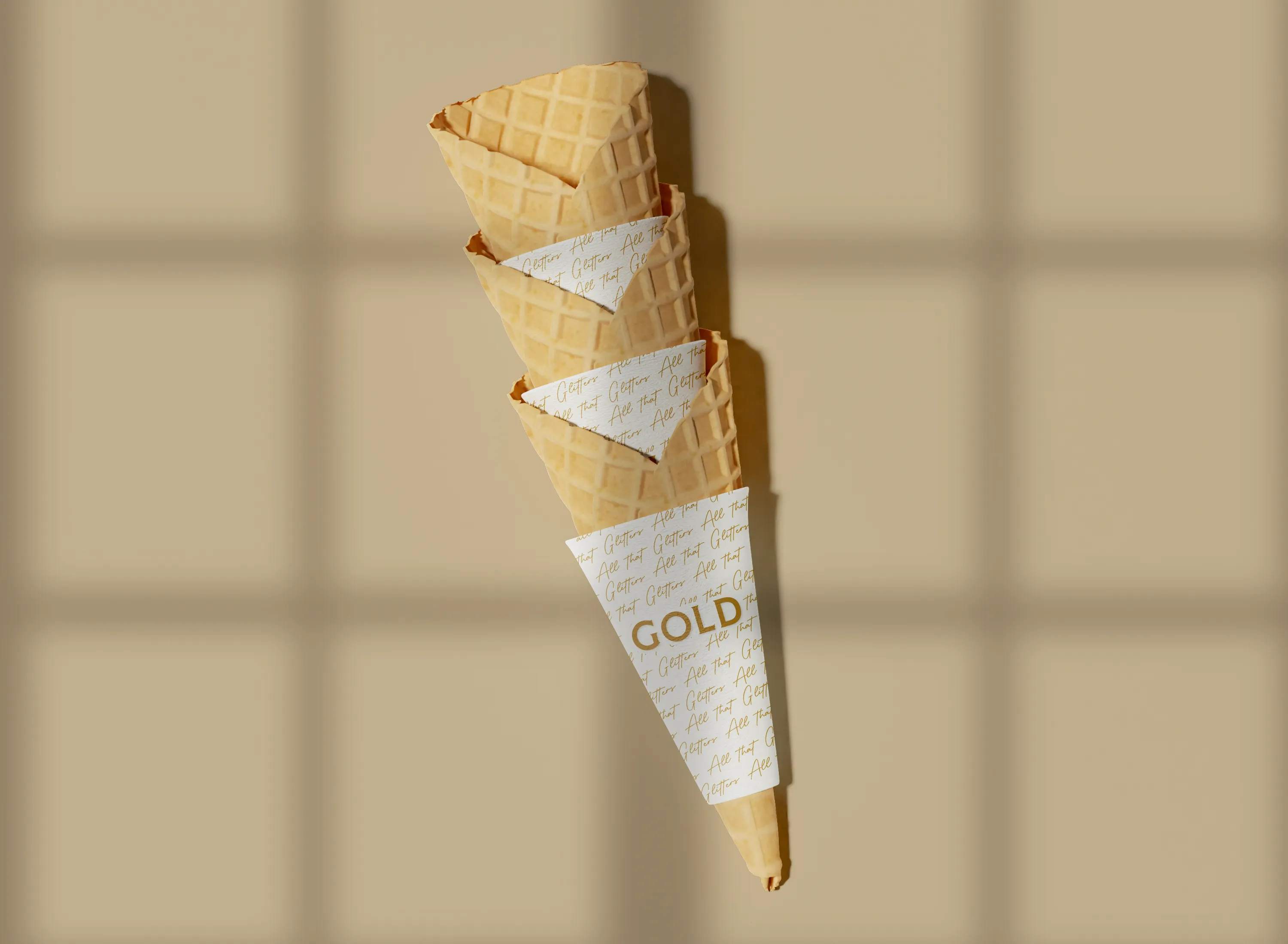
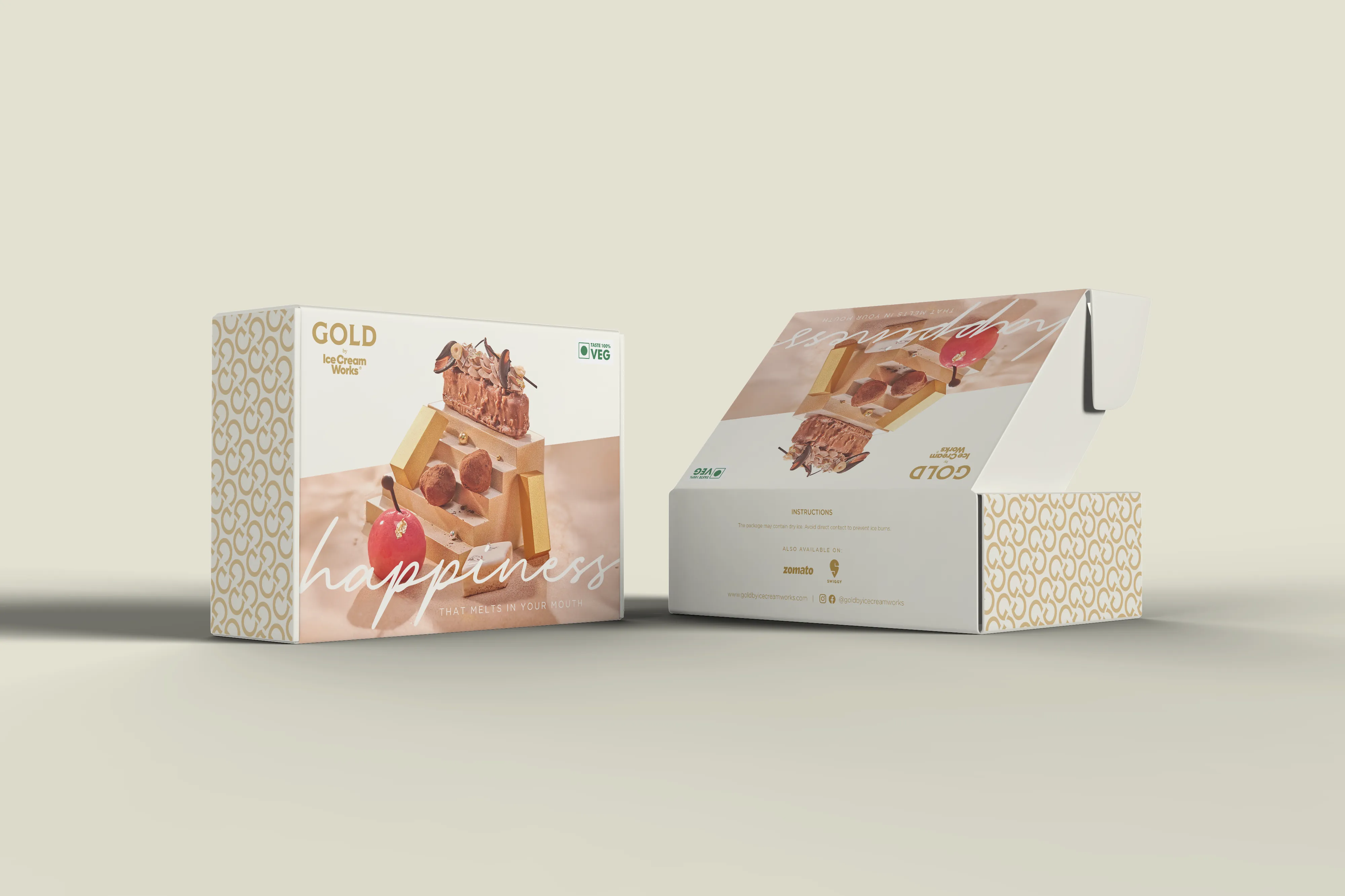
The brand extends beyond the tub into a distinctive retail environment. Every touchpoint, from the storefront to the scoop, was designed to feel considered, refined and unmistakably premium.
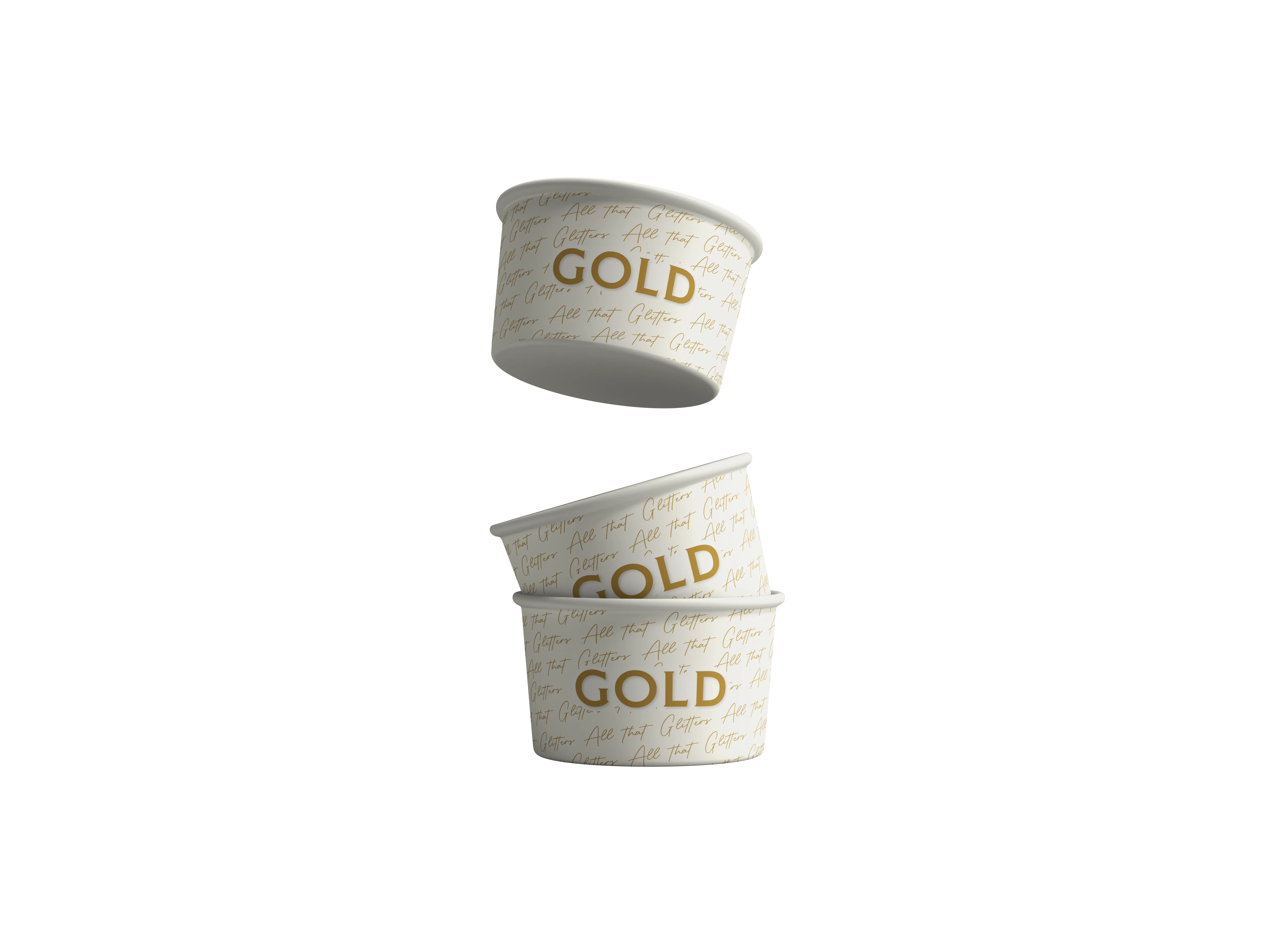
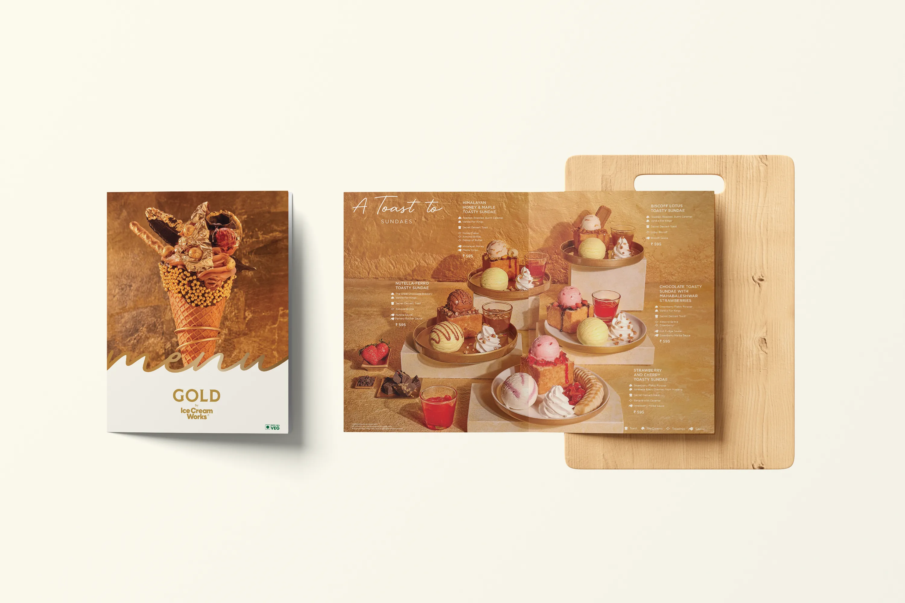
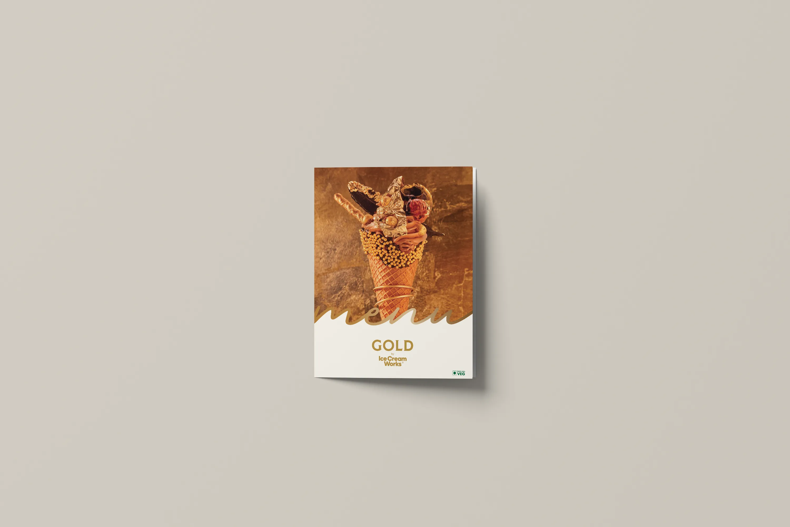
Seen in the world it was built for. The system holds its poise across surfaces and scales, an elevated expression that reads as luxury long before you taste it.