The identity was shaped to feel joyful without feeling childish, a world that could excite children while giving parents somewhere warm and easy.
Through naming, logo direction, menu design and playful visual assets, the café found its own character within the Hamleys universe.
More than a place to wait, it became a lively little pause in the journey, one where food, family and imagination could come together.
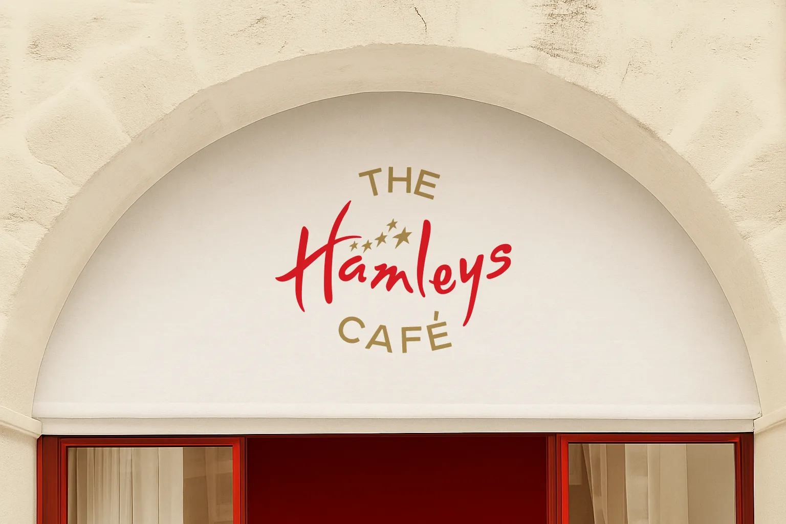
Bright, warm and unmistakably part of the Hamleys world. The mark carries the toy shop’s sense of wonder into a café setting, playful enough to delight a child yet composed enough to feel like a proper place to sit down.
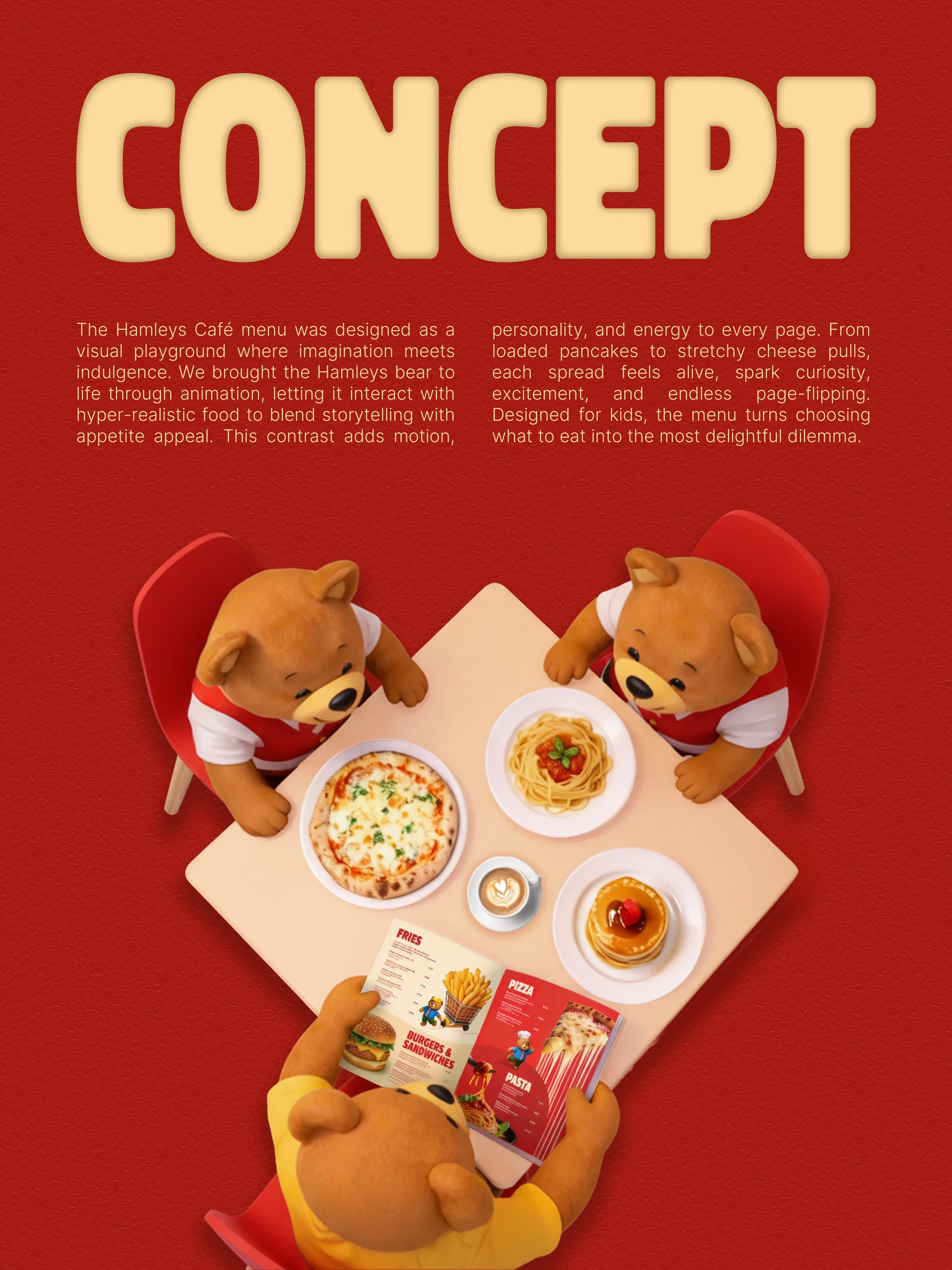
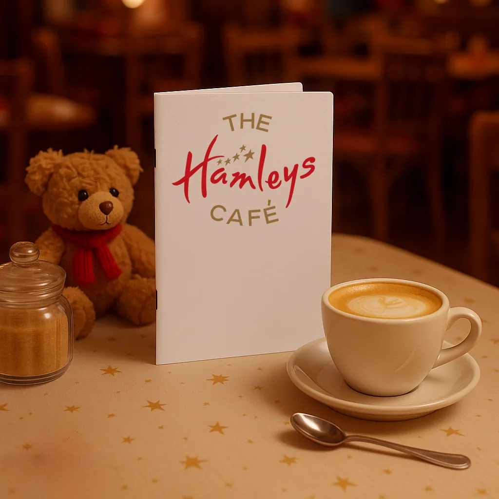
More than a list of dishes, the menu was designed as part of the experience, an object children want to pick up and parents find easy to read. Bright, cheerful and quick to navigate, it turns ordering into a small moment of fun.
View the menu →
From signage to tableware, the world comes together in the room itself. Bright colours, cheerful visuals and playful assets give the café its own character while staying true to the Hamleys universe it belongs to.