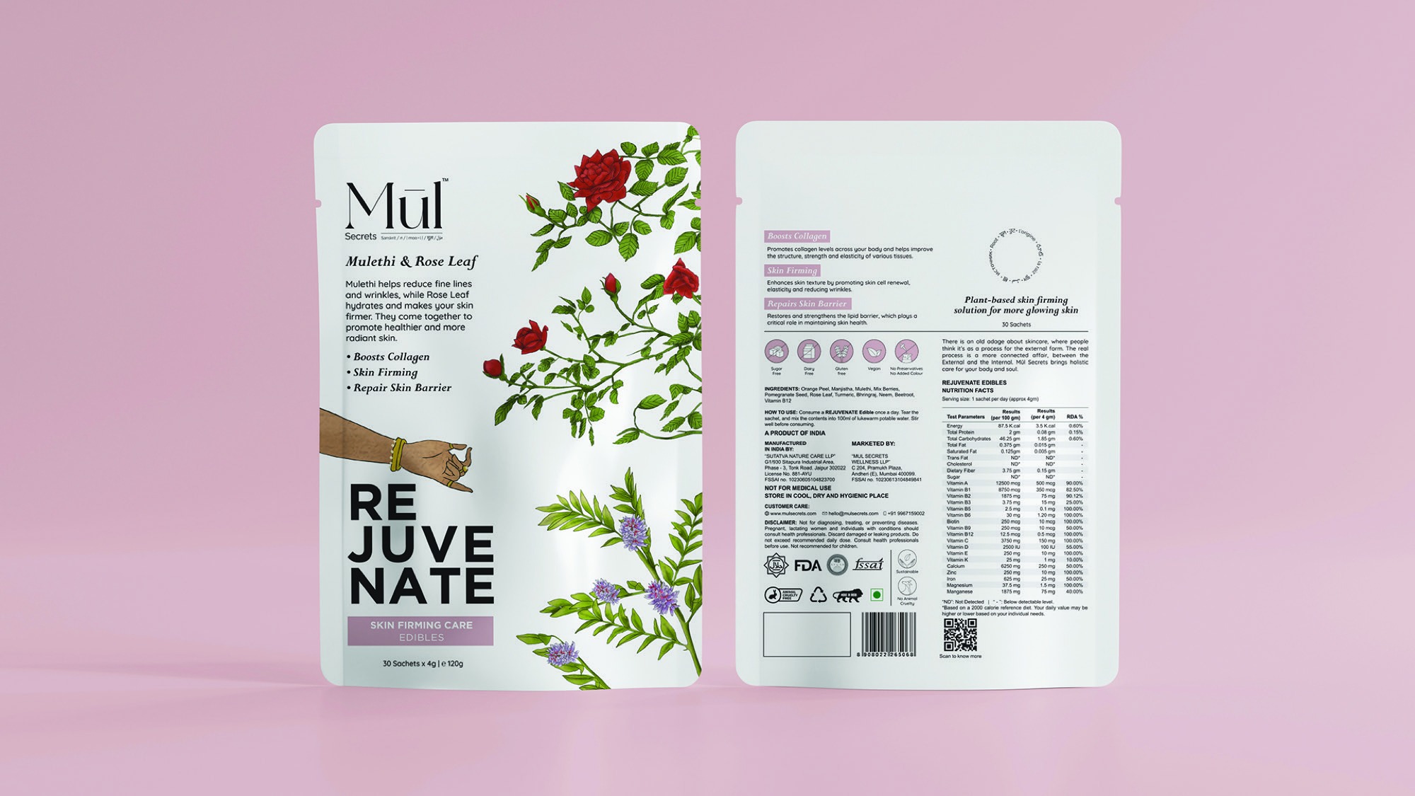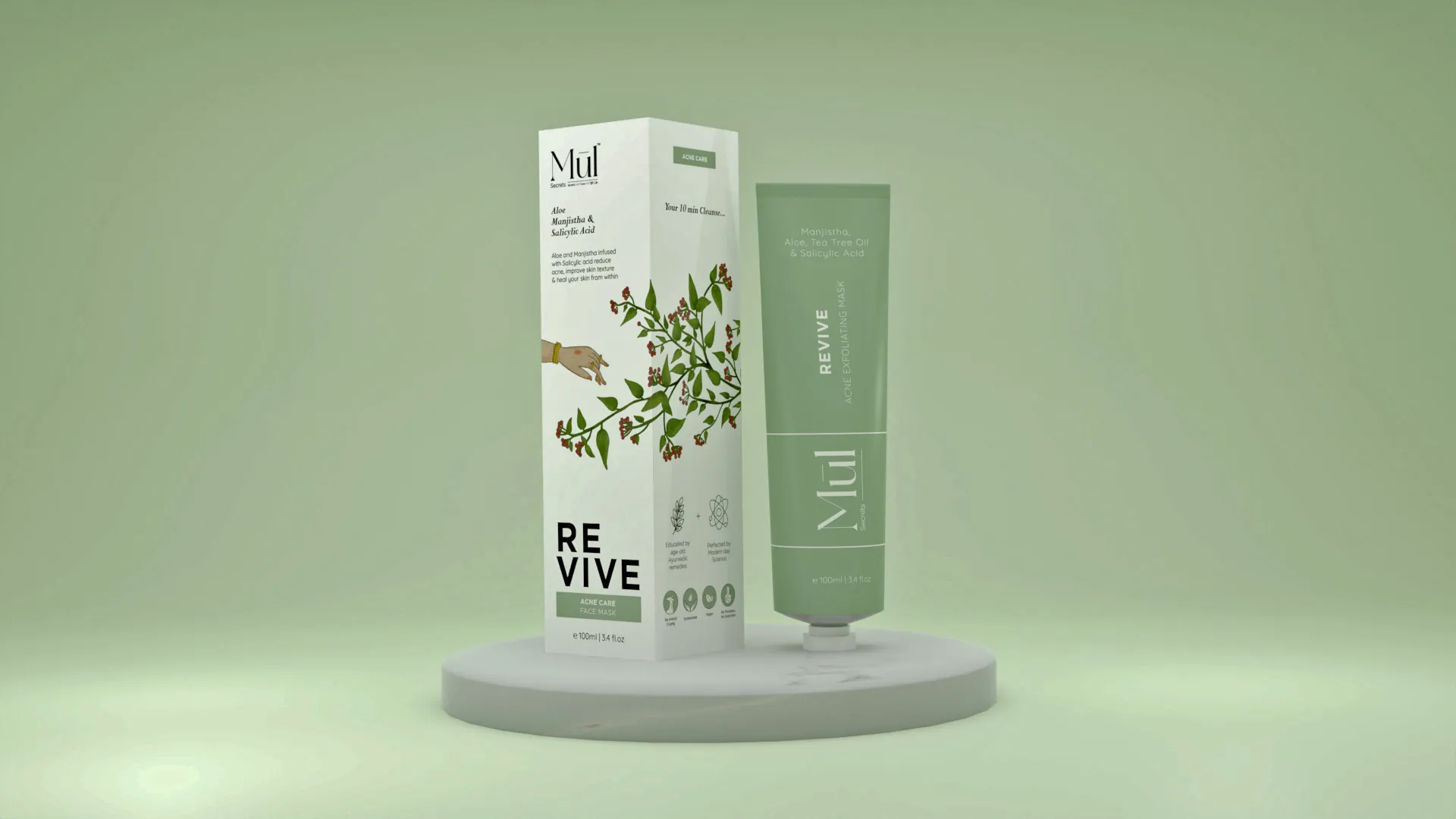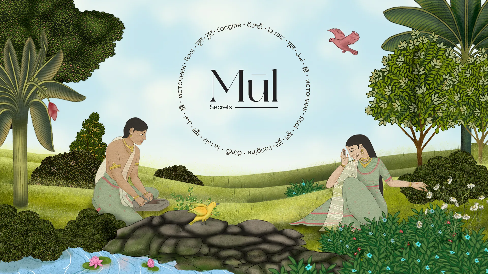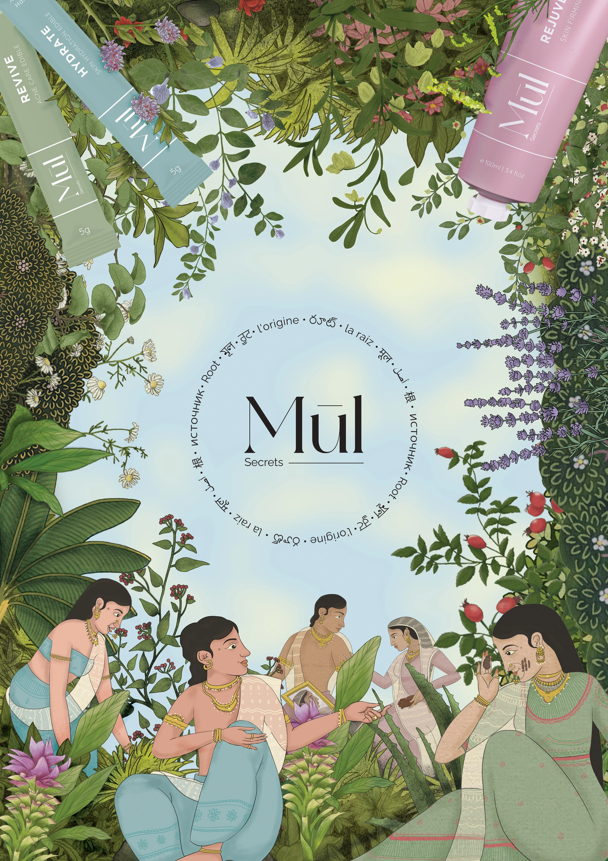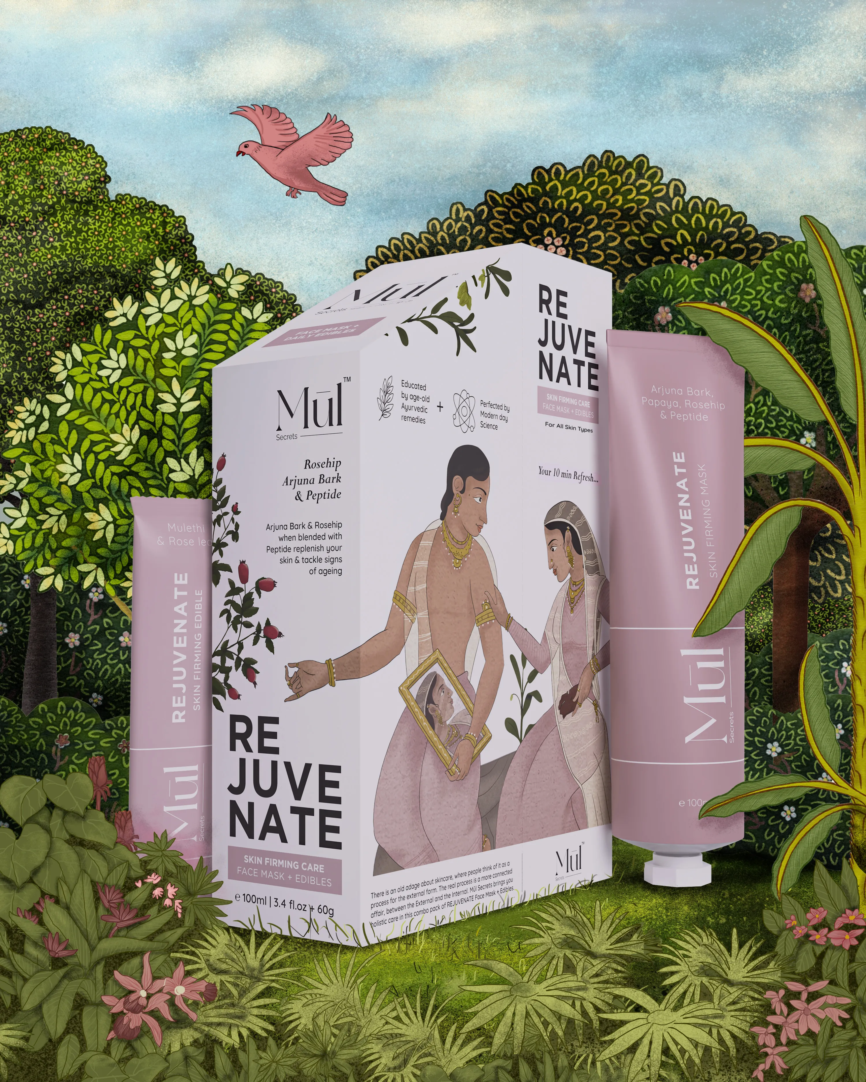
From the name to the identity, packaging system, product language, shoot direction and supporting materials, we created a world that felt both ancestral and modern.
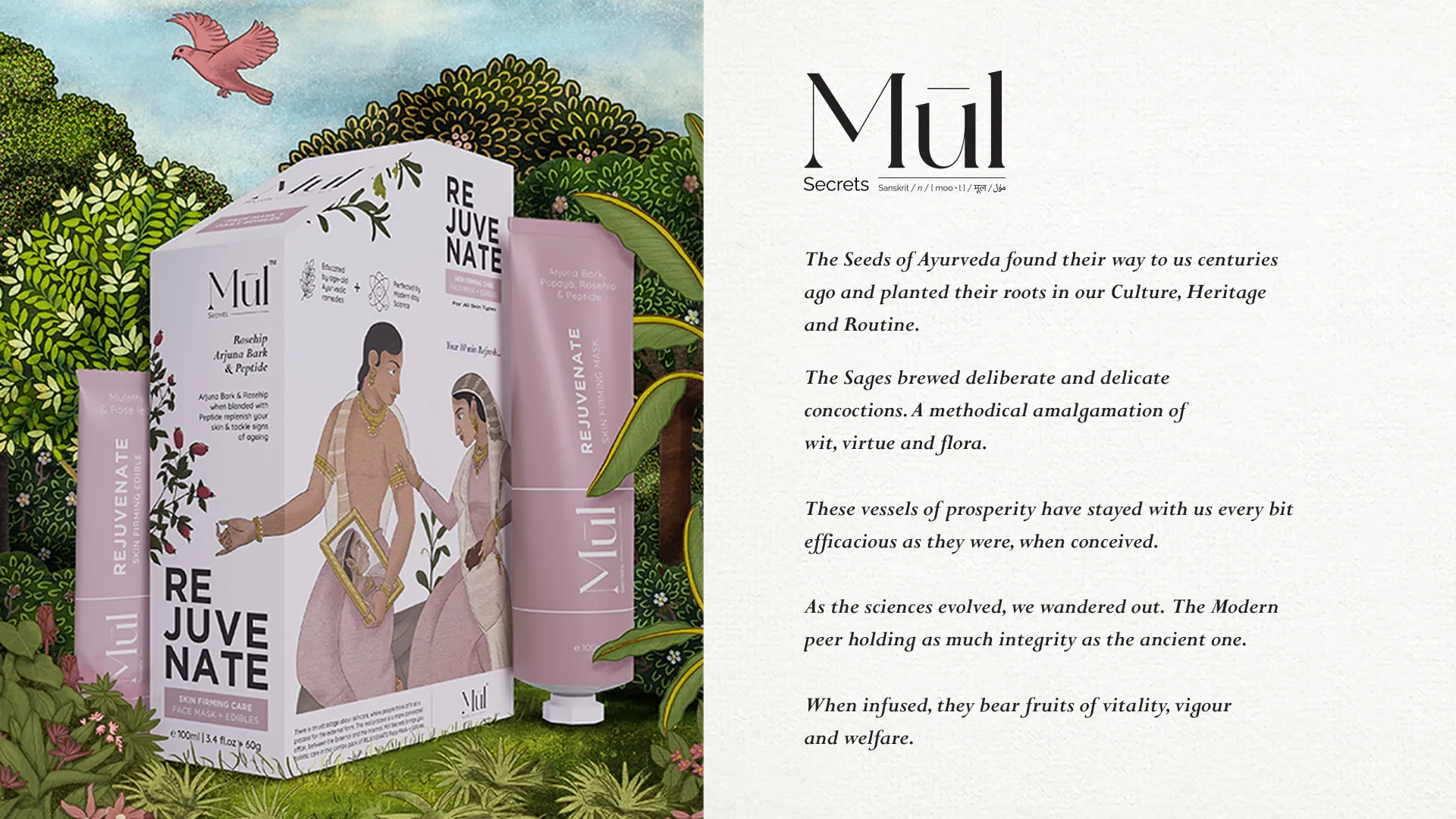
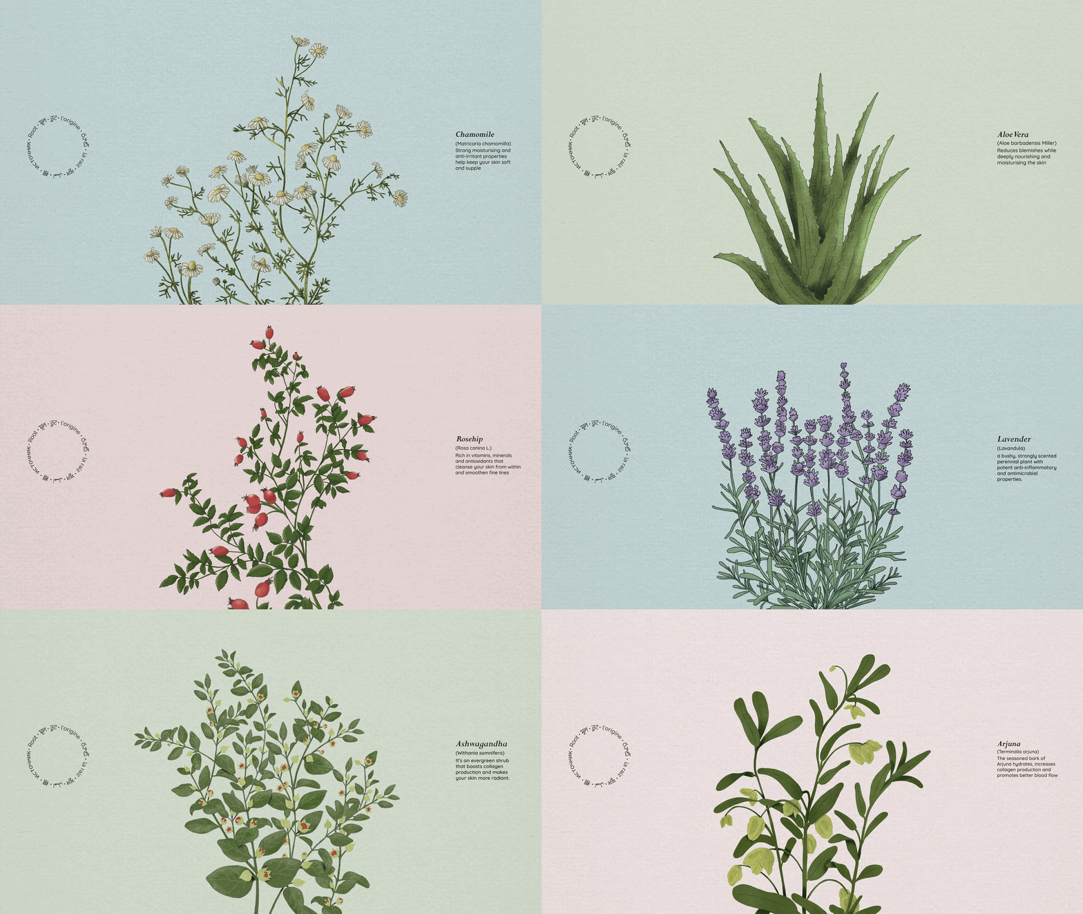
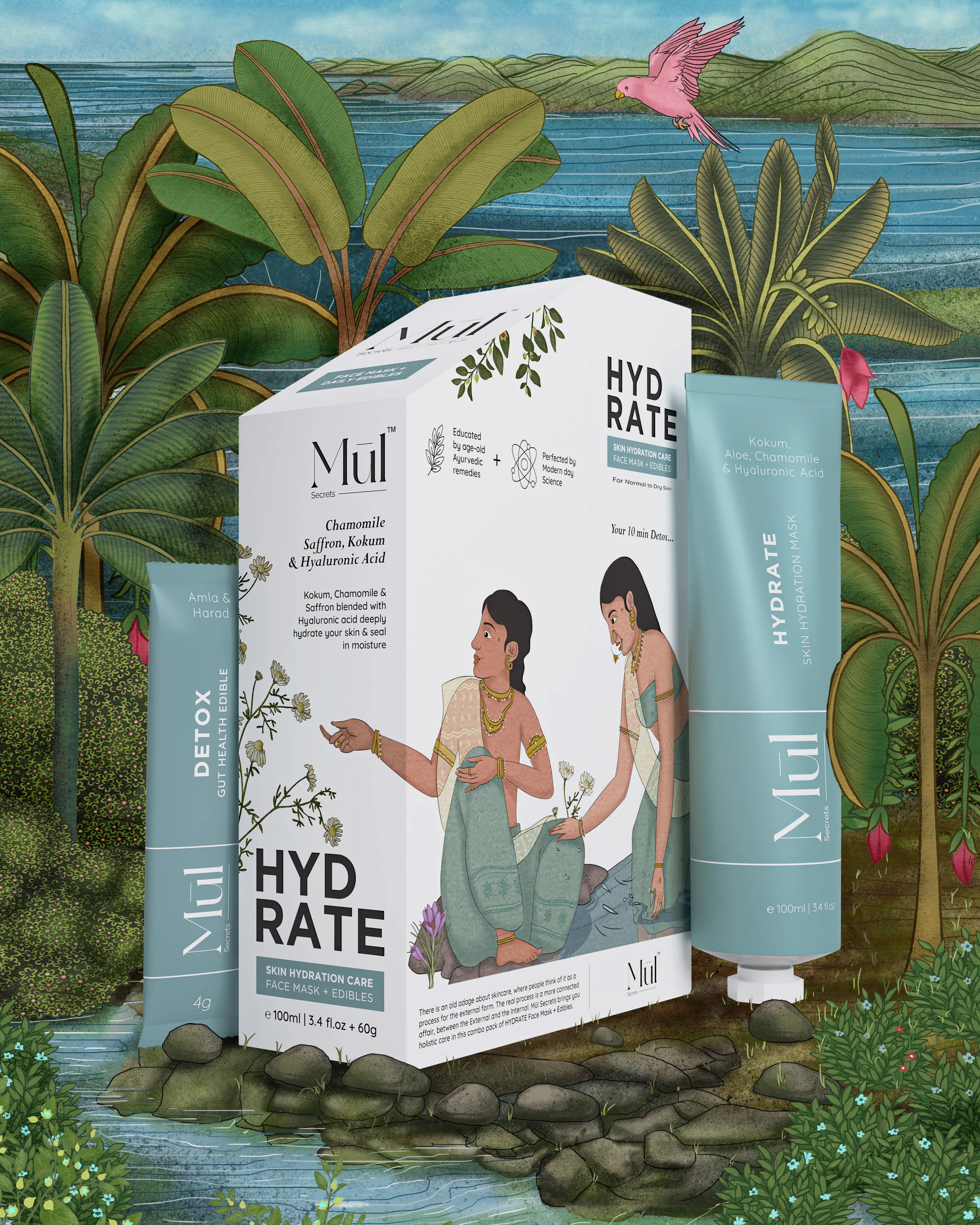
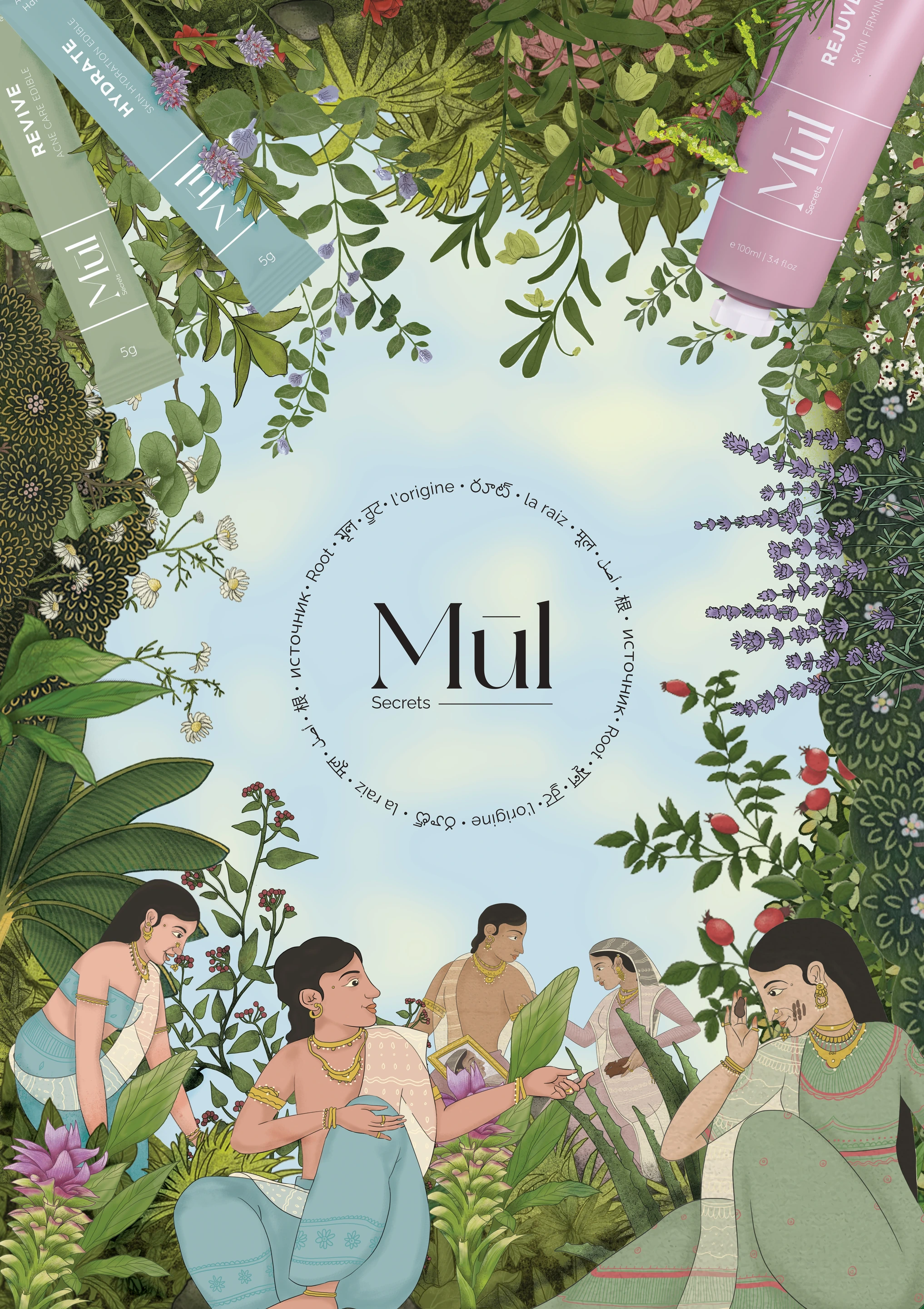
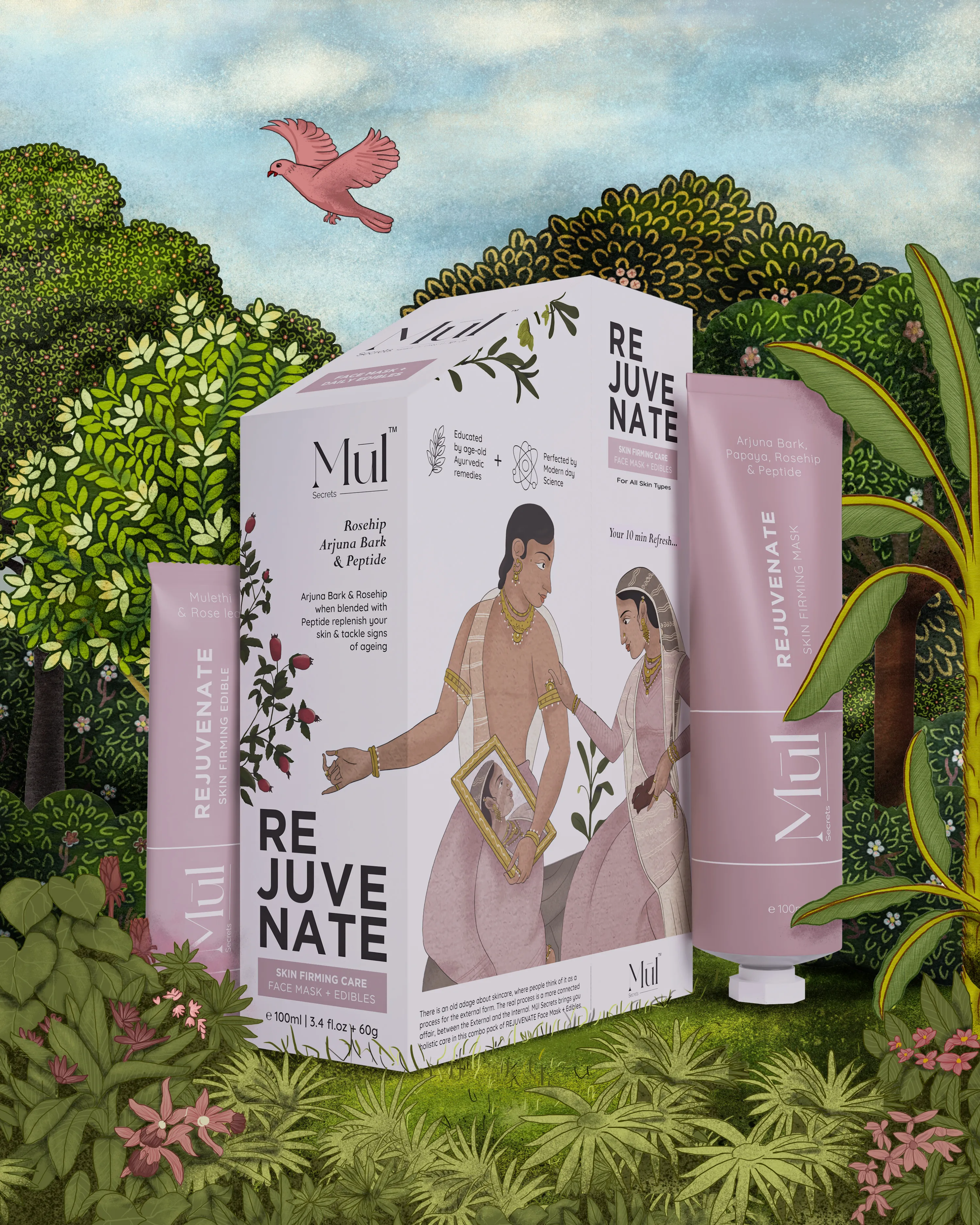
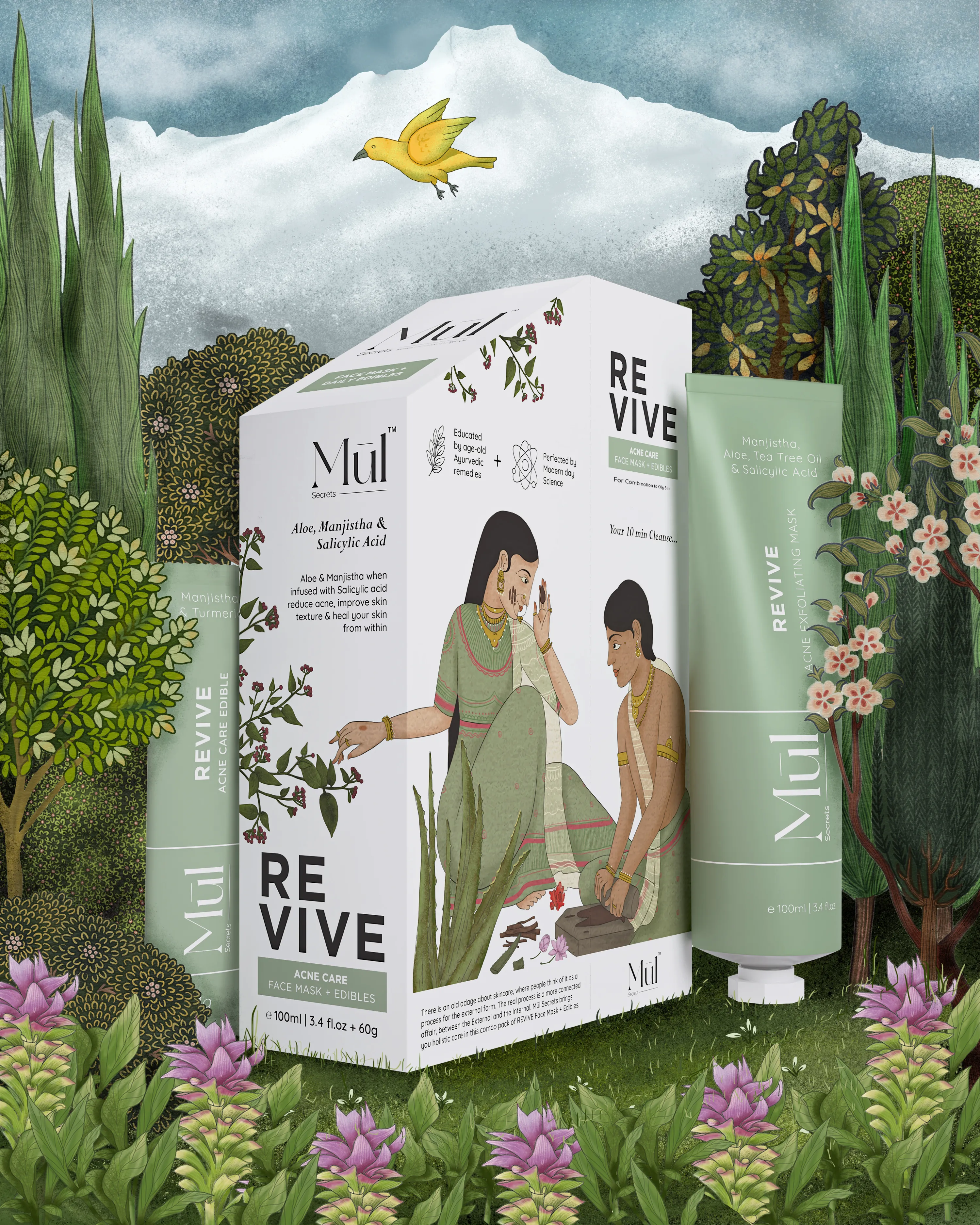
The visual language drew from Indian miniature art, botanical ingredients, soft category-led colours and sharp typography, bringing together nature, science and ritual without ever feeling dated.
The result is a complete identity and packaging system for a brand that treats beauty as something deeper than the surface. Rooted in tradition, refined for now.
#4A3520
#D4A574
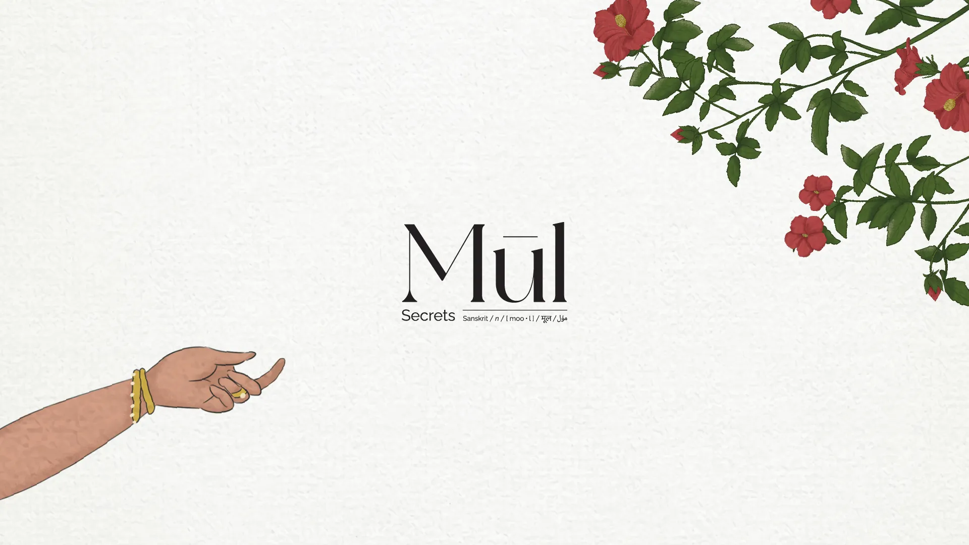
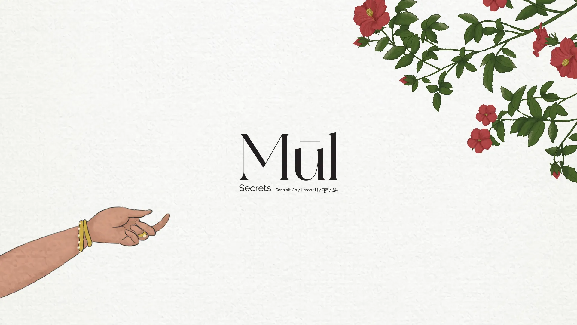
The name carries the idea. Mūl, the root, meets a promise of secrets kept and passed down. A wordmark drawn with the poise of Indian miniature art, upright yet ornamental, holds the brand between the ancestral and the modern without ever feeling dated.
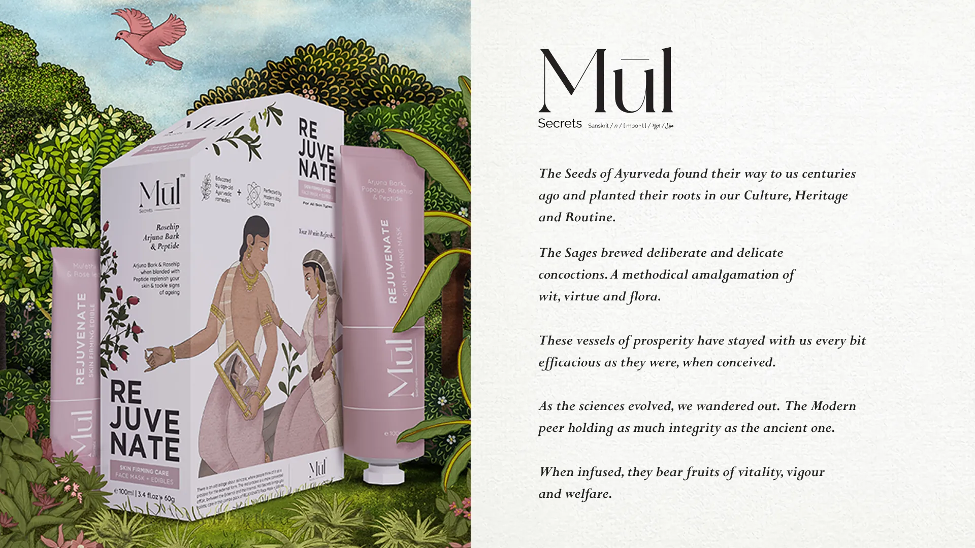
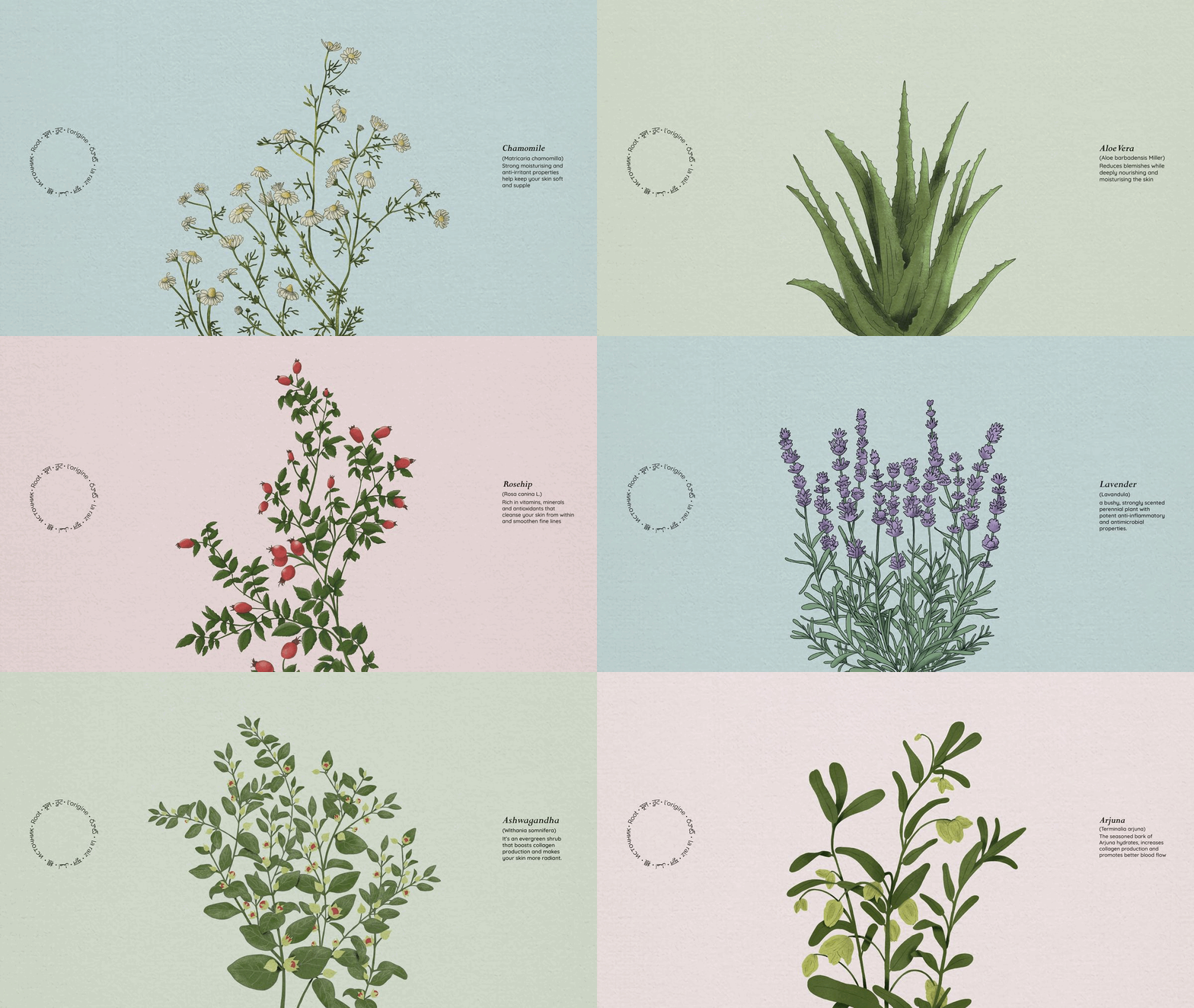
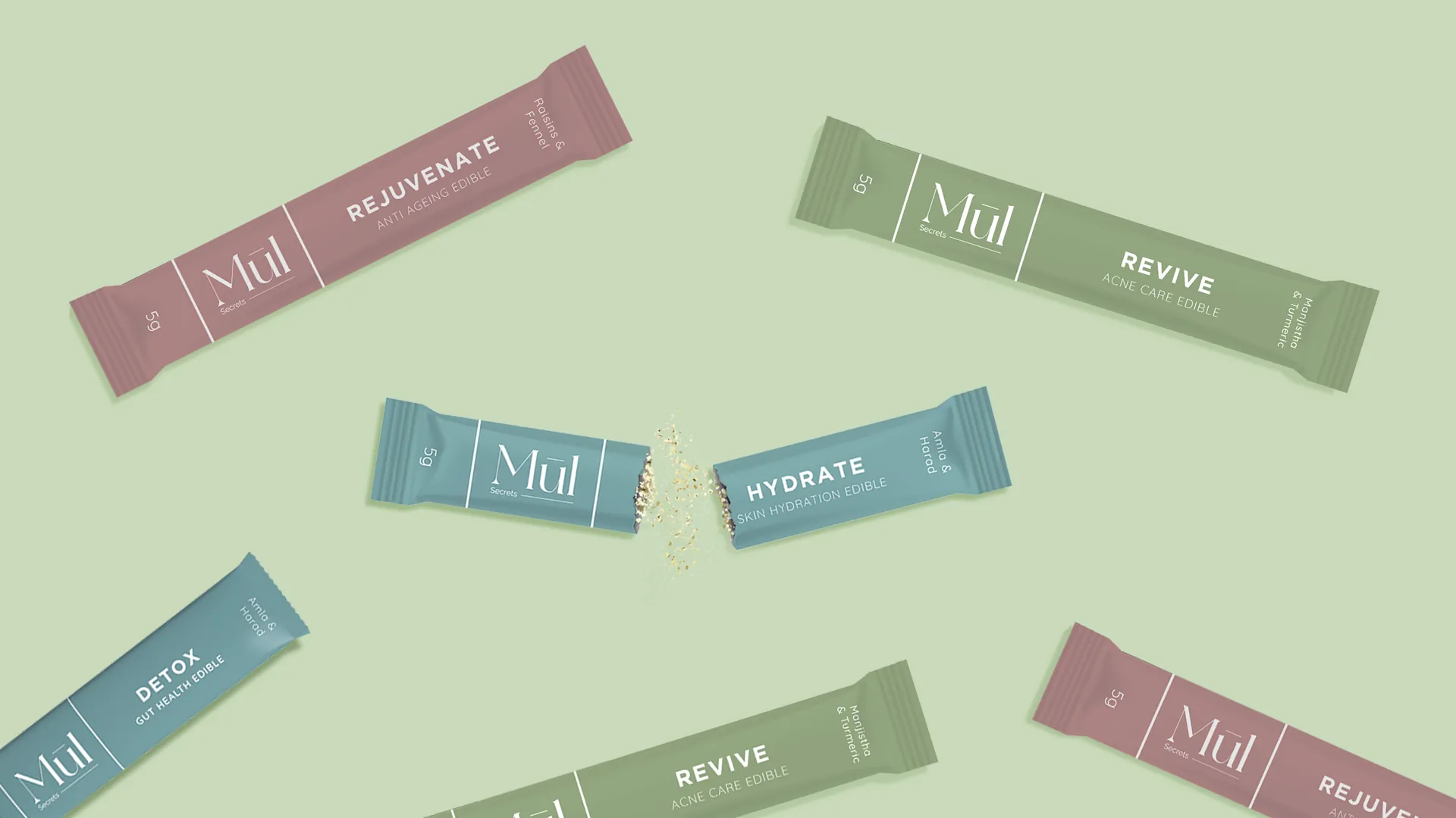
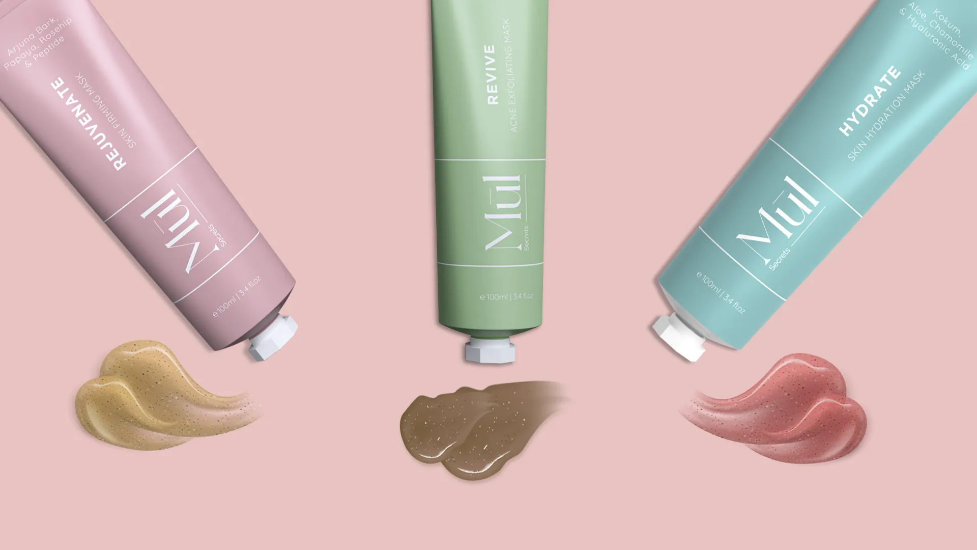
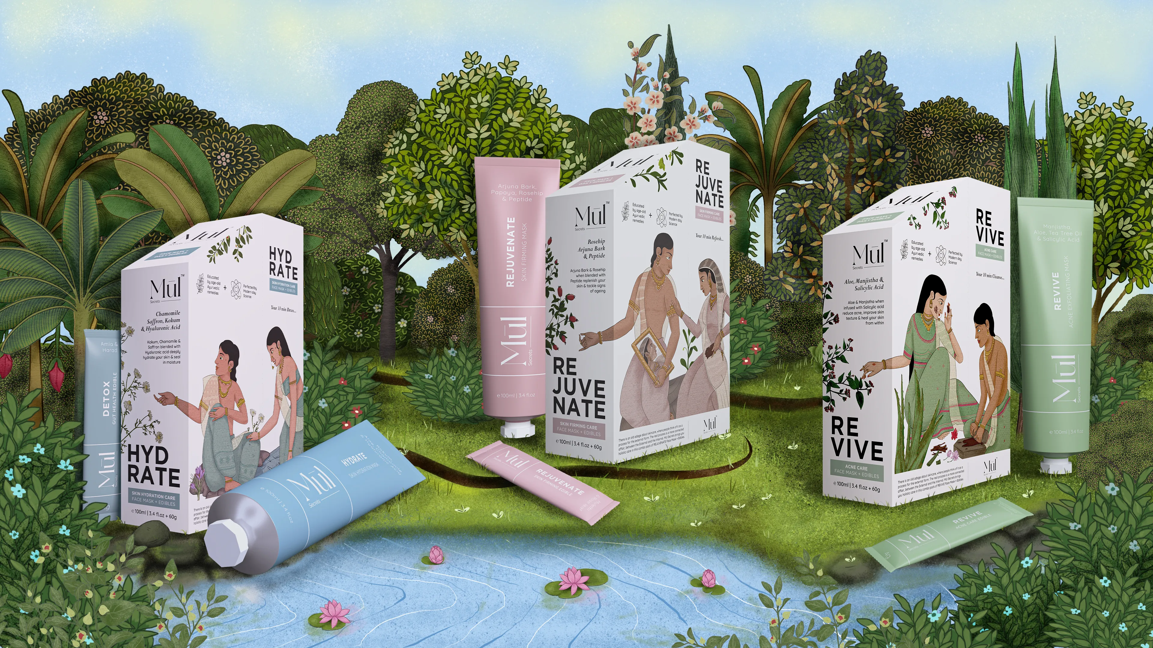
Botanical ingredients, soft category-led colours and sharp typography carried across every SKU. The packaging brings nature, science and ritual together on shelf, every angle and every variant drawn to feel calm, considered and unmistakably rooted.
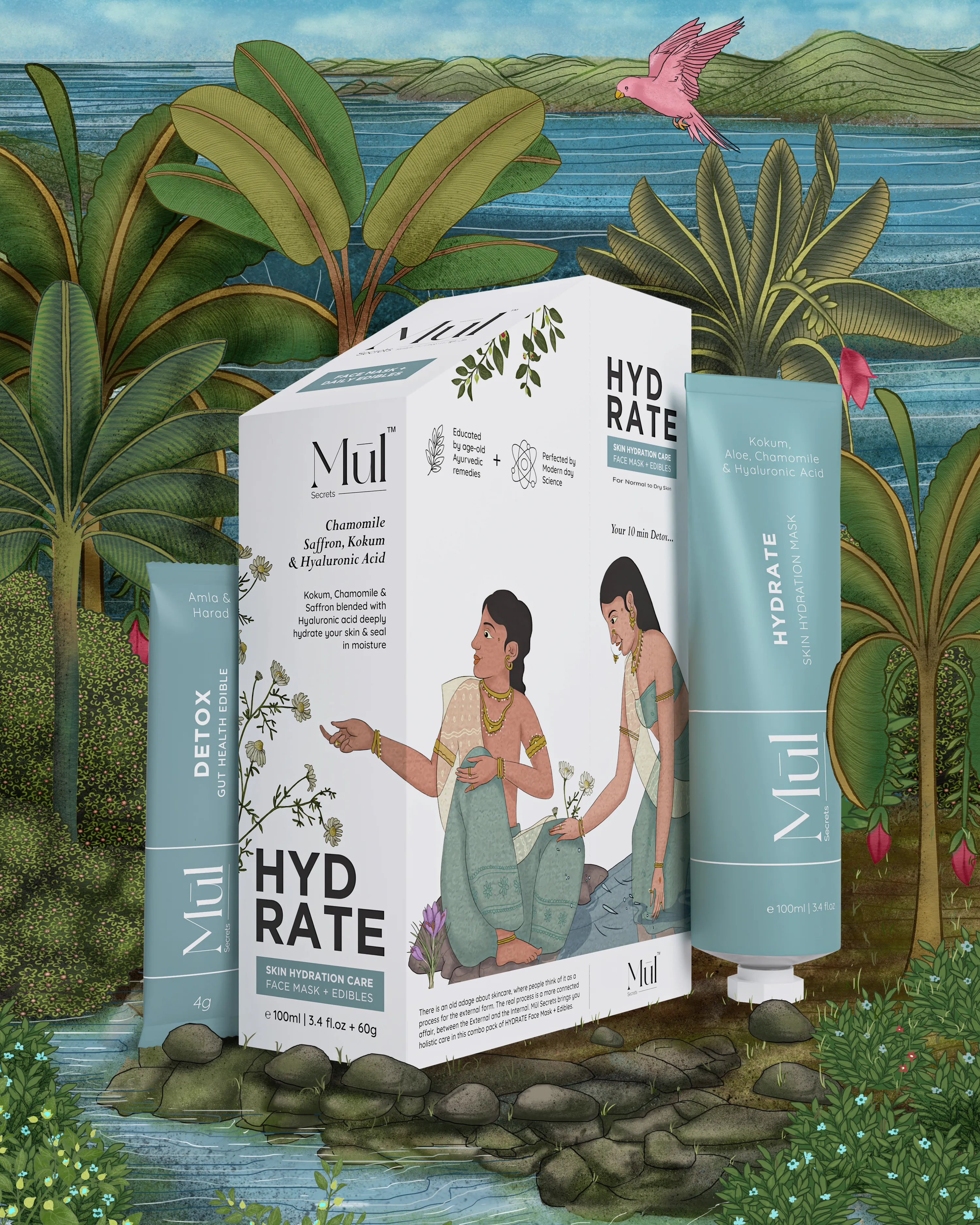
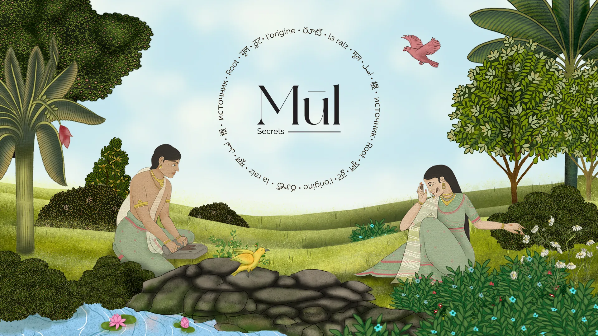
Ritual set to movement. The film gathers the botanical world, the miniature-art detail and the quiet of the pack into a single moment, treating beauty as something deeper than the surface.
The system shown in full, from the strategy behind the name to the world drawn around it. Nature, science and ritual held in one language, so the brand reads as a whole long before a single product is picked up.