For Oriygen, we gave everyday wellness a more elevated place in people’s lives.
The idea was simple. Vitamins should not feel clinical, complicated, or hidden at the bottom of a bag. They should feel effortless, beautiful, ready to be carried, used, and seen.
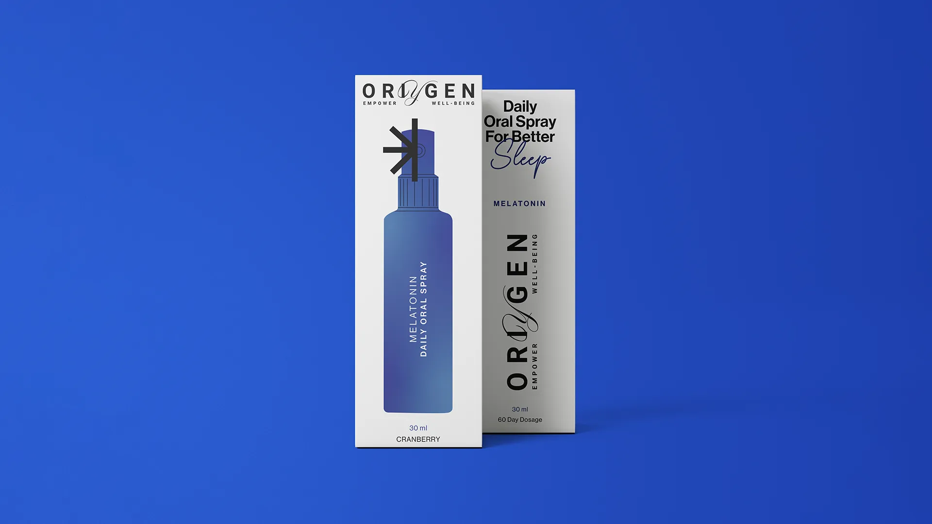
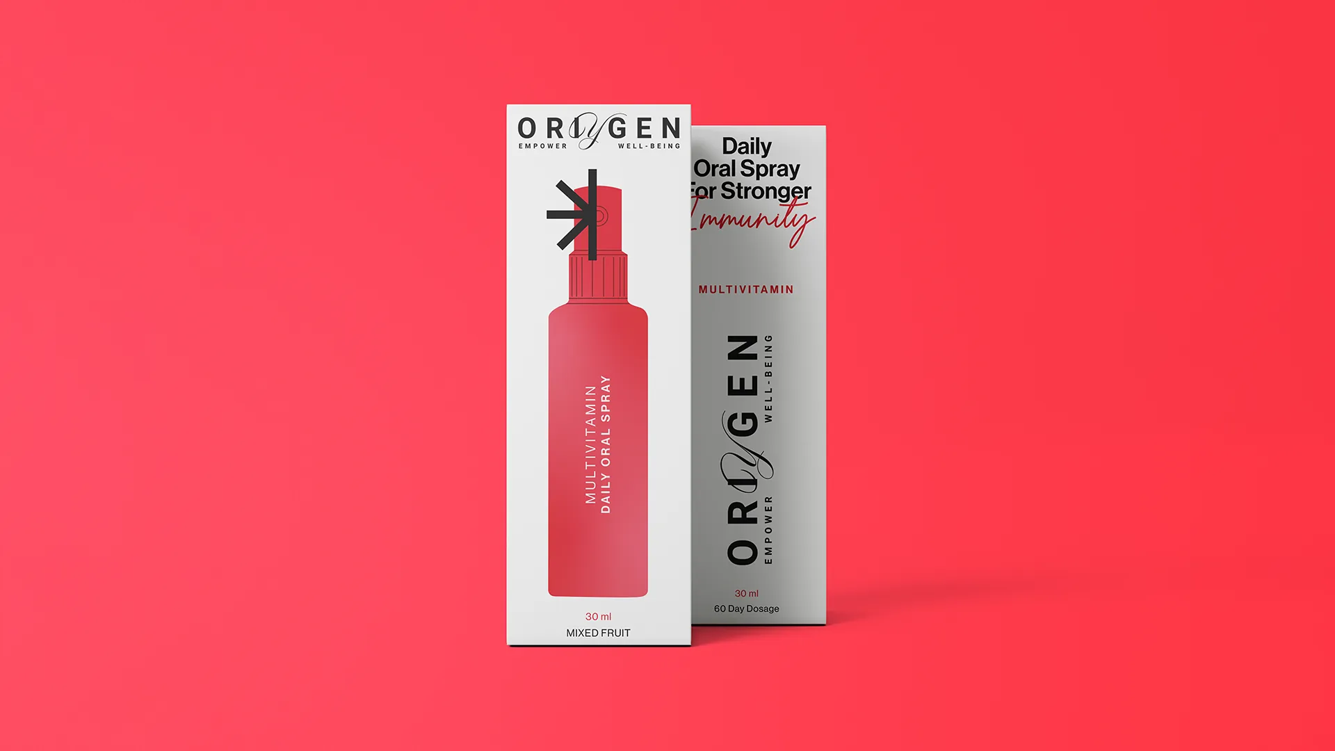
So we created a premium identity and packaging language for a range of oral vitamin sprays, using refined typography, minimal forms, and a colour system inspired by the feeling of each benefit.
What emerged was a wellness brand that felt less like a supplement and more like a daily companion. Small in size, thoughtful in design, and quietly confident in the way it made care feel personal.
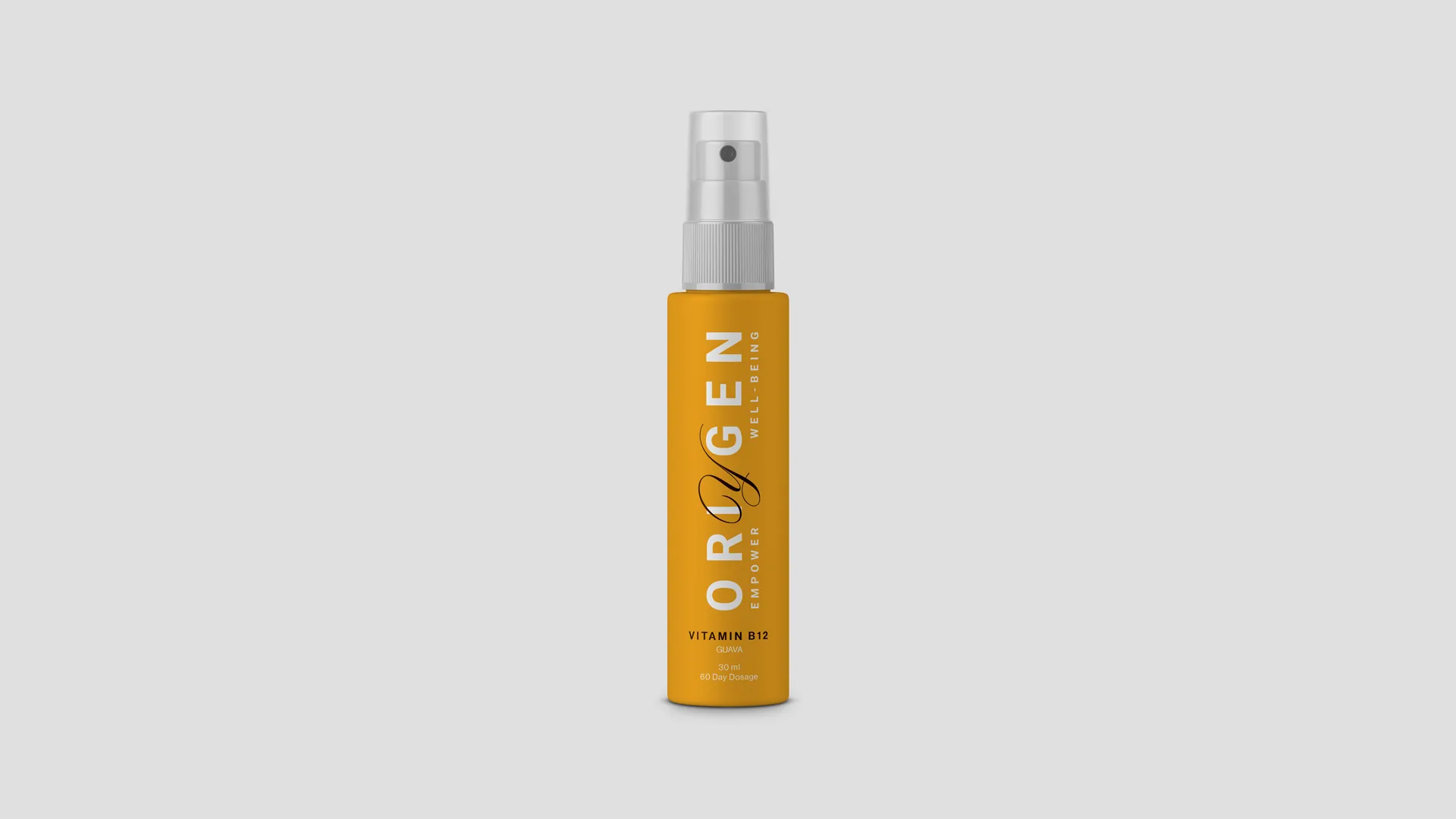
Refined typography and minimal forms give the range a premium, considered presence. The identity reads less like a supplement and more like a daily companion, small in size, thoughtful in design, and quietly confident.
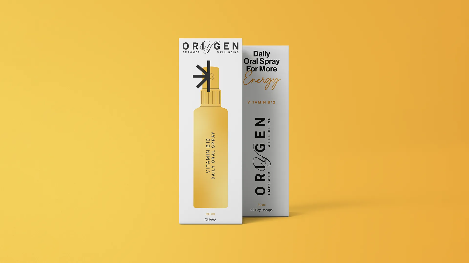
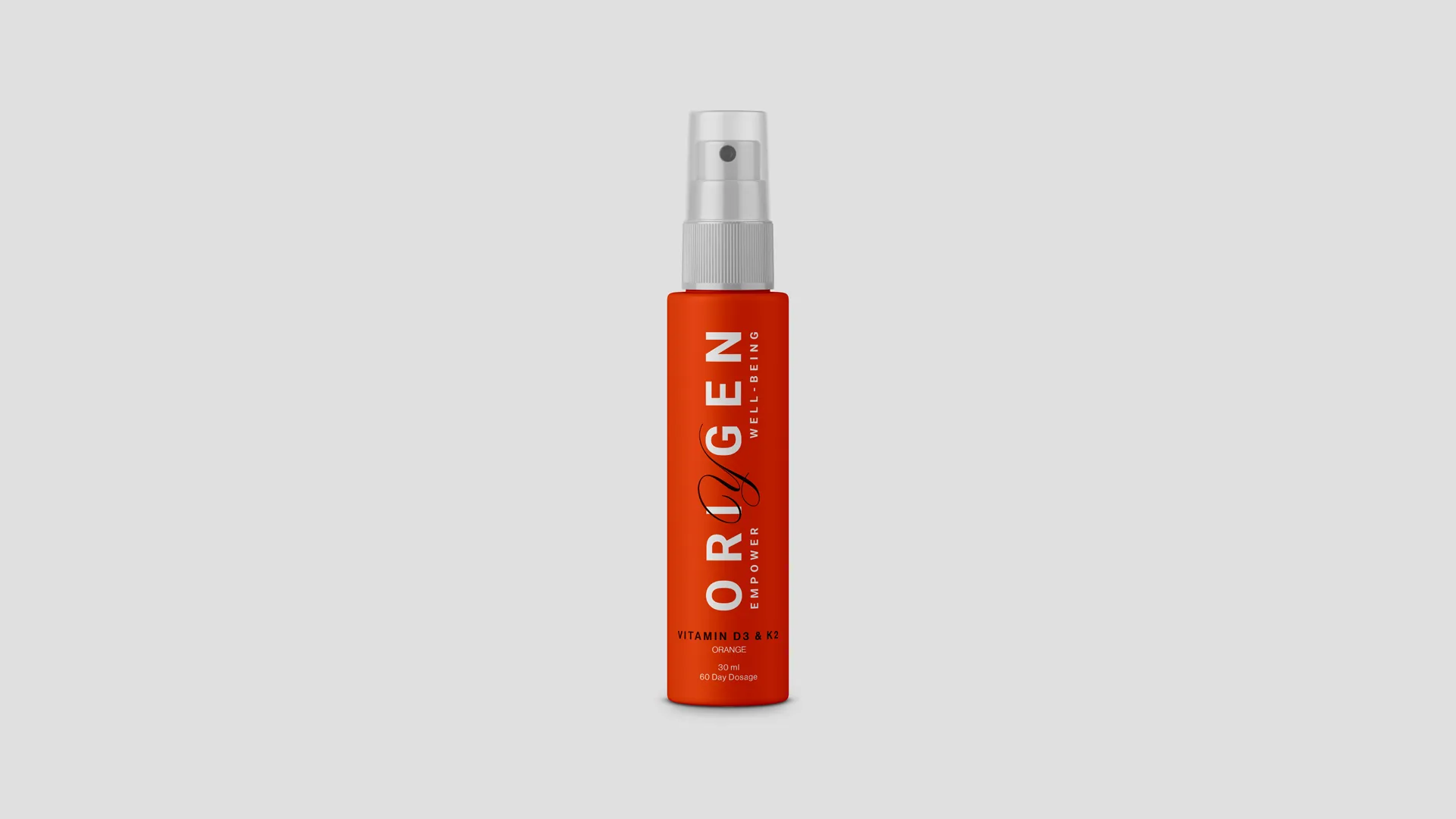
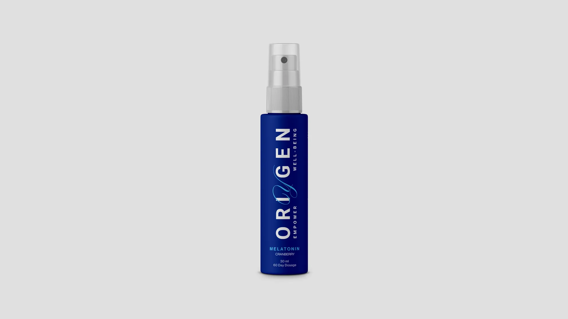
Blue carried the calm of sleep for melatonin. Orange brought in the warmth of the sun for Vitamin D3. Yellow echoed the freshness of citrus for Vitamin C. Every product earned its own mood, drawn from the feeling of each benefit.
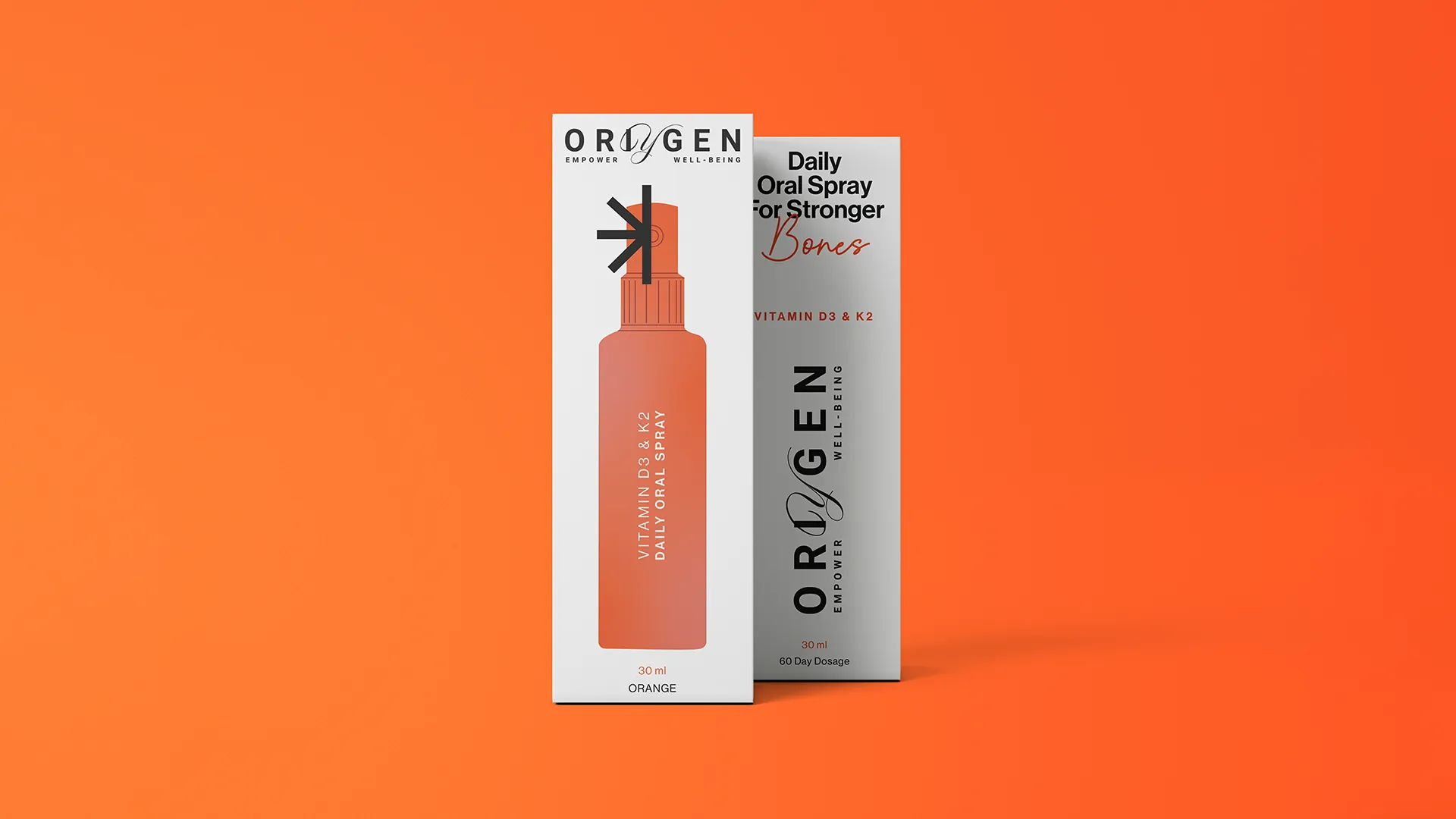
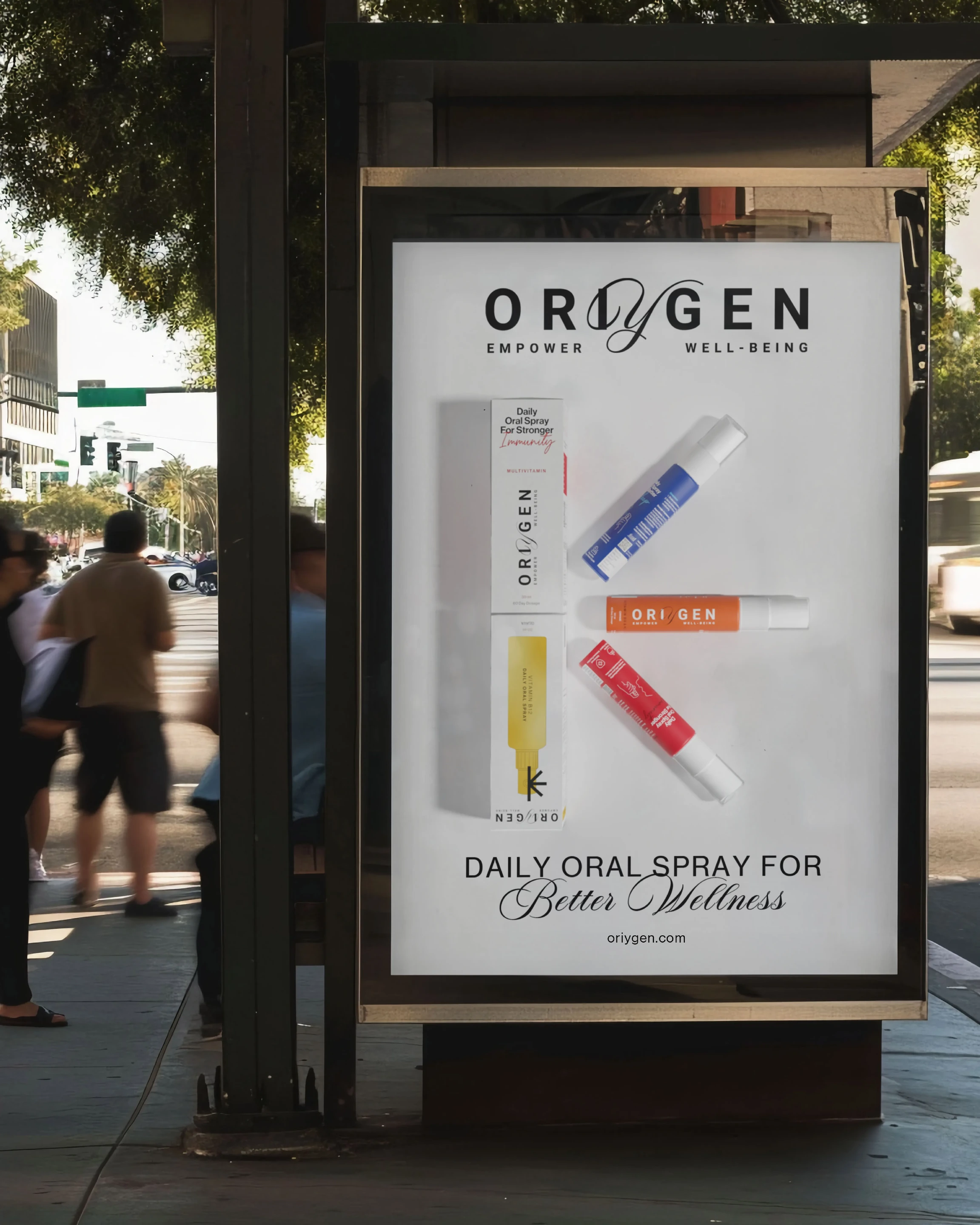
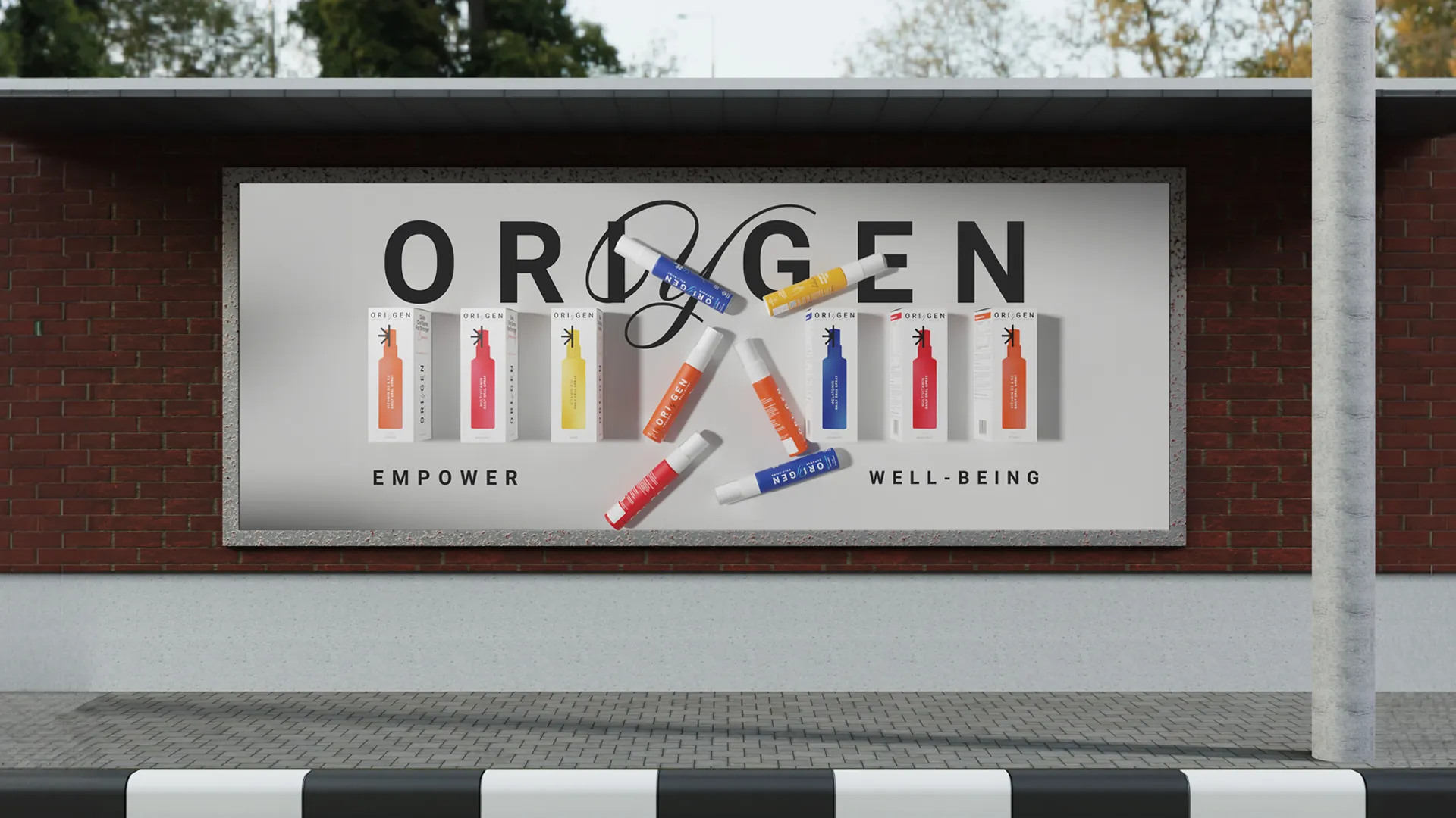
Ready to be carried, used, and seen. The packaging language keeps the range effortless and beautiful across every SKU, so that care feels personal and everyday wellness never asks to be hidden away.
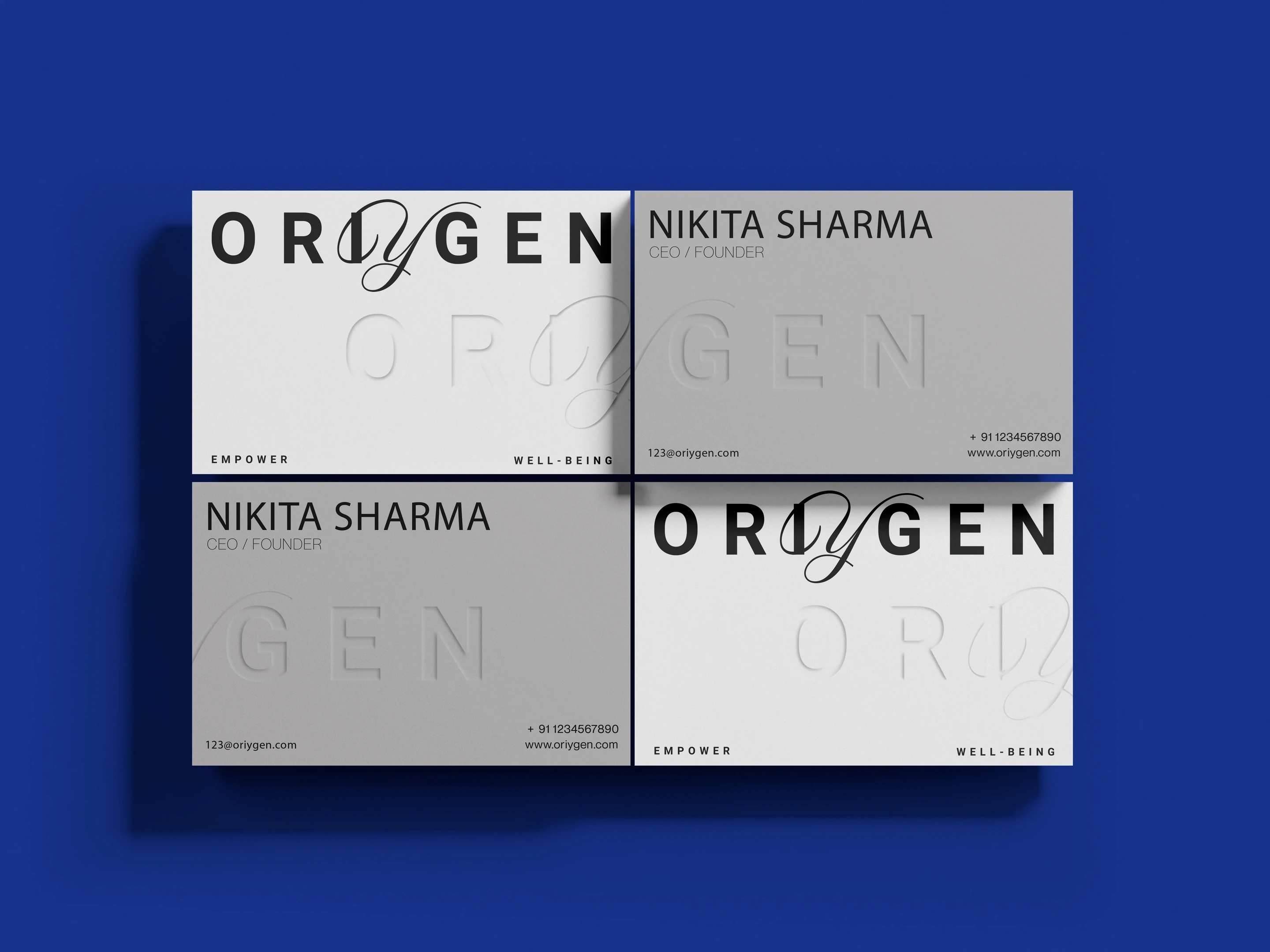
Off the pack, the system carries the same quiet confidence, from surface to shelf to the daily ritual it becomes. A wellness brand made to feel like a companion, not a chore.