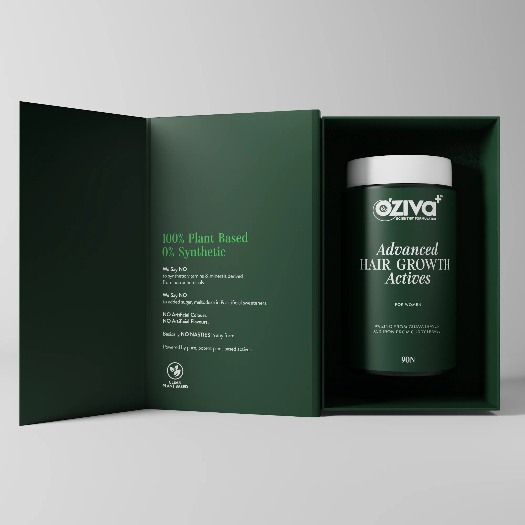
OZiva sits at the intersection of clean wellness and clinical proof, and the brief was to hold both ends of that tension on one label.
Yellow built the system end to end. A typographic spine that scales from a capsule jar to a protein tub, a colour vocabulary keyed to product function, and a 3D motion language that turns SKUs into hero films.
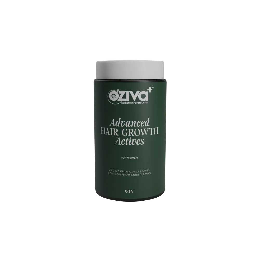
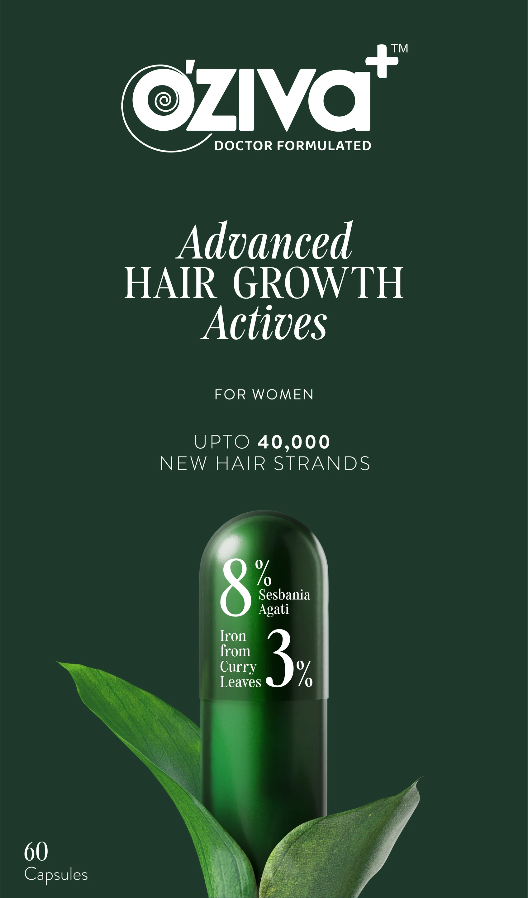
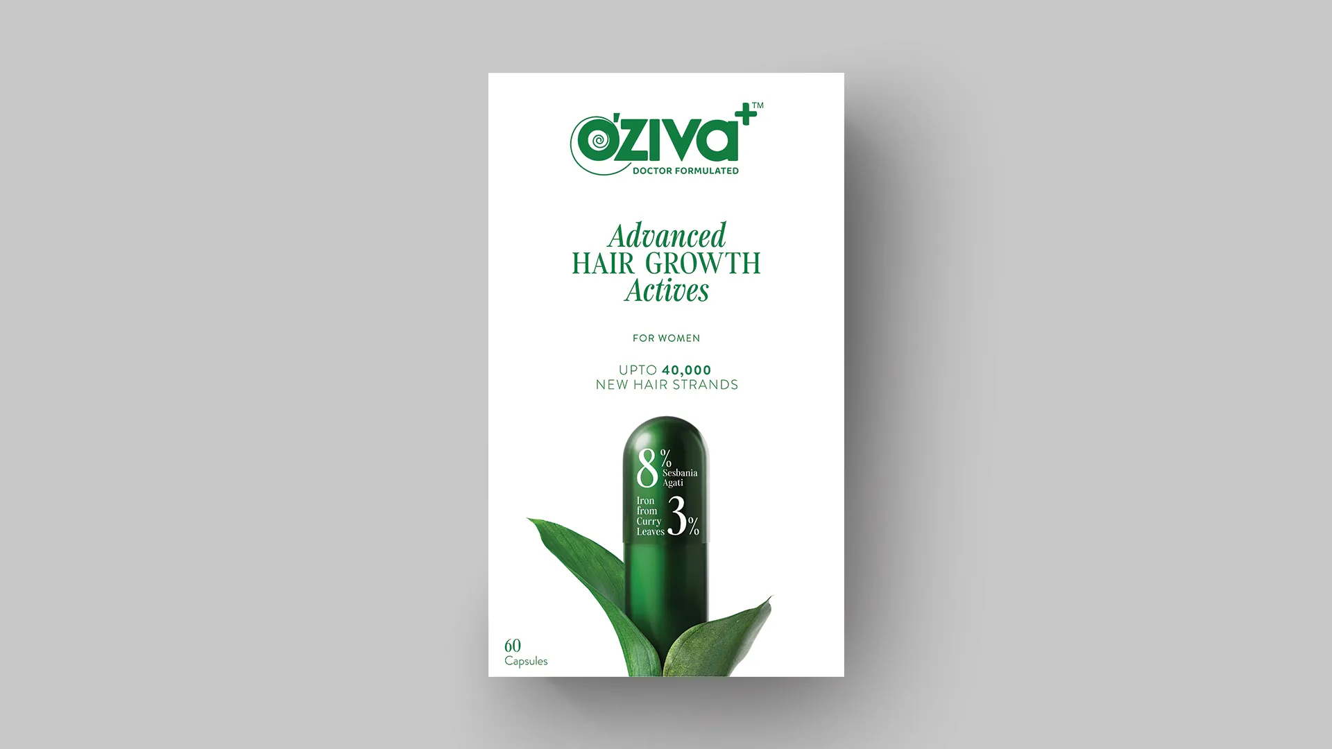
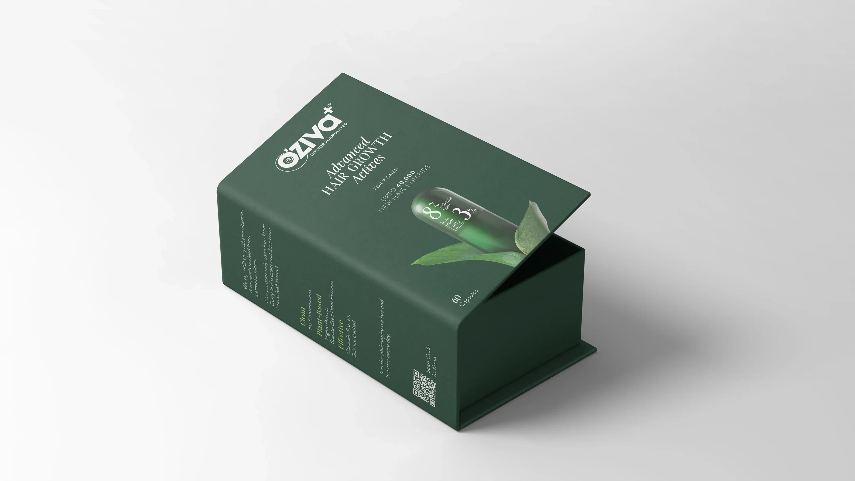
Across the Advanced range, twelve products now read as one family on the shelf, in the feed, and on the chemist's counter.
Stillness, set in motion. A 3D pack-animation language that lifts each SKU off the shelf and into the feed, plant-based on the label and clinically held in the formula. One loop, built to carry the whole Advanced range with the same calm, considered gravity.
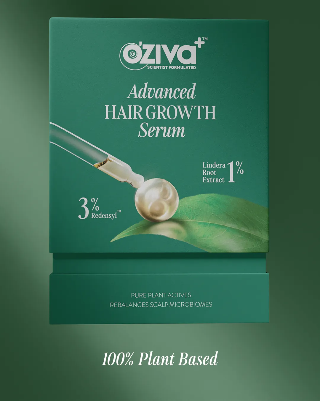
A single design language that scales cleanly from the smallest capsule jar to the largest protein tub. The typographic spine, function-keyed colour and restrained plant-based cues let every product read as its own SKU while still belonging, unmistakably, to one family.