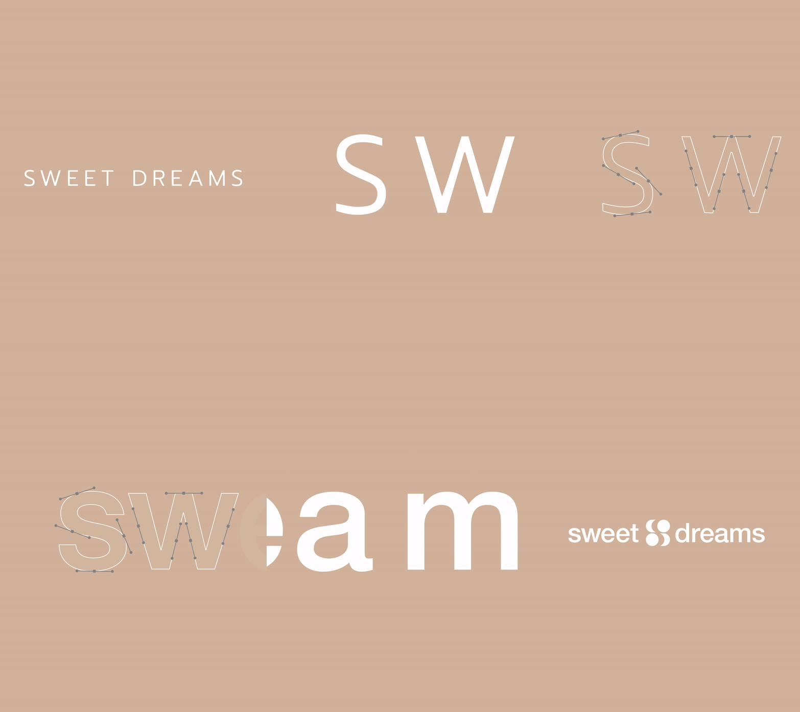
From strategy and positioning to brand storytelling, we rebuilt every element to feel more contemporary, elevated and globally relevant.
A new visual identity, logo system, typography, colour palette and design language, drawn from the rituals of rest and the hours between day and night.
The result carries a sense of softness, sophistication and quiet confidence across every touchpoint the brand meets.
A new logo system and typographic voice, editorial and unhurried. EB Garamond italic for the display line, a clean workhorse sans beneath, together carrying the warmth and quiet of rest.

A deep plum-navy drawn from the hours before sleep, softened by a warm sand glow. The palette gives the brand its ease, contrast that reads as comfort rather than noise.
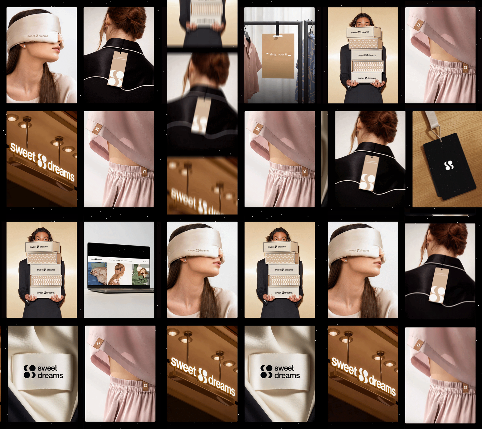
Packaging, brand assets, visual guidelines, motion identity and a communication framework, one cohesive world for Sweet Dreams that moves with the same softness across every surface.