
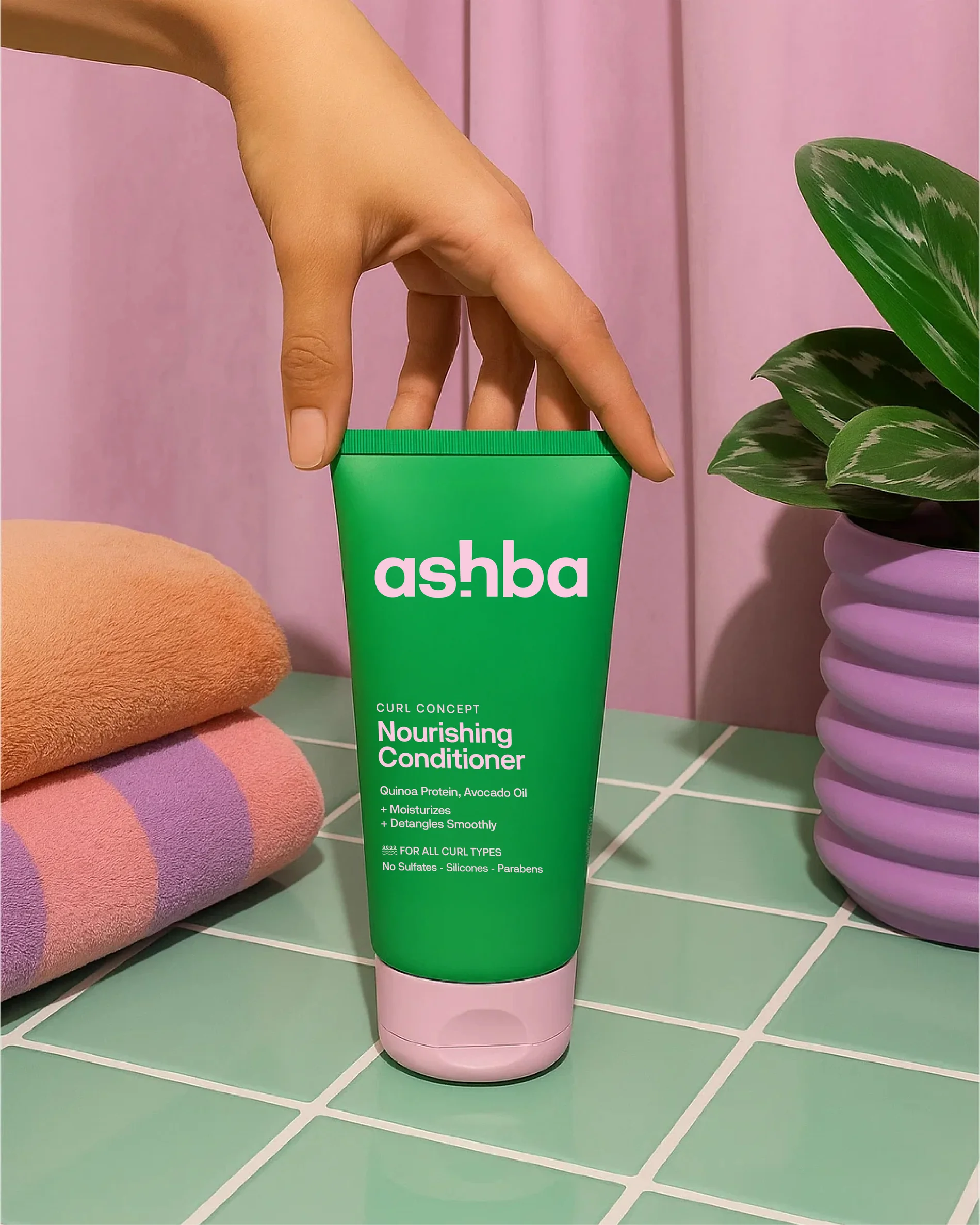
Ashba was created to give textured hair the care and attention it too often lacked.
As the brand grew, it needed a visual language that felt clearer, more contemporary and easier to navigate across a widening product range. We refreshed the identity and packaging system, building a cleaner architecture, stronger product distinction and a more cohesive presence across touchpoints.
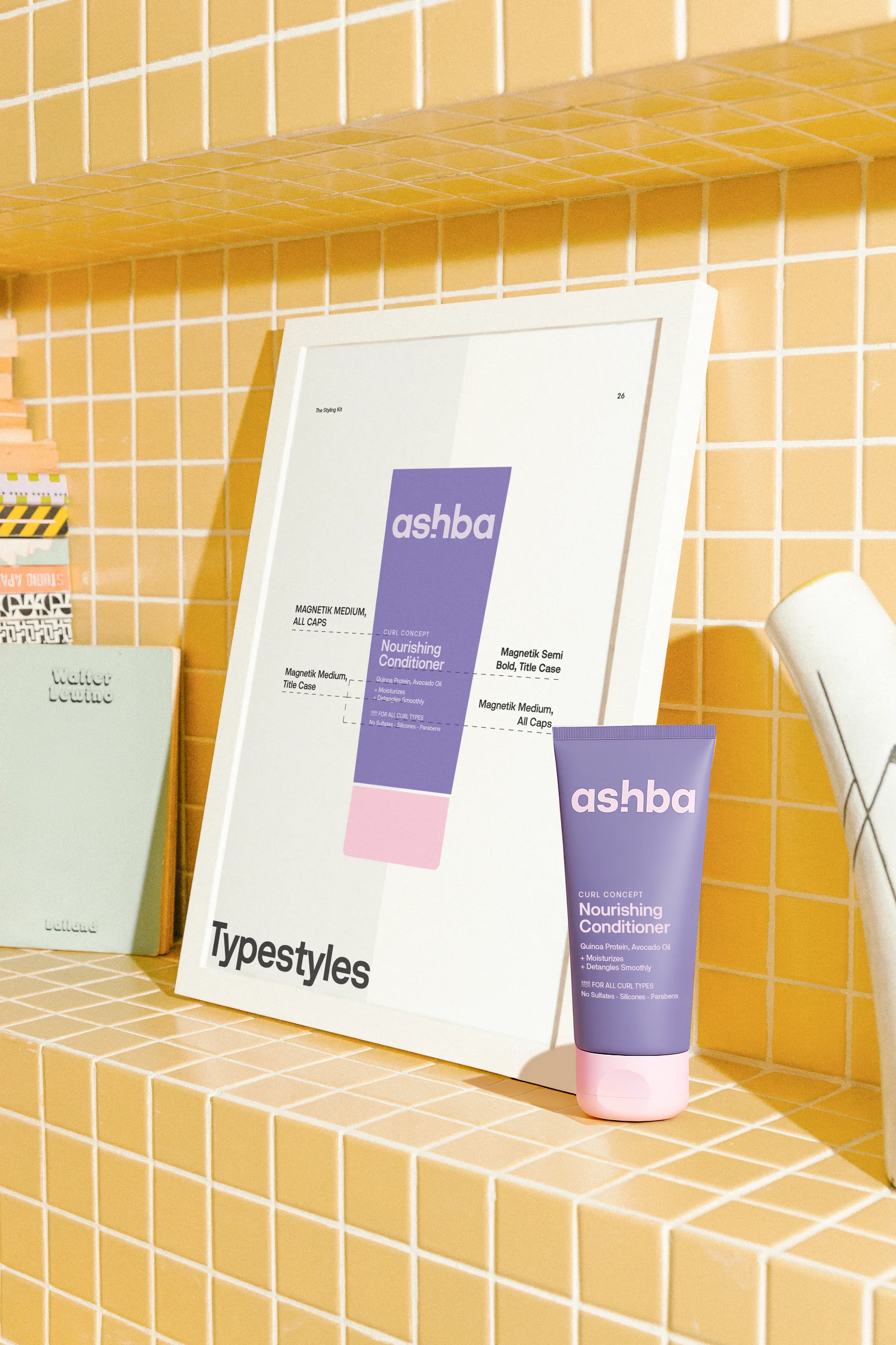
A bold palette and a simplified information hierarchy help products stand out while making routines and benefits easier to understand.
The result is a brand that feels more confident, recognisable and true to the simplicity at the heart of Ashba.
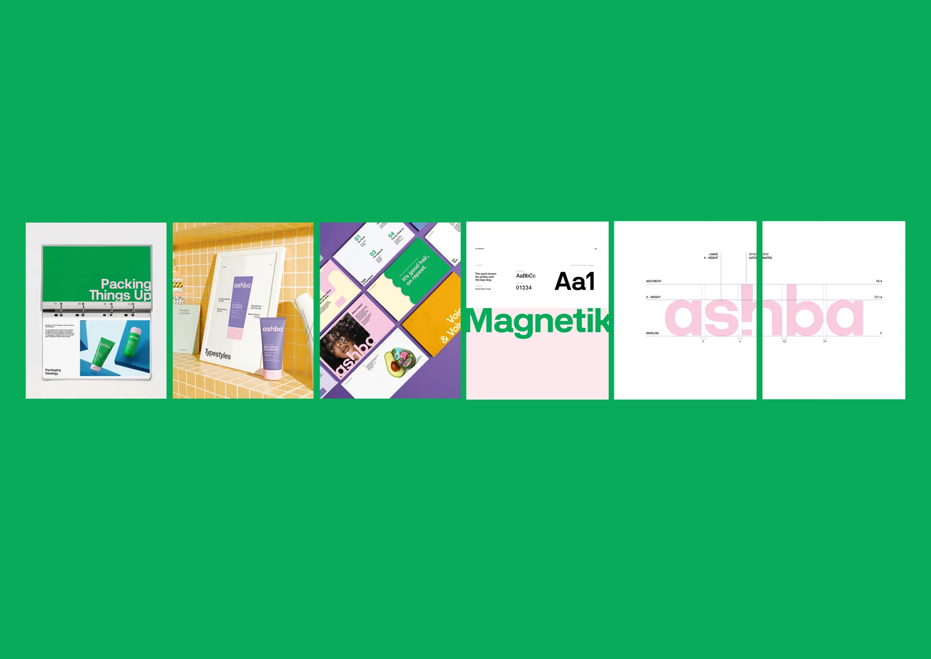
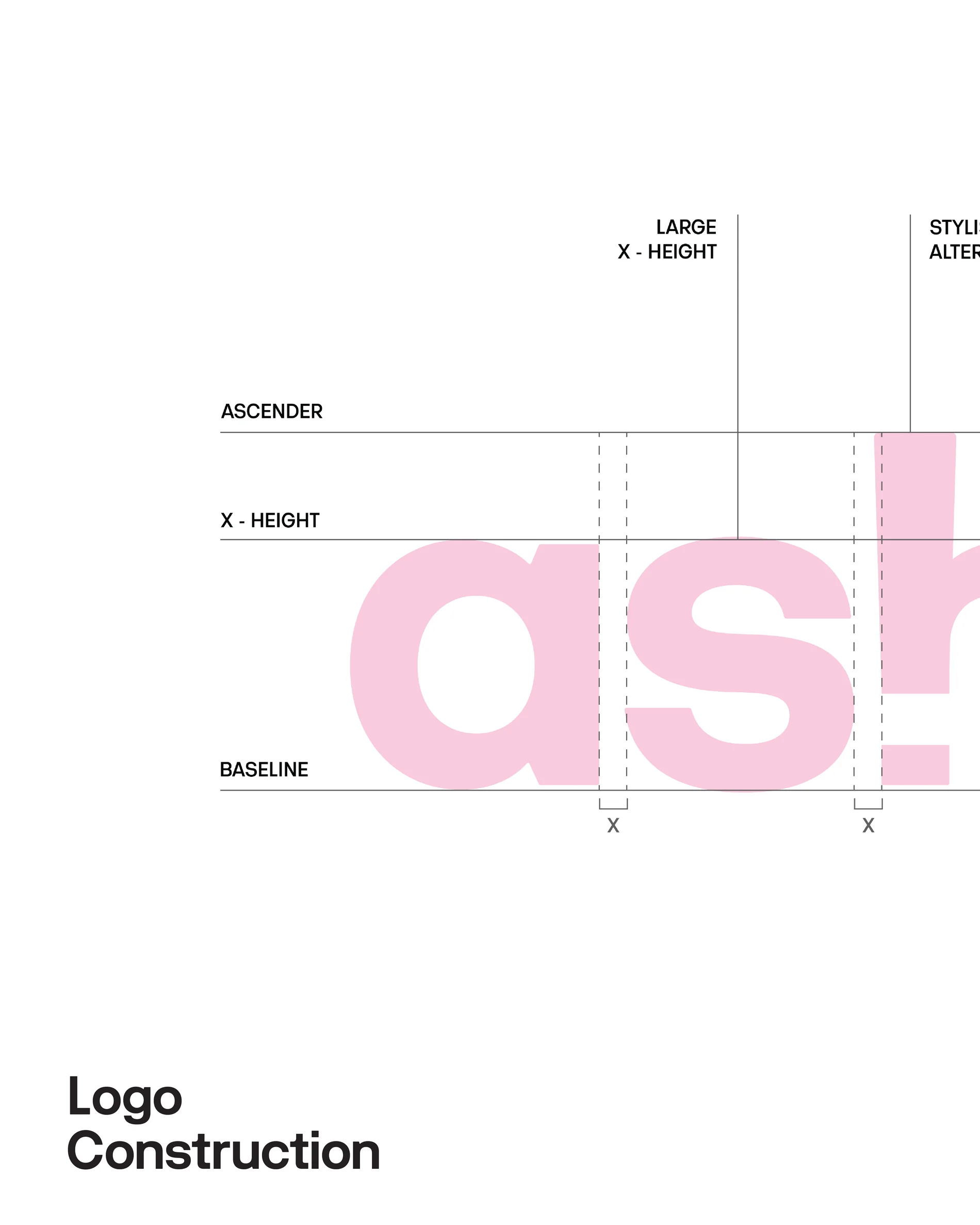
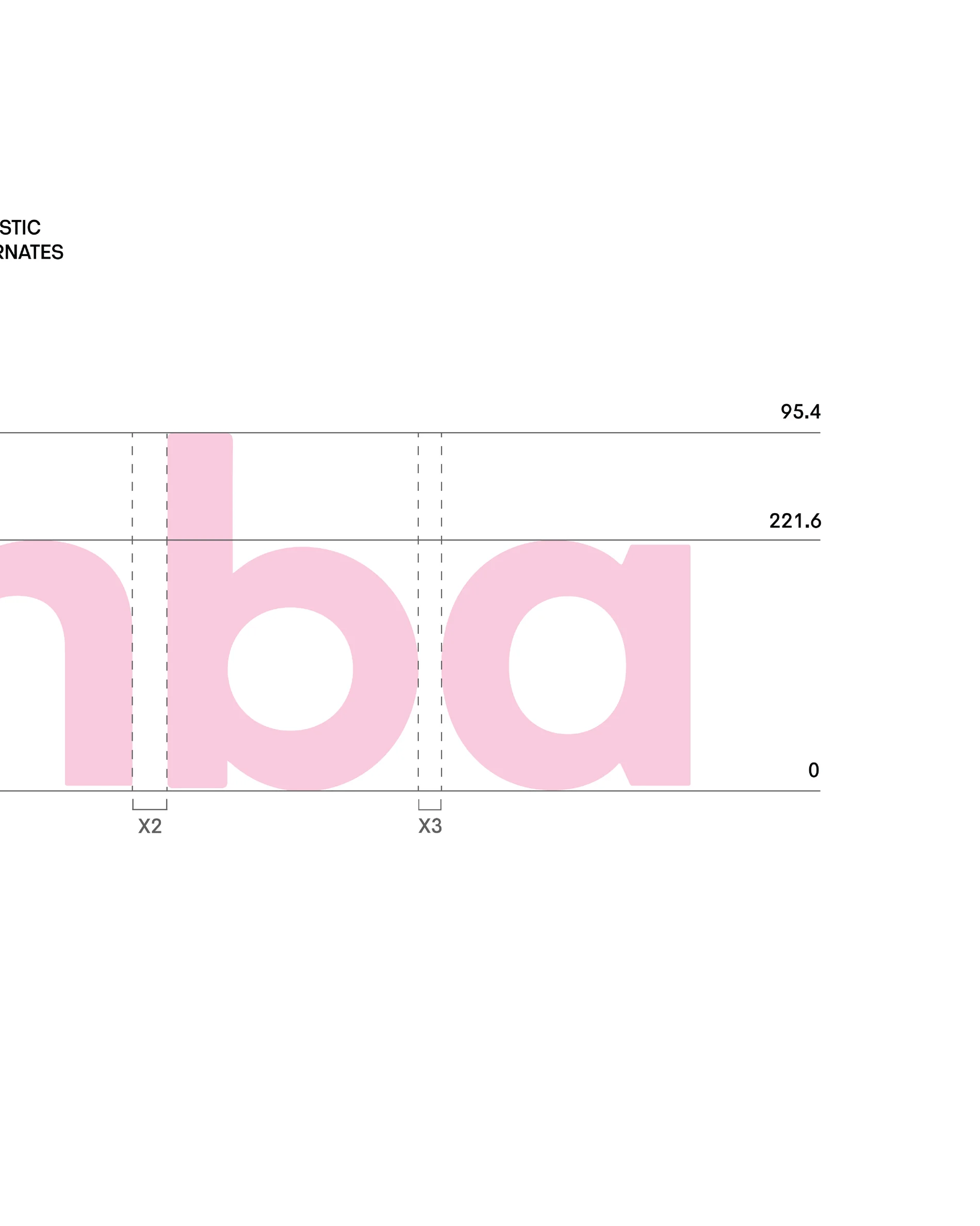
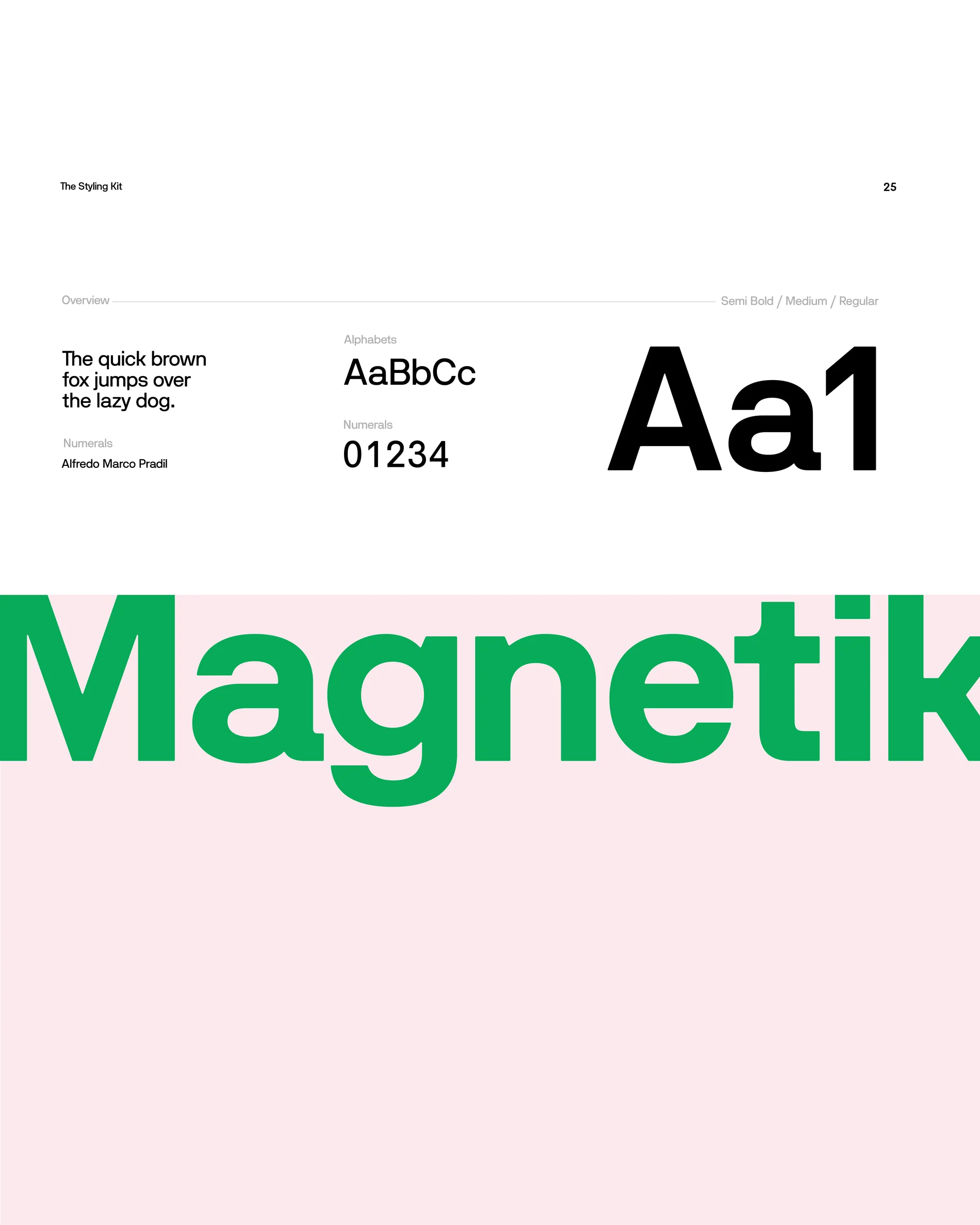
The refreshed identity, shown across wordmark, palette and application. A cleaner architecture and a simplified hierarchy carry the brand with the quiet simplicity that sits at the heart of Ashba.
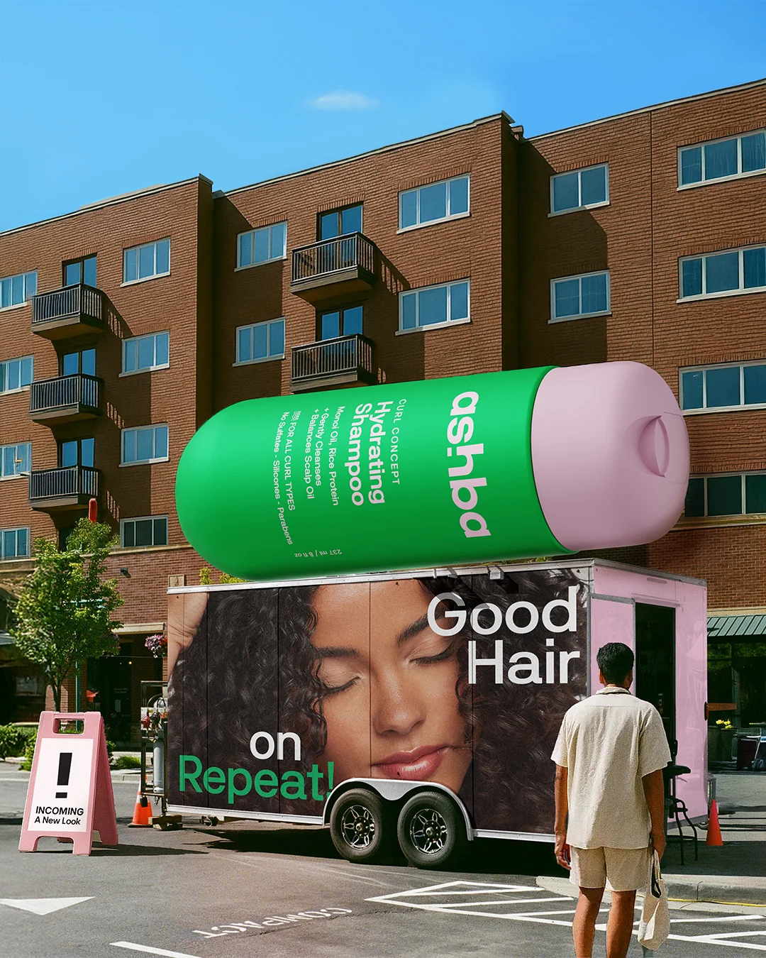
Motion gives the identity movement, showing how bold colour, clean typography and a simplified hierarchy work together off the pack. Routines and benefits read more easily, and the brand feels contemporary at every touchpoint.
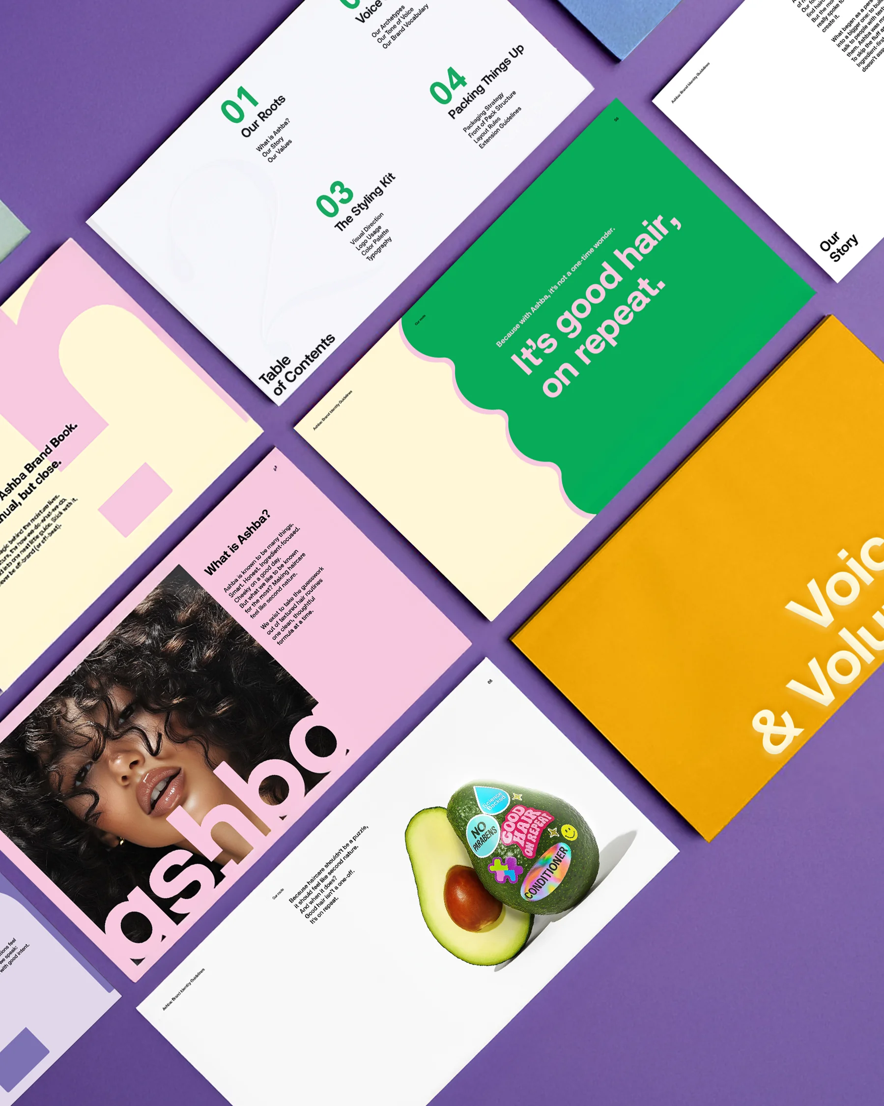
The system documented in full. Wordmark, colour, typography and application come together in a brand book that holds every decision to a single idea, made cohesive across the range.
Green Haze
Azalea