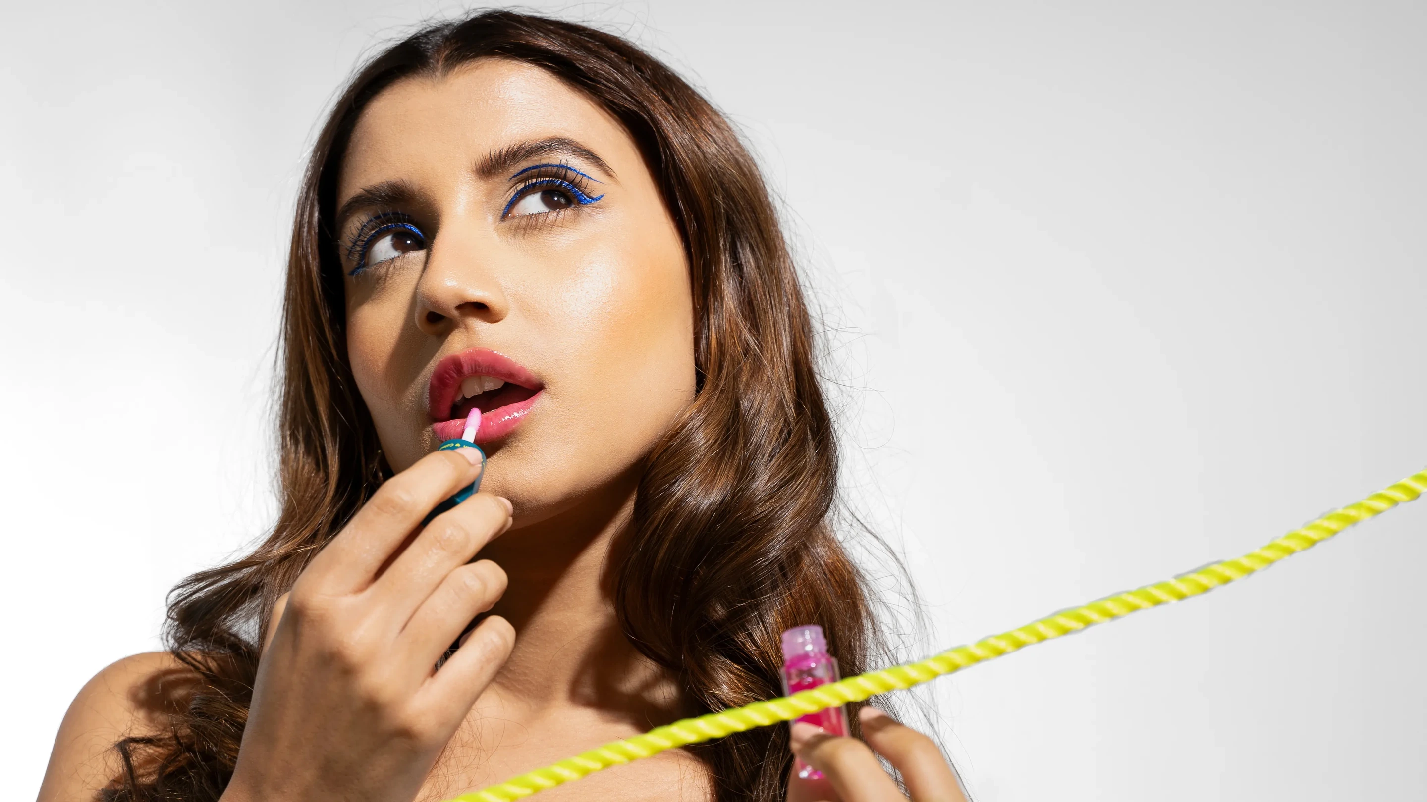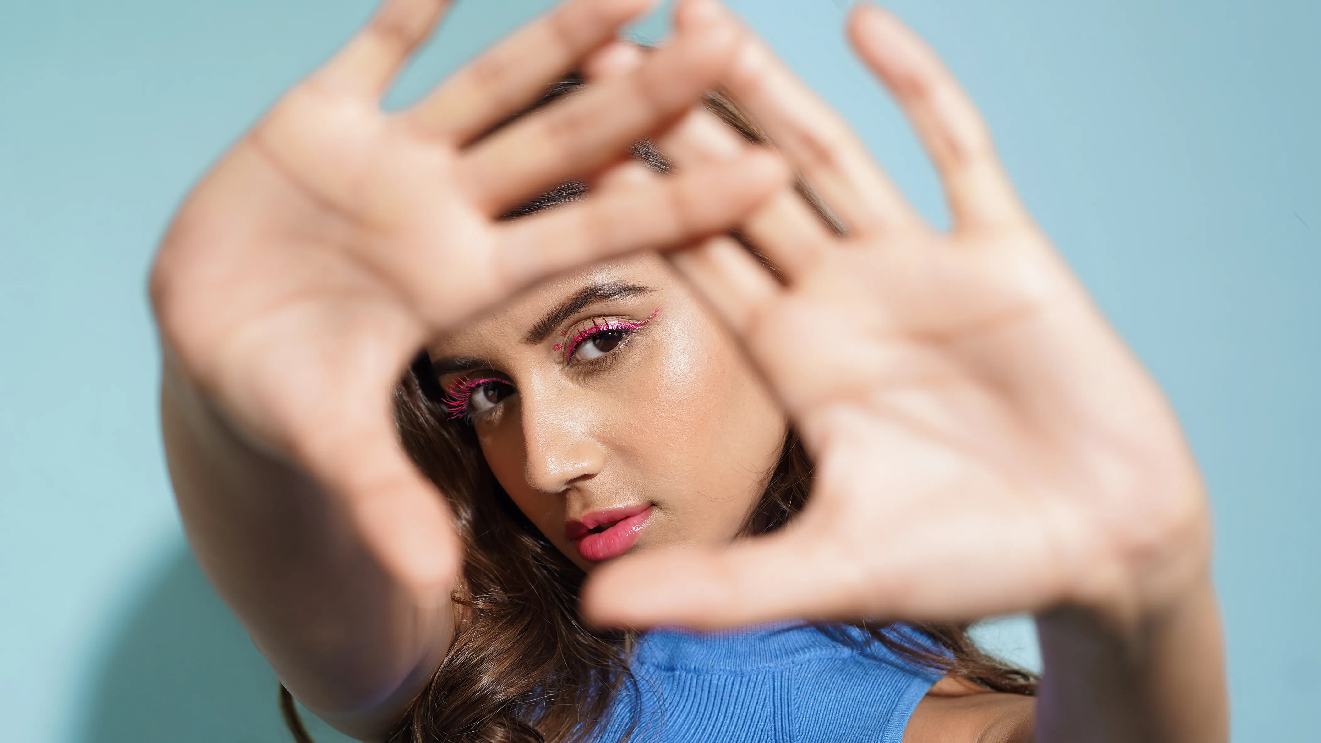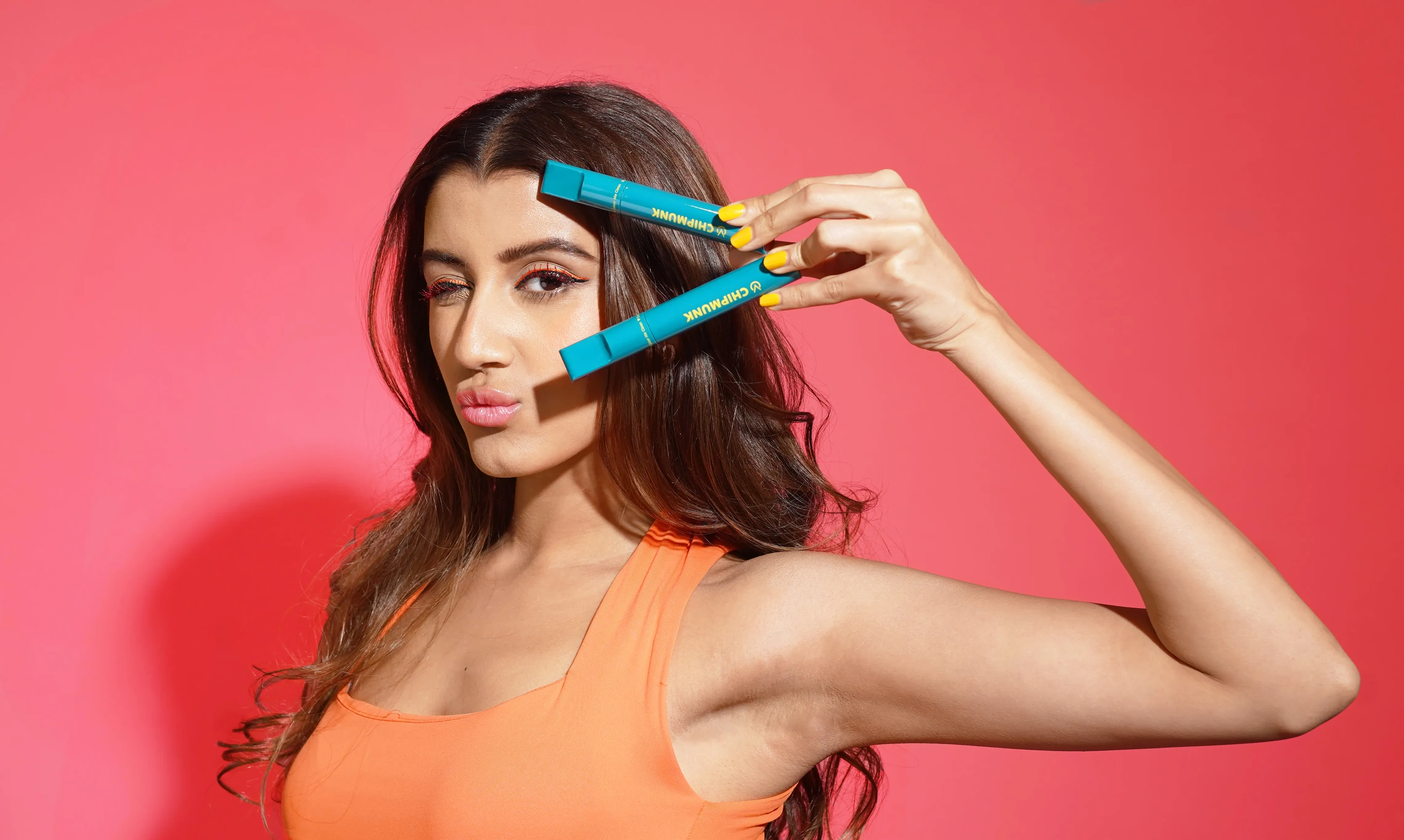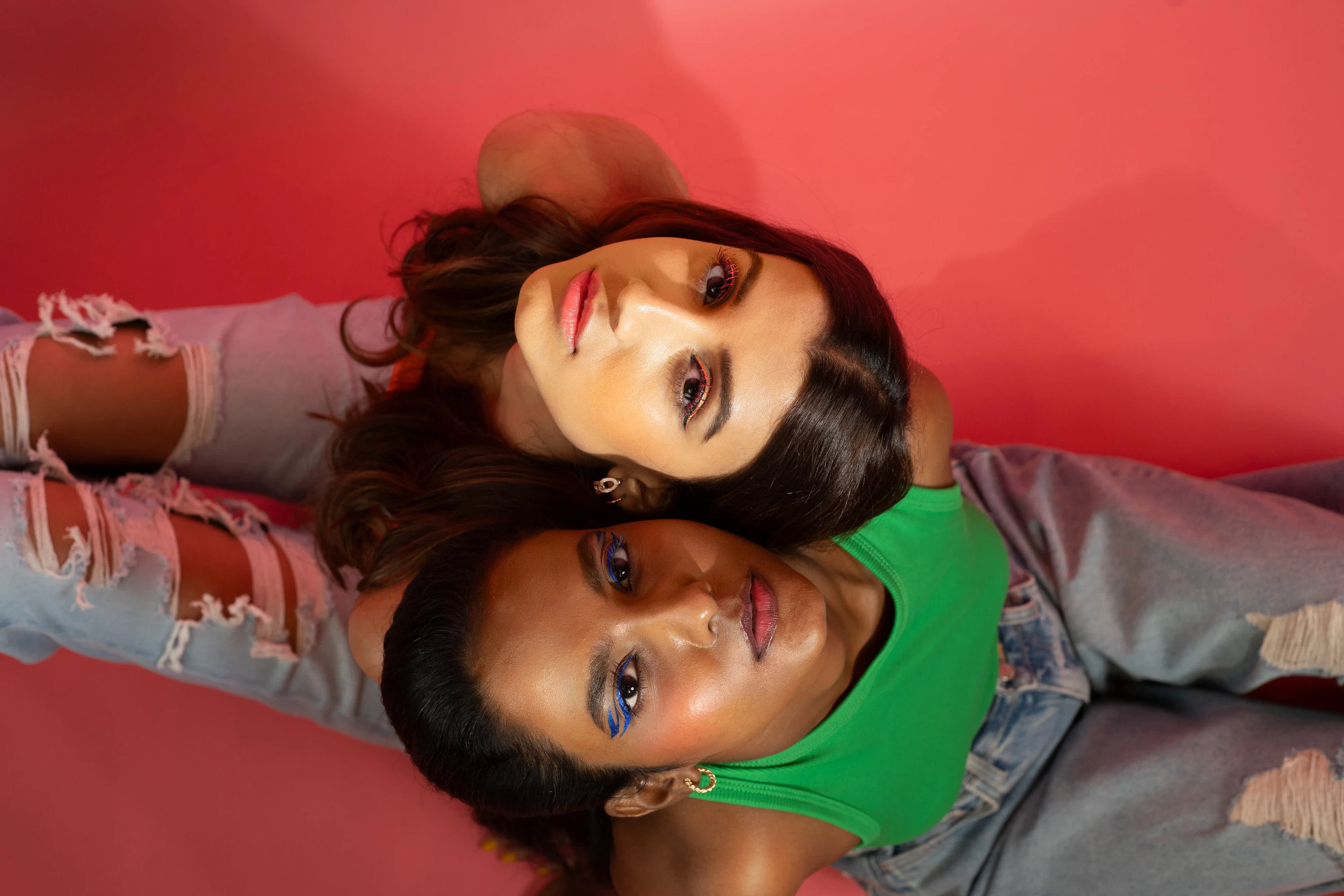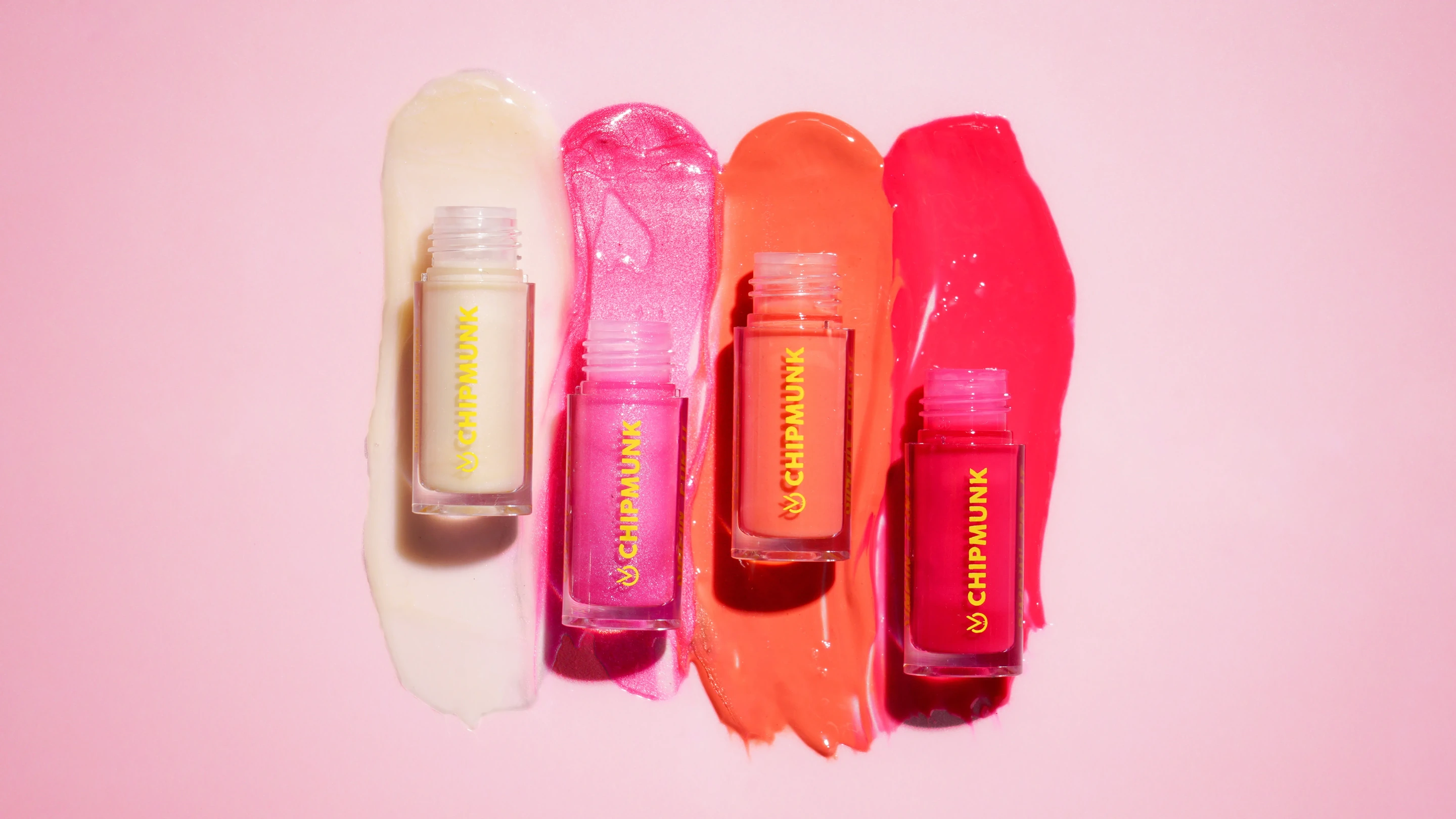
Chipmunk is a conscious makeup brand, built around clean, skin-loving and inclusive beauty.
We shaped its identity to bring together the glamour of makeup with the gentleness of skincare, creating a world that felt bold, playful and fresh.
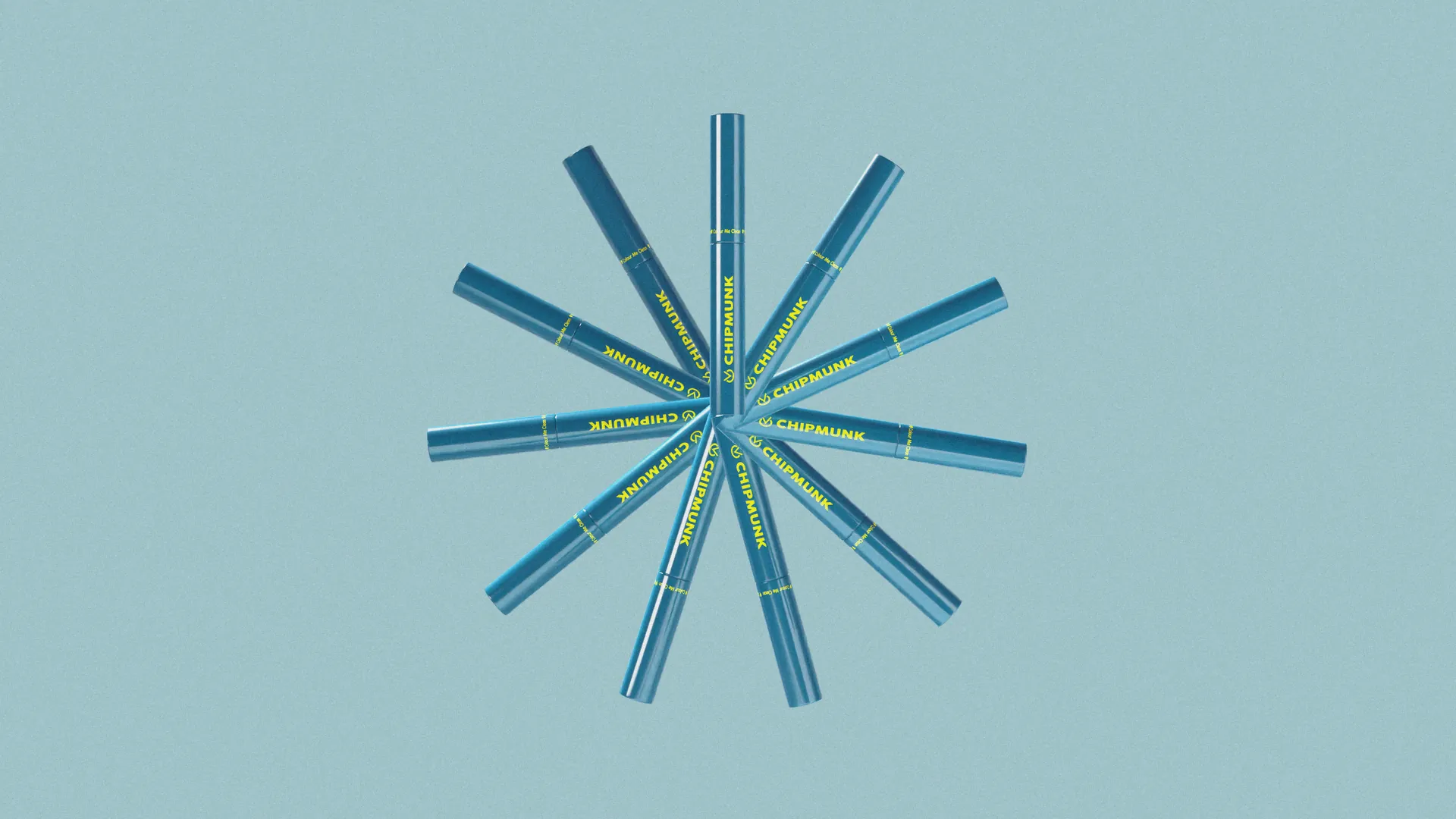
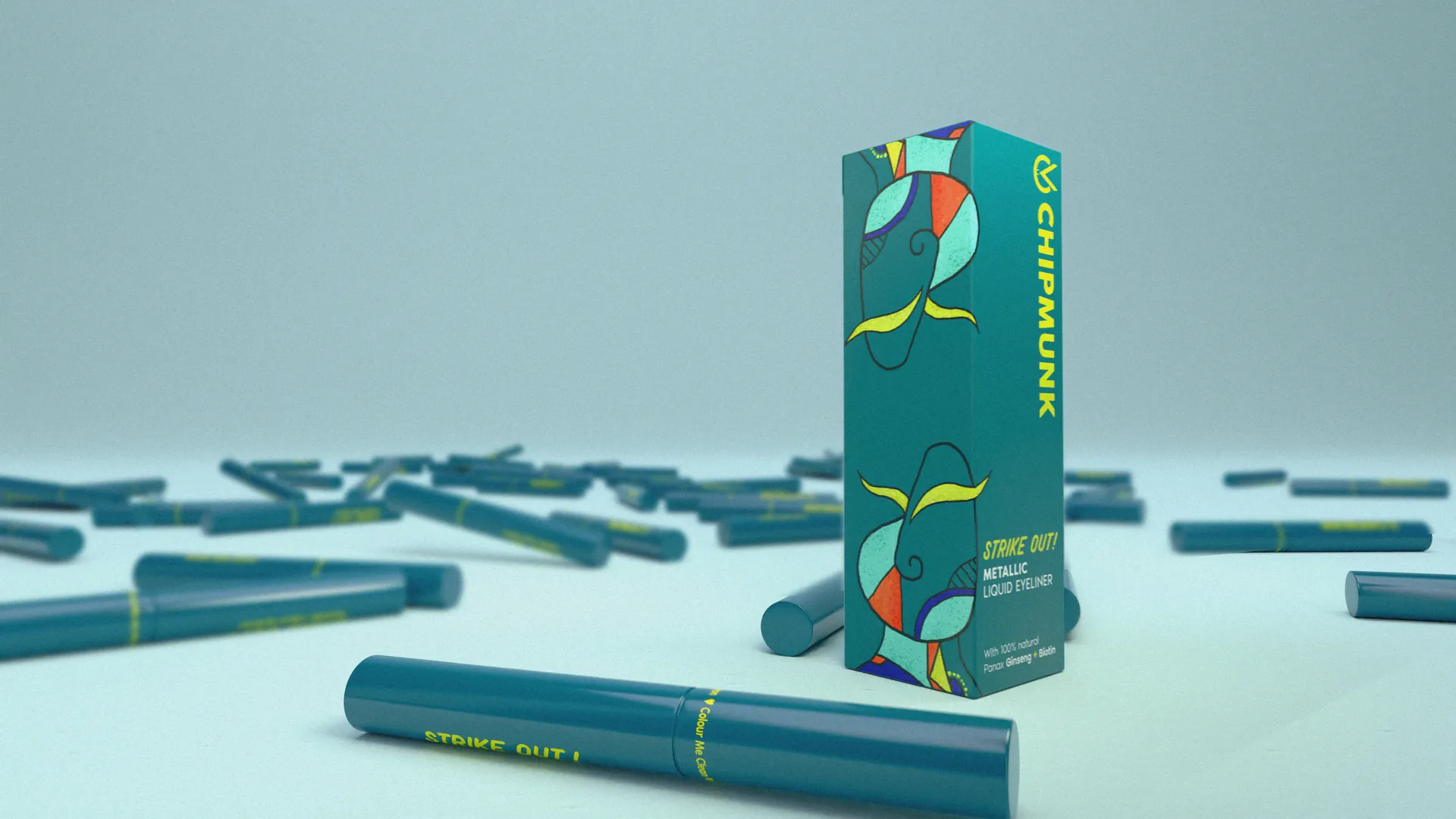
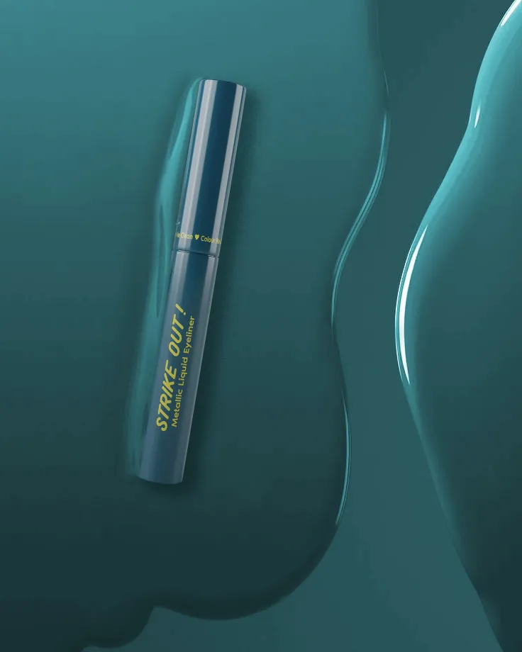
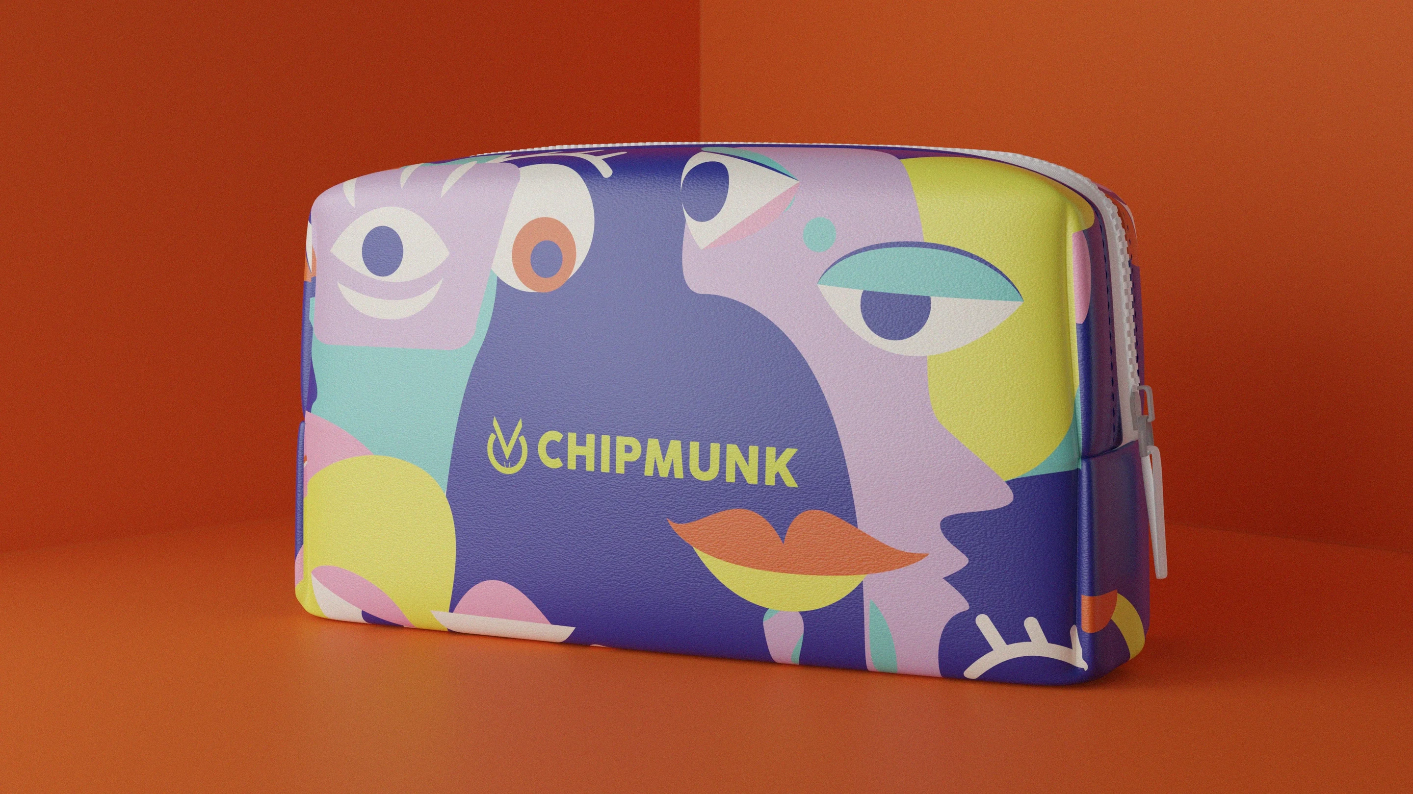
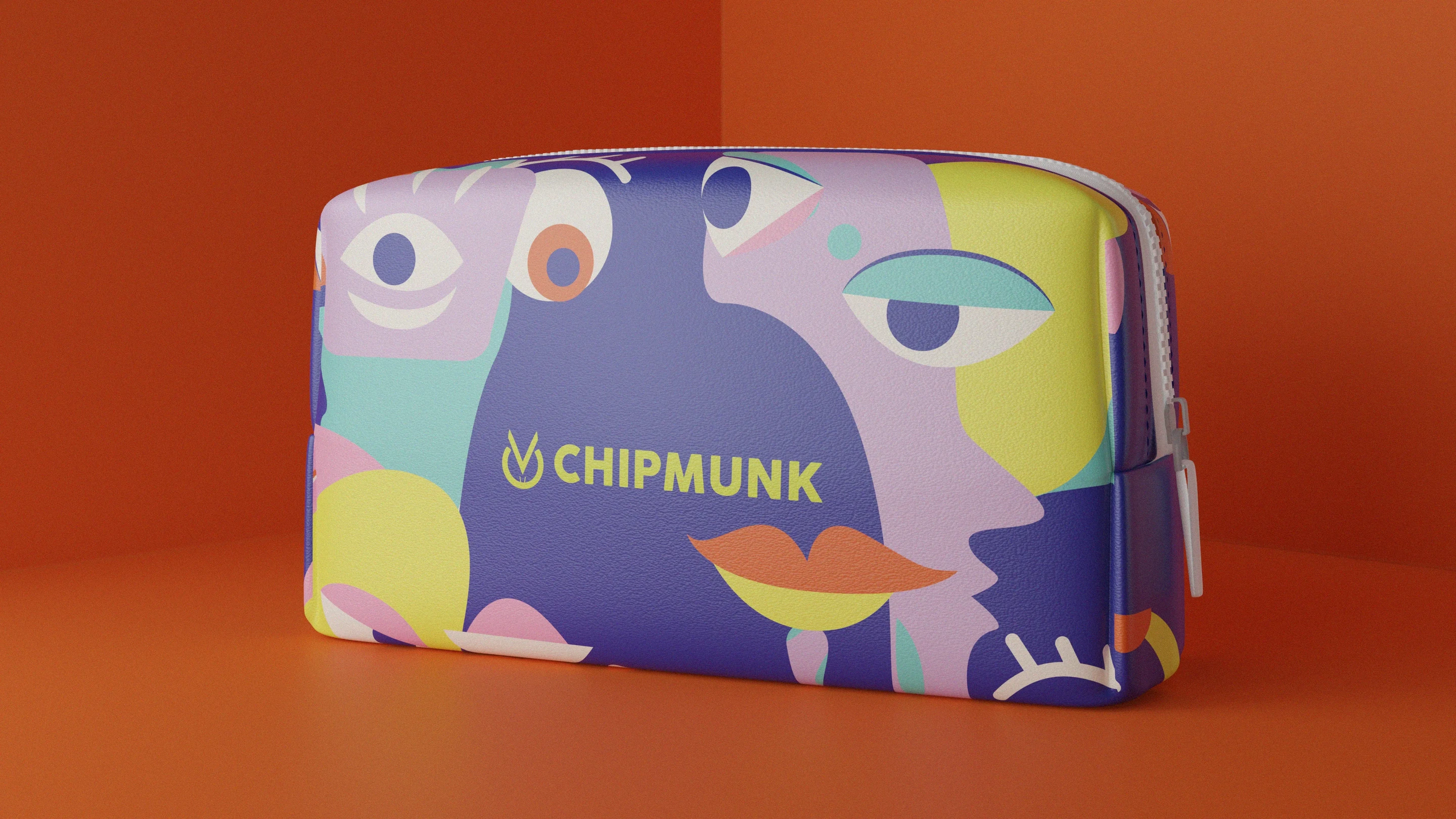
From the logo to packaging and collaterals, the brand language uses stark colours, experimental imagery and a vivid palette of dark blue, lime, teal and purple to give Chipmunk a distinct, confident presence.
The result is a makeup brand that feels fun, expressive and skin-first.
Stark colour, experimental imagery and a vivid palette of dark blue, lime, teal and purple carry the range. The packaging holds the glamour of makeup and the gentleness of skincare in a single confident gesture, playful without ever losing its poise.
Motion gives the identity its personality, colour blocks, expressive type and skin-first cues moving in step. The film shows a makeup brand that feels fun, expressive and rooted in gentleness, an idea that reads as clearly at a glance as it does on the shelf.
Off the pack, the language keeps its confidence, the same stark colour, experimental imagery and vivid palette carried across every collateral. From logo to layout, the system gives Chipmunk a distinct presence wherever a shopper meets it.