
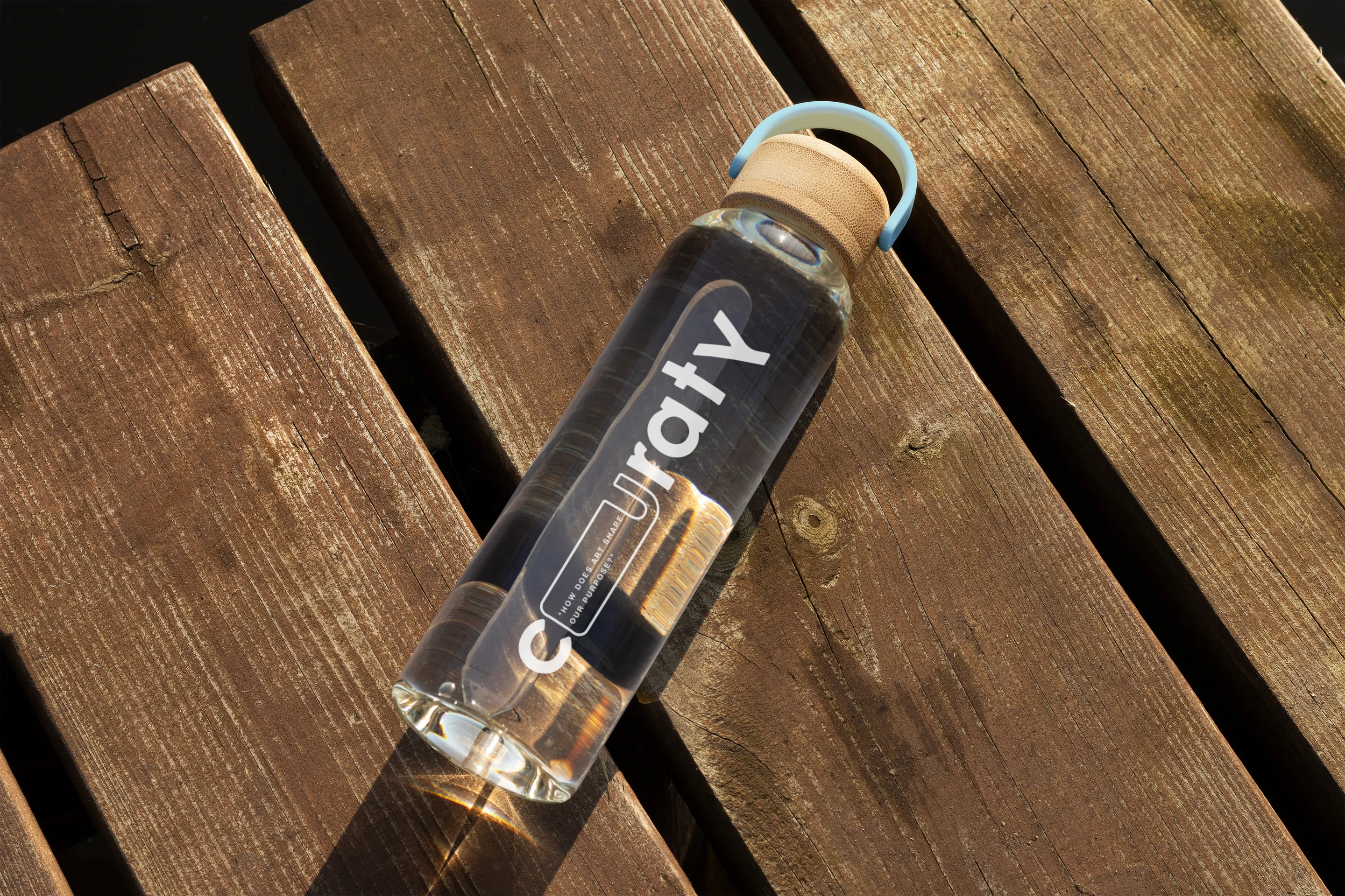
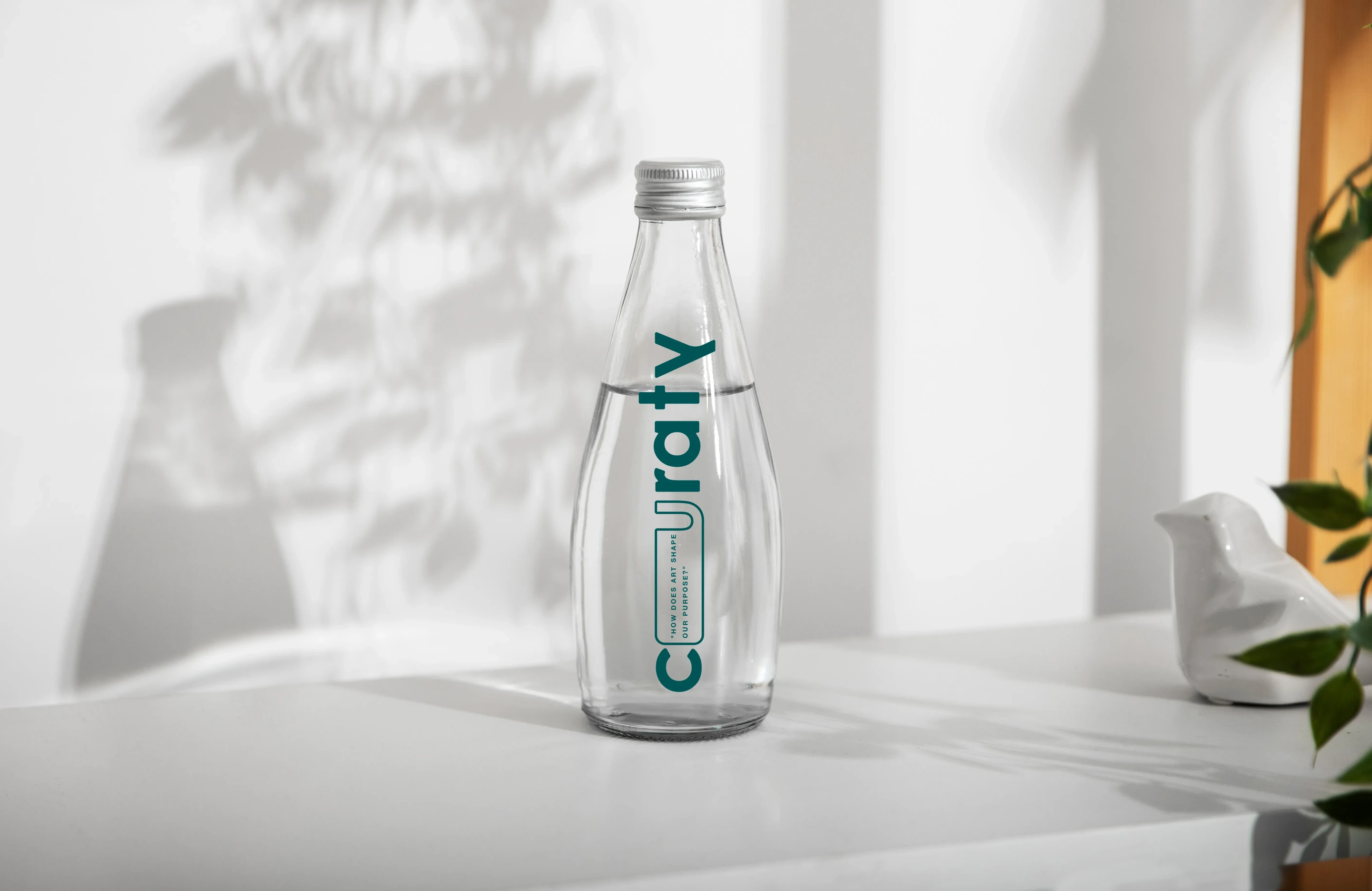
For Curaty, we crafted a brand world where art was not just something to be seen, but something to be felt, lived with, and slowly discovered.
From the identity and website to the collaterals that carried its voice forward, every touchpoint was built like an invitation into a more thoughtful way of experiencing spaces.
The language, visuals and digital journey came together to reflect Curaty's belief that art can soften a room, stir a memory, begin a conversation, and turn everyday walls into quiet sanctuaries of expression, balance and belonging.
The mark is drawn to feel calm and considered rather than loud, an identity that behaves like a gallery attendant — present, poised and never in the way of the work. It carries Curaty across every surface without ever raising its voice.
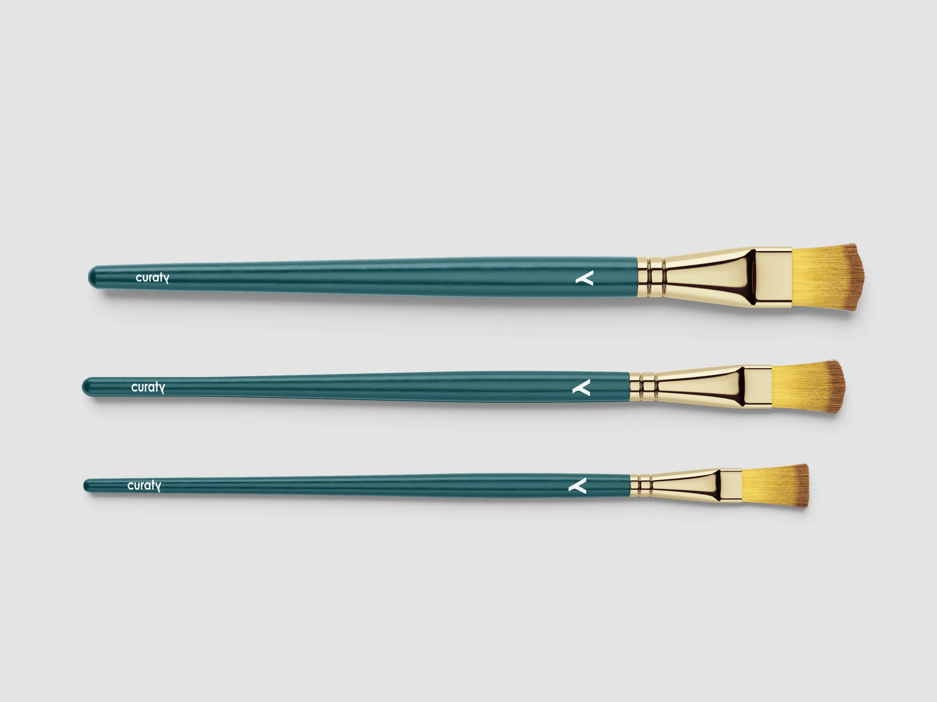
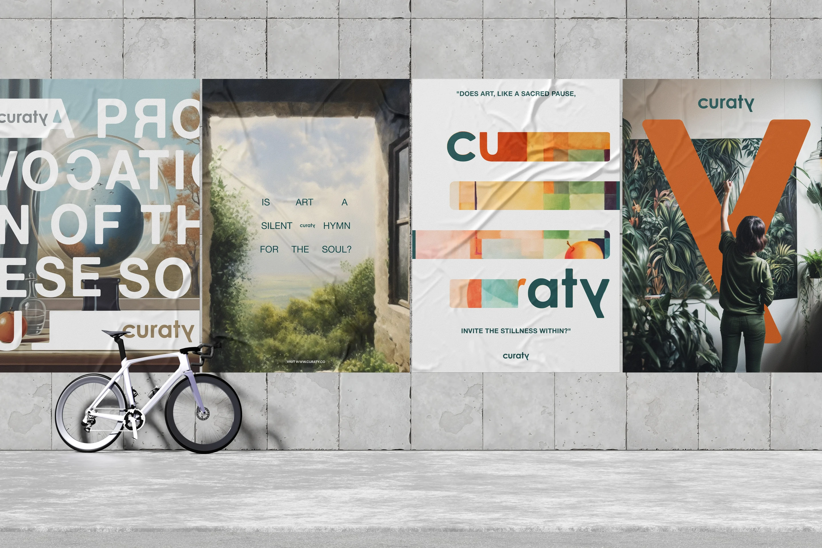
A grounded stone neutral and a quiet ivory field, anchored by a deep plum reserved for the moments that matter. The palette gives Curaty its poise — warmth that reads as intimacy, restraint that reads as taste.
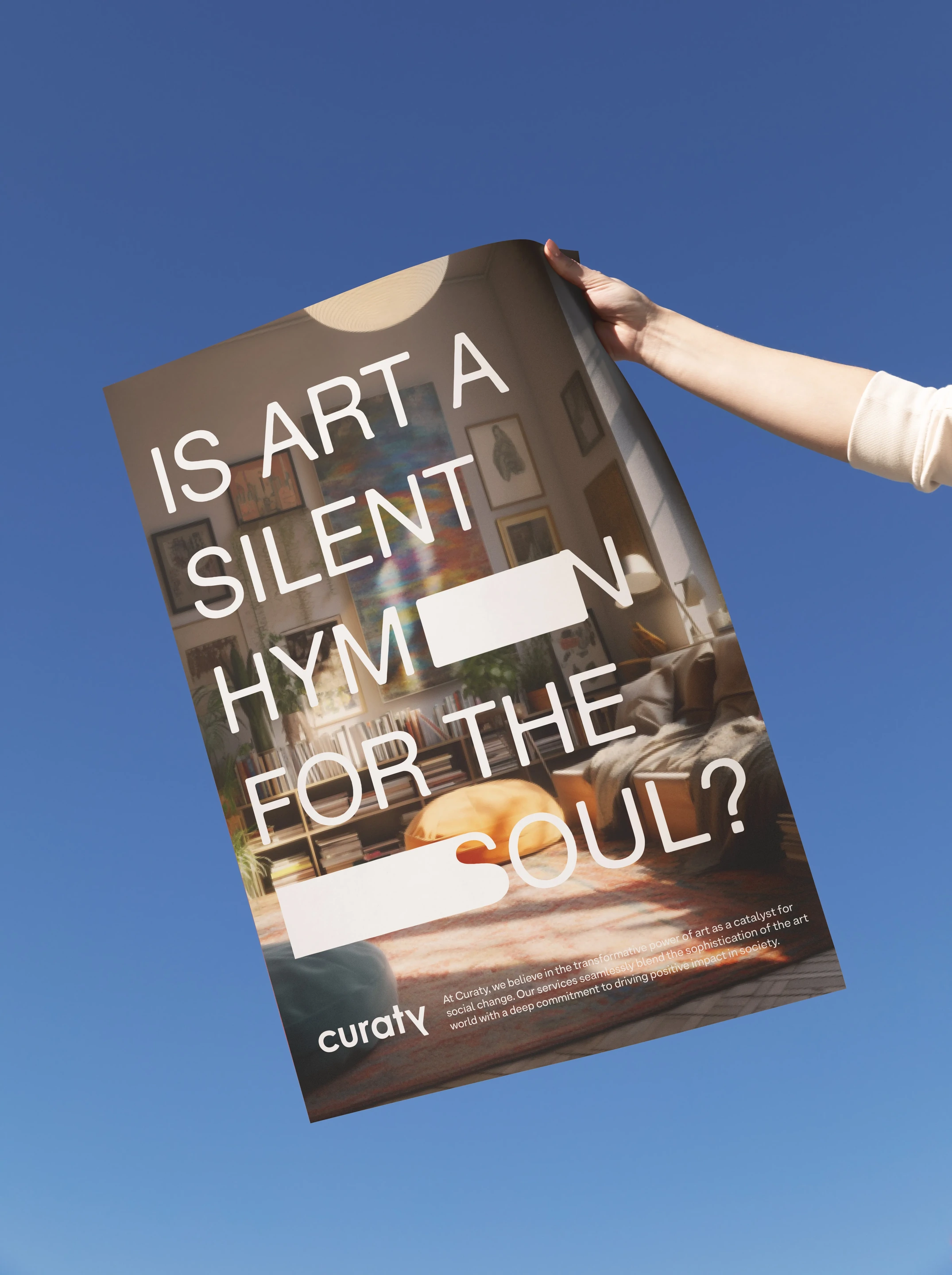
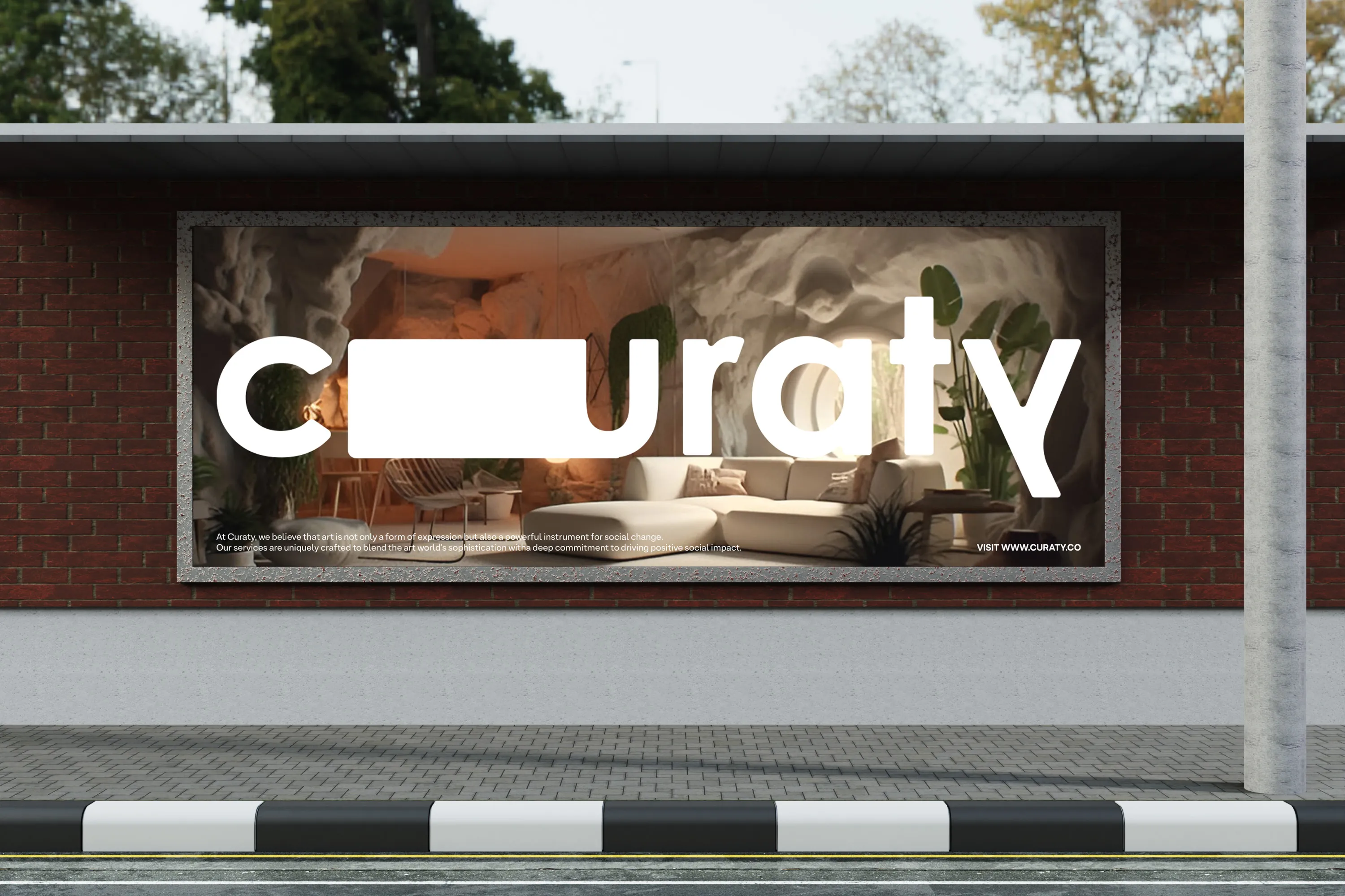
The website is built to be moved through slowly. Space, pace and typography guide the eye the way a room does, so that discovering a piece online feels closer to encountering it on a wall — unhurried, intentional and worth lingering over.
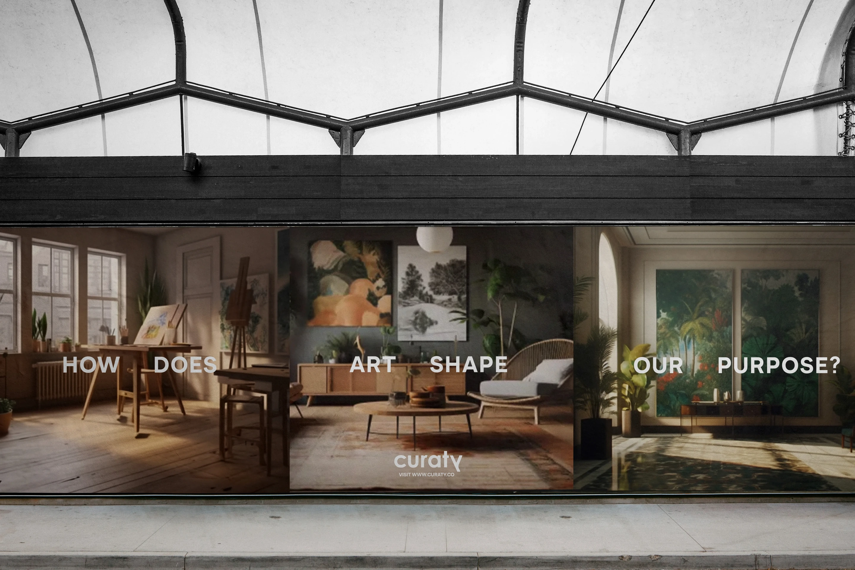
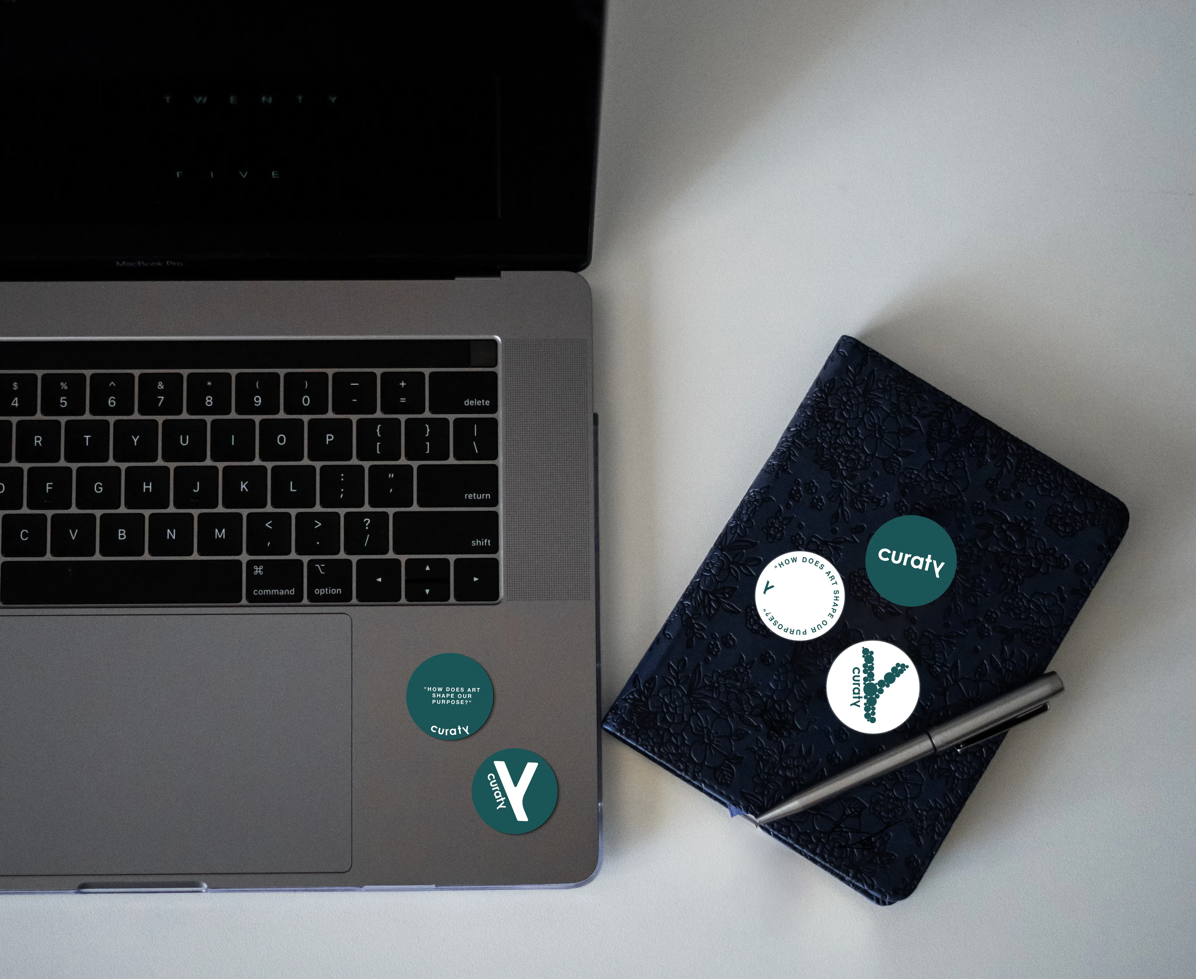
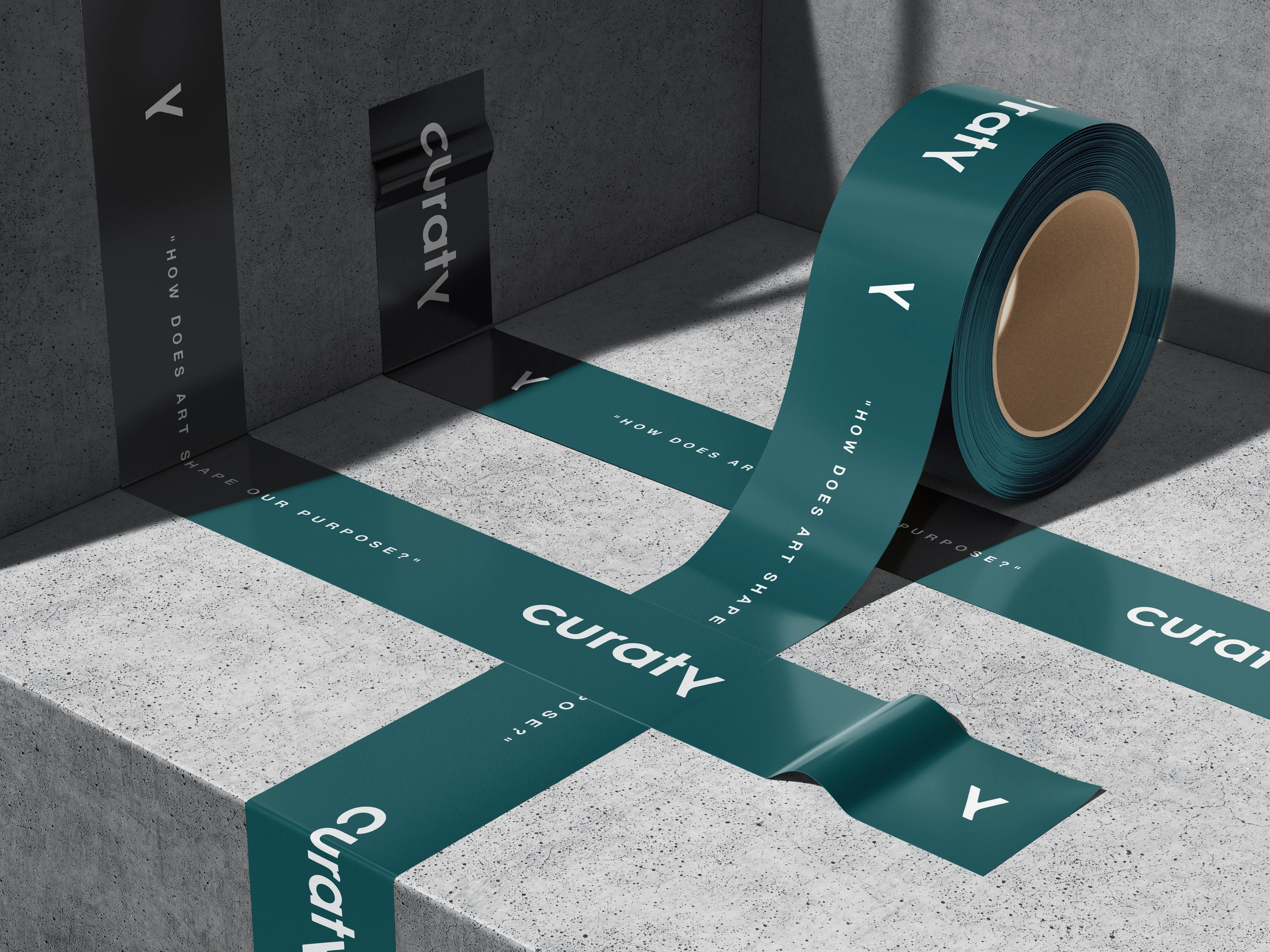
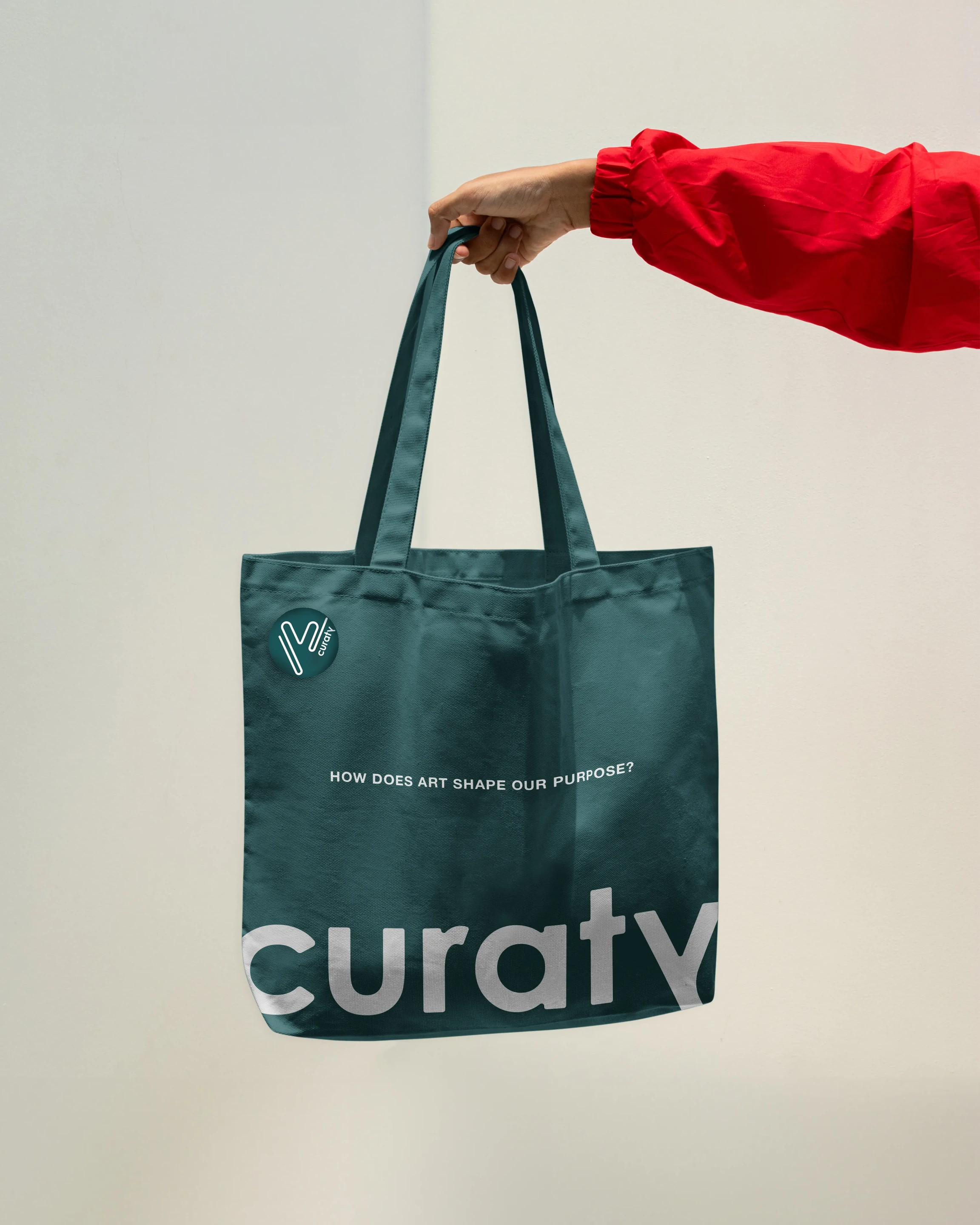
From the printed piece to the everyday object, the collaterals carry the same considered rhythm. Each one extends the invitation Curaty makes — that art belongs not behind glass, but in the rooms and routines of a life well lived.
#B8A089
#4A2C3A