
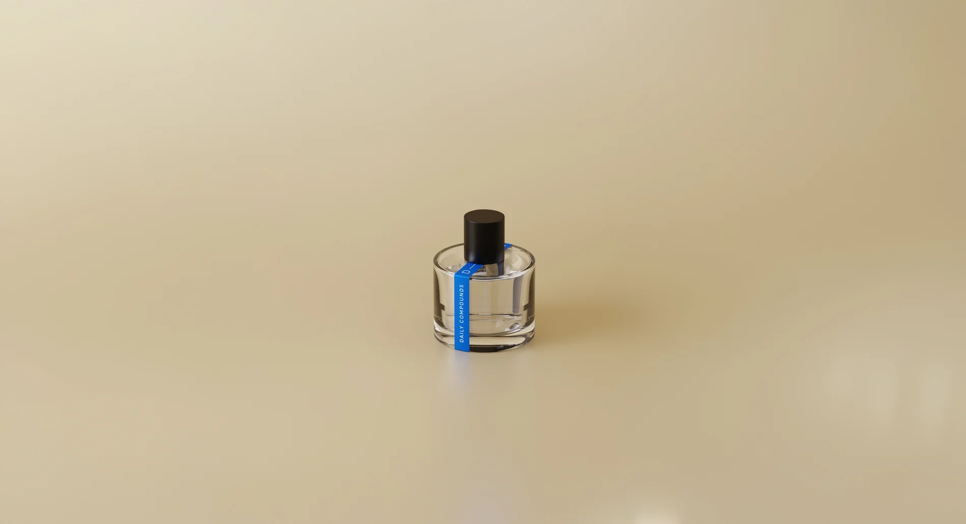
Fragrance is an intimate, everyday ritual, yet the category often relies on fantasy over facts. Daily Compounds set out to approach scent differently, with science, transparency and intention at its core.
We built the brand around this tension between the scientific and the sensory. From positioning and voice to the visual identity, we developed a system that feels precise without becoming clinical, and expressive without becoming excessive, a custom wordmark, the D–C unit inspired by chemical bonds, and a simple yet emotive palette.
A key move was giving each scent its own visual character, abstract patterns rooted in the landscape, mood and olfactory profile of each fragrance, turning scent into a visual language that could evolve across the range, and carry from bottle to box to feed.
A custom wordmark that reads with the precision of a compound name, and the D–C unit drawn from chemical bonds. Clear typography, generous space and a restrained palette let the science lead, without ever tipping into the clinical.
Abstract patterns rooted in the landscape, mood and olfactory profile of each fragrance, turning scent into a visual language that evolves across the range and gives every bottle its own character.
The system carried across the minimal bottle and label architecture, the outer boxes and the discovery sets. Each pattern finds its place on the pack, so the range reads as one family while every scent stays distinct.
We extended the identity into social and art direction, a consistent visual language for how the brand shows up, making science and transparency feel as natural to the category as the scent itself.