
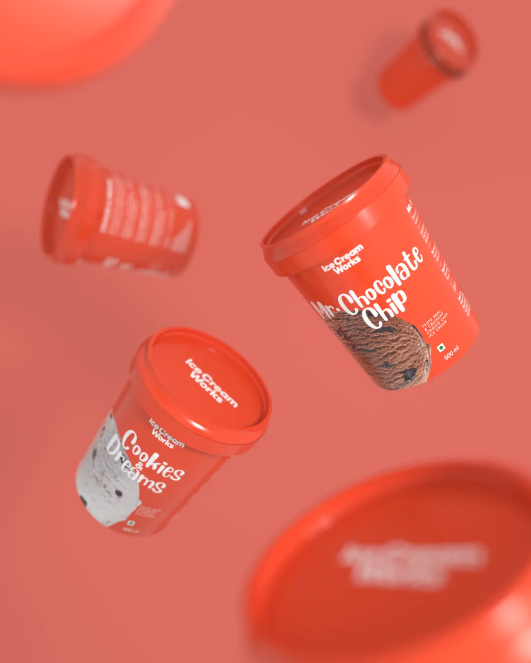
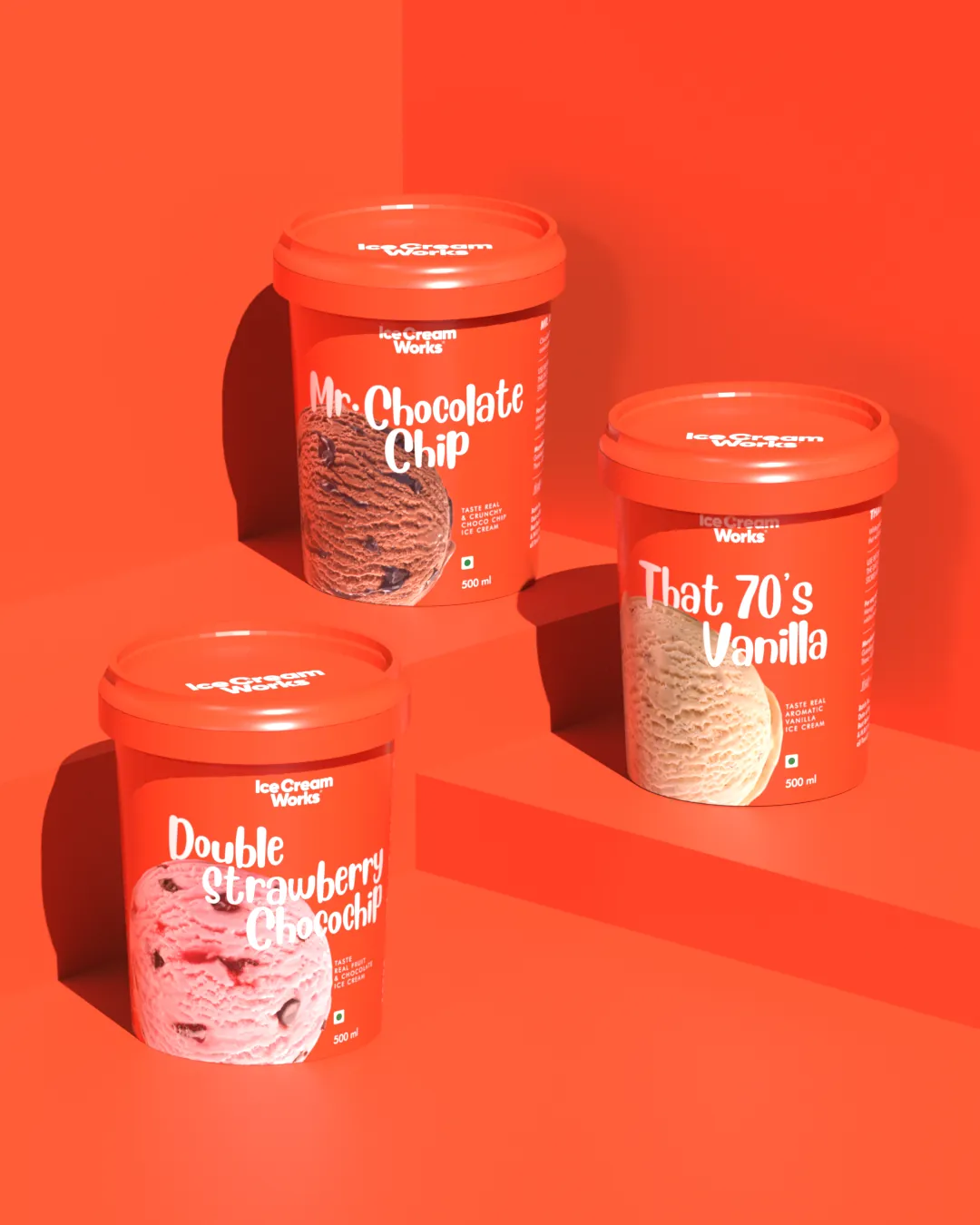
The rebrand covered the logo, visual identity, packaging, communication, retail space design and collaterals.
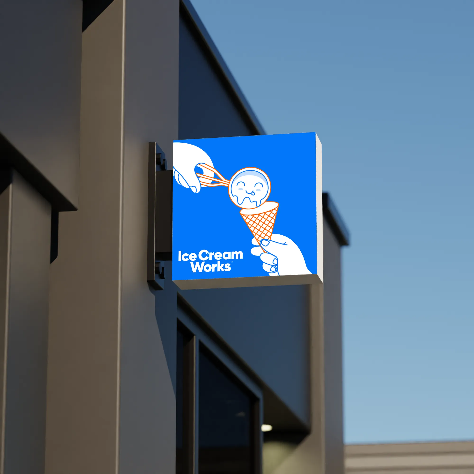
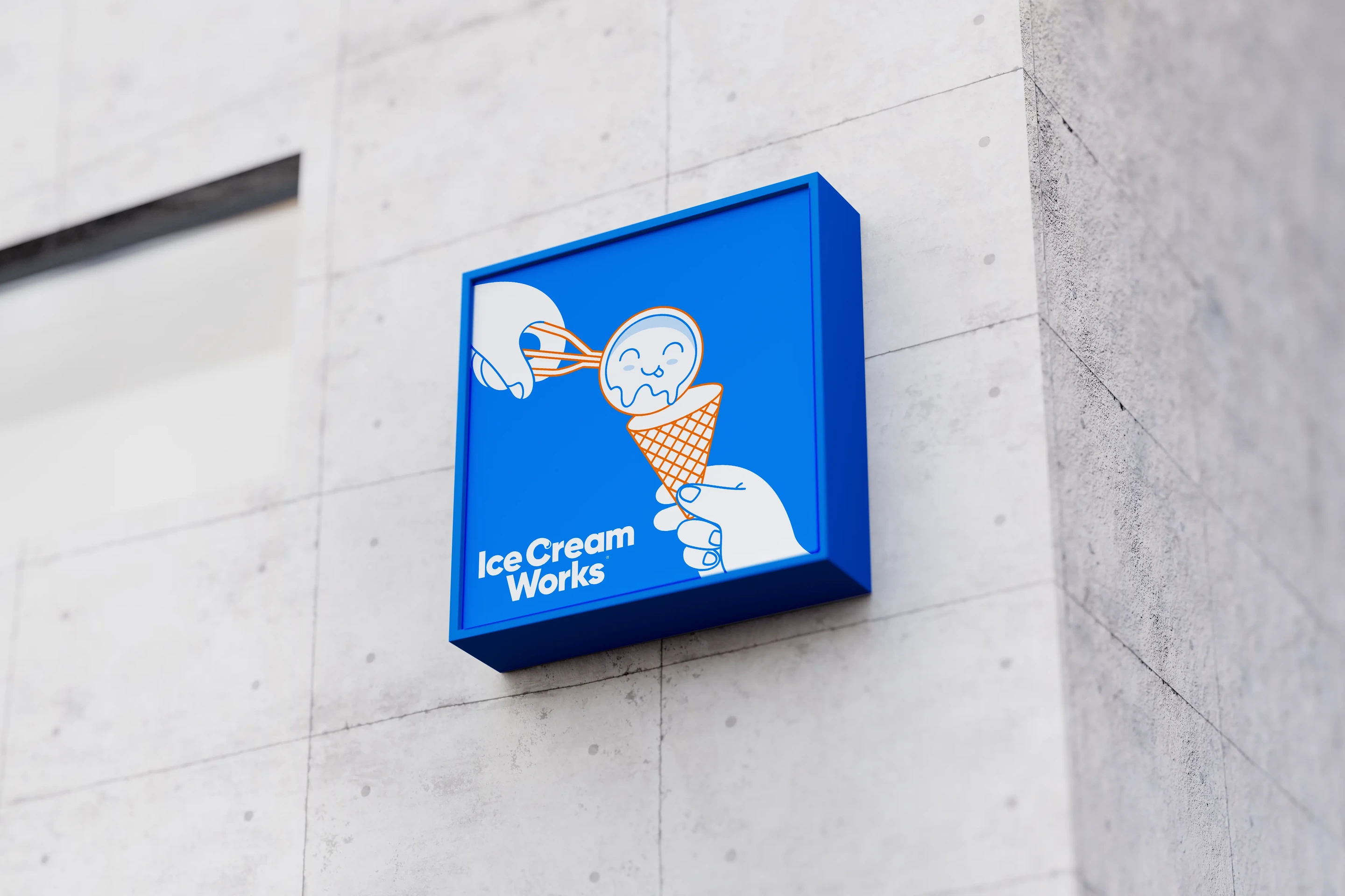
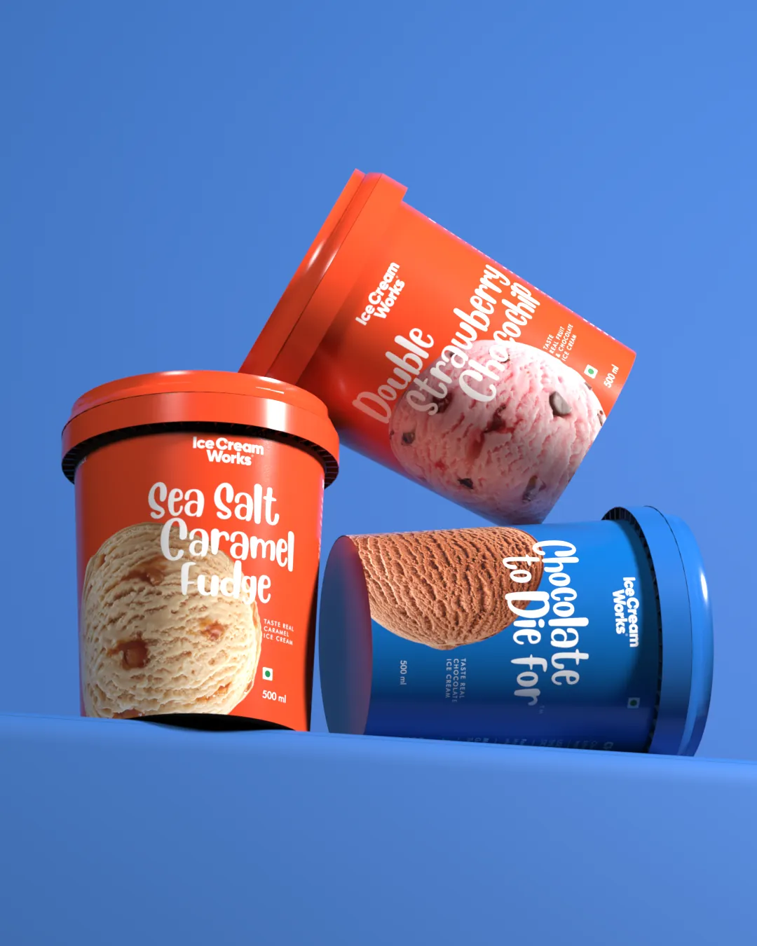
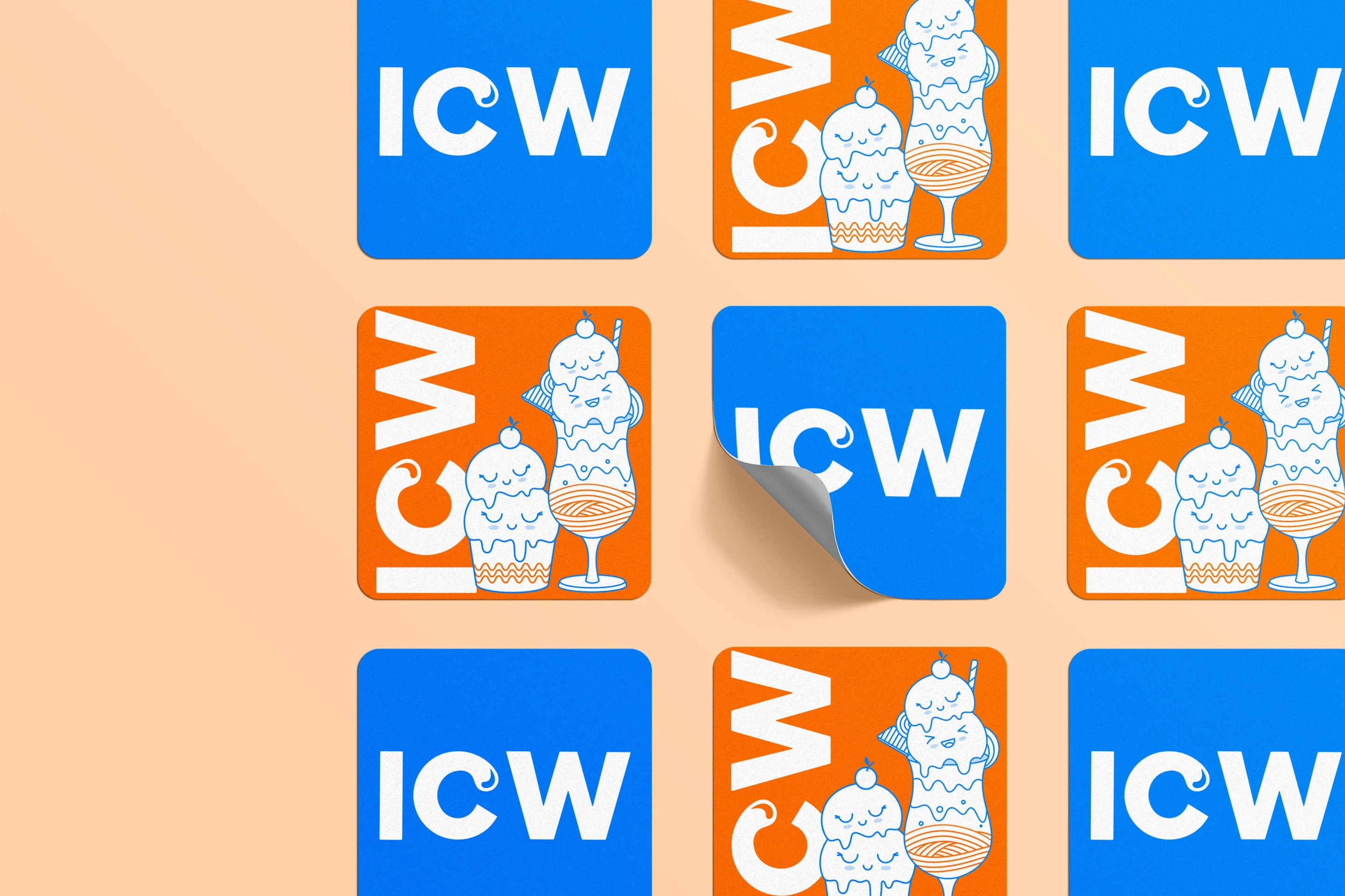
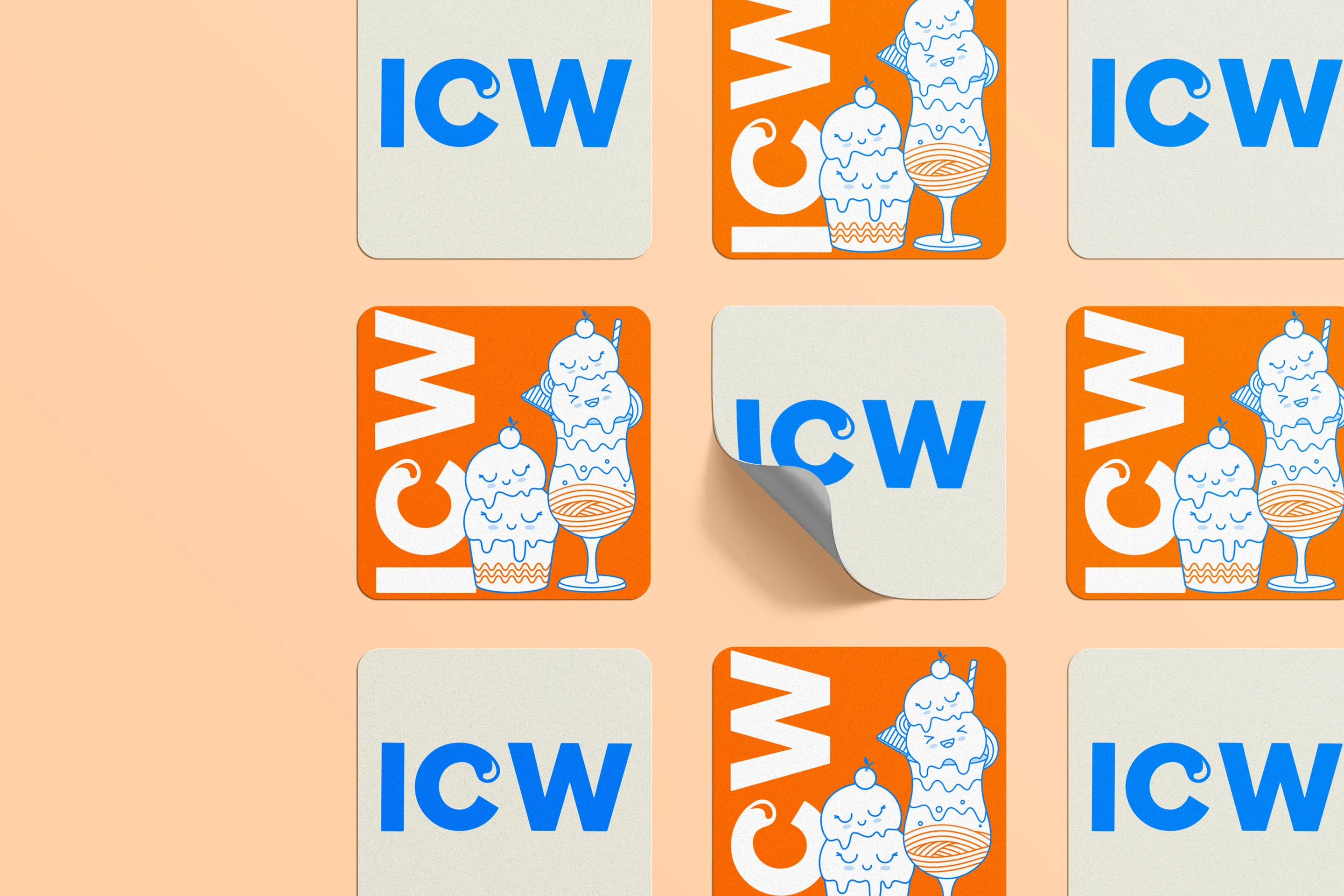
We moved the brand into an electric blue and orange palette, breaking away from the softer, sweeter codes of the category and giving it a sharper, more ownable presence.
The system was built to feel conversational, joyful and bold, with playful typography and flavour-led packaging across the classic, premium and black ranges.
The result was a full identity refresh that made Ice Cream Works feel more current, more memorable and more alive.
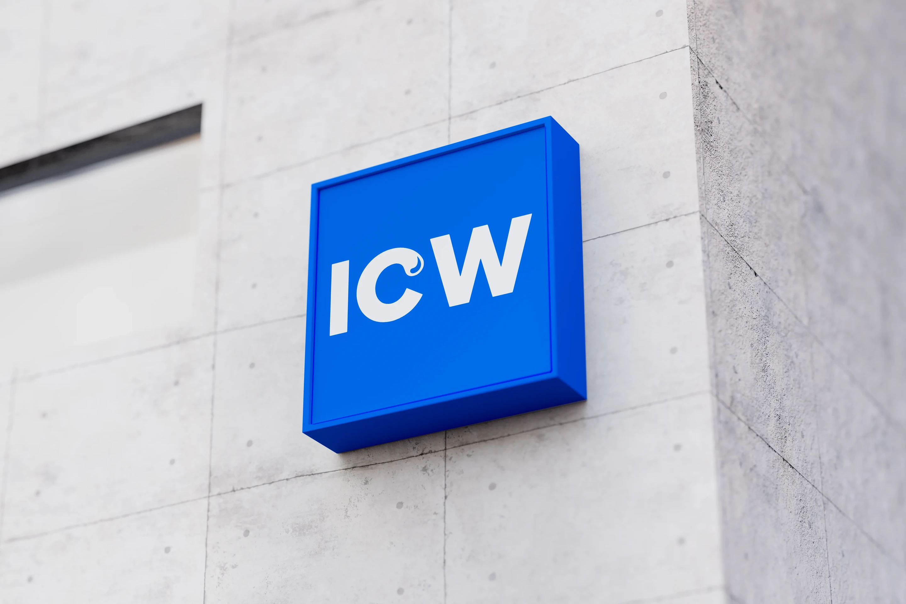
Playful, confident and unmistakably its own. The identity leans into the joy of the category without the softness that usually comes with it, giving Ice Cream Works a presence that reads at a glance from across the street.
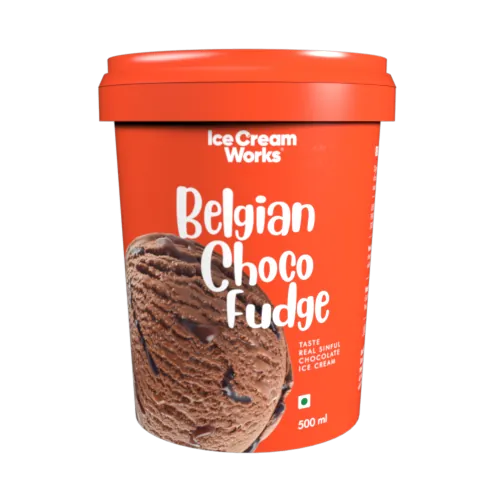
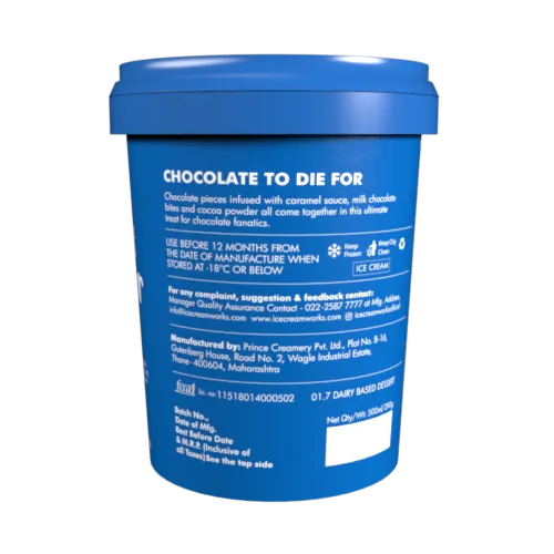
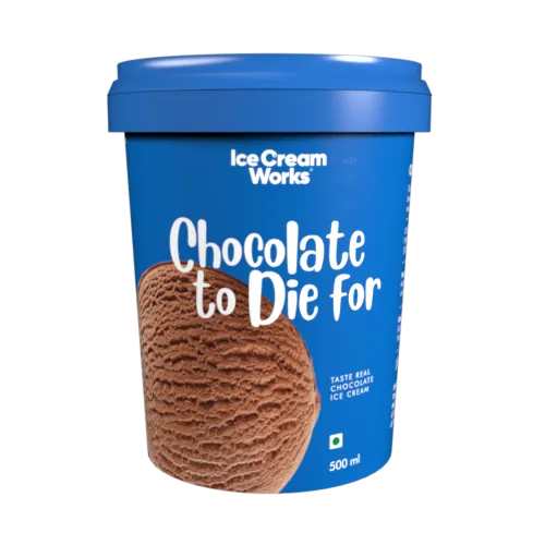
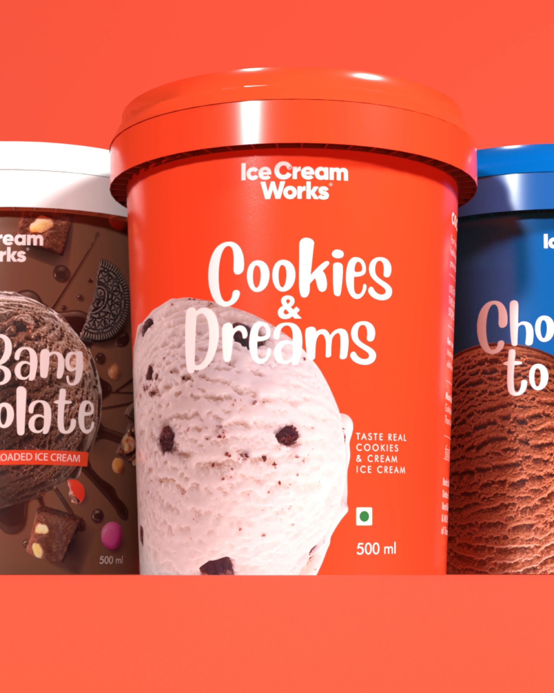
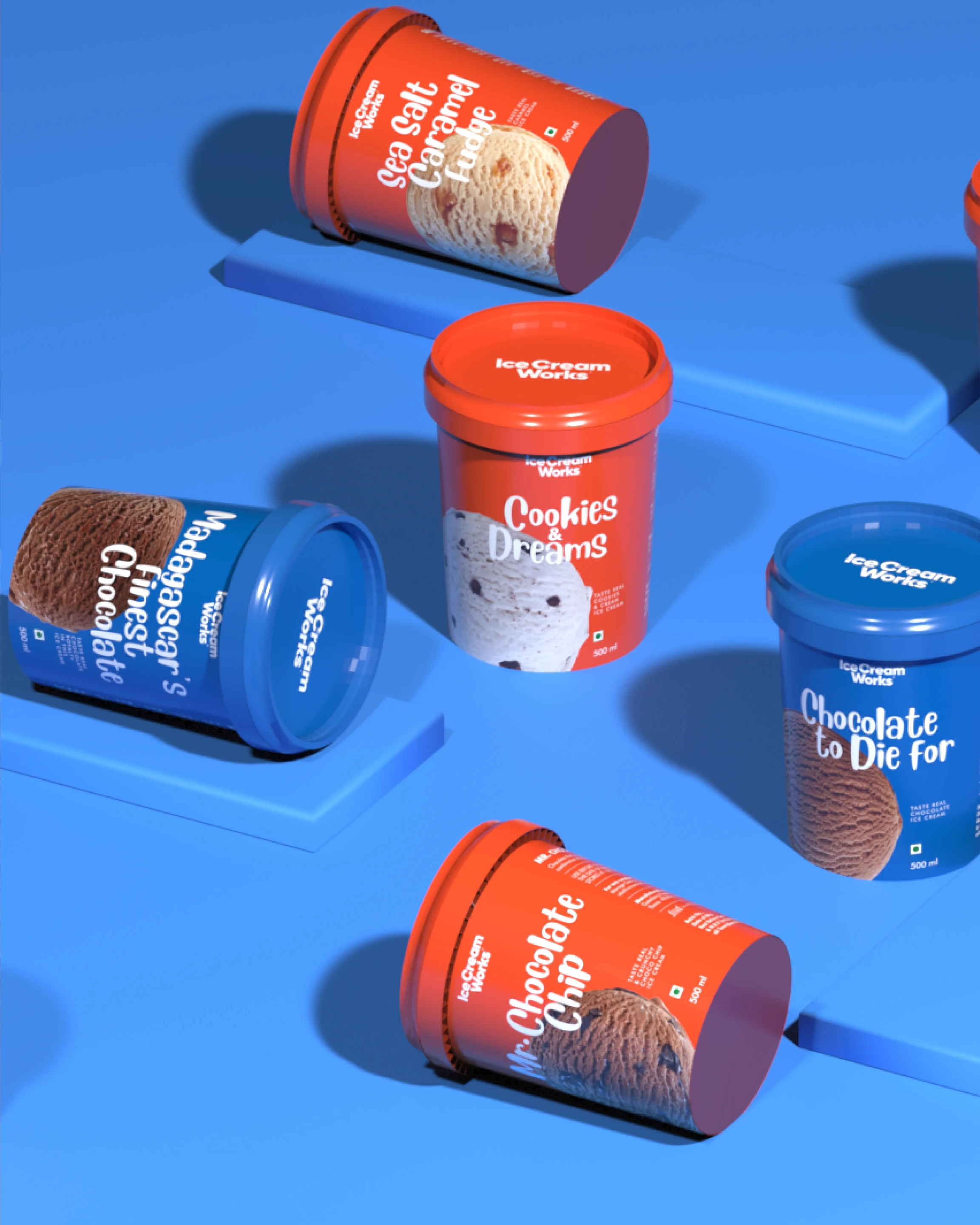
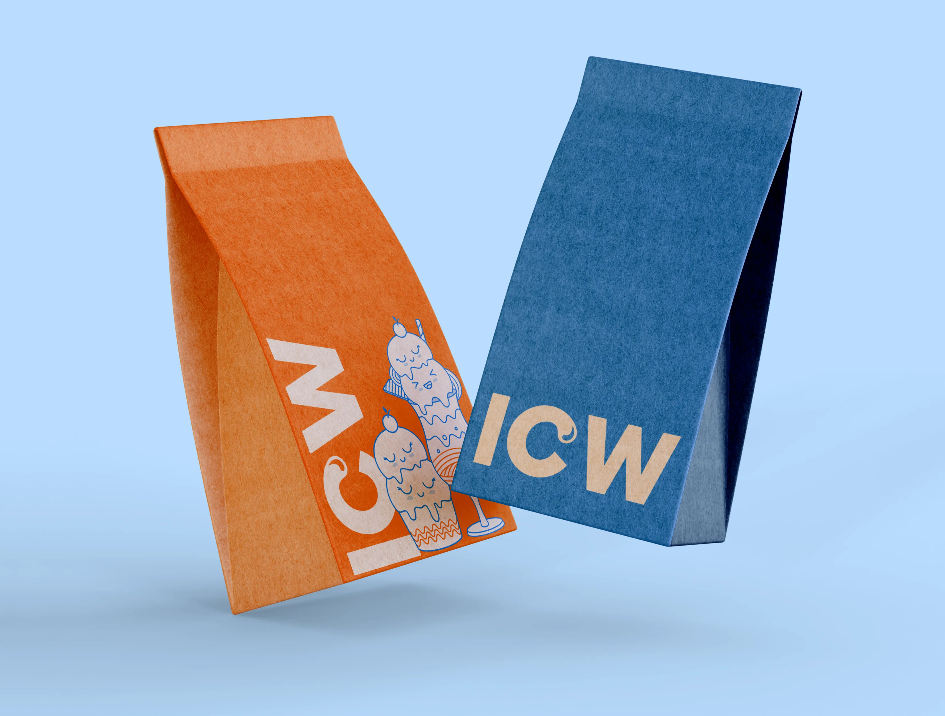
Flavour-led packaging across the classic, premium and black ranges, each built to hold its own in the freezer and reward a second look on the counter. The packaging in full, every angle, every variant.
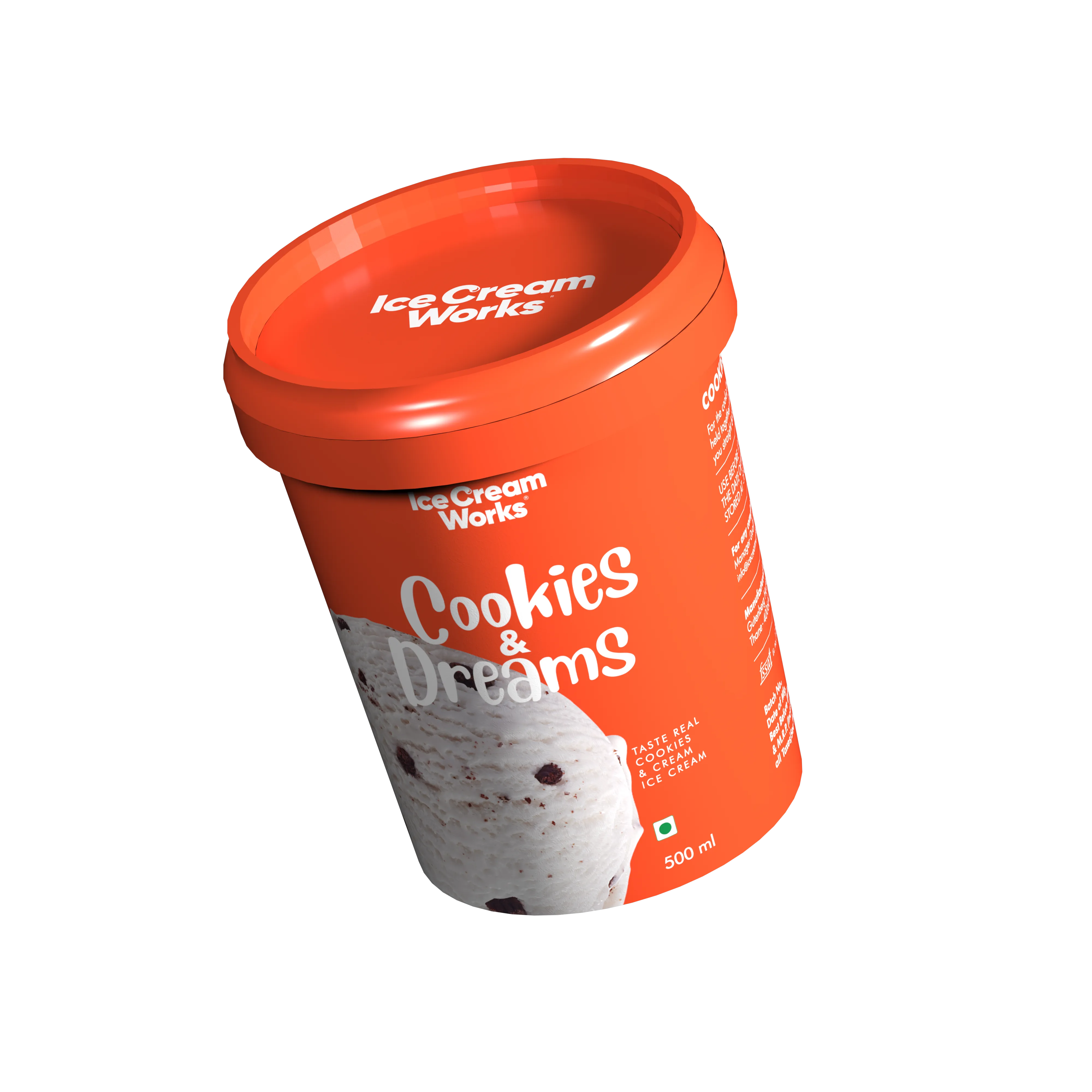
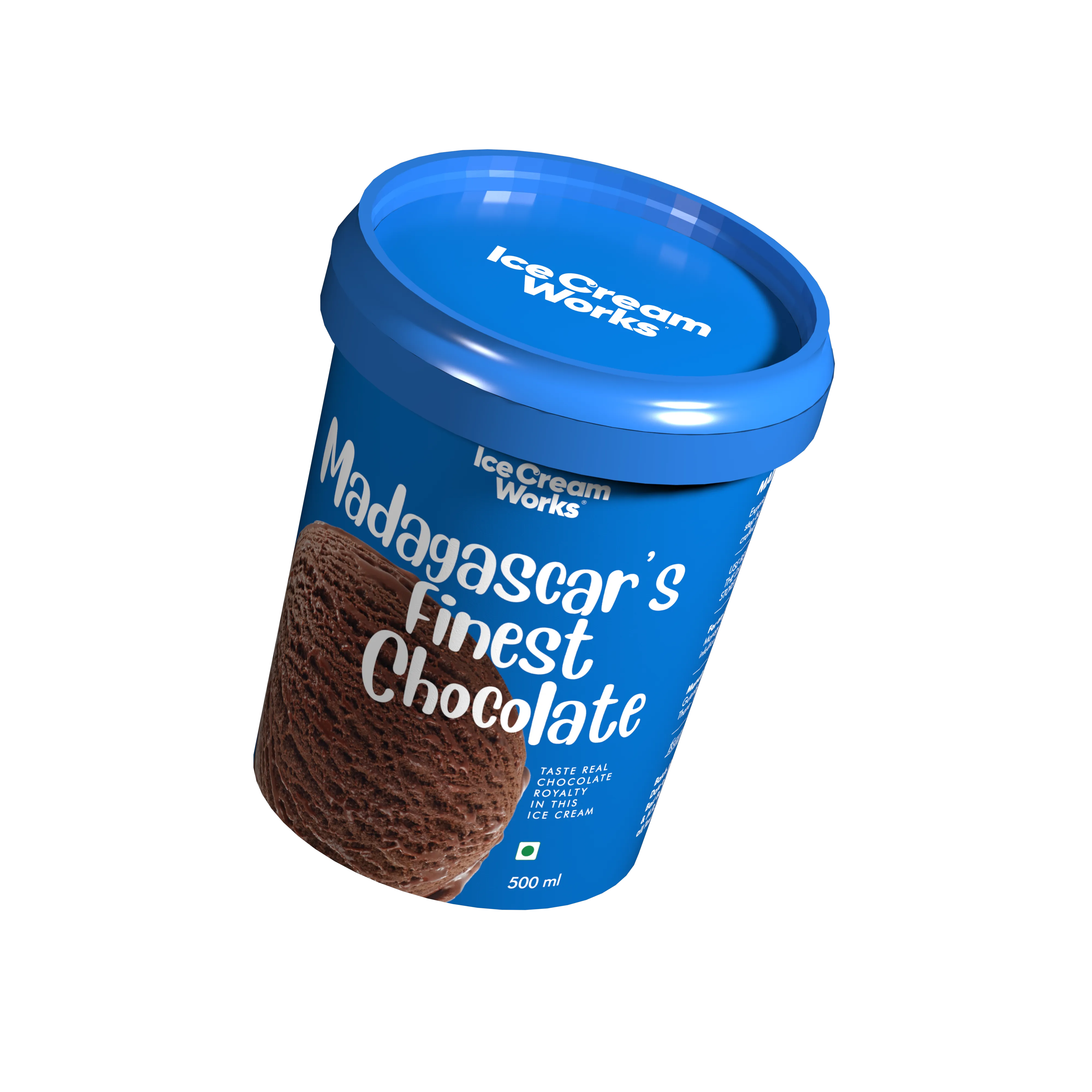
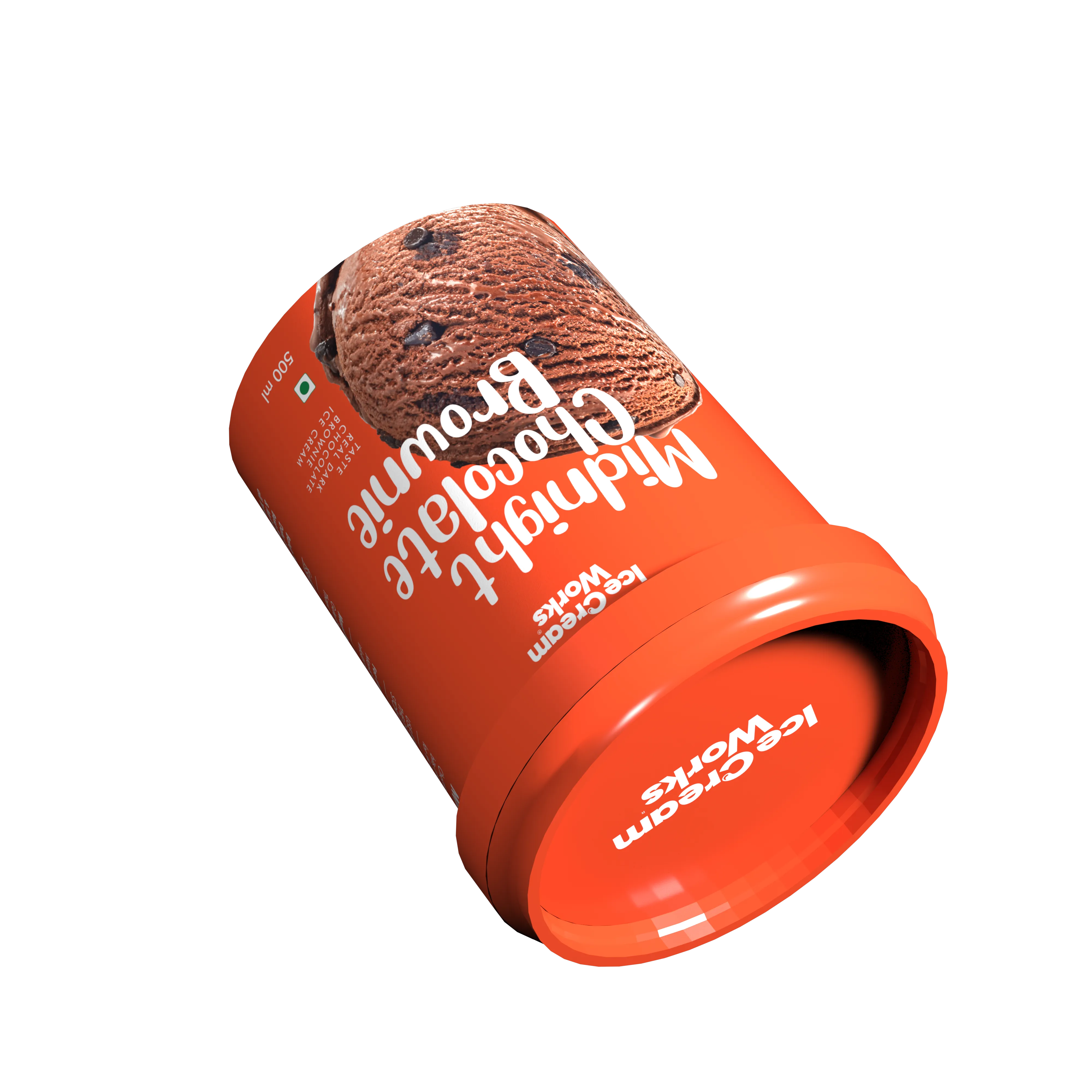
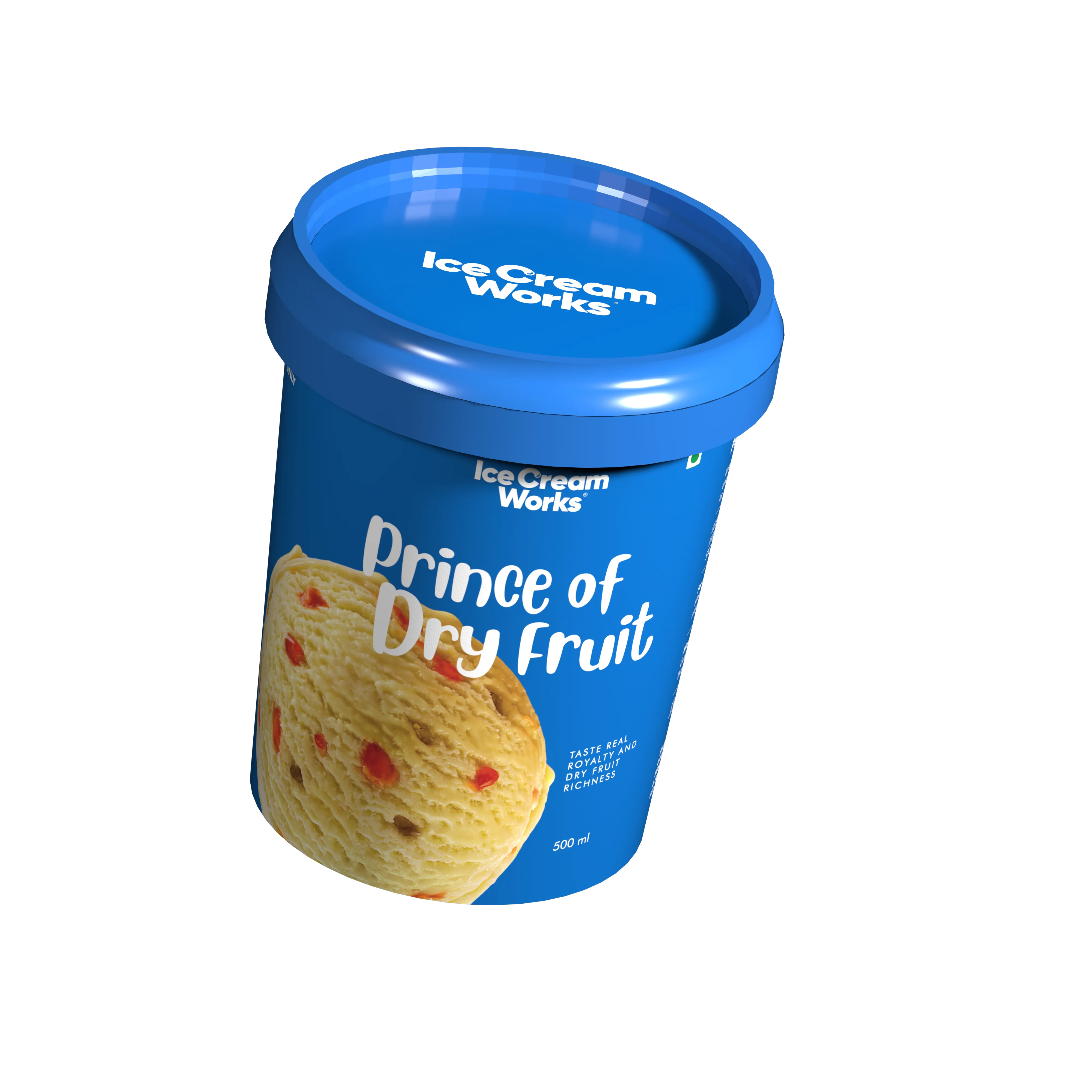
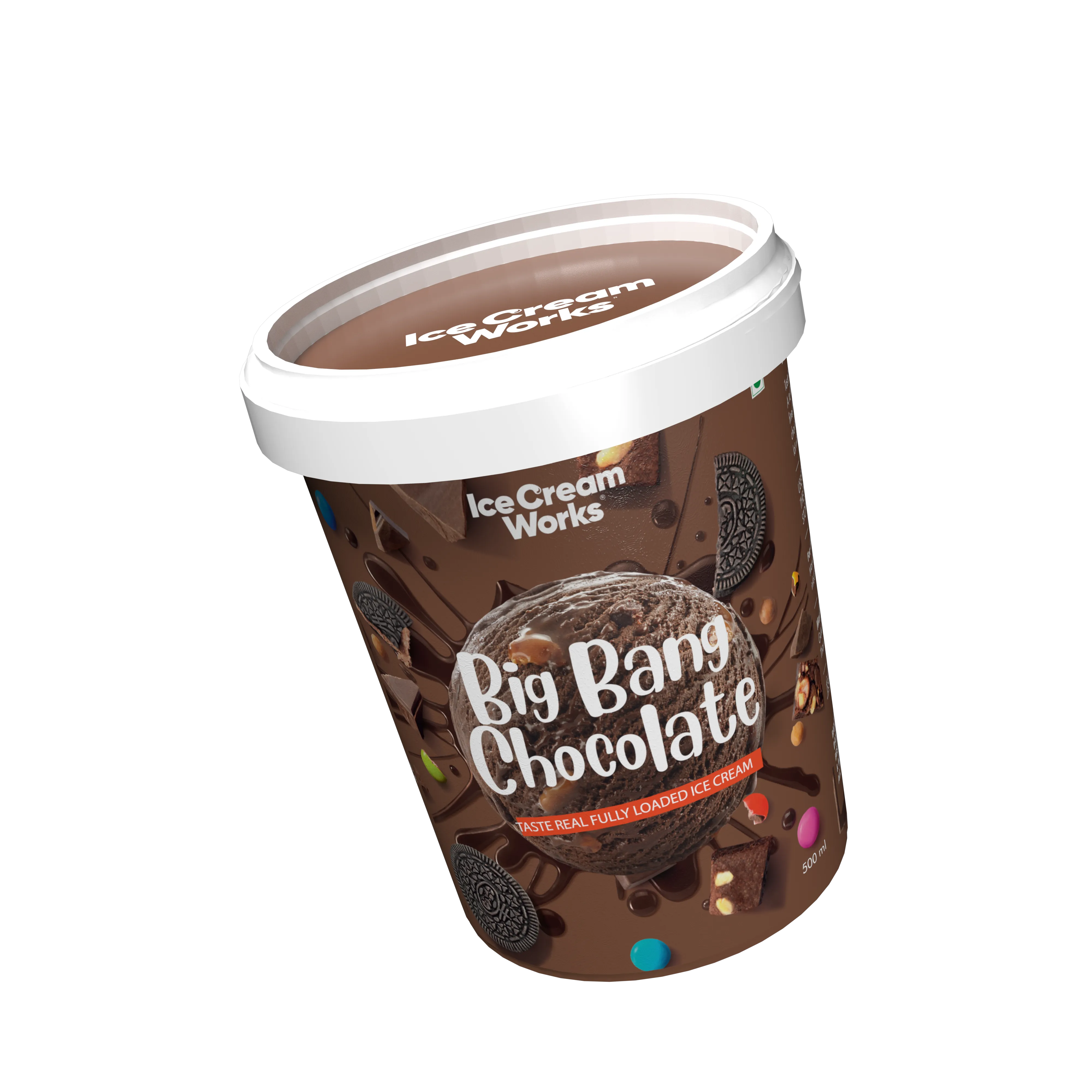
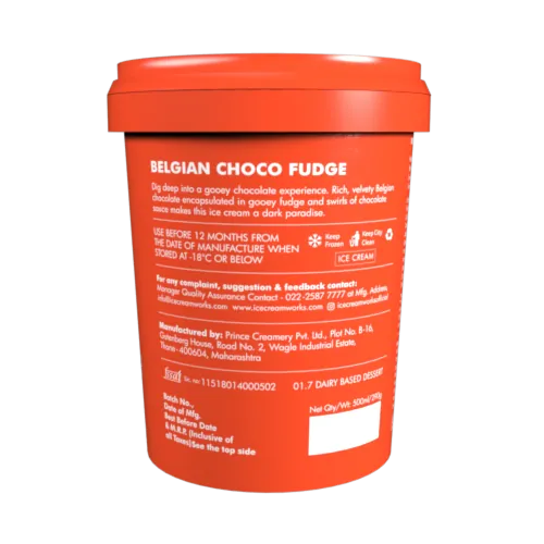
Three ranges, one confident language. The system flexes from everyday joy to premium restraint, so each tier feels distinct on shelf while still reading, instantly, as one brand.
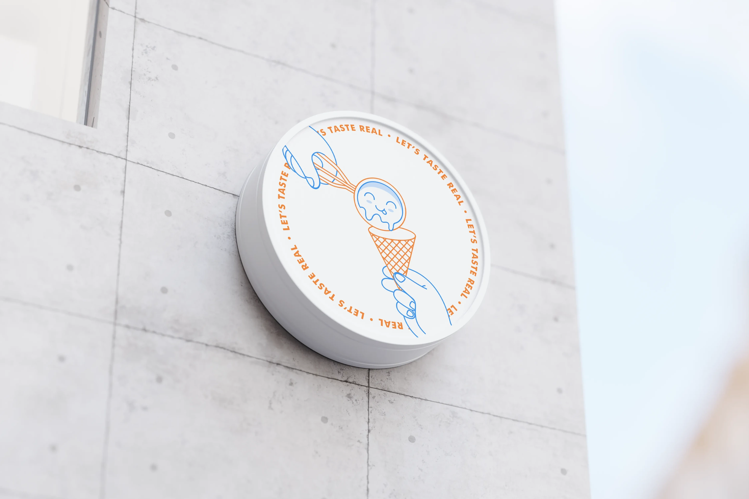
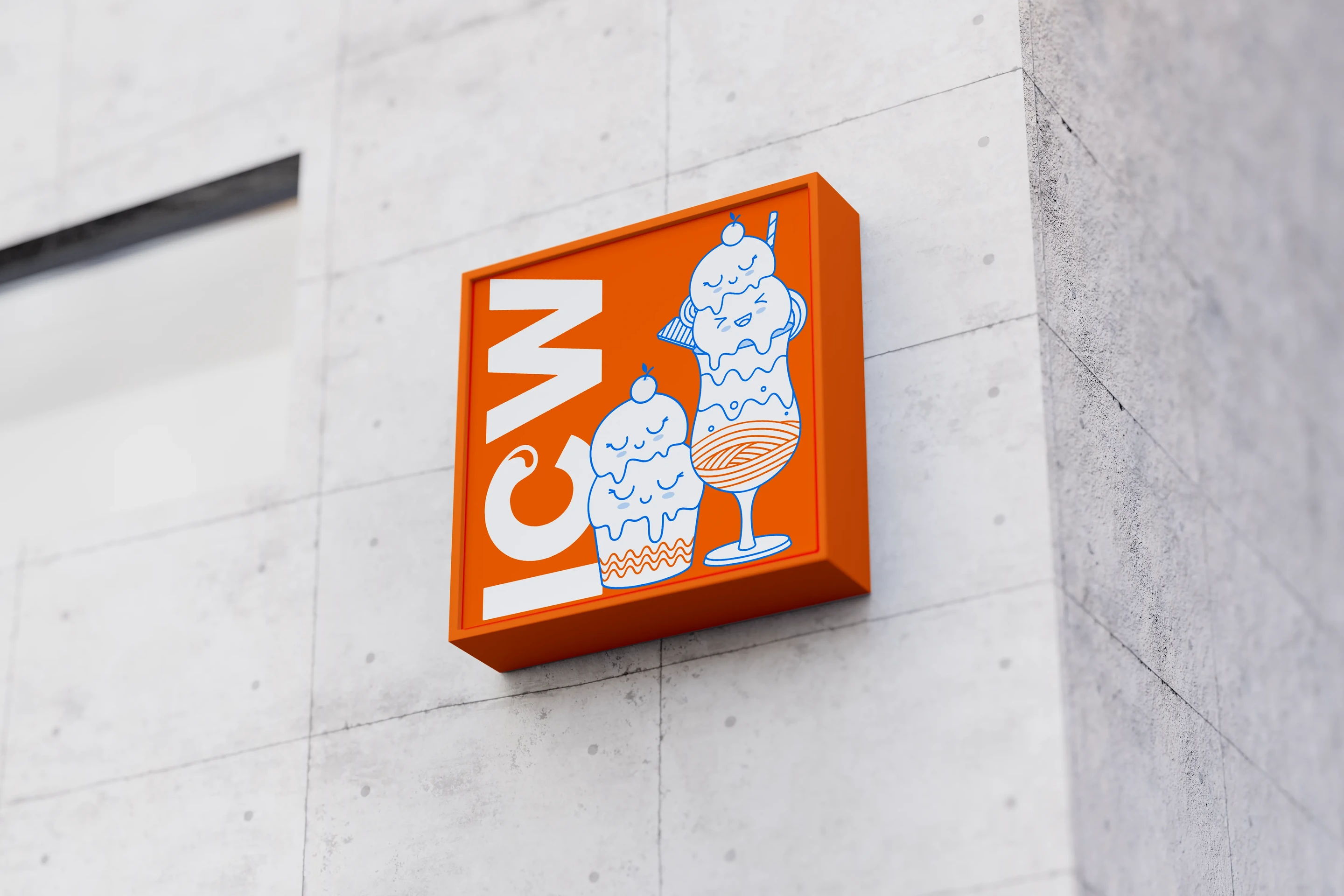
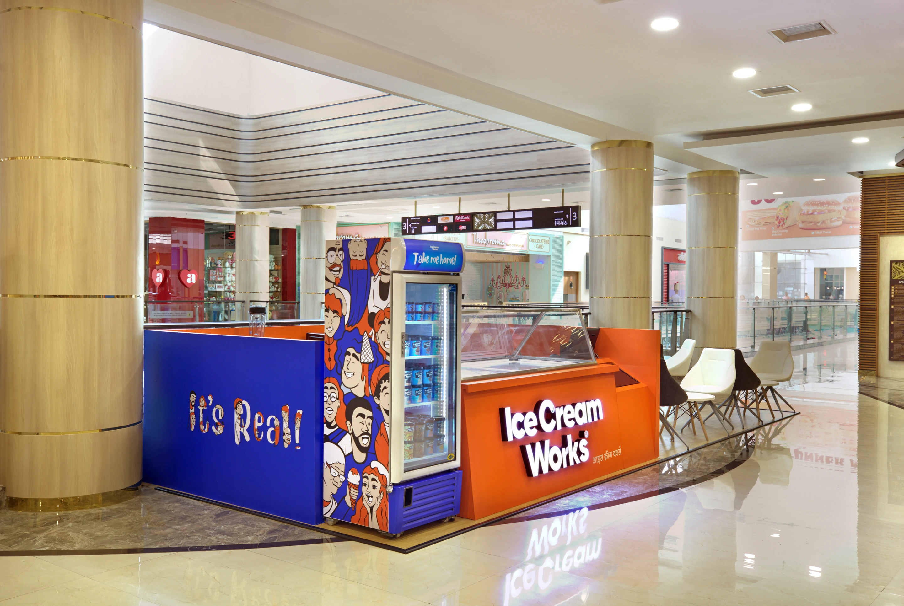
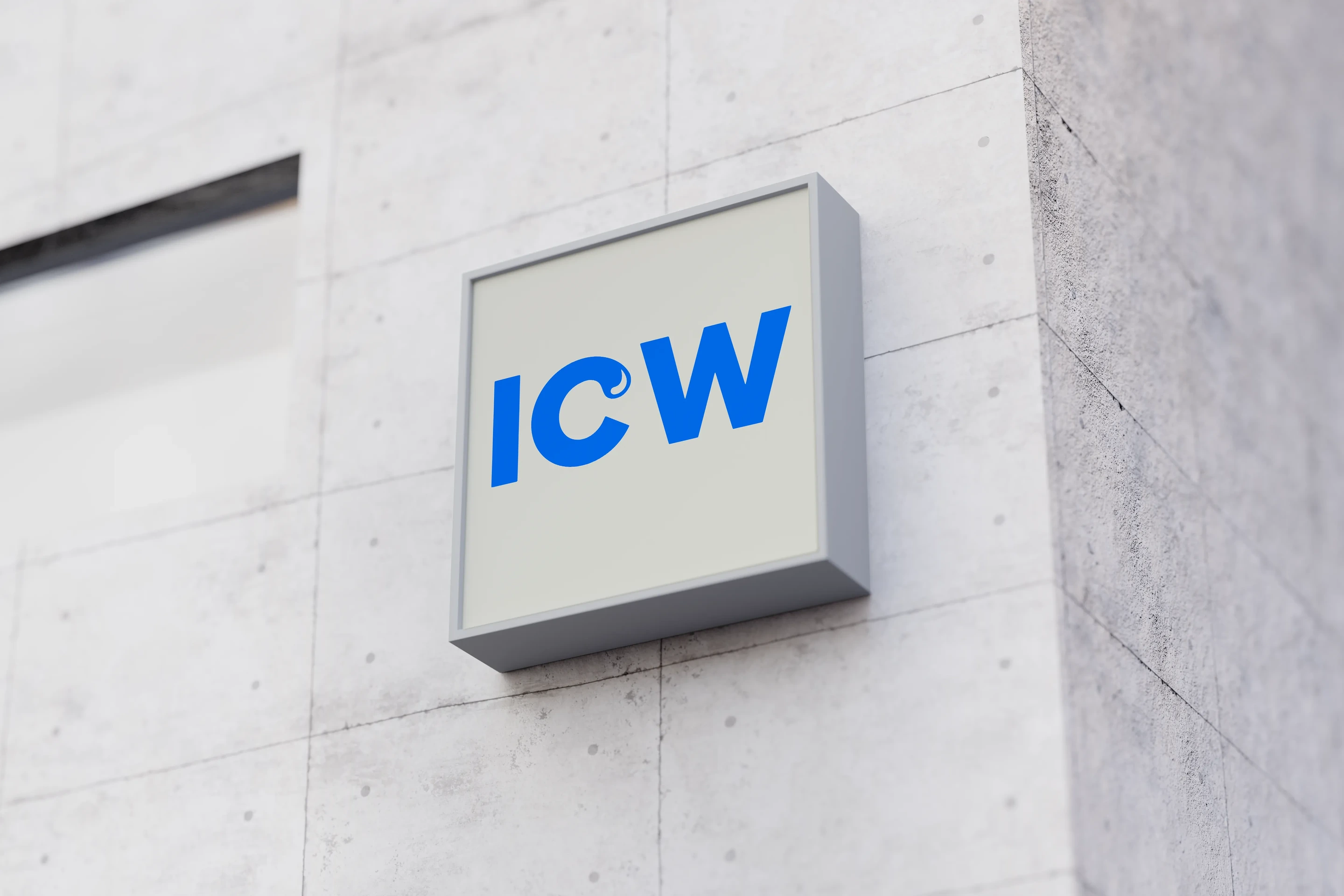
The same energy carried into the physical space. From the 300 sq. ft. and 200 sq. ft. formats to the kiosk designs, facade, signage, poster systems, menu displays and outlet collaterals, every surface was brought into one consistent brand language.
#0044CC
#FF6B1A