
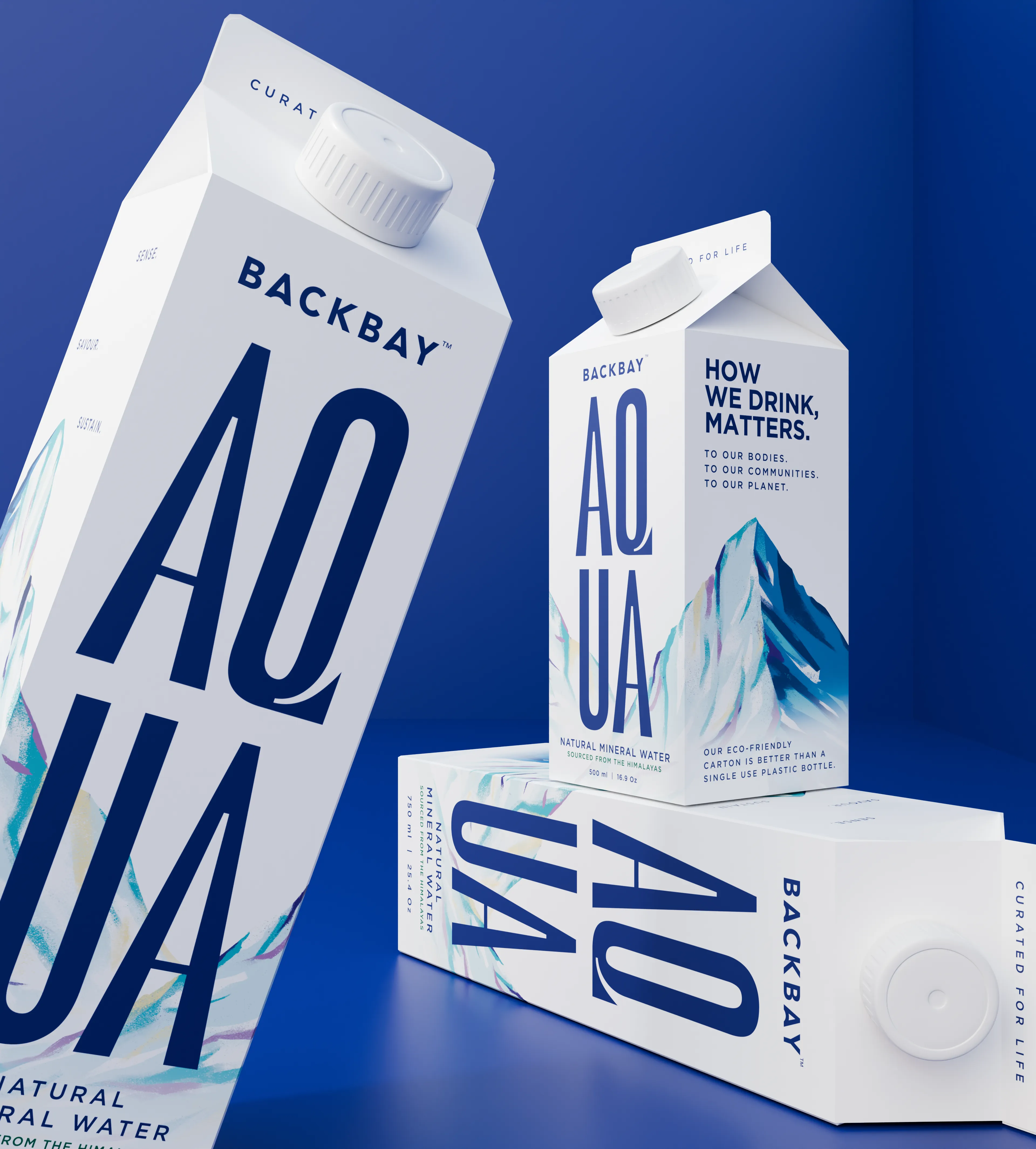
We partnered with founders Bhumi and Samiksha Pednekar to create a new kind of water brand, one that balances mineral-rich hydration with a more conscious approach to packaging.
From strategy and positioning to naming, identity, packaging and storytelling, we built a complete system designed to challenge the conventions of the category.
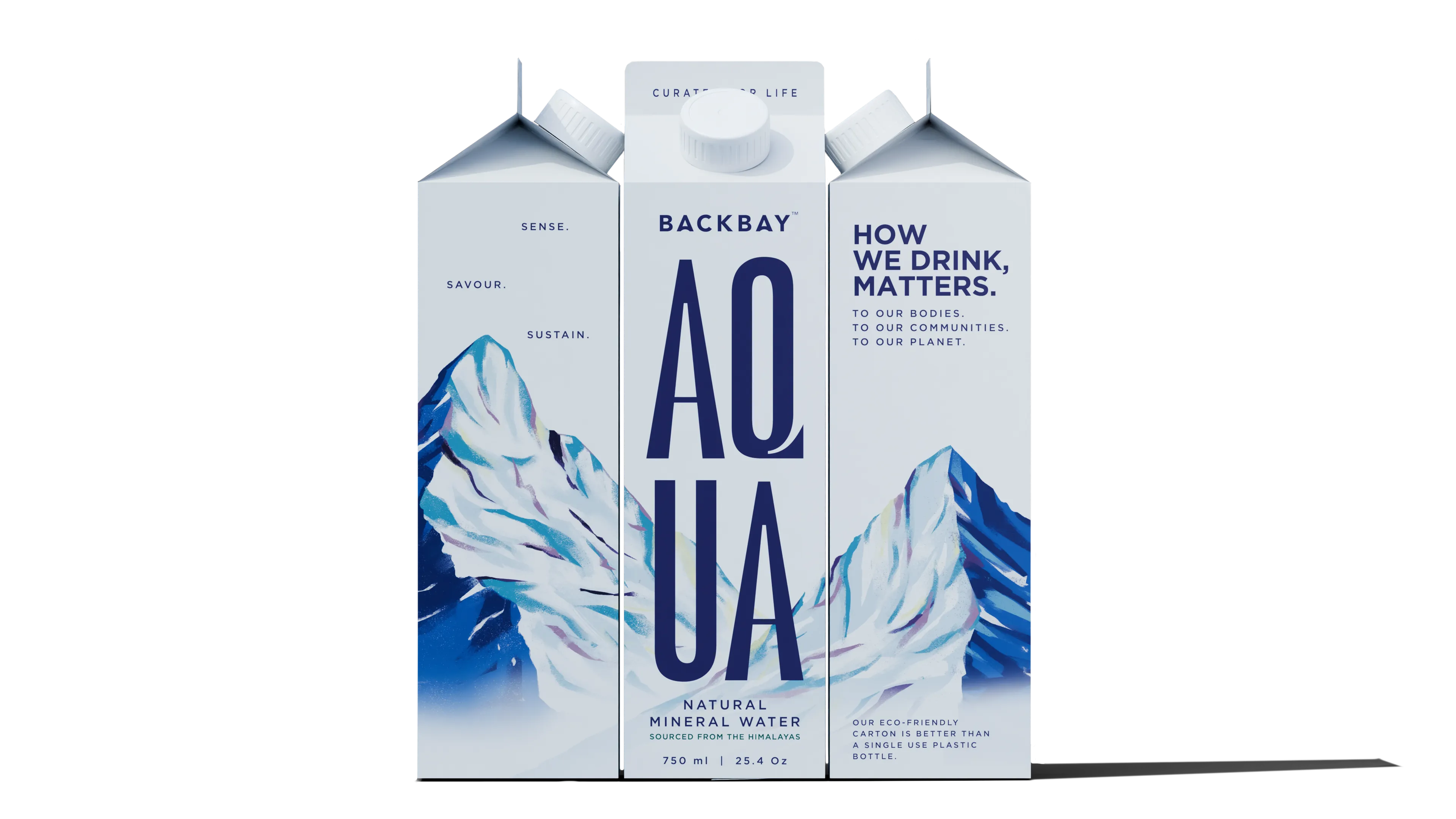
Inspired by the Himalayas, the visual language feels pure, elevated and unmistakably ownable, with oversized typography, illustrated alpine landscapes and a sustainability-first carton format.
The result is a brand that turns everyday hydration into a more considered choice, for both people and the planet.
Sense. The pulse, the sensation, moments that restore your understanding of your true self.
Savour. Refreshment and taste in their purest, most natural form. We package the source of life.
Sustain. Beyond a buzzword, a way of being. Every action keeps the planet at the forefront.
#001A70
#FFFBF4
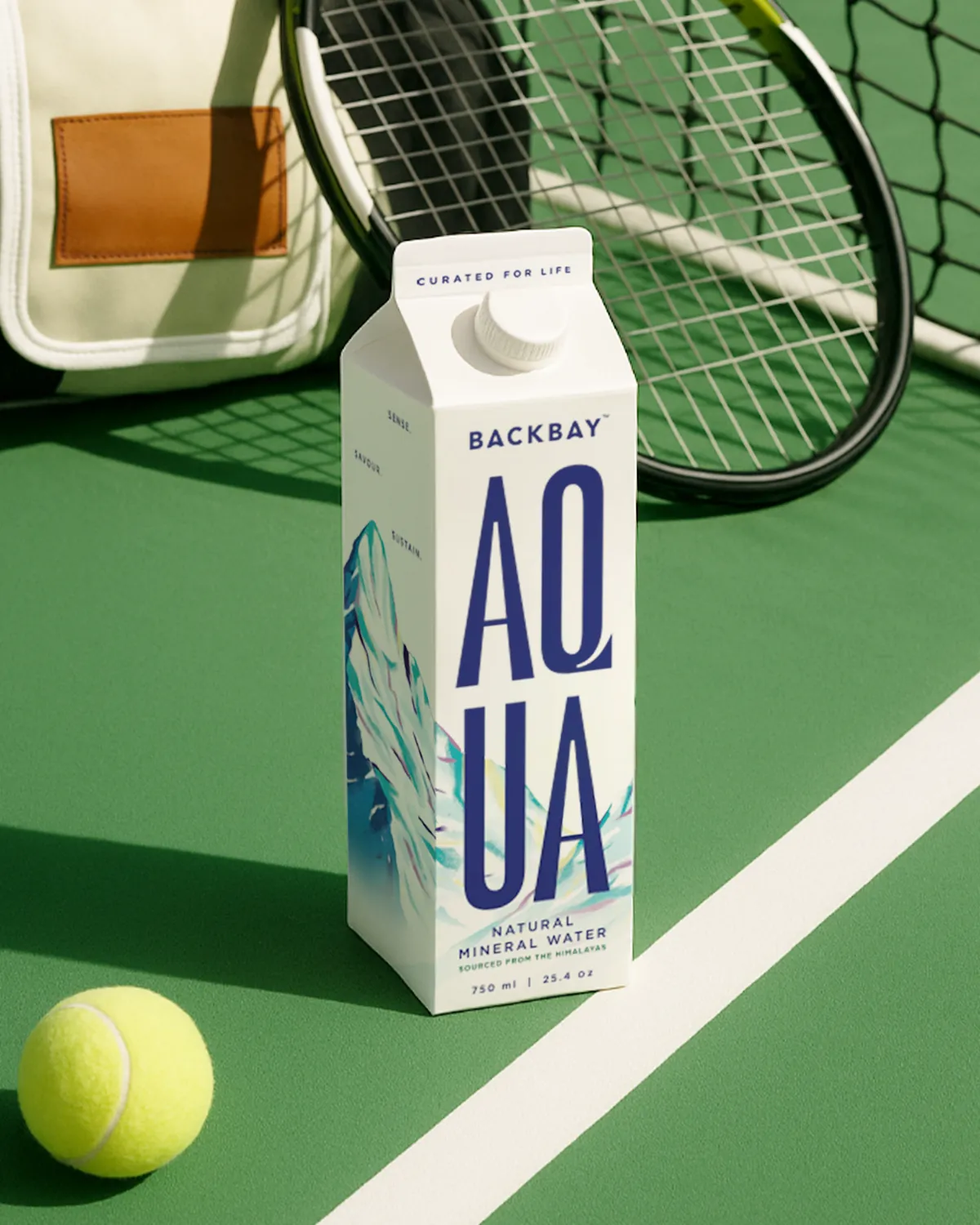
The first product, the proof of the system. Sourced at altitude and held in a paperboard carton, every angle considered. Oversized typography and an illustrated alpine landscape turn a functional object into a storytelling tool.
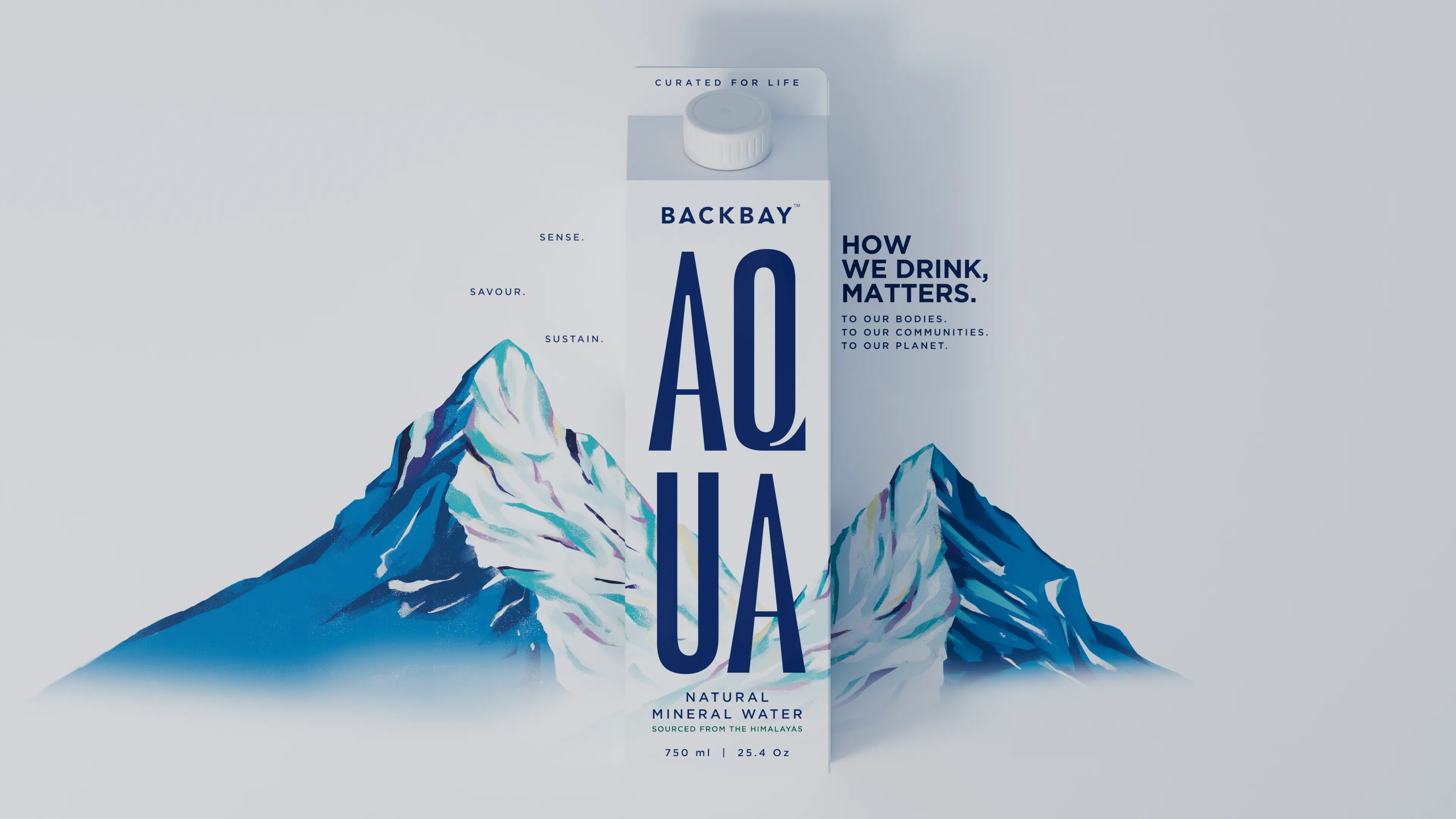
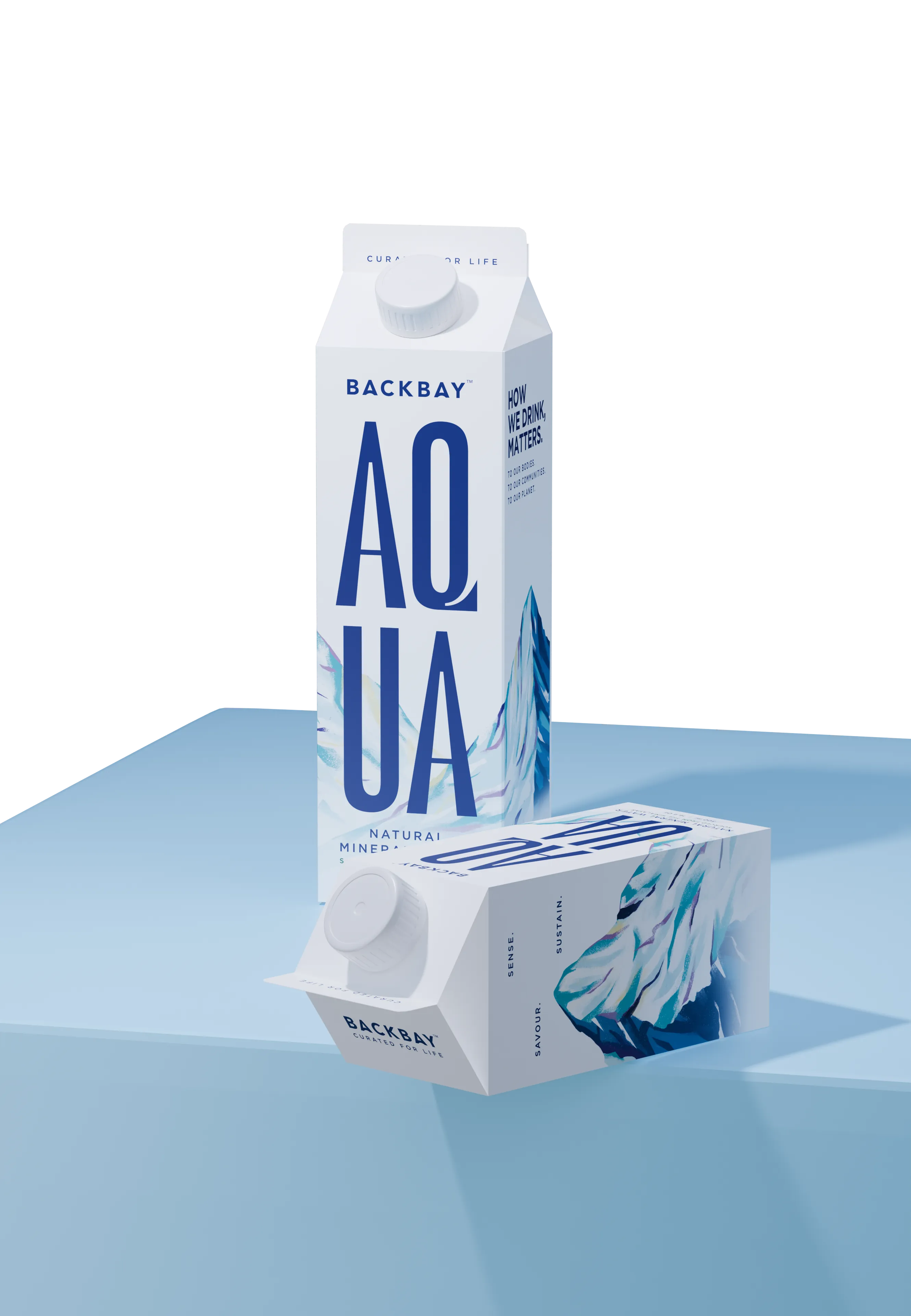
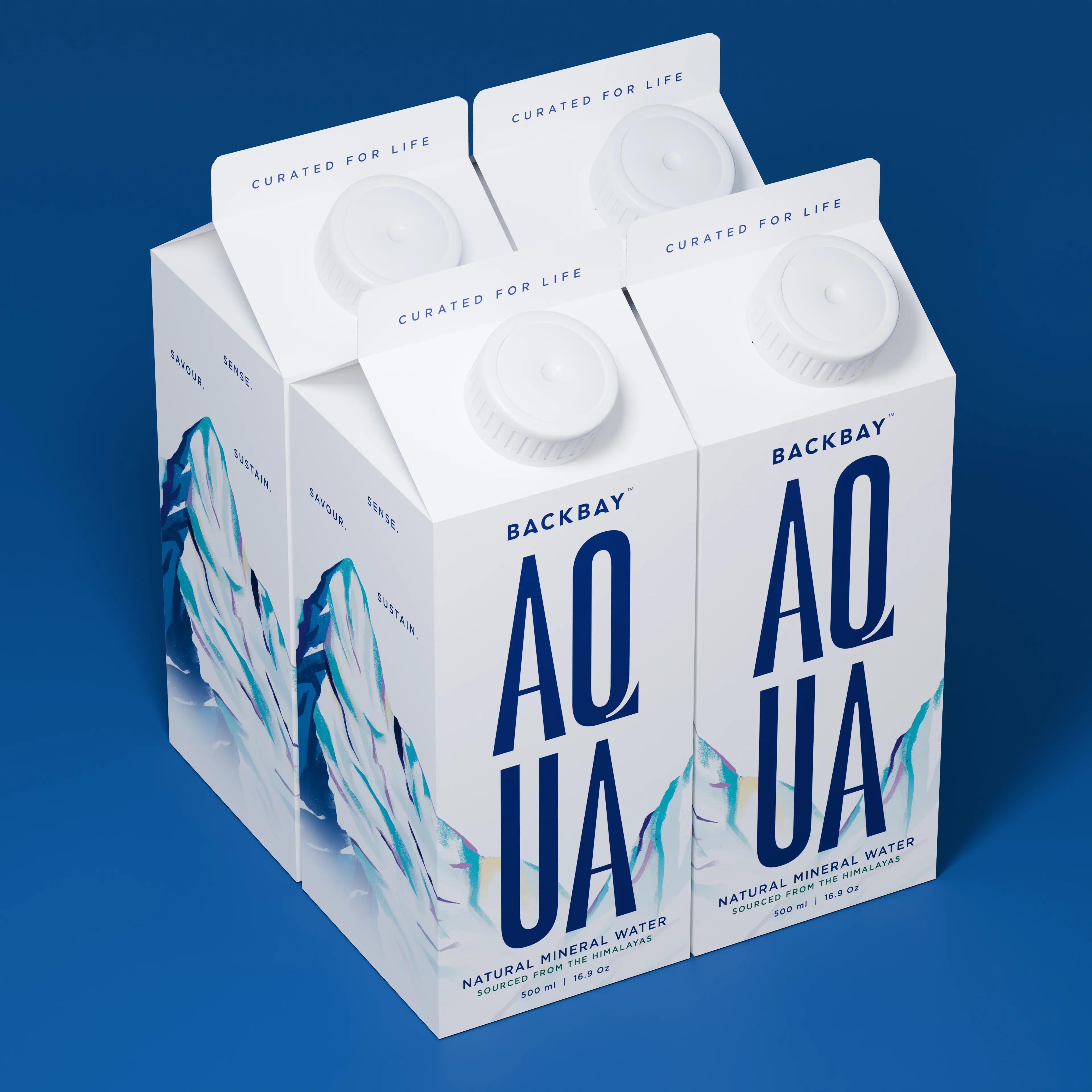
The brand in motion. Backbay Aqua, the first product, told as a film that carries the alpine feel from the source to the shelf, and the wordmark into movement.
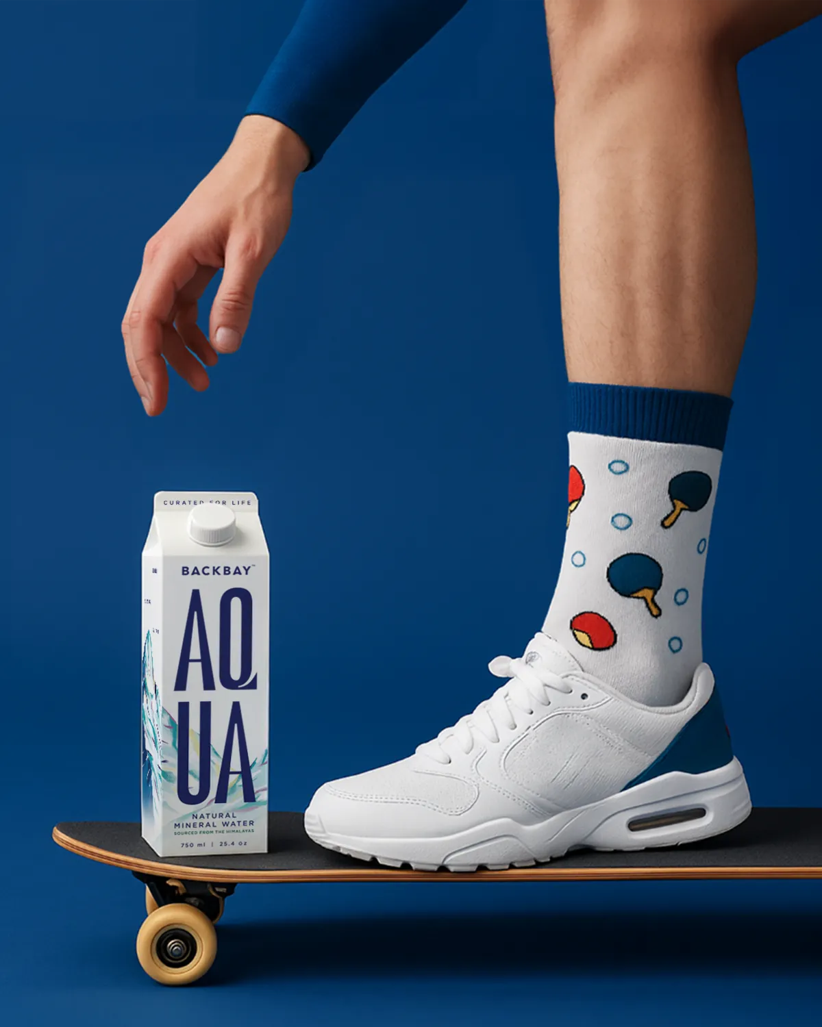
The pack in the world. On the shelf, in the hand, in the rooms a buyer chooses to keep it, the system holds its composure everywhere it lands.
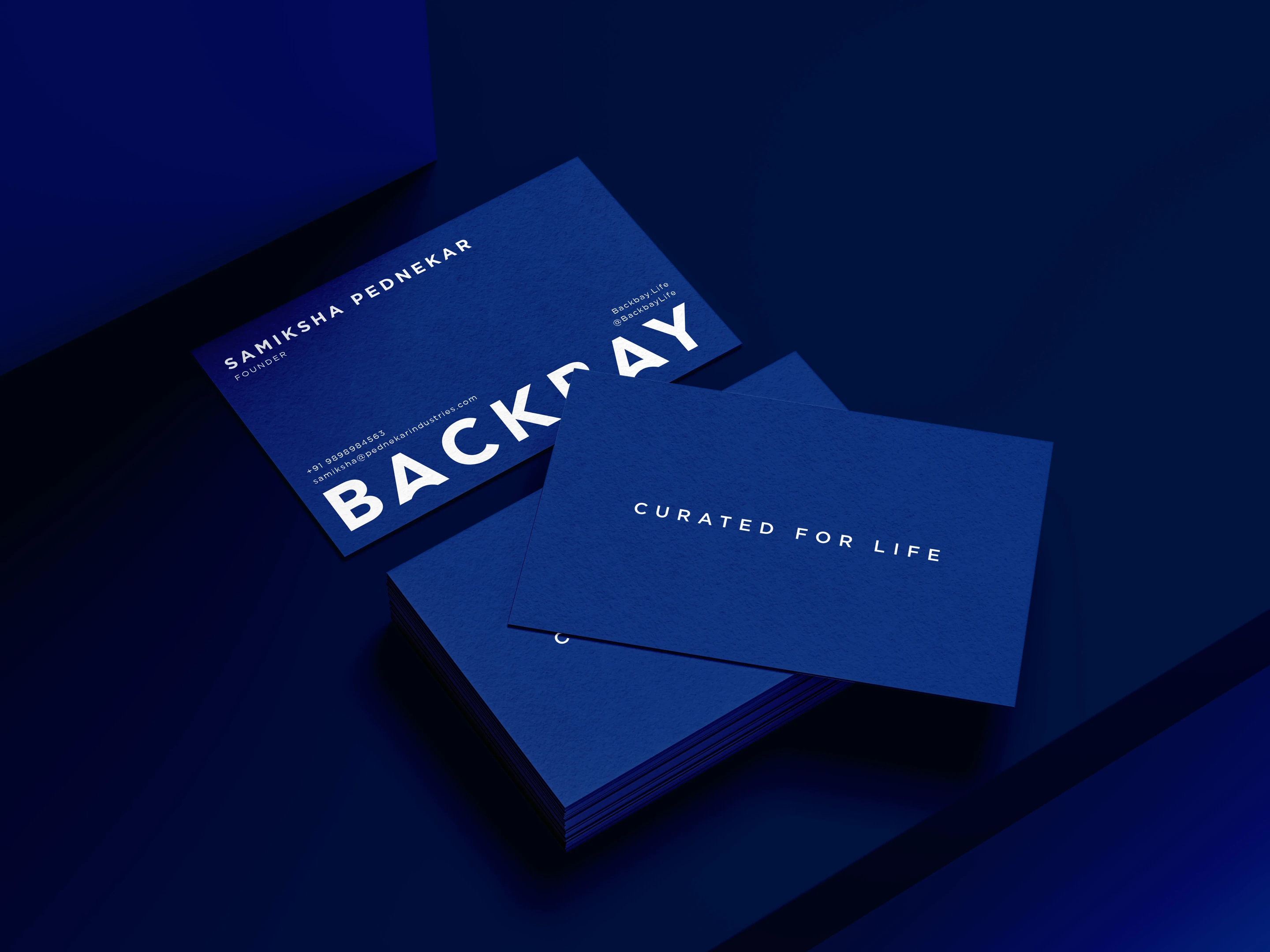
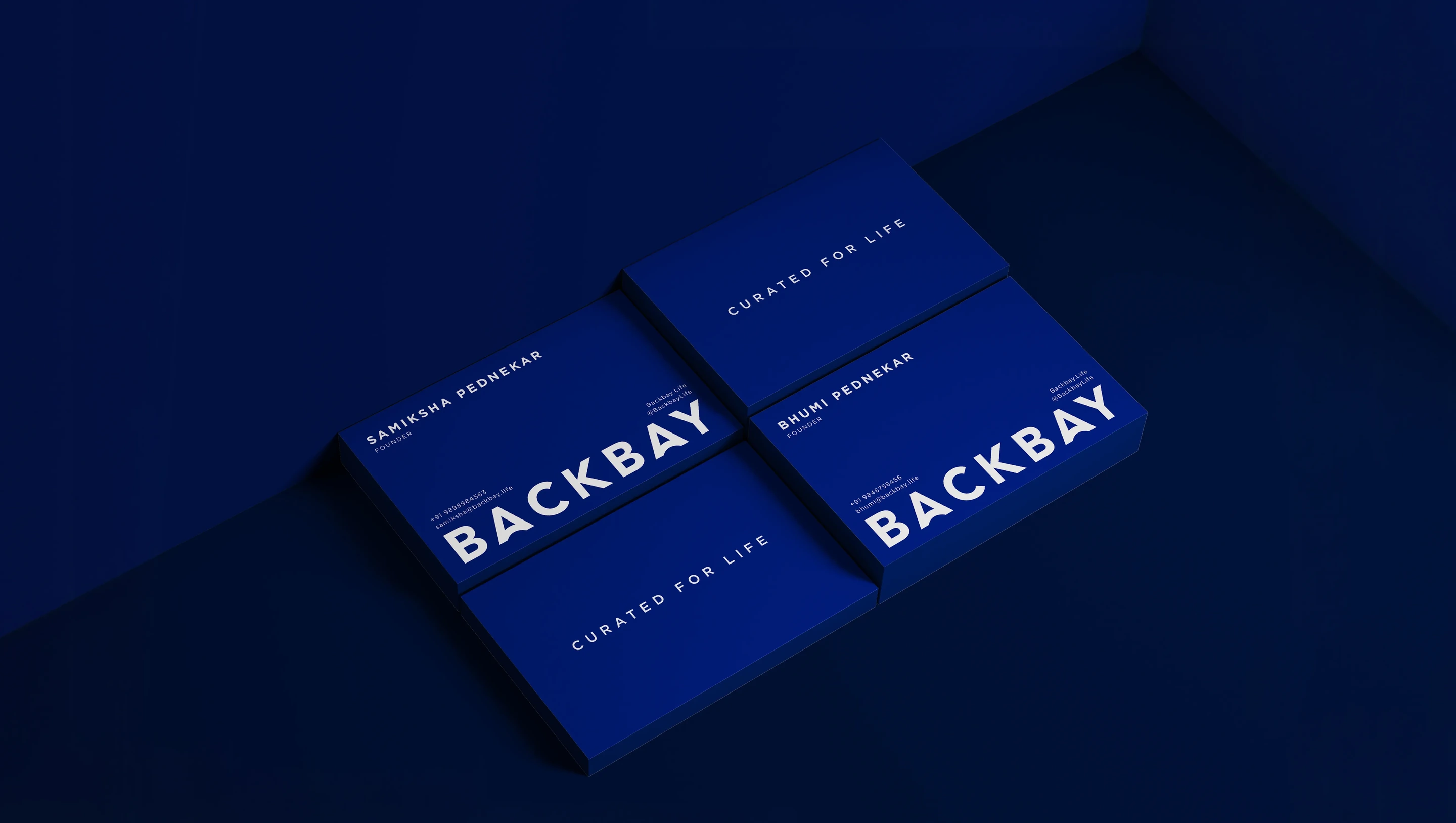
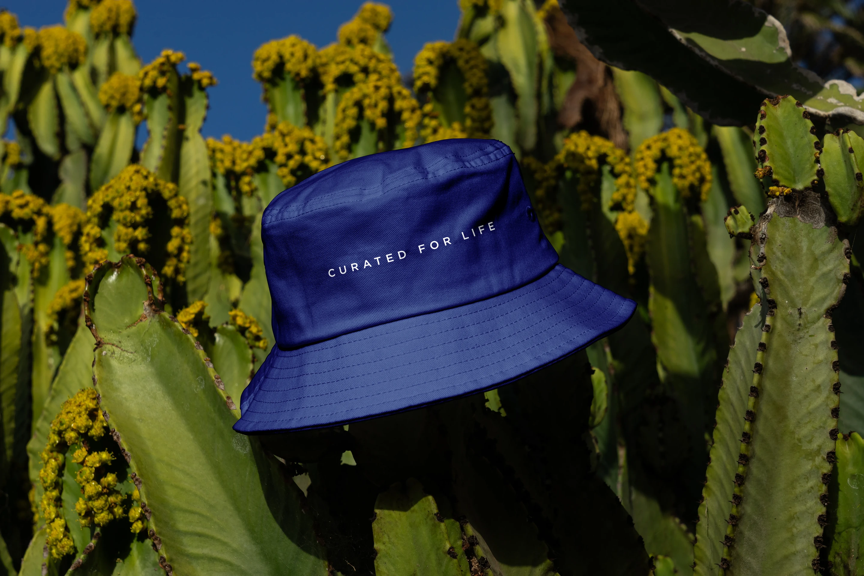
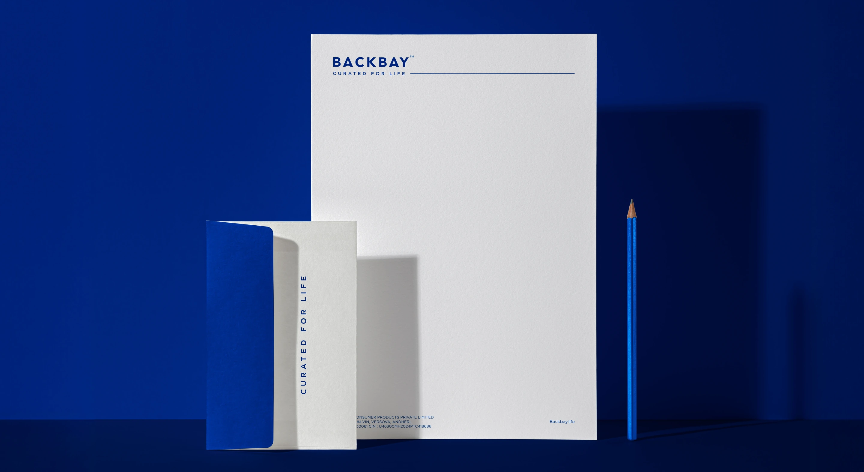
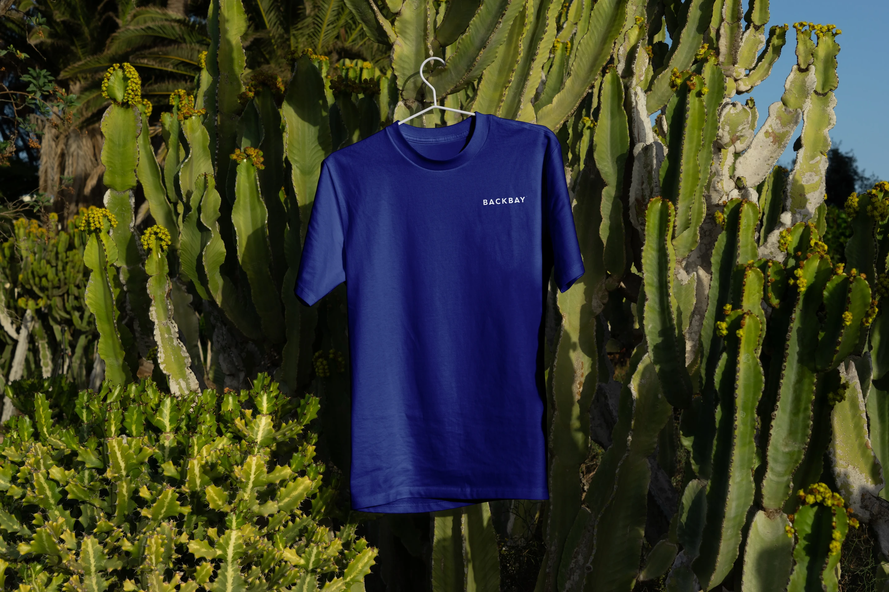
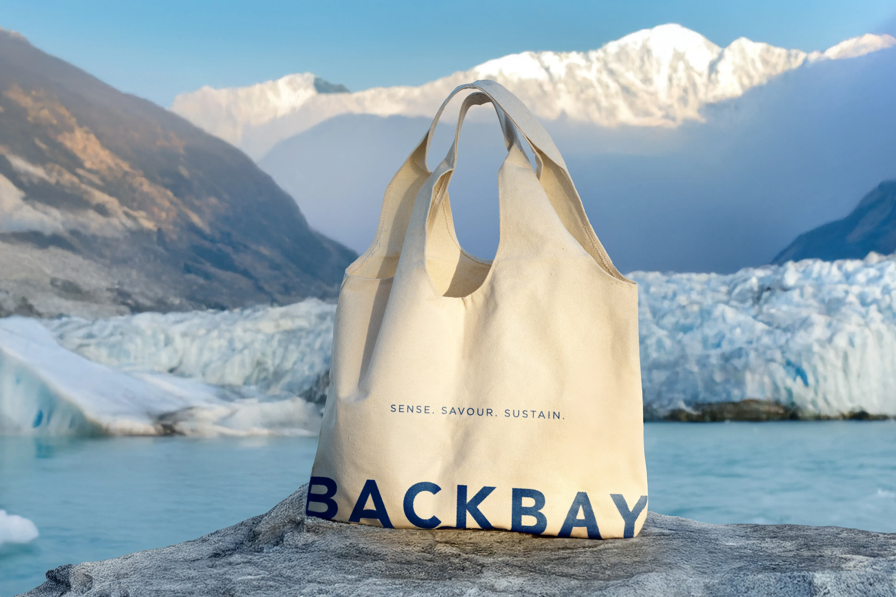
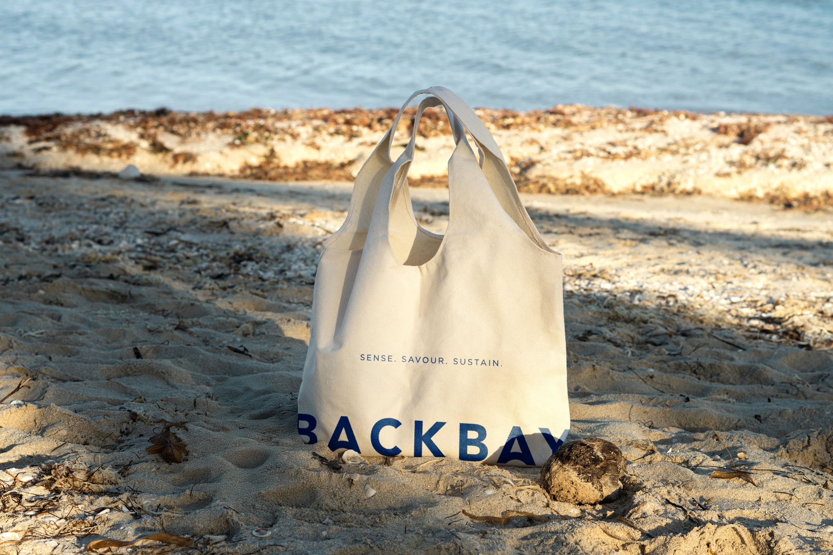
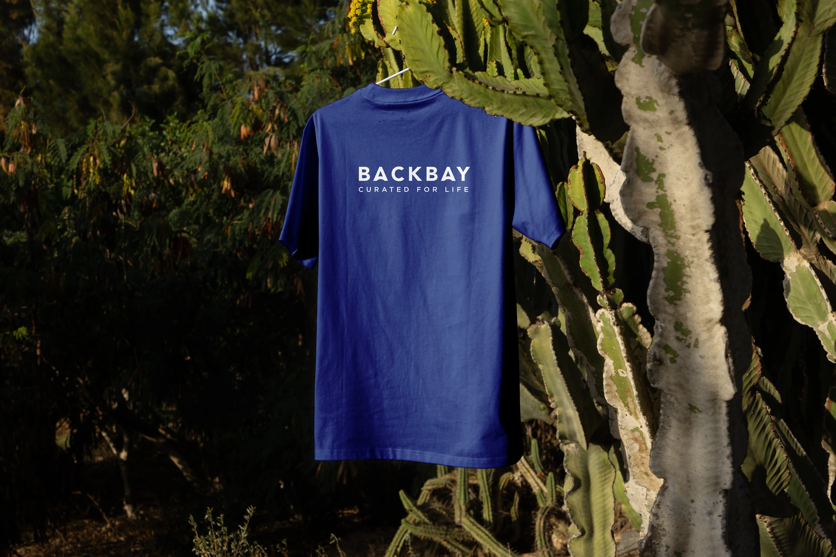
Where Backbay lives off the pack, on feed, in conversation and across the wider brand world. The thinking, shown, so the identity reads as one considered whole.
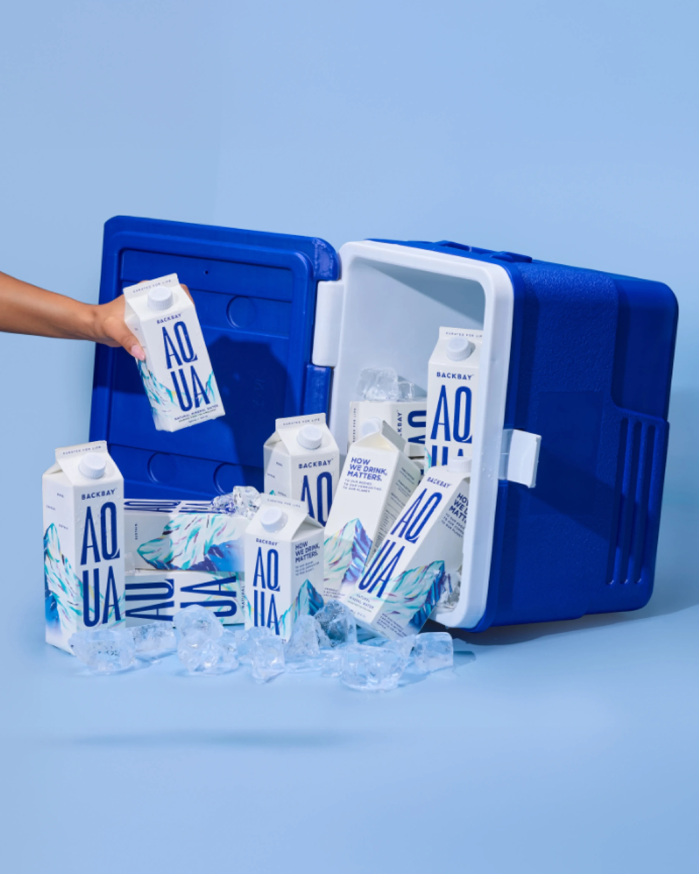
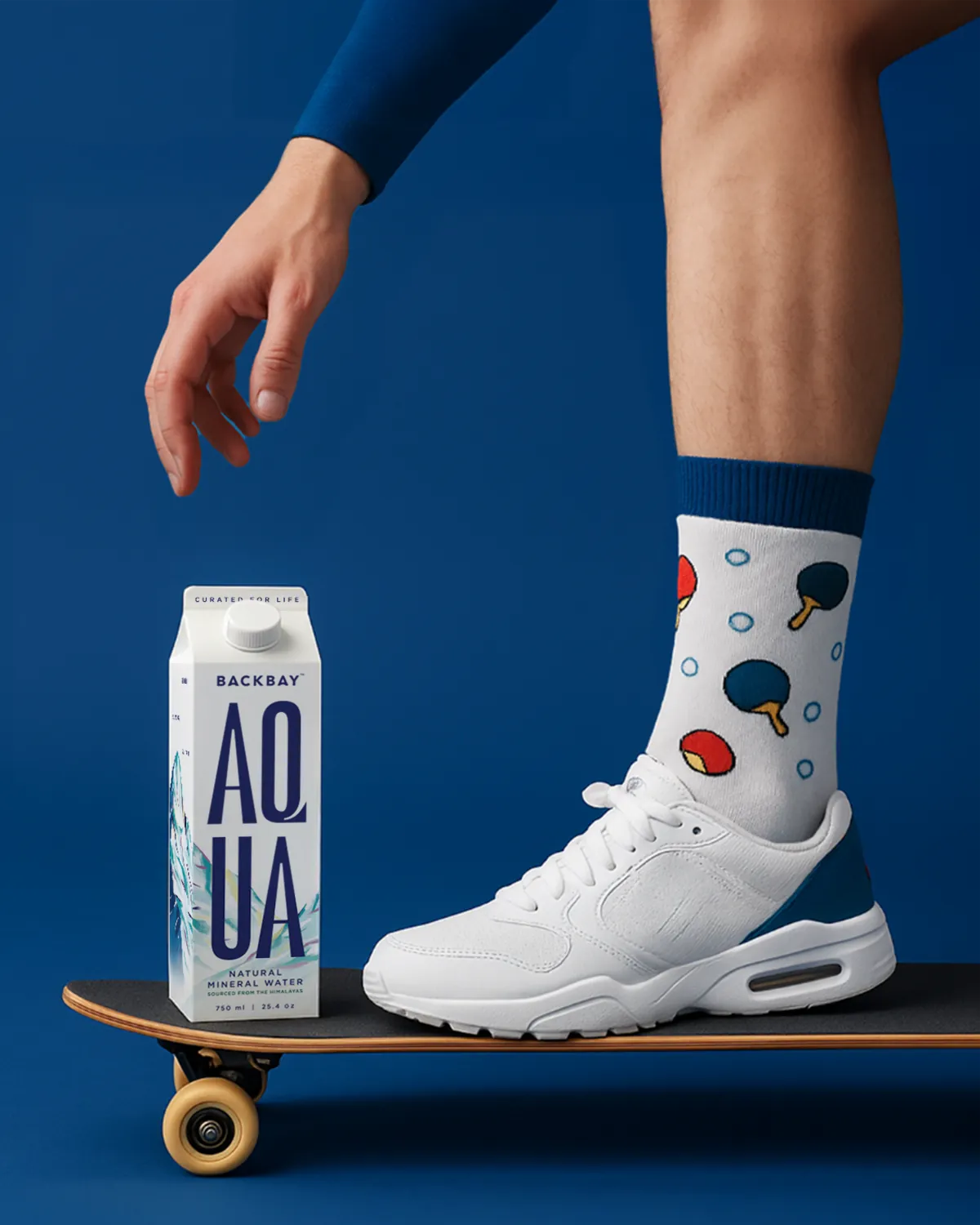
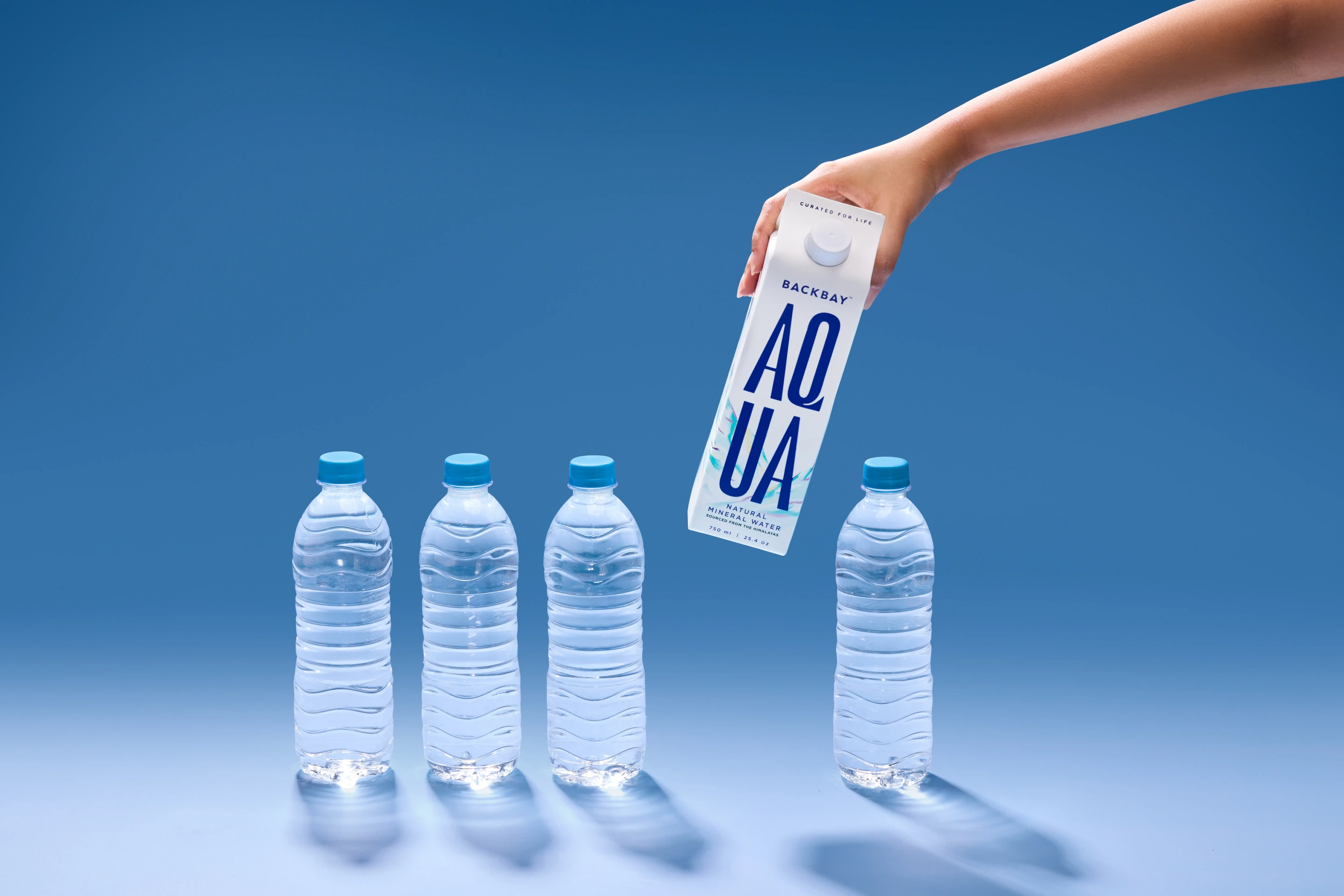
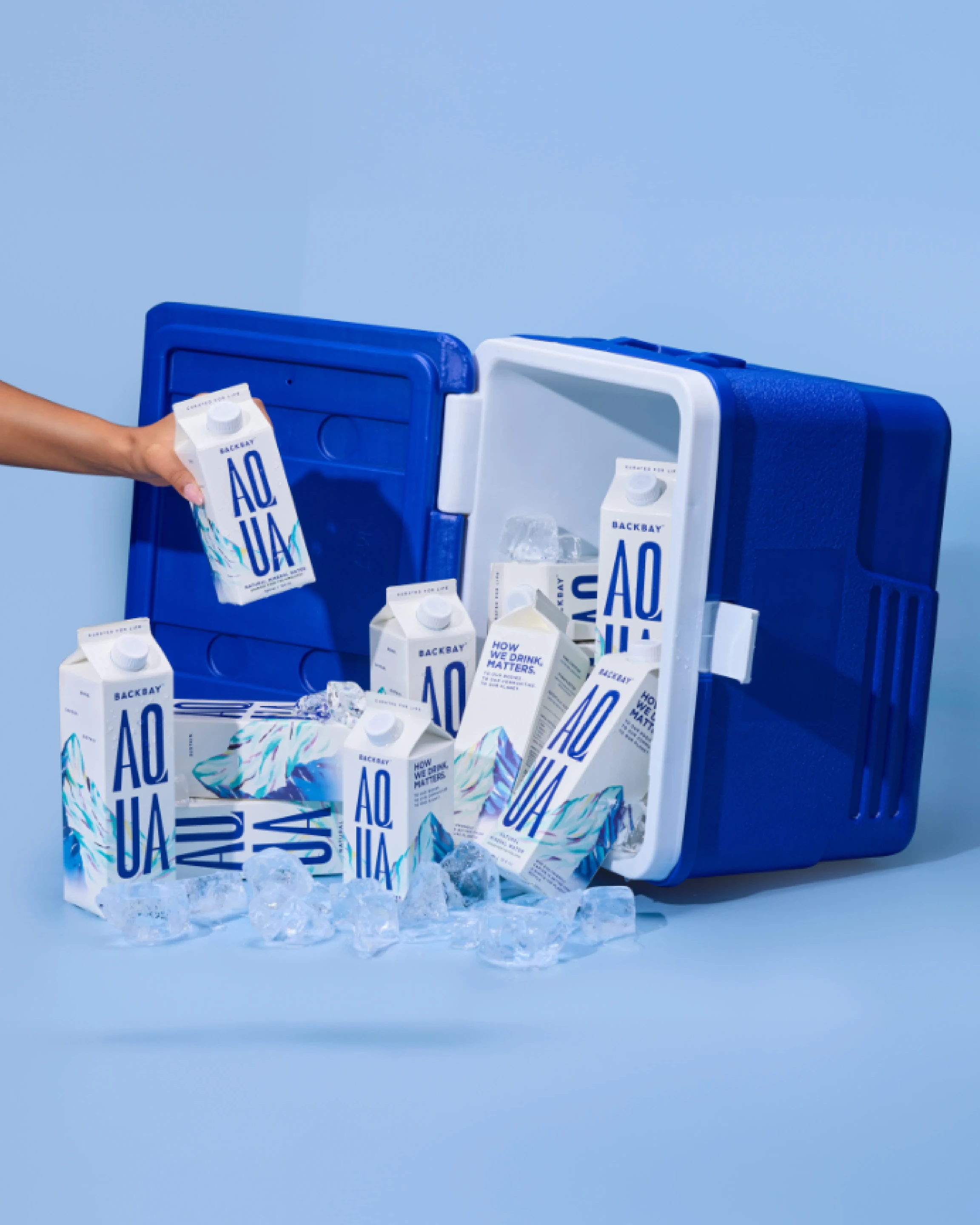


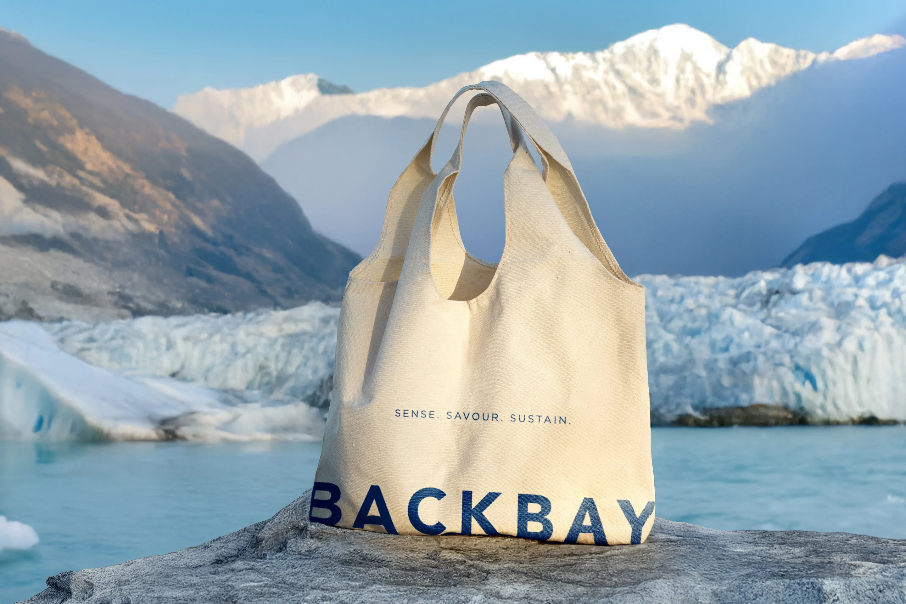
Sustainability, not as a buzzword. Paperboard over PET, recyclable end to end, a lower-carbon journey from spring to shelf. Natura A175 paperboard with a recyclable cap, zero microplastics into the water, and electrolytes drawn by the mountain itself. The category's quiet rewrite, packaged inside a carton most people will never think about.