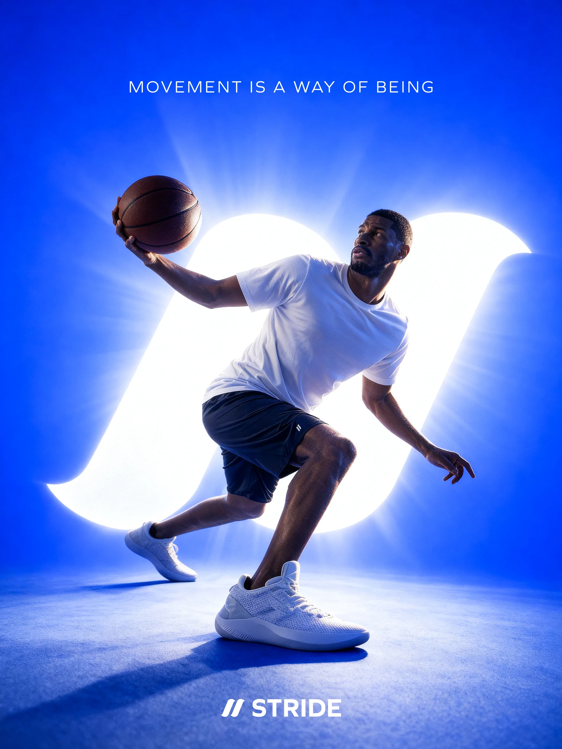
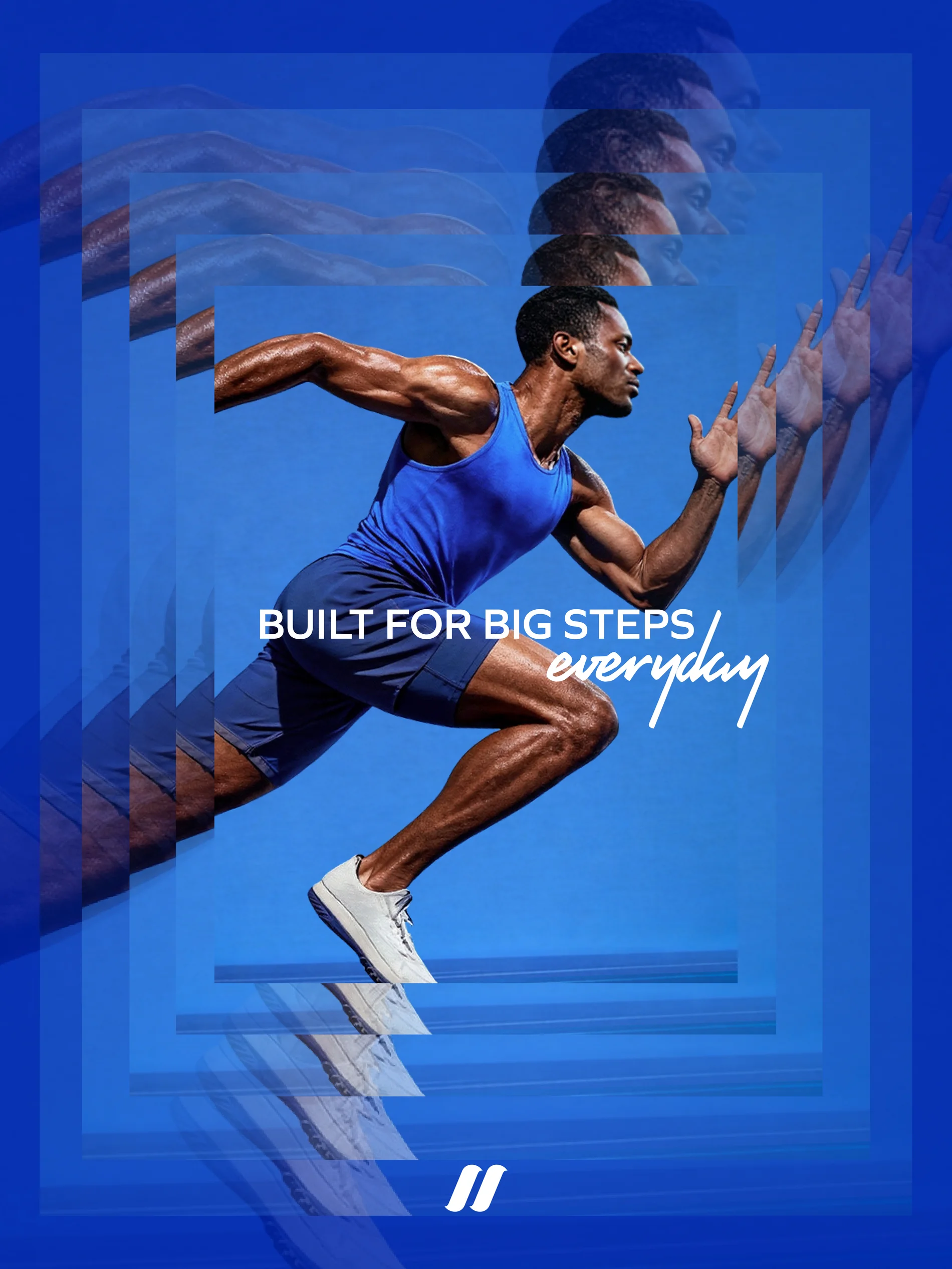
We built the brand from the ground up: philosophy, tone of voice and tagline, followed by the logo, typography and colour system that gave it shape.
The logomark's parallel strokes capture momentum and rhythm, paired with a clean, geometric typeface and a dynamic script that brings spontaneity and edge.
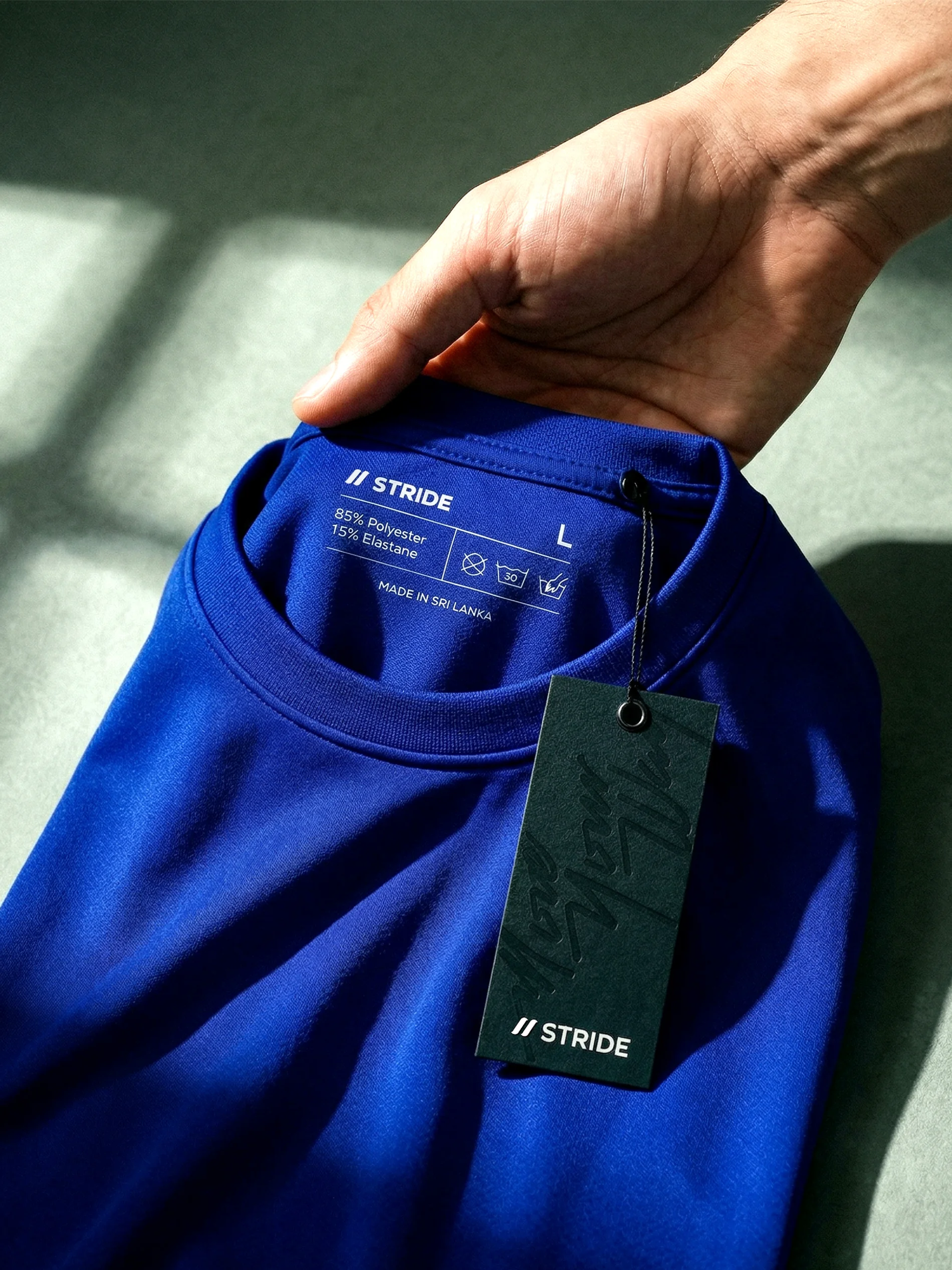
Together they are anchored by a bold blue against deep, grounded tones. On the ground, this took form in hang tags and clothing labels, social media and art-direction guidelines, carrying that same sense of motion into everything Stride touches.
Philosophy, tone of voice and tagline set the tone, then the visual system gave it shape. Strength that is fluid, not forced, running through every mark and every rule.


The logomark's parallel strokes capture momentum and rhythm, paired with a clean, geometric typeface and a dynamic script that brings spontaneity and edge.
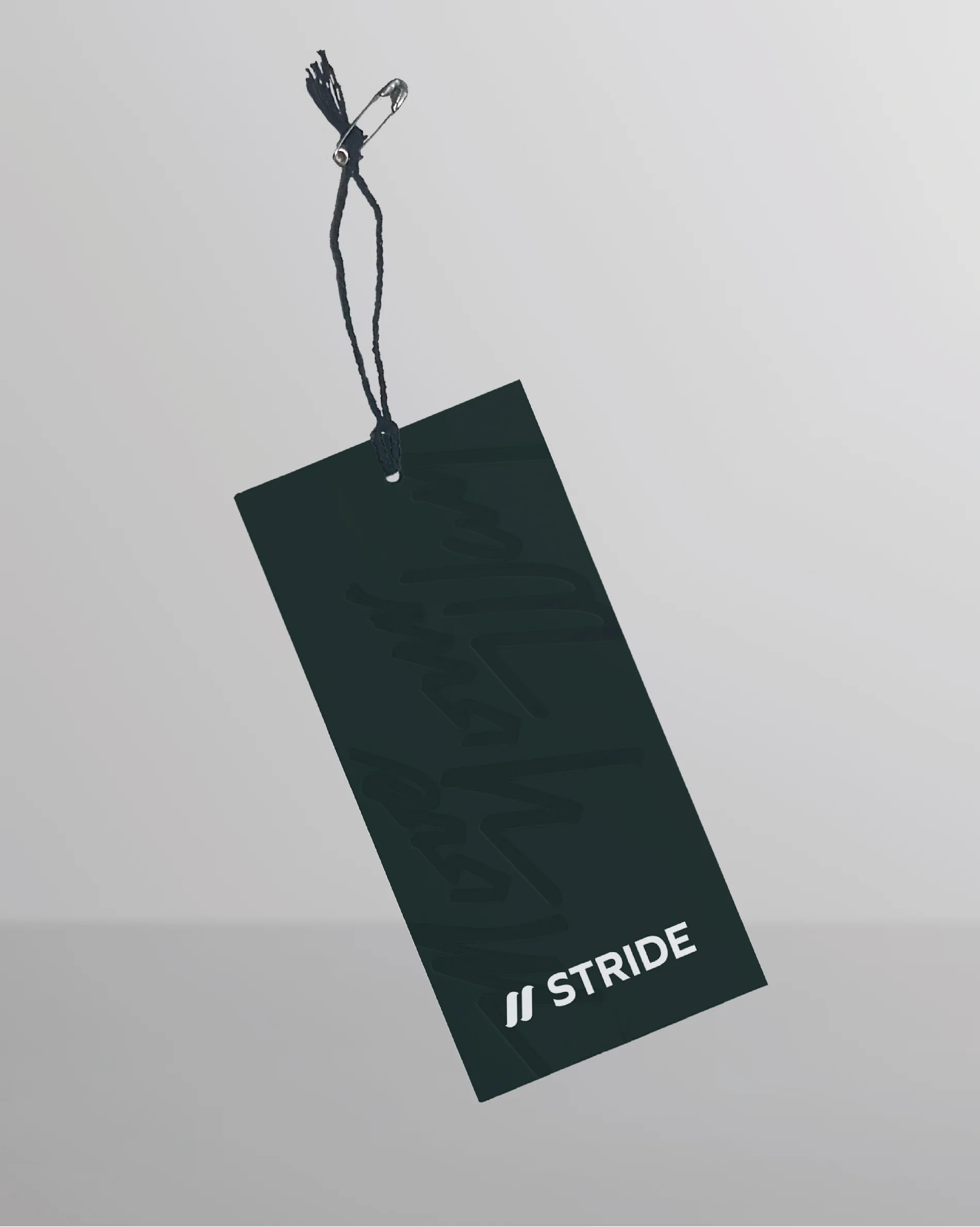
On the ground, the system took form in hang tags and clothing labels, anchored by a bold blue against deep, grounded tones, carrying that same sense of motion.


Social media and art-direction guidelines carry the brand outward, moving with the wearer rather than against them into everything Stride touches.