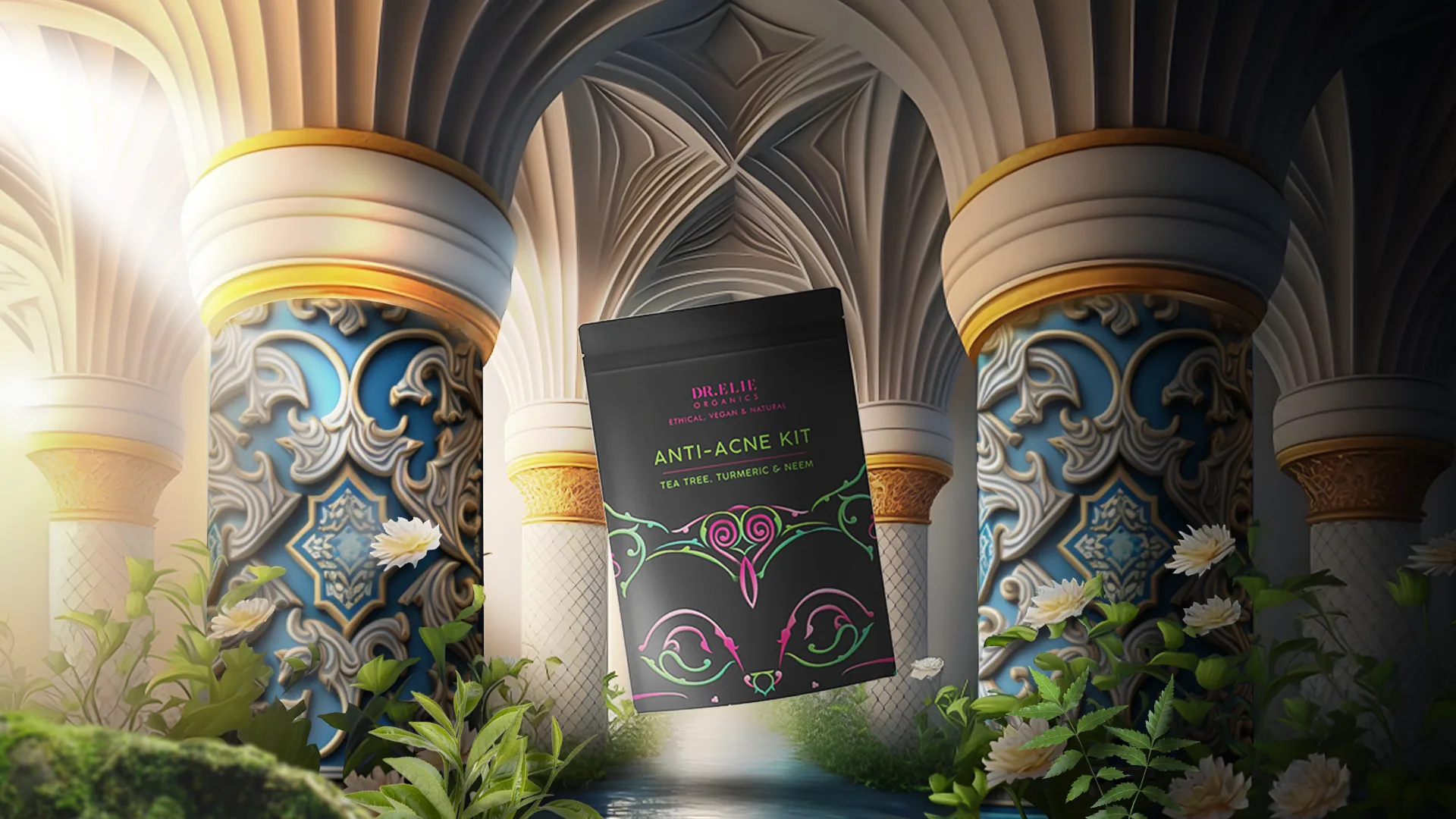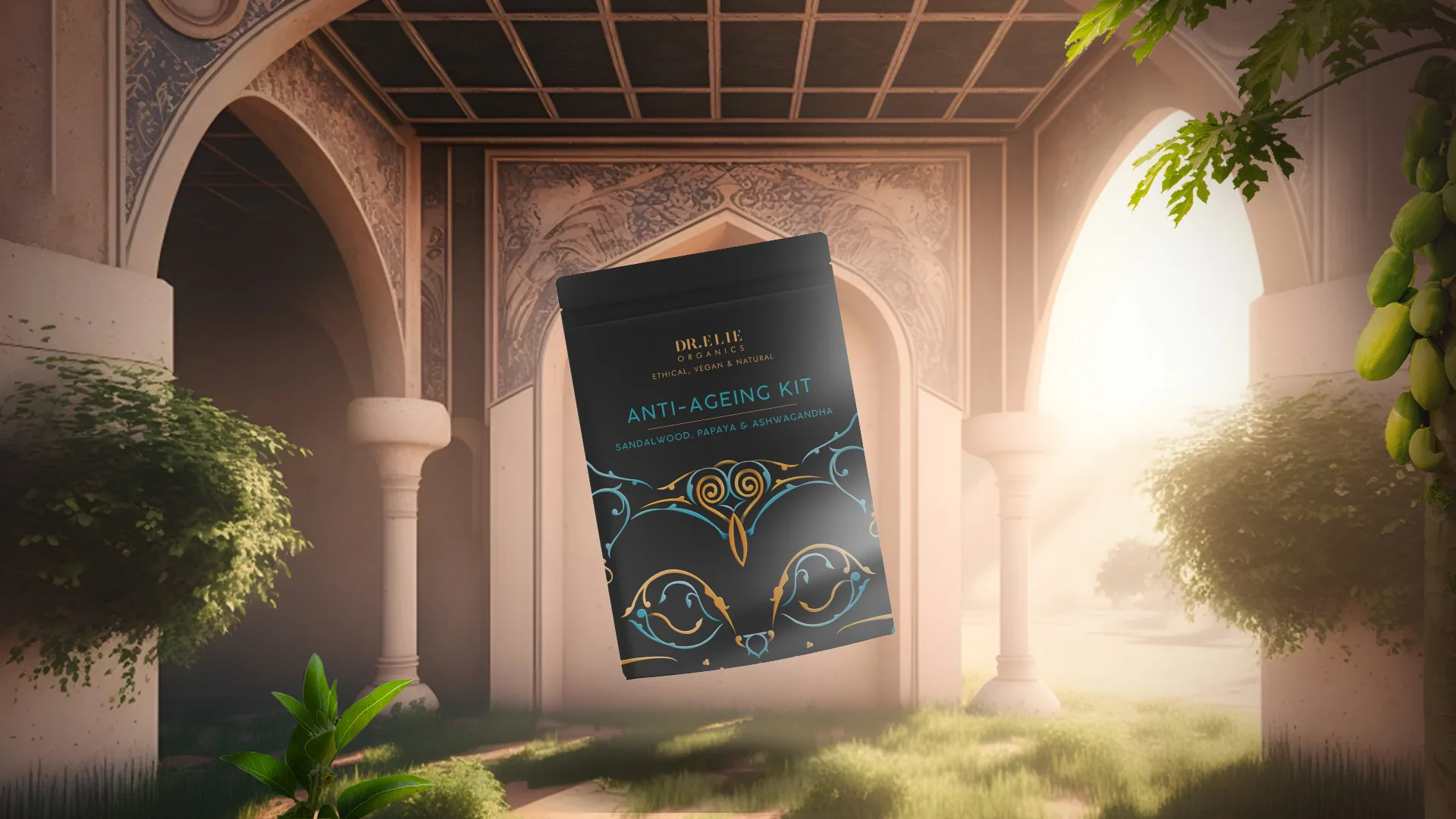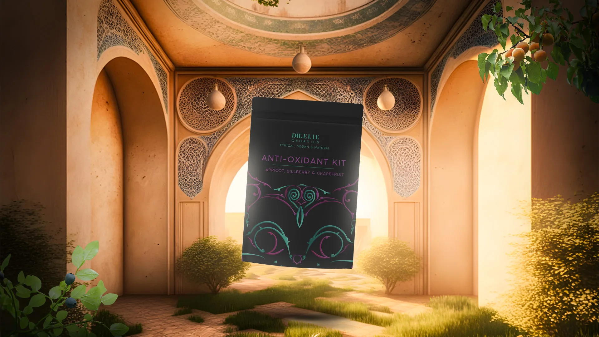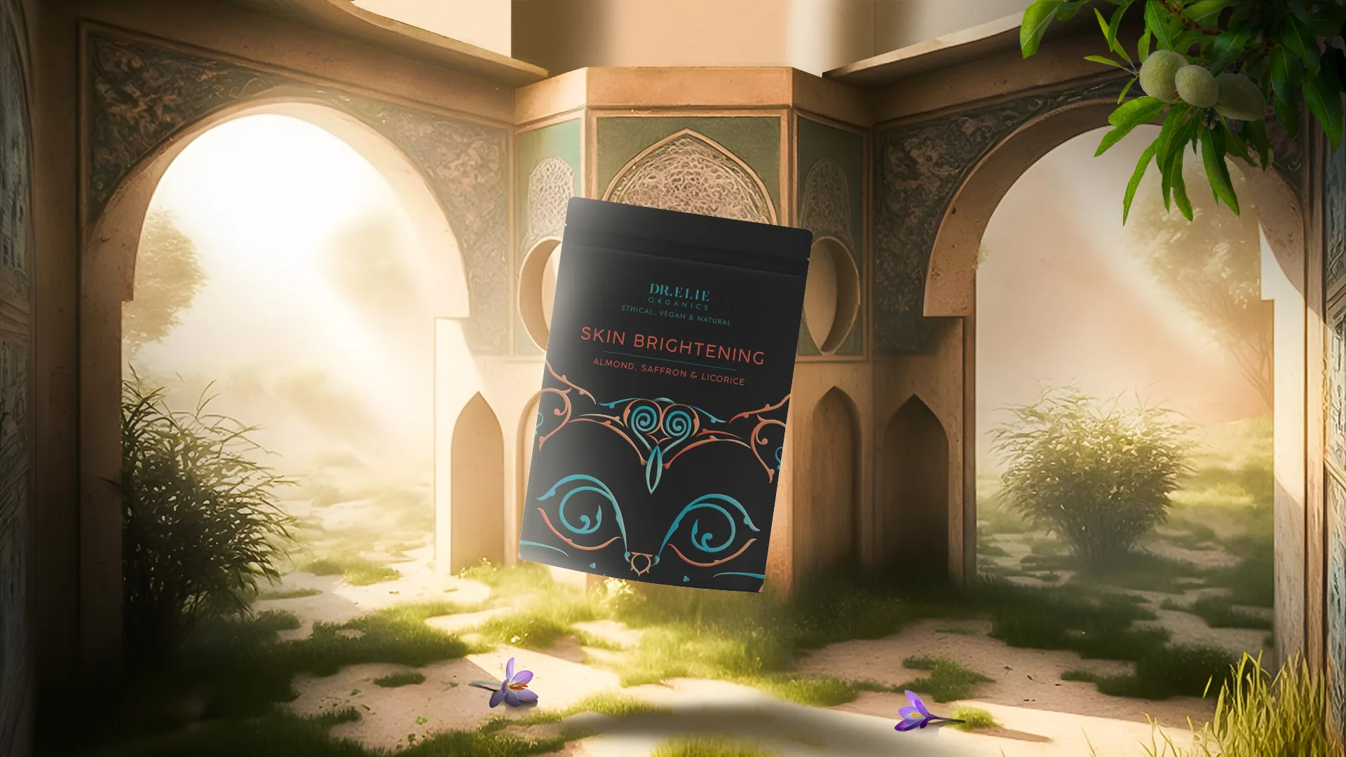
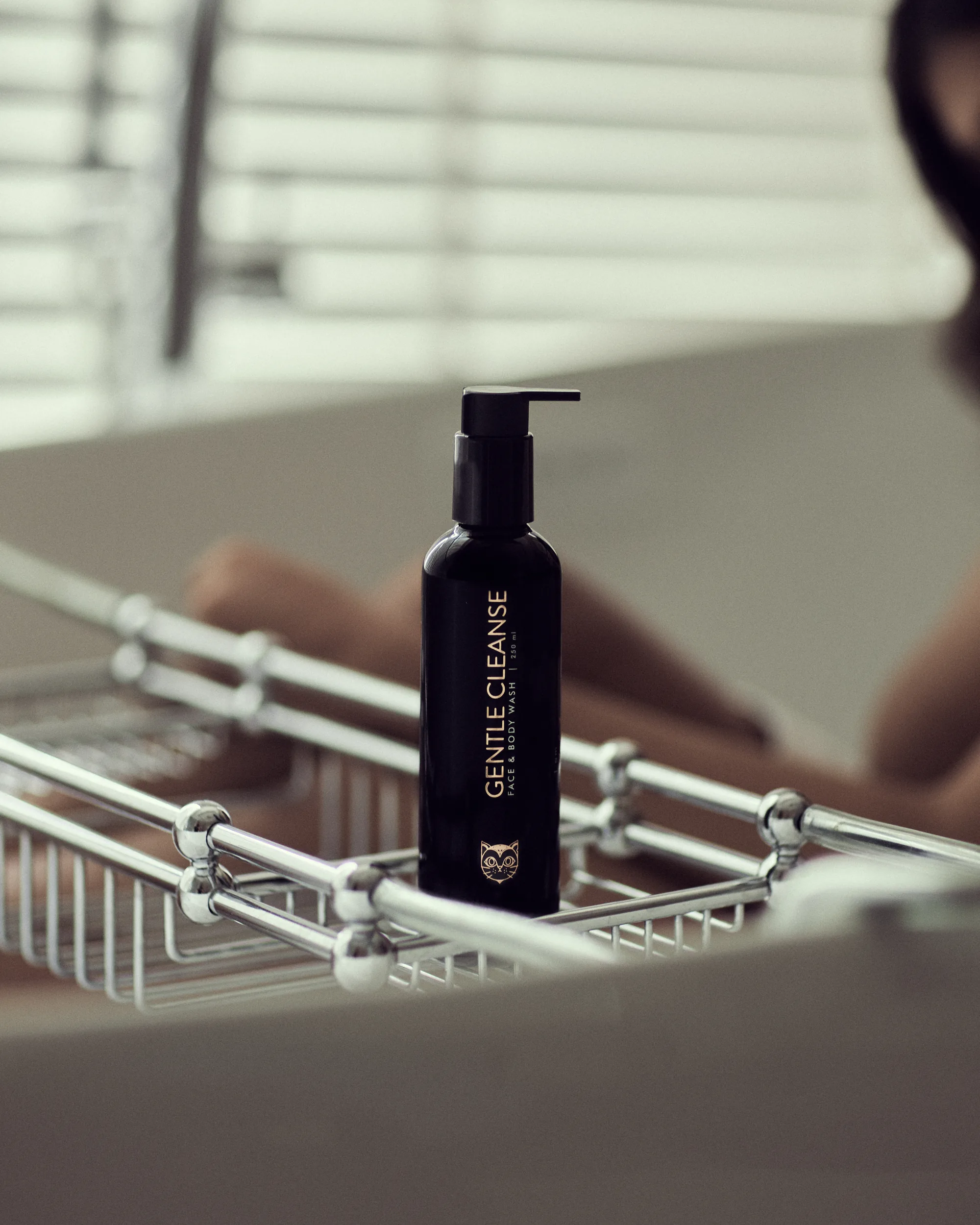
Dr Elie Organics was imagined as a self-care brand that goes beyond skin and hair, into a more holistic idea of looking after oneself.
The identity was built from the ground up, name, logo, packaging, shoot, and brand film. At its heart sits the black cat: superstition reinterpreted as independence, elegance, and quiet rebellion.
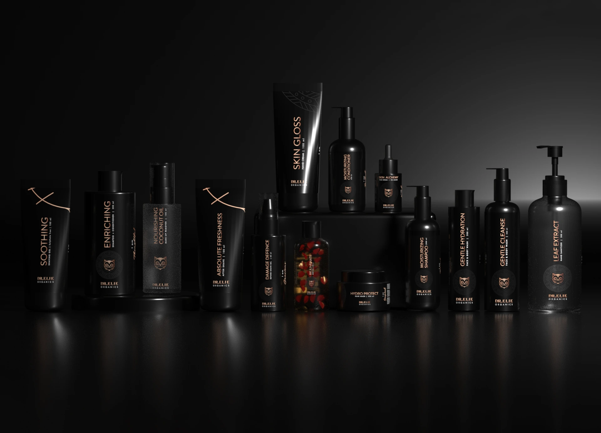
Paired with rose gold and a deep black canvas, the world gave the brand a distinct, premium presence in a crowded category.
Independence, elegance, and quiet rebellion, the mark at the heart of the brand.
Rose gold on a deep black canvas, carried across the range. Every bottle reads as a considered object, premium, tactile, and unmistakably Dr Elie on a shelf full of sameness.
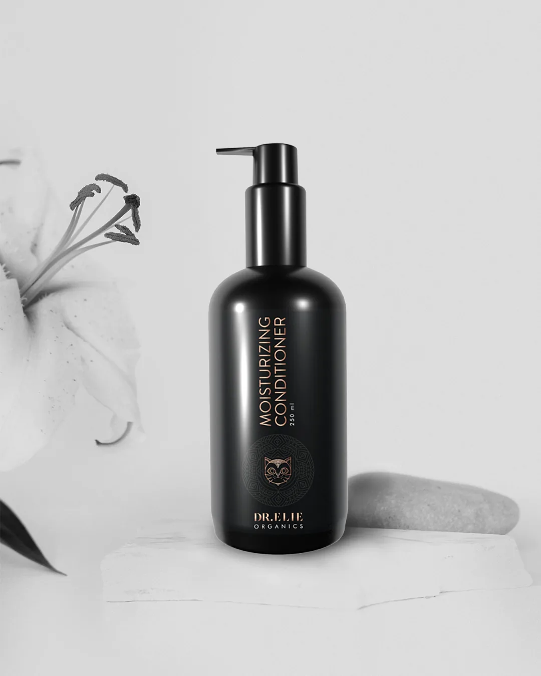
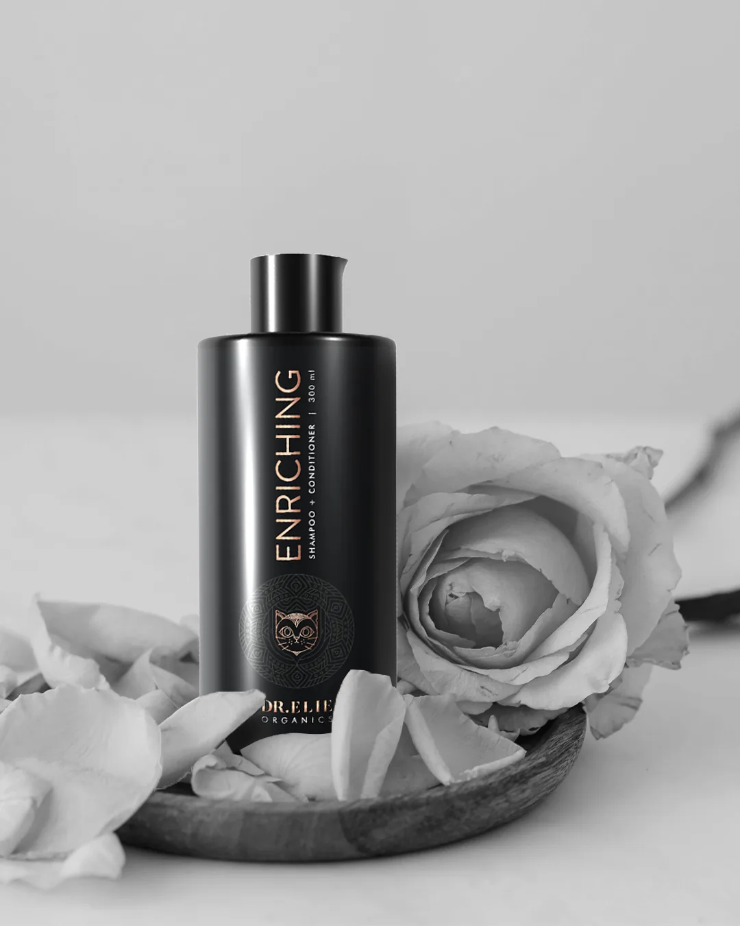
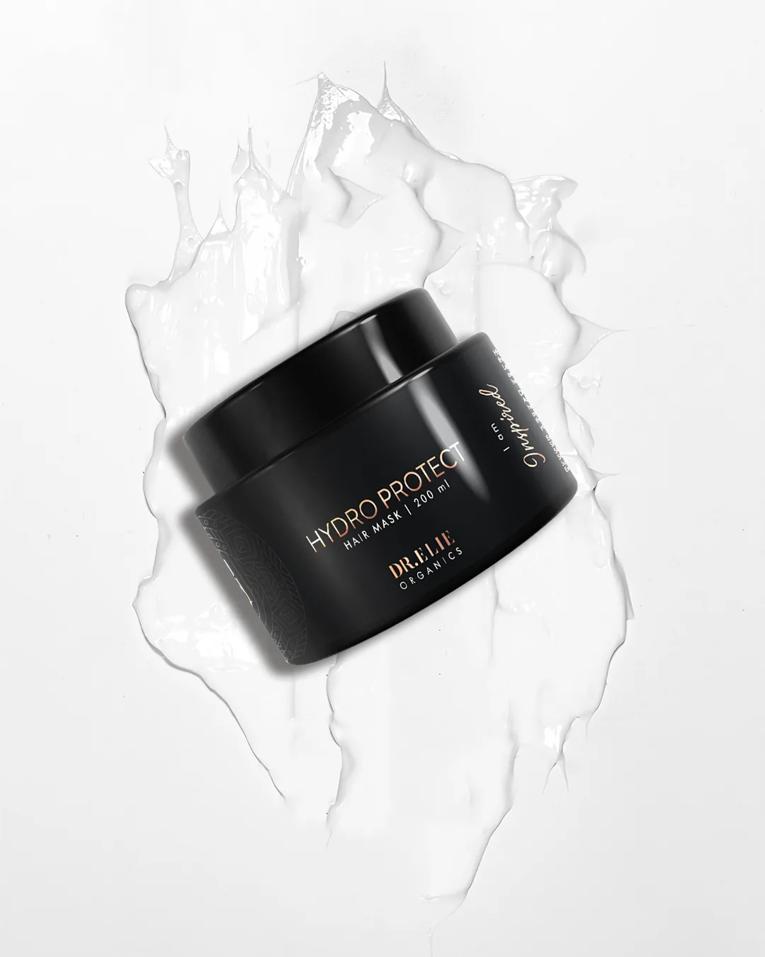
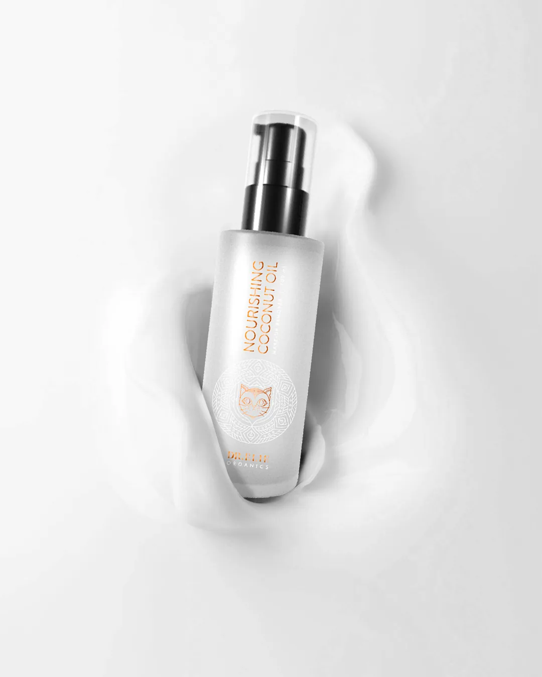
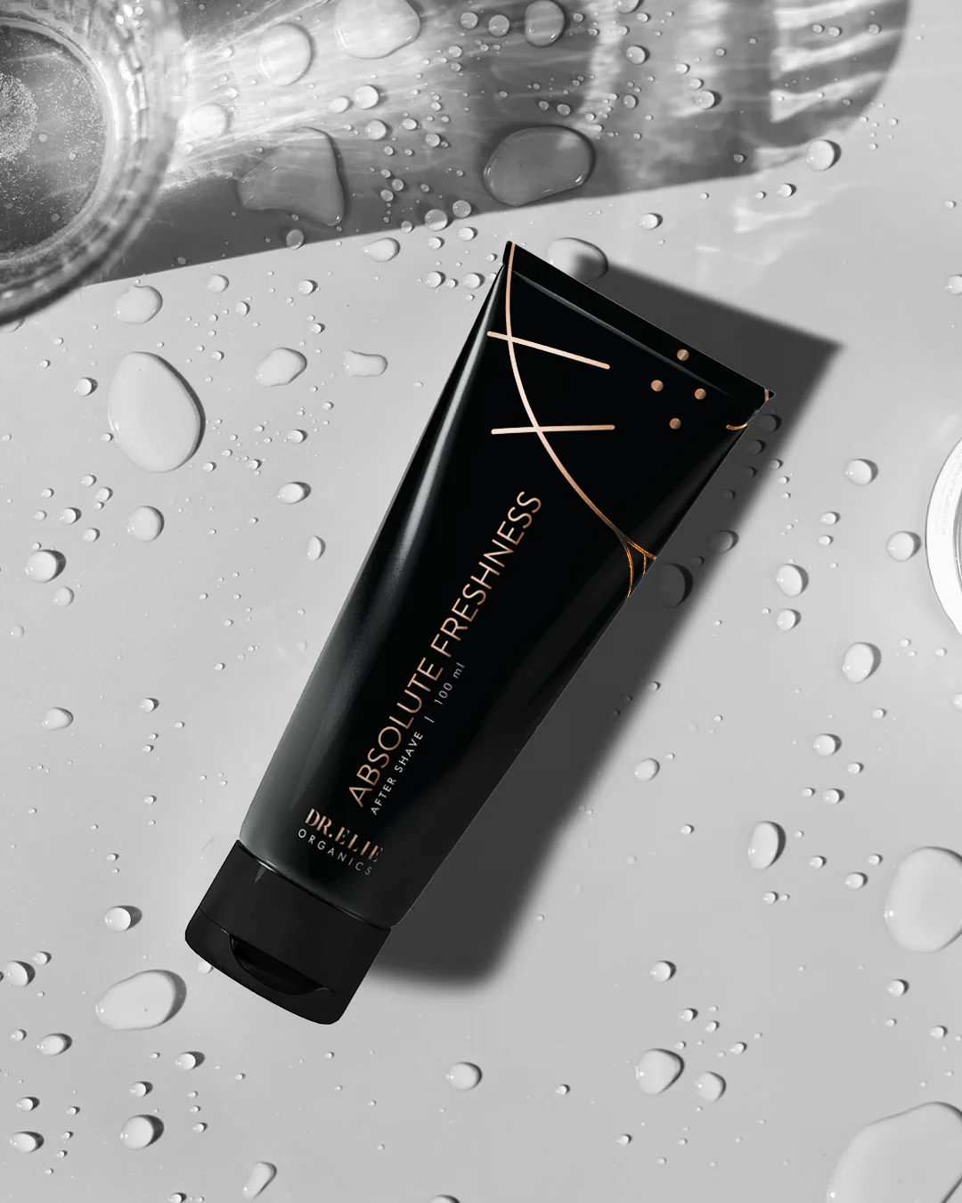
A campaign built on the same rose-gold-and-black language, warm, editorial and quietly confident. The imagery frames self-care as a ritual rather than a routine.
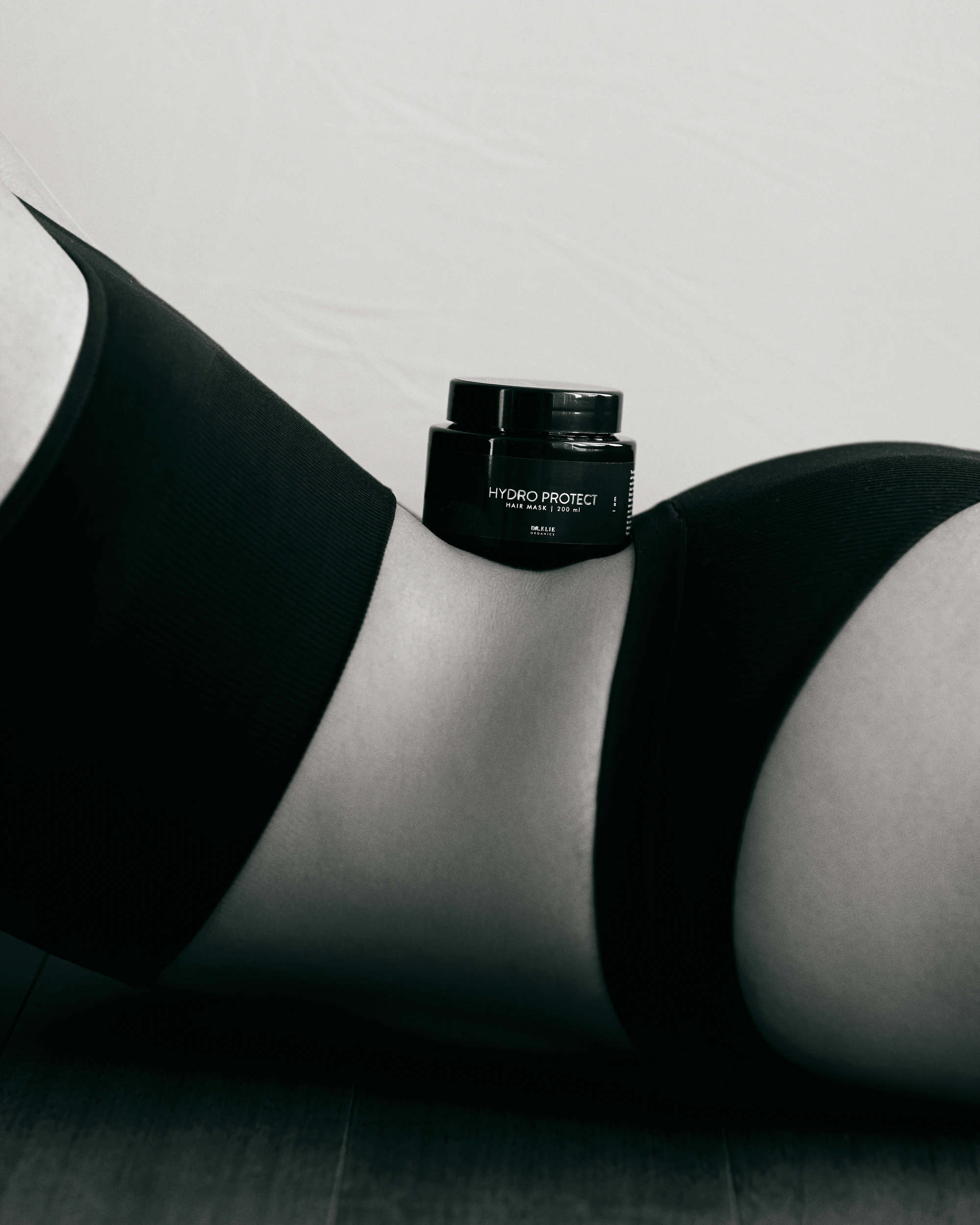
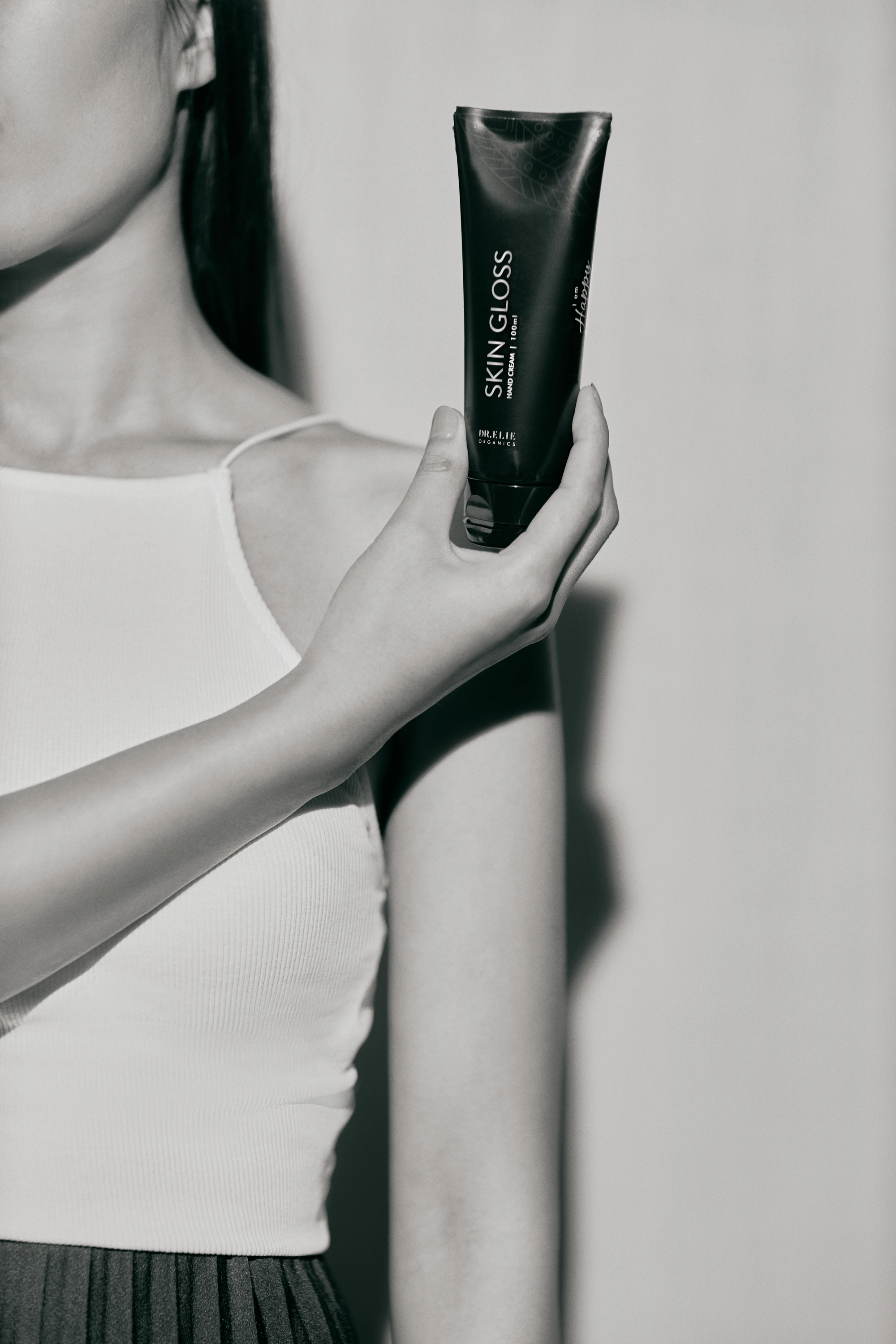
The finishing craft, surface, texture and close detail. Where the brand world resolves into the small, deliberate touches that make it feel whole.