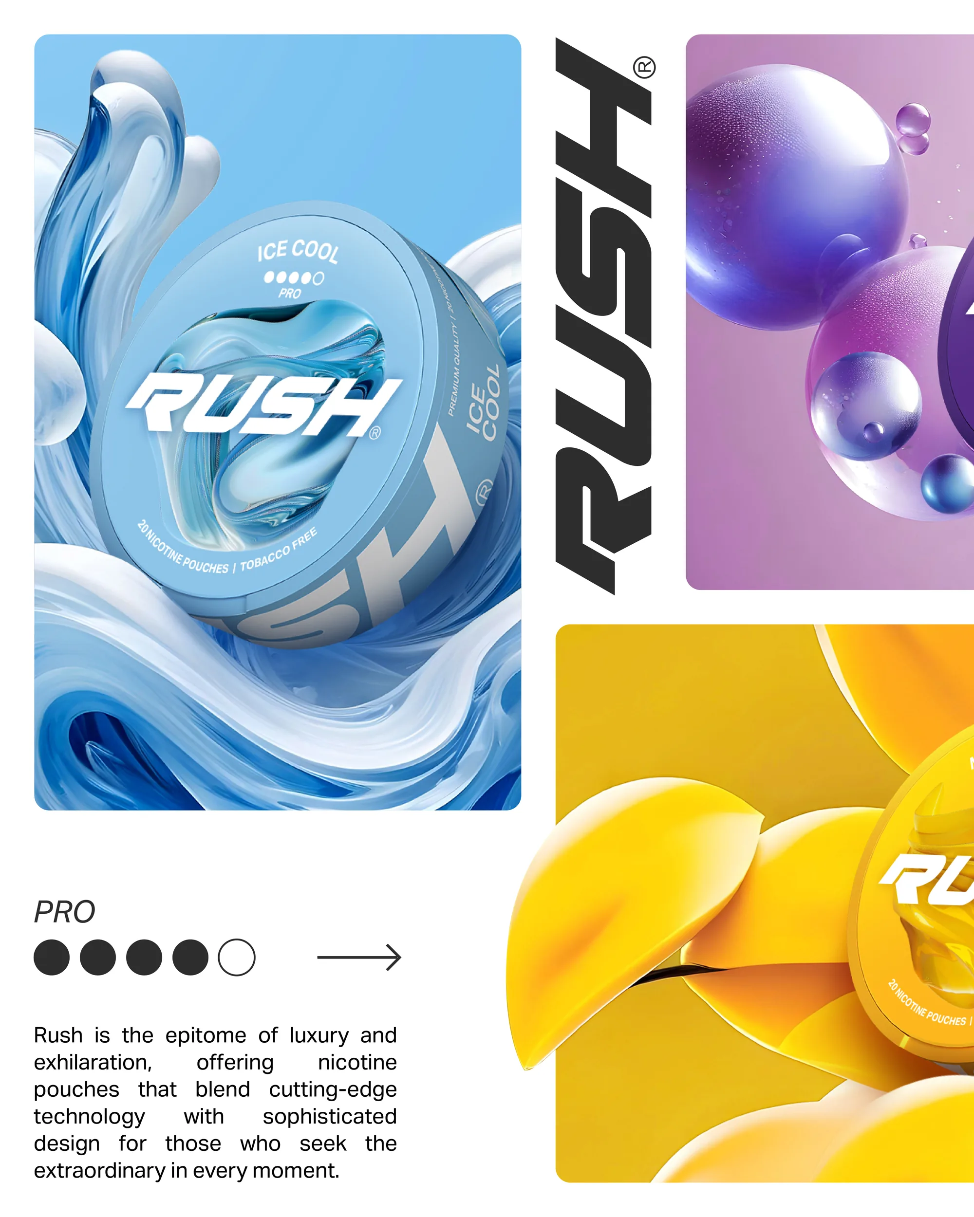
Rush was created for Dholakia Tobacco as a global nicotine-pouch brand, shaped around one principle: flavour first.
Each variant was given its own distinct world, turning mint, berry, mango, grape, cherry and frost into bold visual terrains rather than simple pack colours.
The name captured the instant hit of the product, while the logo, packaging and retail creatives brought in speed, sharpness and energy.
The result is a system that makes the pouch category feel more expressive, more collectible, and far more alive on shelf.
The core identity gives Rush its own voice, sharp, fast and unmistakably confident. Built on a charcoal ground with a vivid red hit, the logo reads instantly on shelf and carries the same energy from pack to poster to feed.
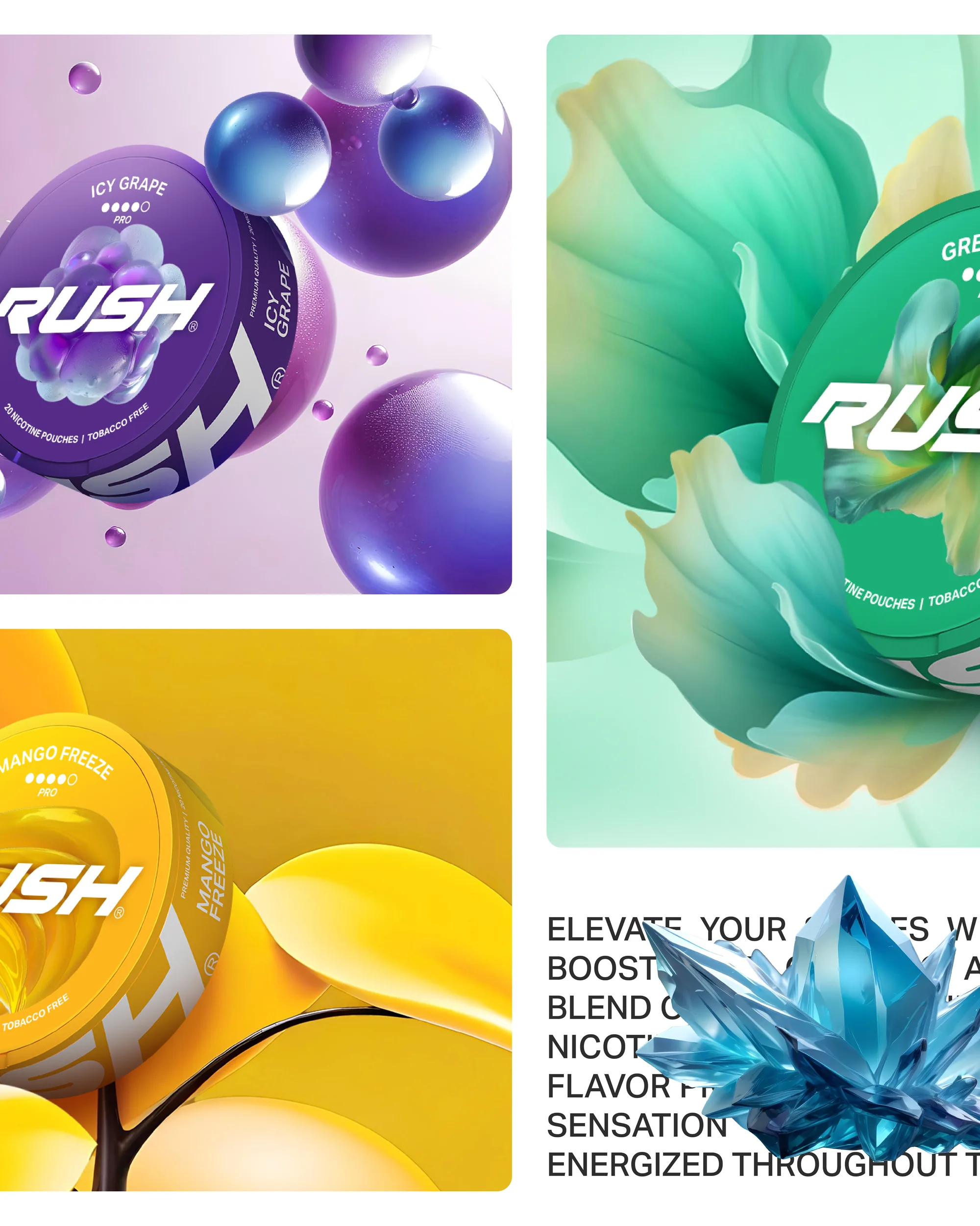
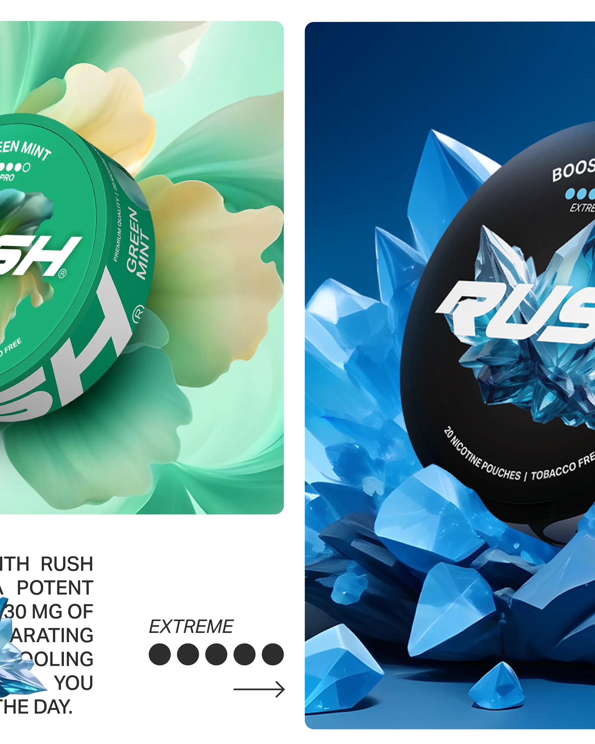
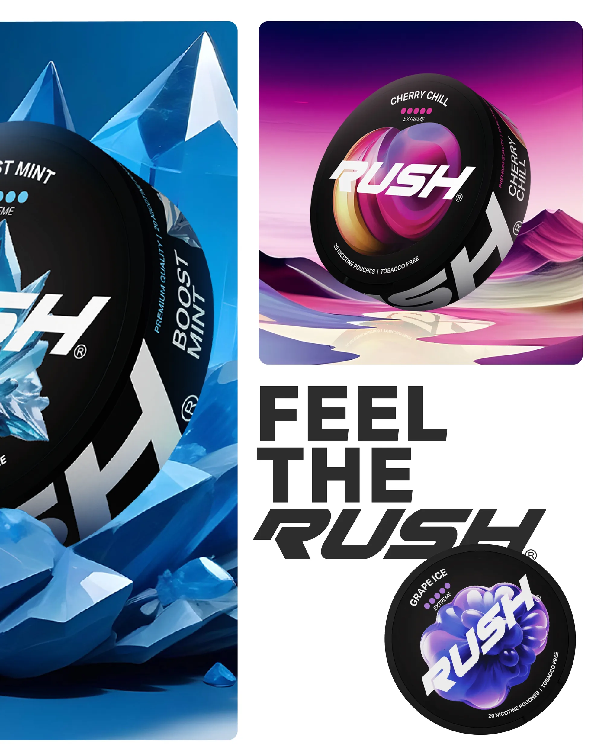
Mint, berry, mango, grape, cherry and frost, each turned into its own bold visual terrain rather than a simple pack colour. The flavour-led system makes every variant expressive and collectible, giving the range a rhythm that a shopper can read at a glance.
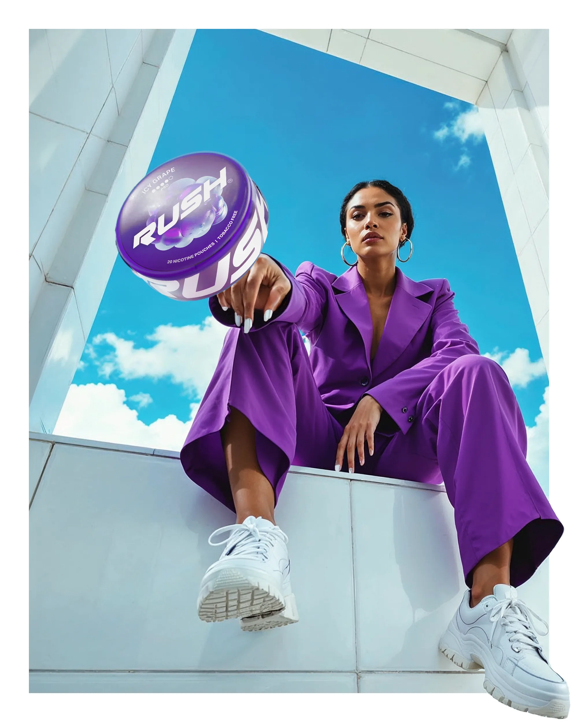

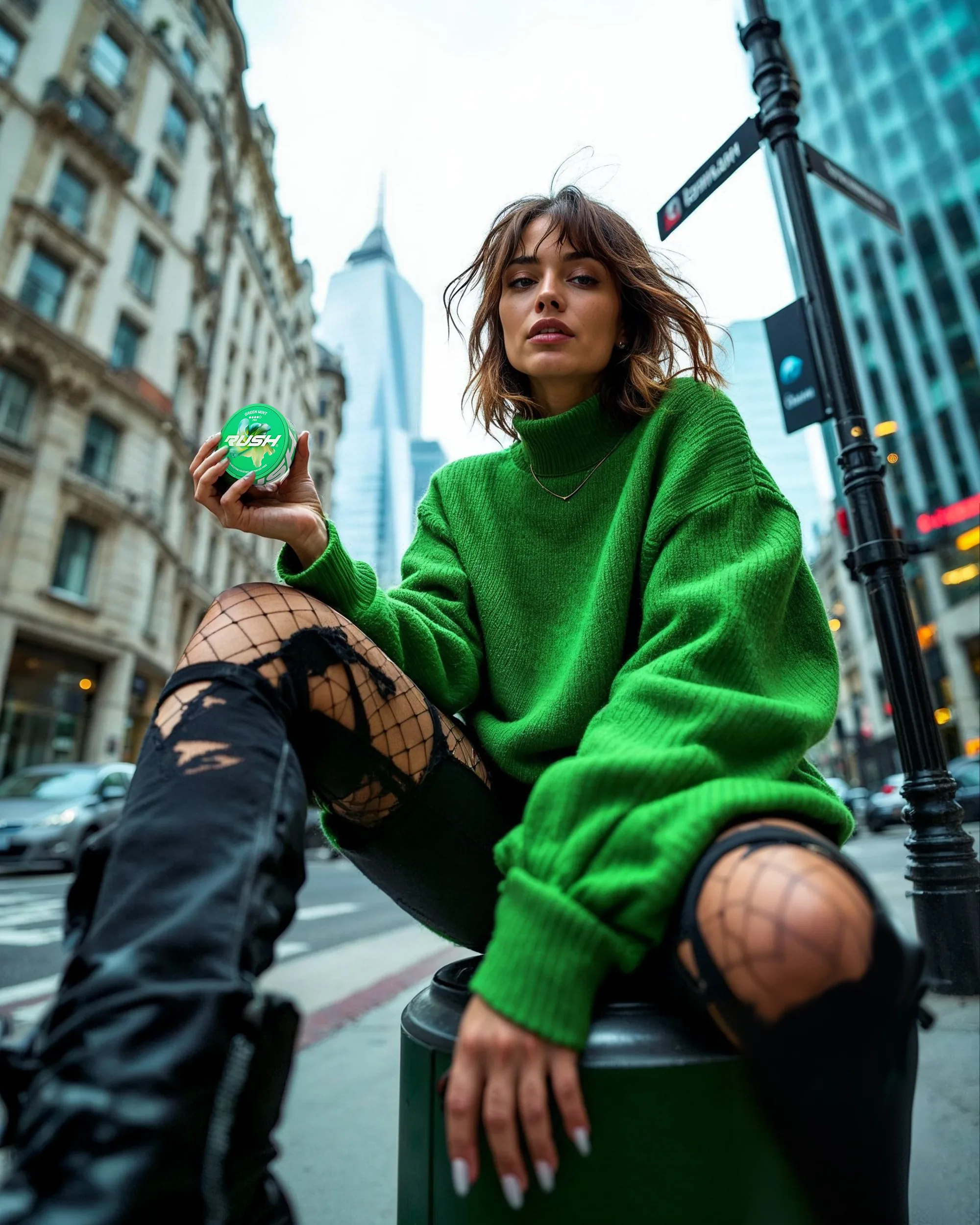


From core identity to retail creative, Rush was designed to carry speed and energy wherever it appears. The campaign imagery gives the pouch category a presence it rarely enjoys, expressive, high-contrast and impossible to walk past.