
Stampeight is Sony Music’s newest fandom platform, a place where the people who love an artist find each other. Our task was to give that gathering an identity, one that captures the energy, emotion and culture that bring fans together.
So we built a brand as expressive as the community it represents. A wordmark drawn by hand and spaced by hand, tuned to the rhythm of music typesetting, made to behave like a label, a stage and a calling card at once.
Designed for stage and broadcast, for artist and for release, and built to hold its own next to the world’s music-house marks, while staying authored from India.
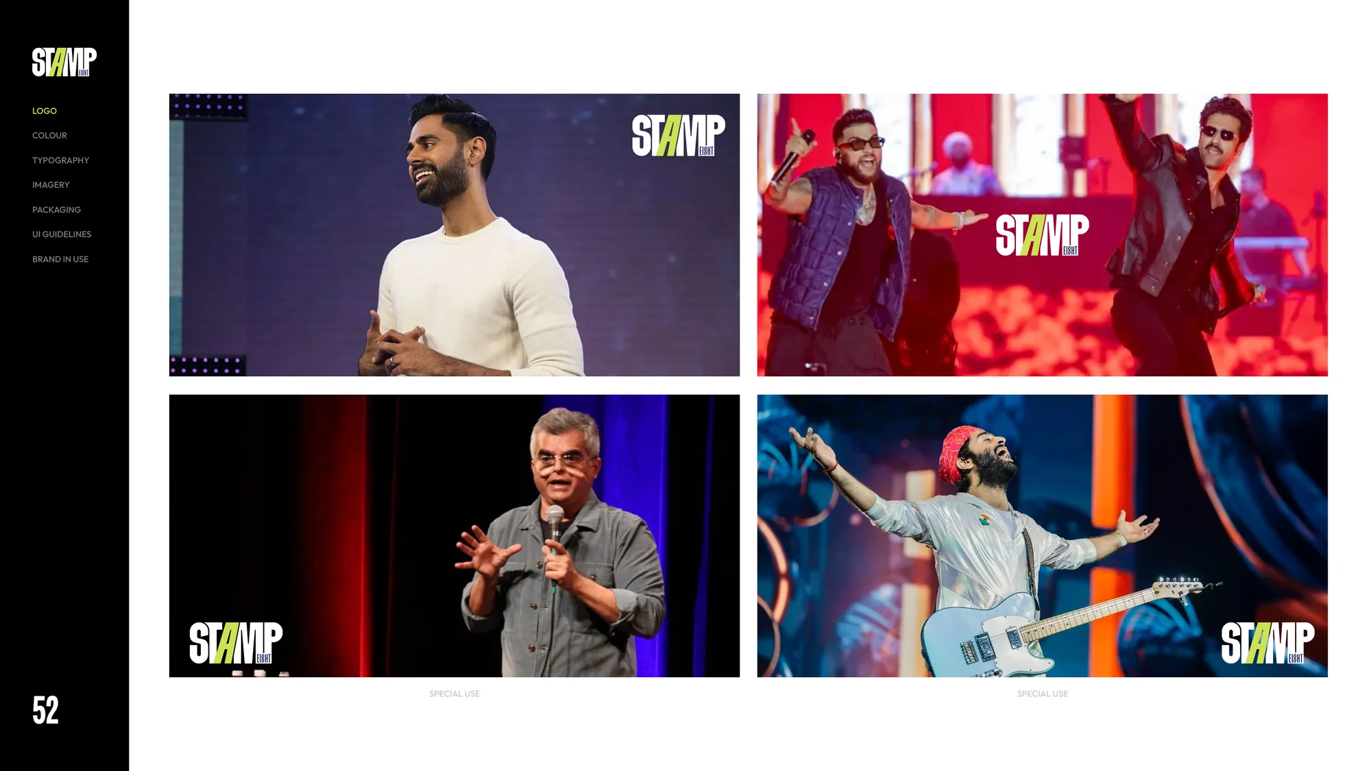
The wordmark is built to perform at every distance. Readable in a thumbnail, commanding on a stadium backdrop, intact on a vinyl sleeve. Drawn by hand, spaced by hand, and tuned to the rhythm of music typesetting so it reads as sound as much as letterform.
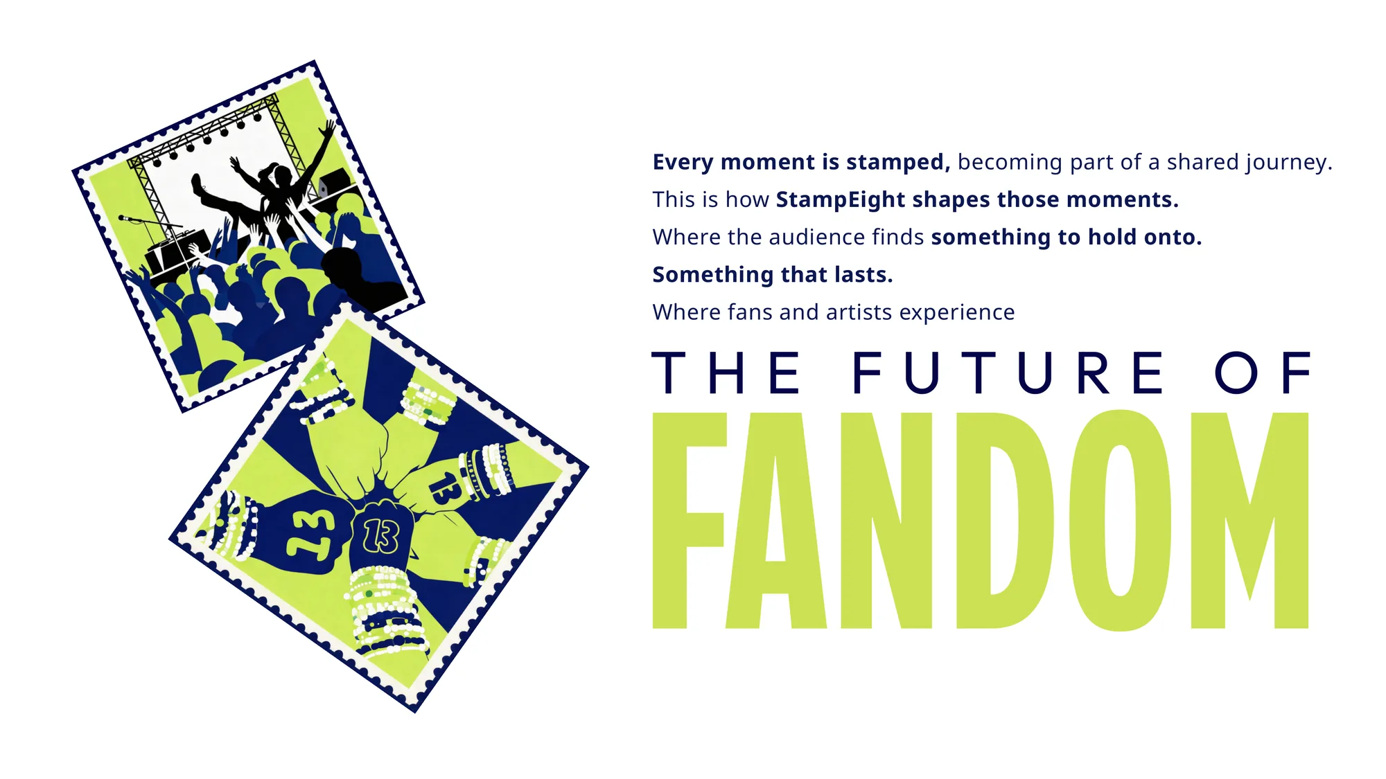
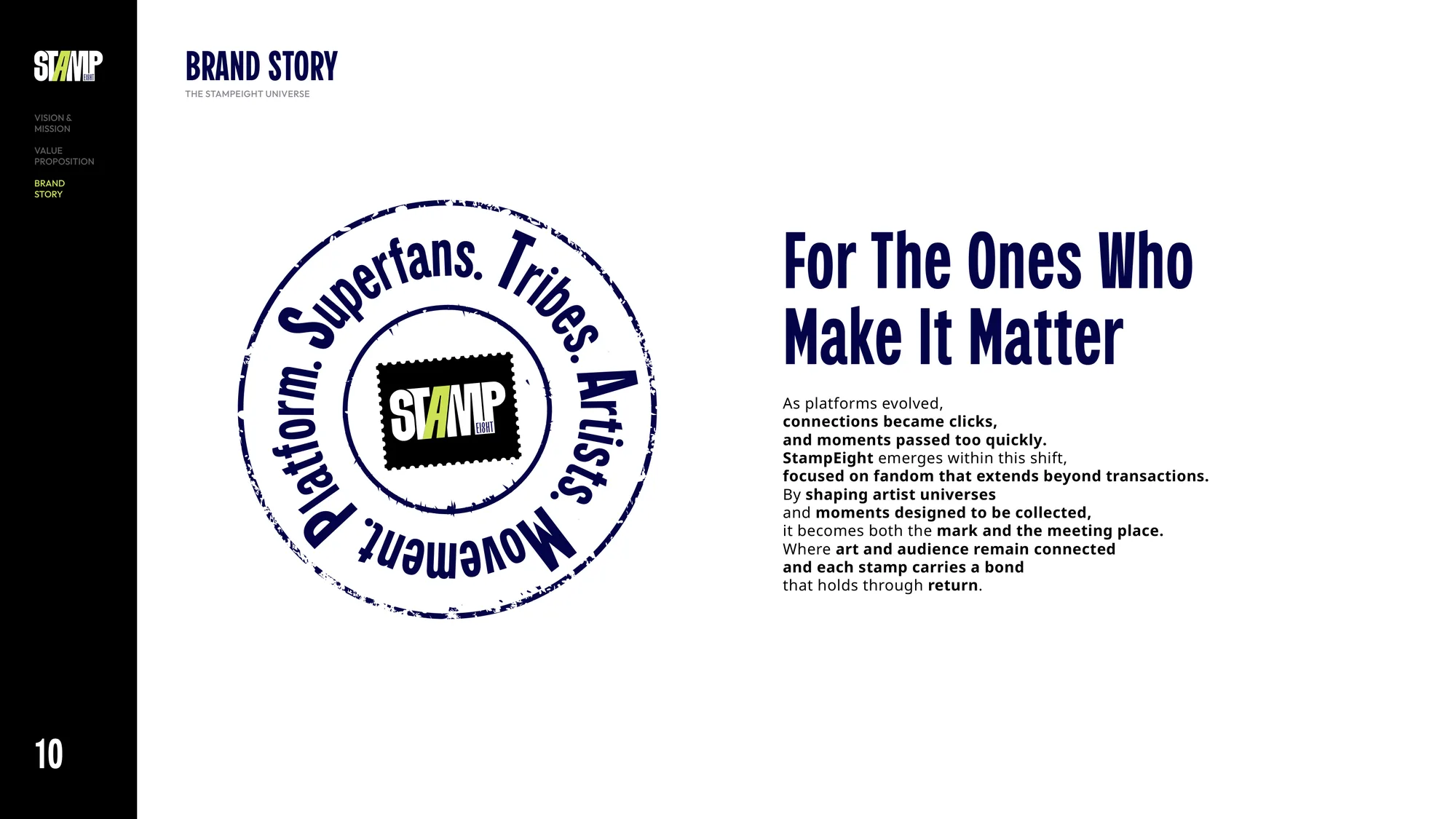
A typographic voice that carries the brand from a release title to a broadcast lower-third without losing character. High contrast, held quietly, so the artist stays the loudest thing in the room.
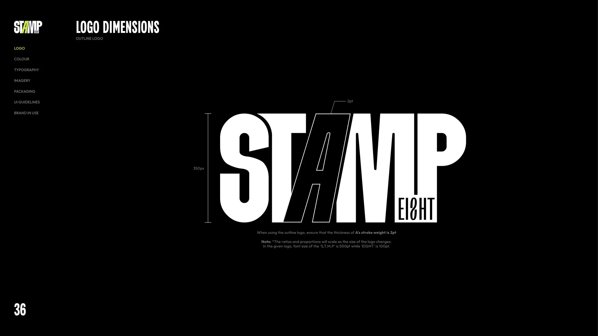
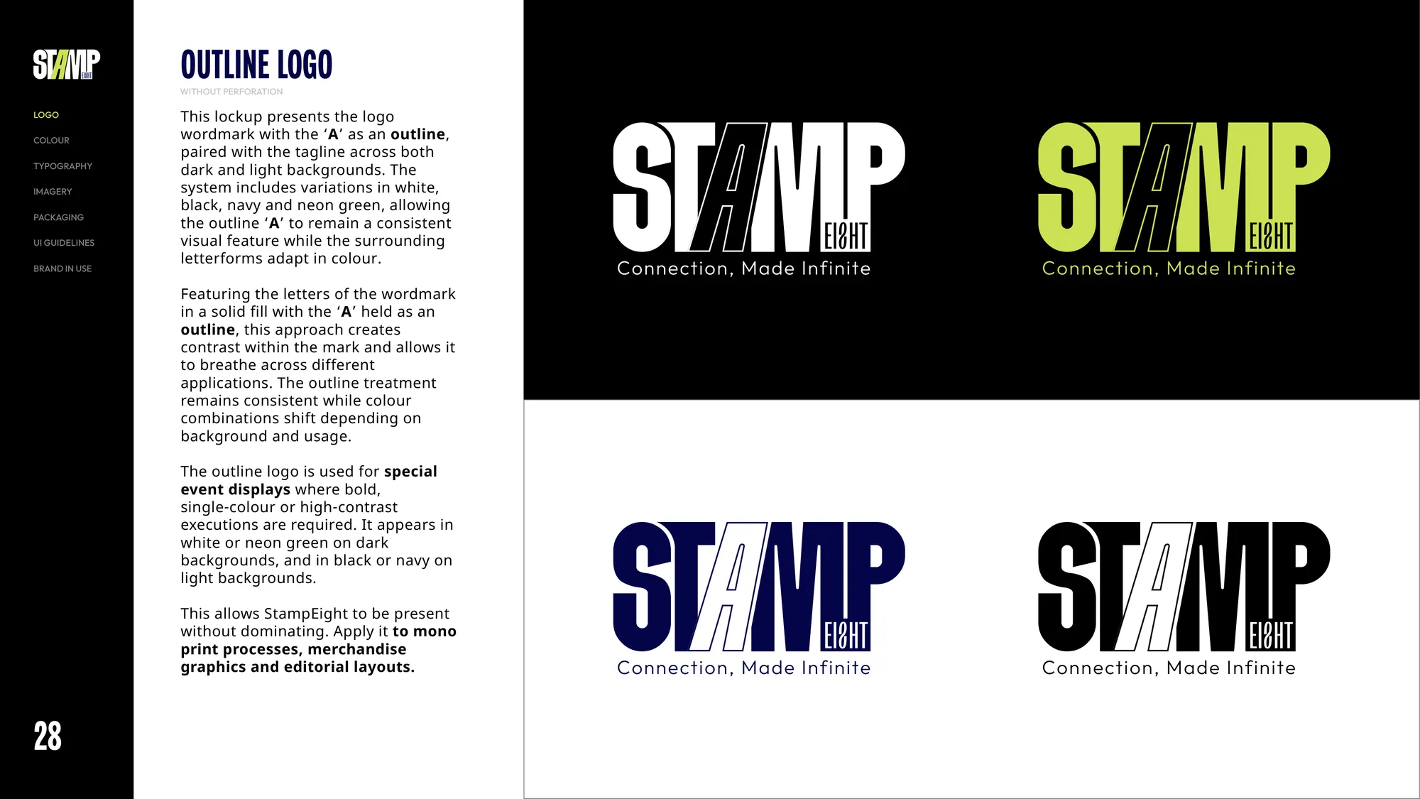
The identity documented as a working system, not a static logo: how the mark moves, where the type sits, how the black ground and single accent behave across stage, screen and sleeve. A brand that is confident enough to disappear when the lights come on, and recognised when it returns.
#0E0D0C
The anchor. Used wherever the artist needs the most room.
#F4EFE0
The breath. Gives the brand its quiet.
#FCB116
The accent. Punctuation, never paragraph.
#5A6483
The supporting voice. Where precision matters.