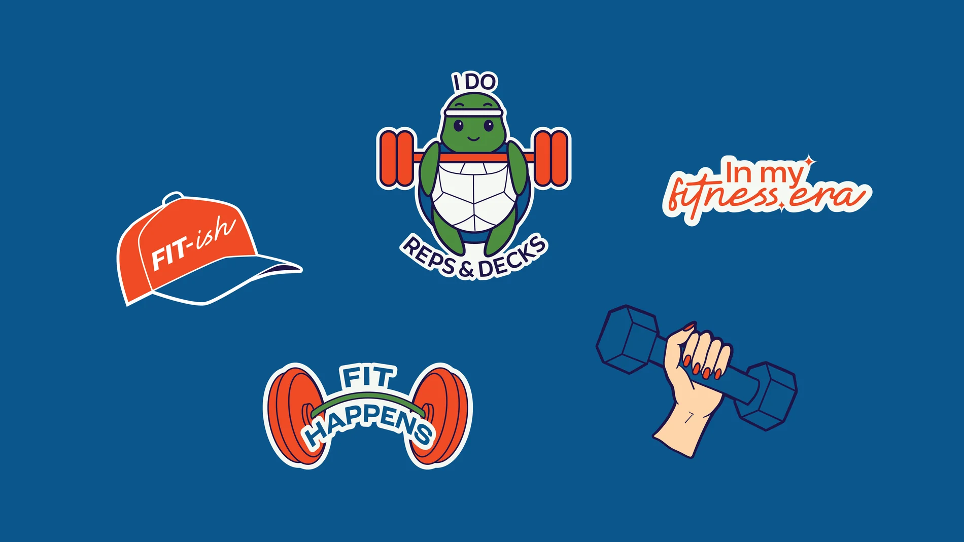
Branding · Circular Athleisure
Terraloop.
Move with purpose.
Every garment begins long before it's worn. For Terraloop, that journey starts in the ocean, where discarded plastic is transformed into premium athleisure. We shaped the brand's purpose, story, tone of voice and visual identity to tell that journey with clarity and conviction.
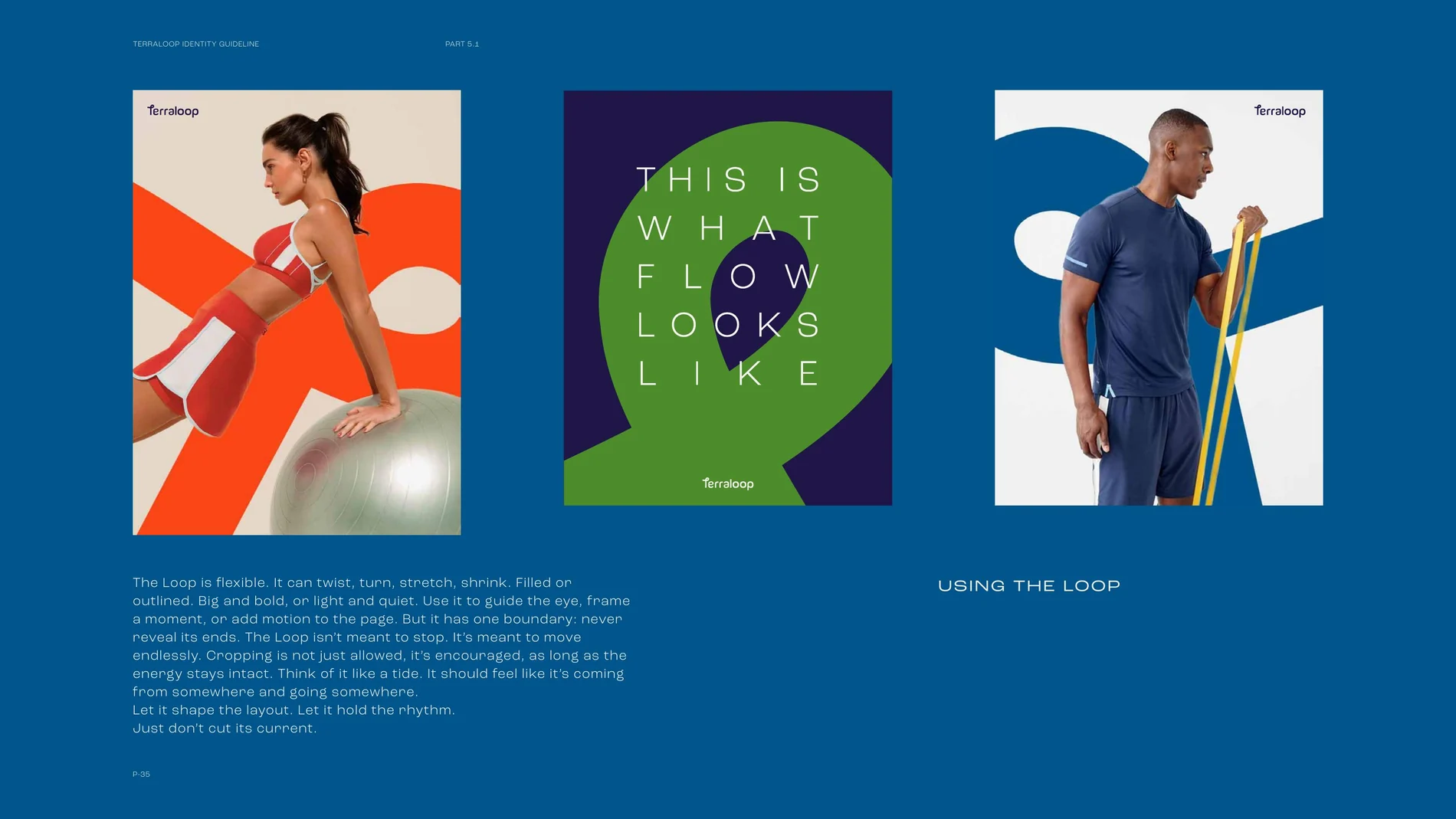
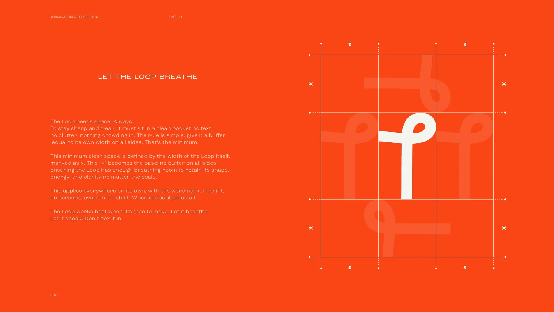
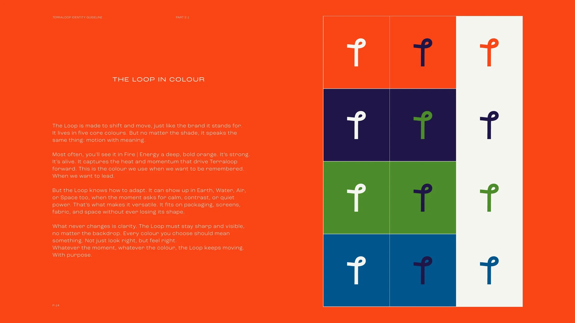
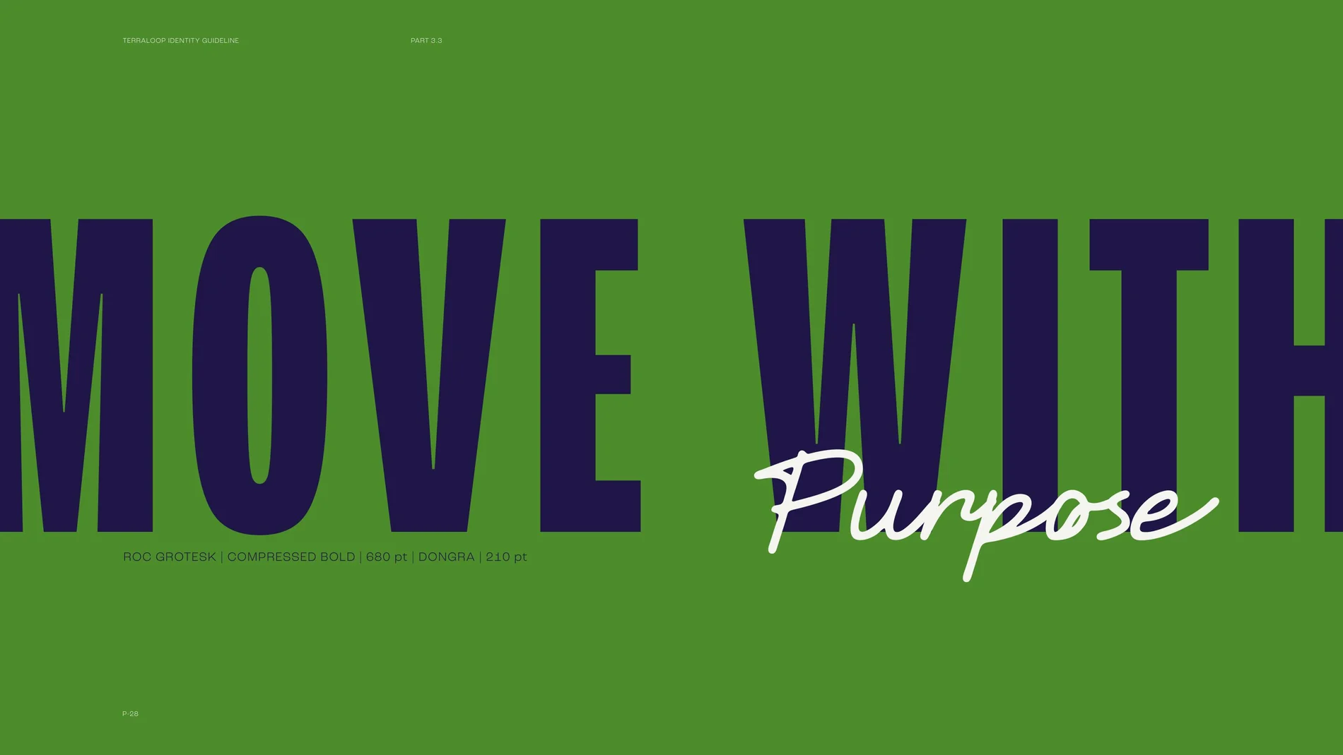
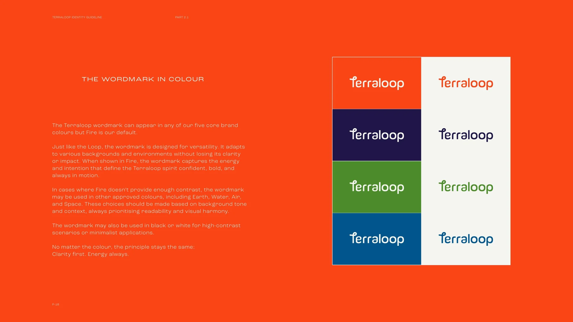
At its centre sits the Loop, a single unbroken mark tracing the brand's journey from waste to thread to garment. We paired it with a typeface that's clean and sure of itself, and a colour palette drawn from the elements, fire, water, earth, air and space, each carrying its own energy while staying grounded together.
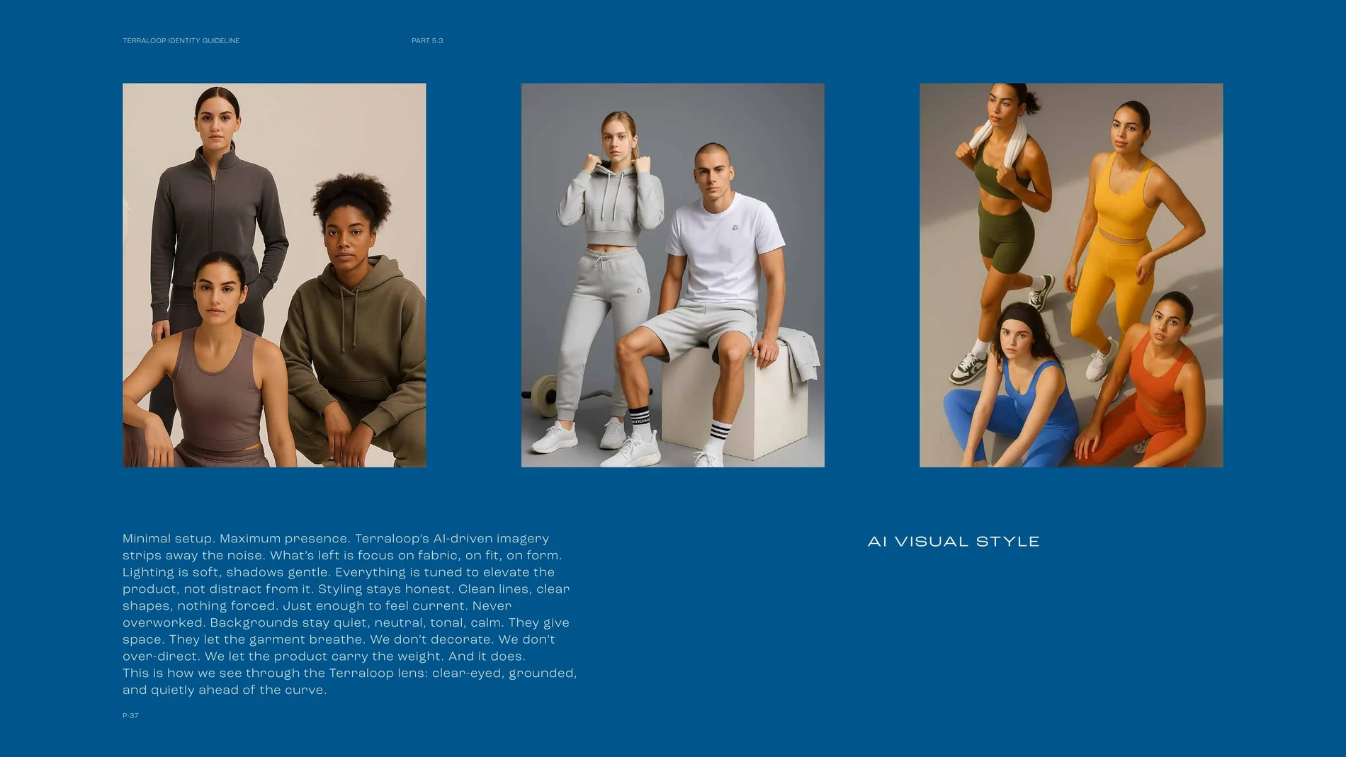
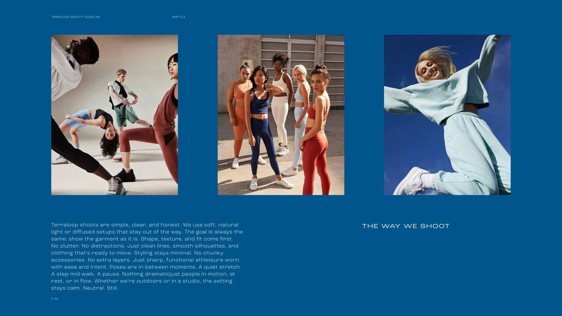
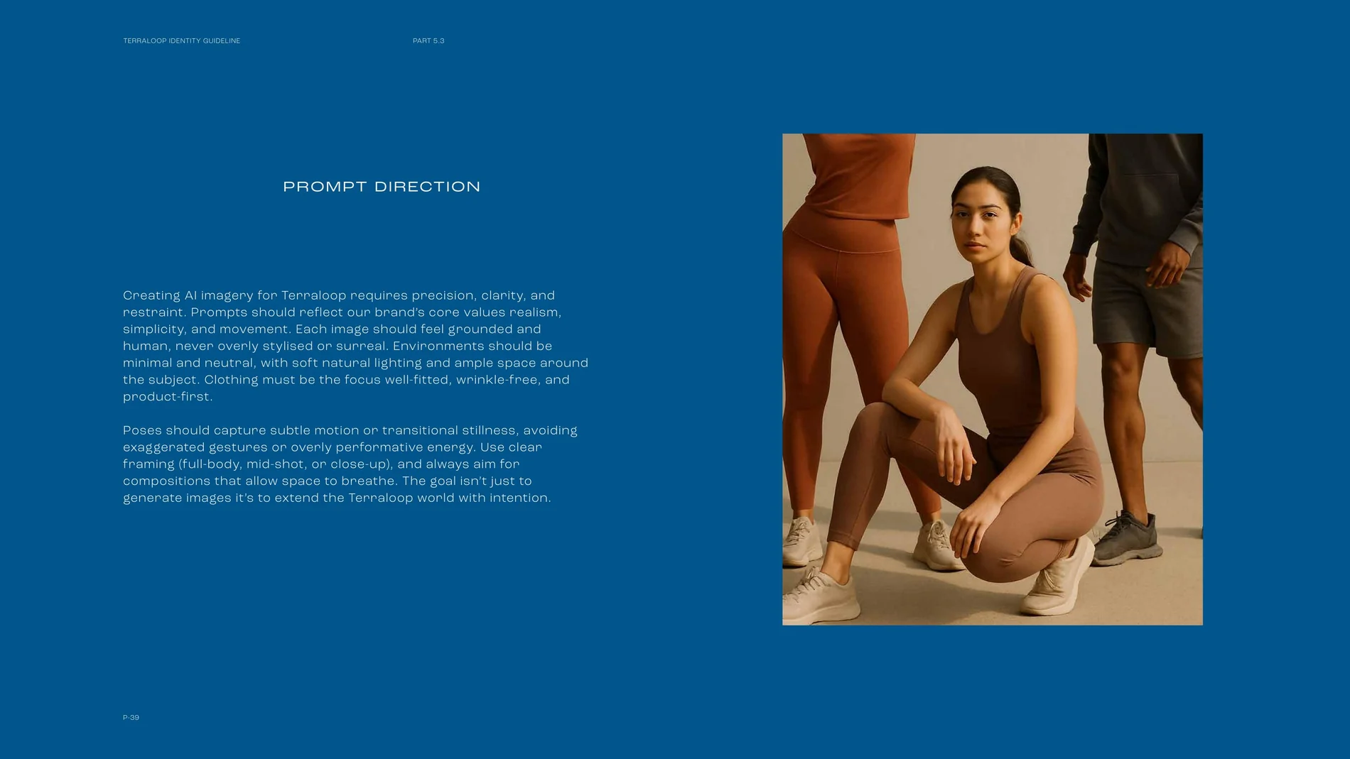
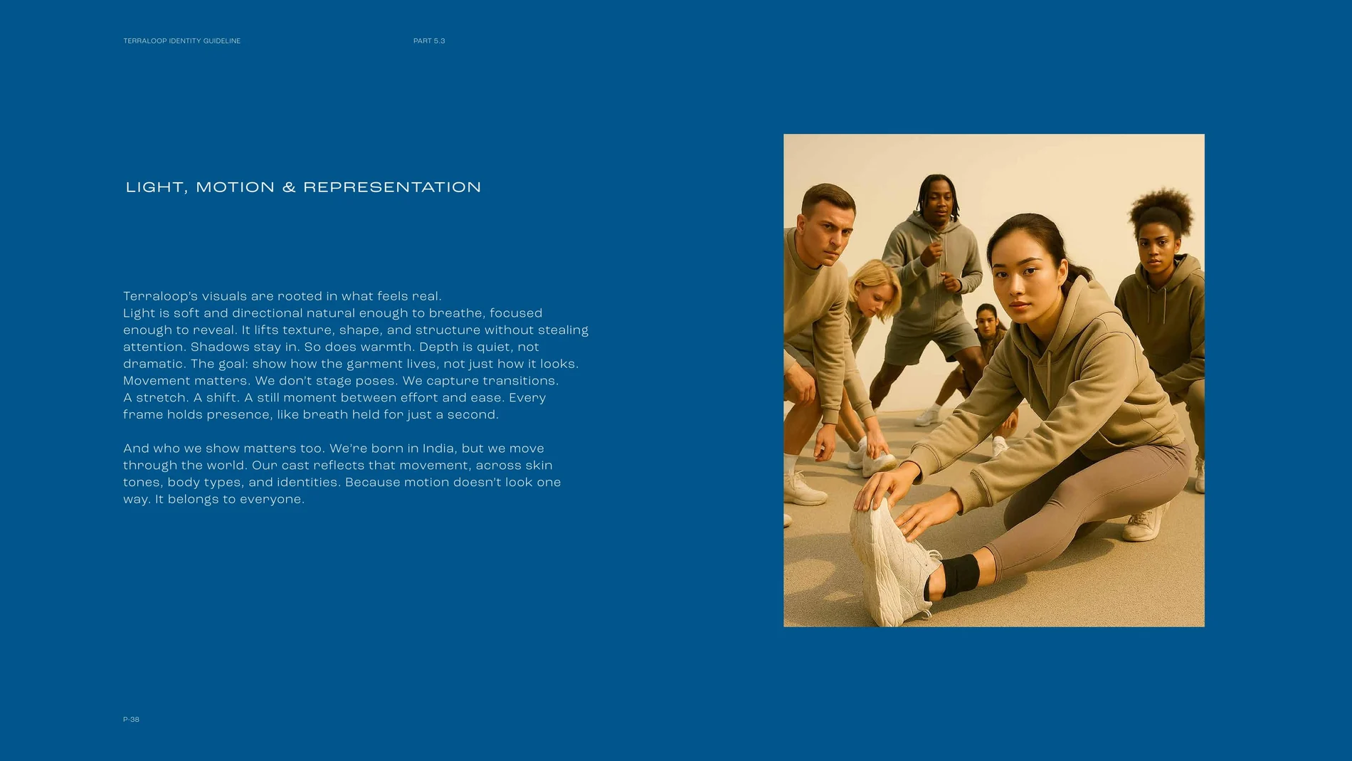
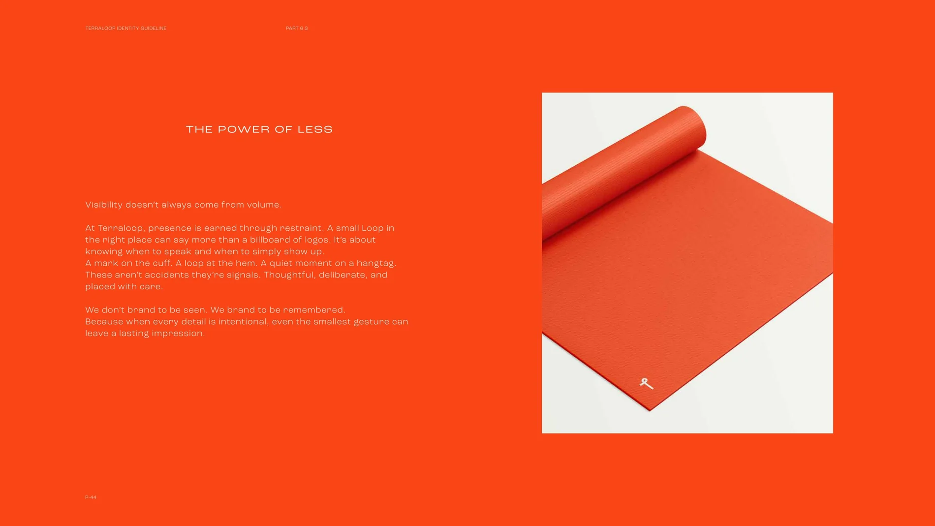
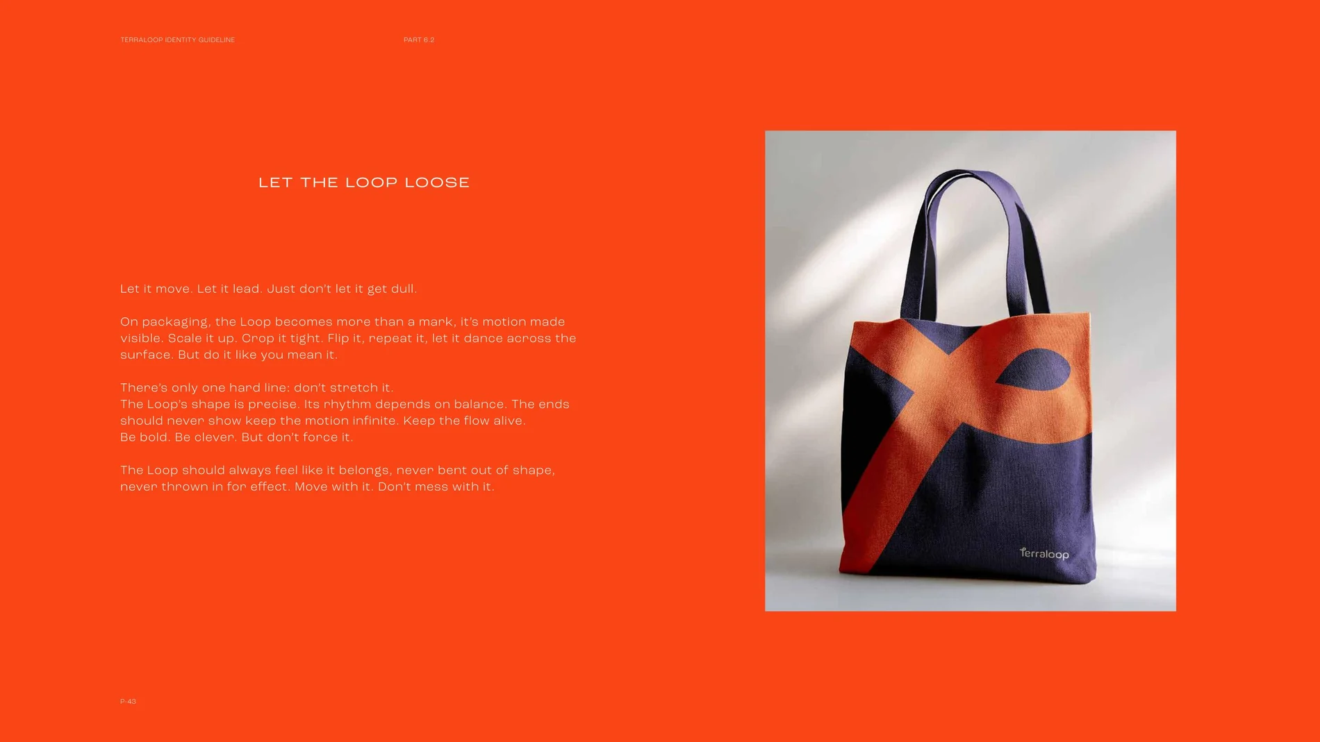
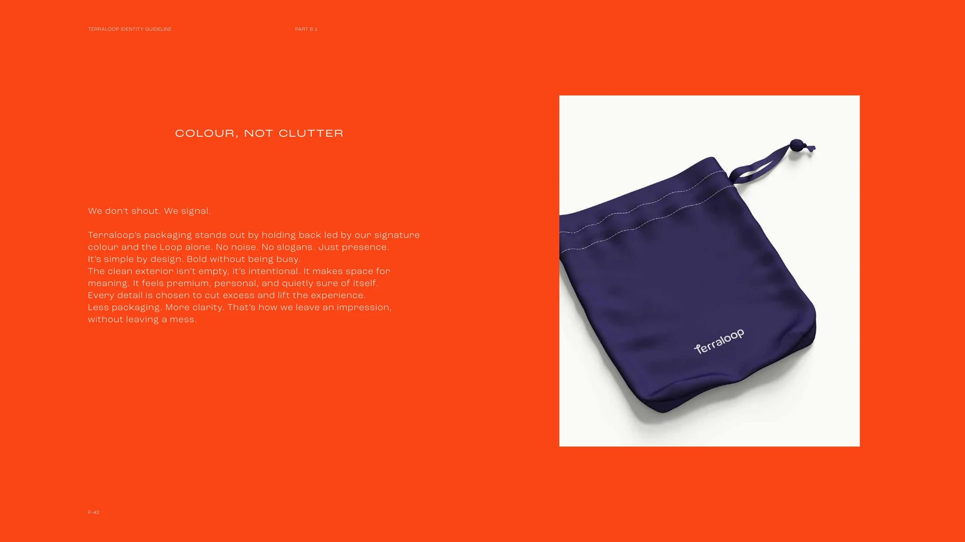
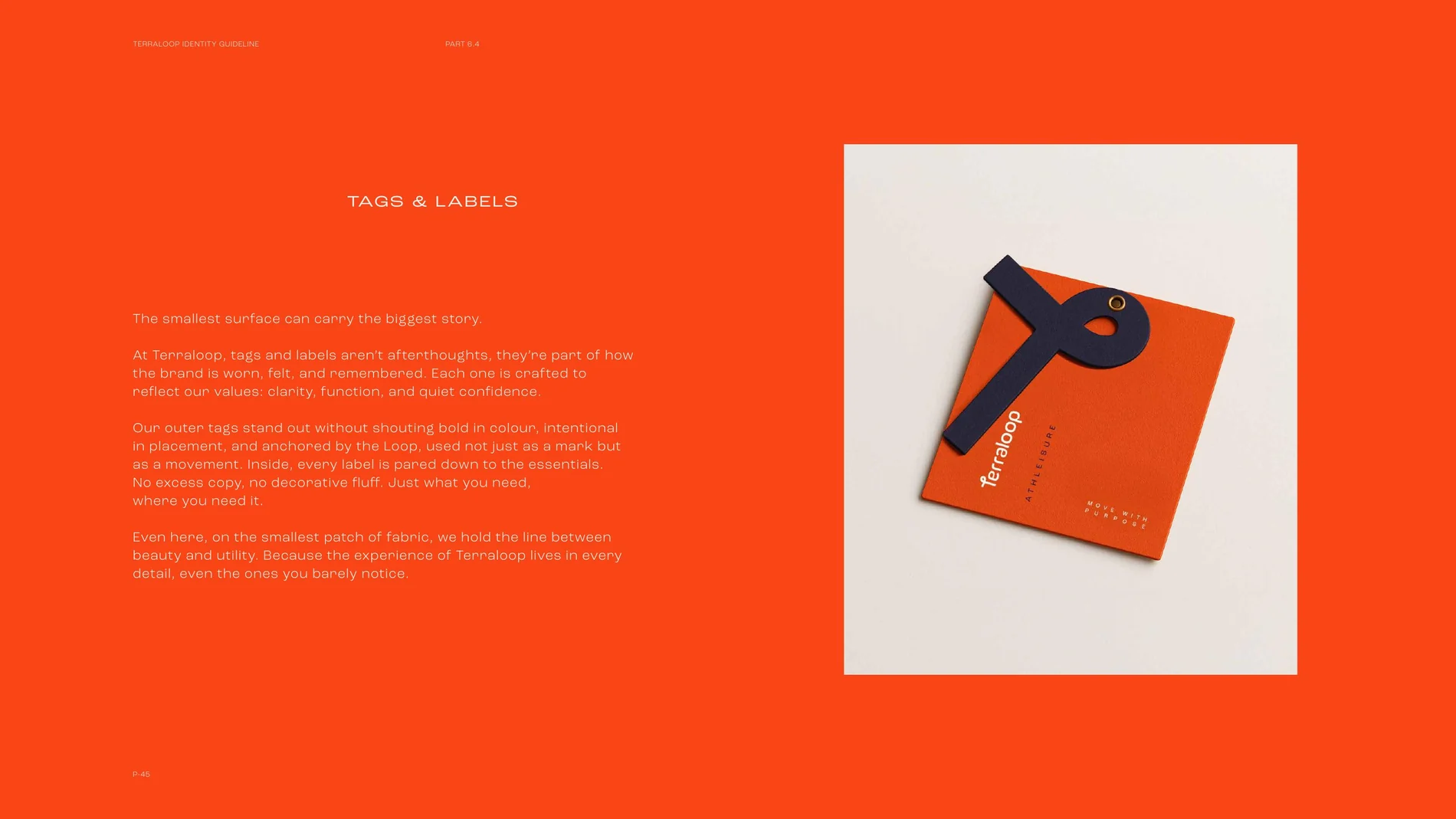
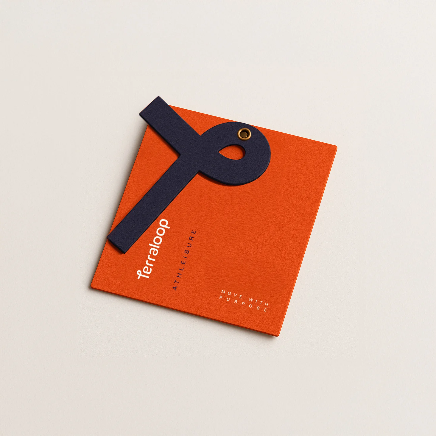
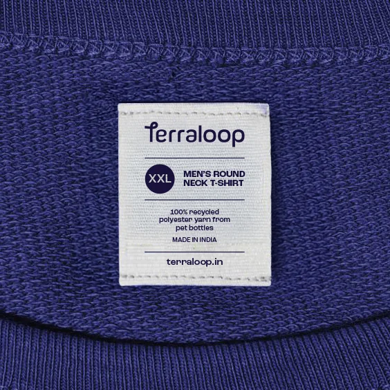
This system extended into packaging, tags and labels, social media guidelines and a full creative direction covering photography and AI-generated imagery, giving Terraloop a consistent, considered presence from the smallest label to the largest campaign visual.
(02) The Loop
(03) The System
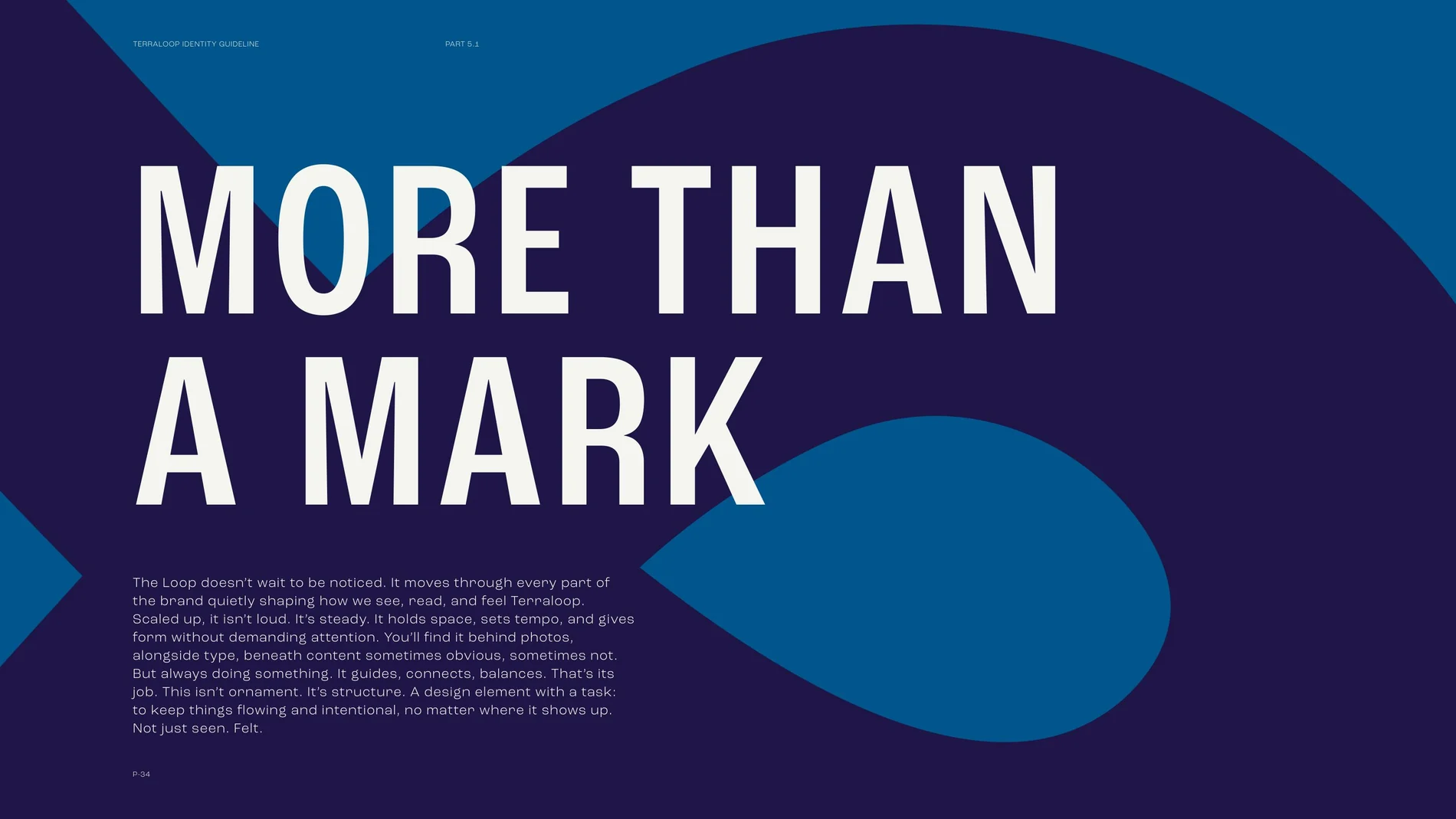
From the smallest label to the largest visual.