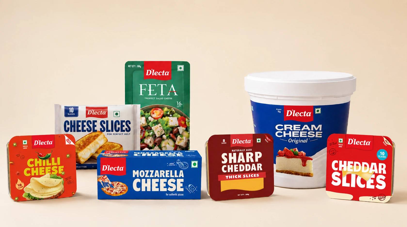
With one of the most diverse cheese portfolios in the market, D’lecta’s packaging had grown organically over time.
We refreshed the range category by category — bringing greater consistency, clarity, and distinction across every SKU.
The result is a system that feels more cohesive on shelf, easier to navigate, and truer to the quality behind the brand.
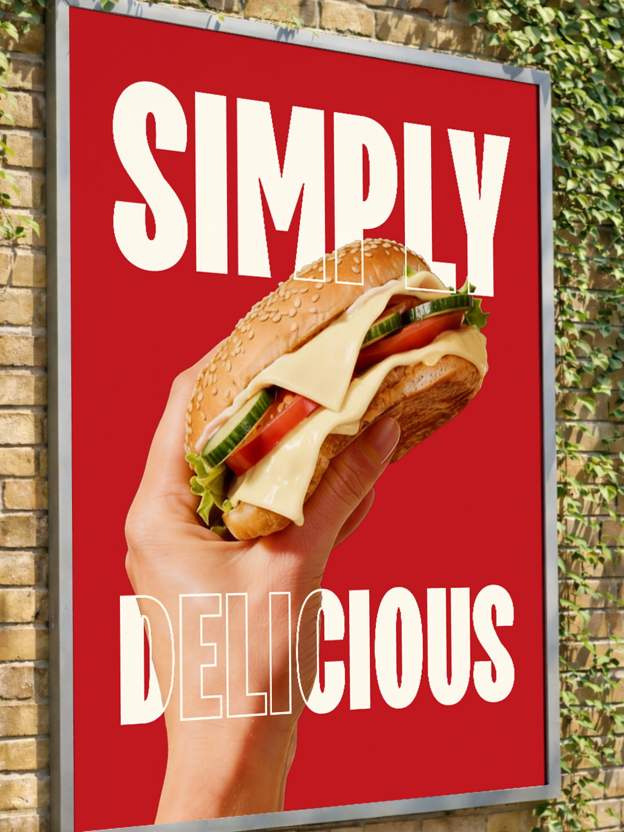
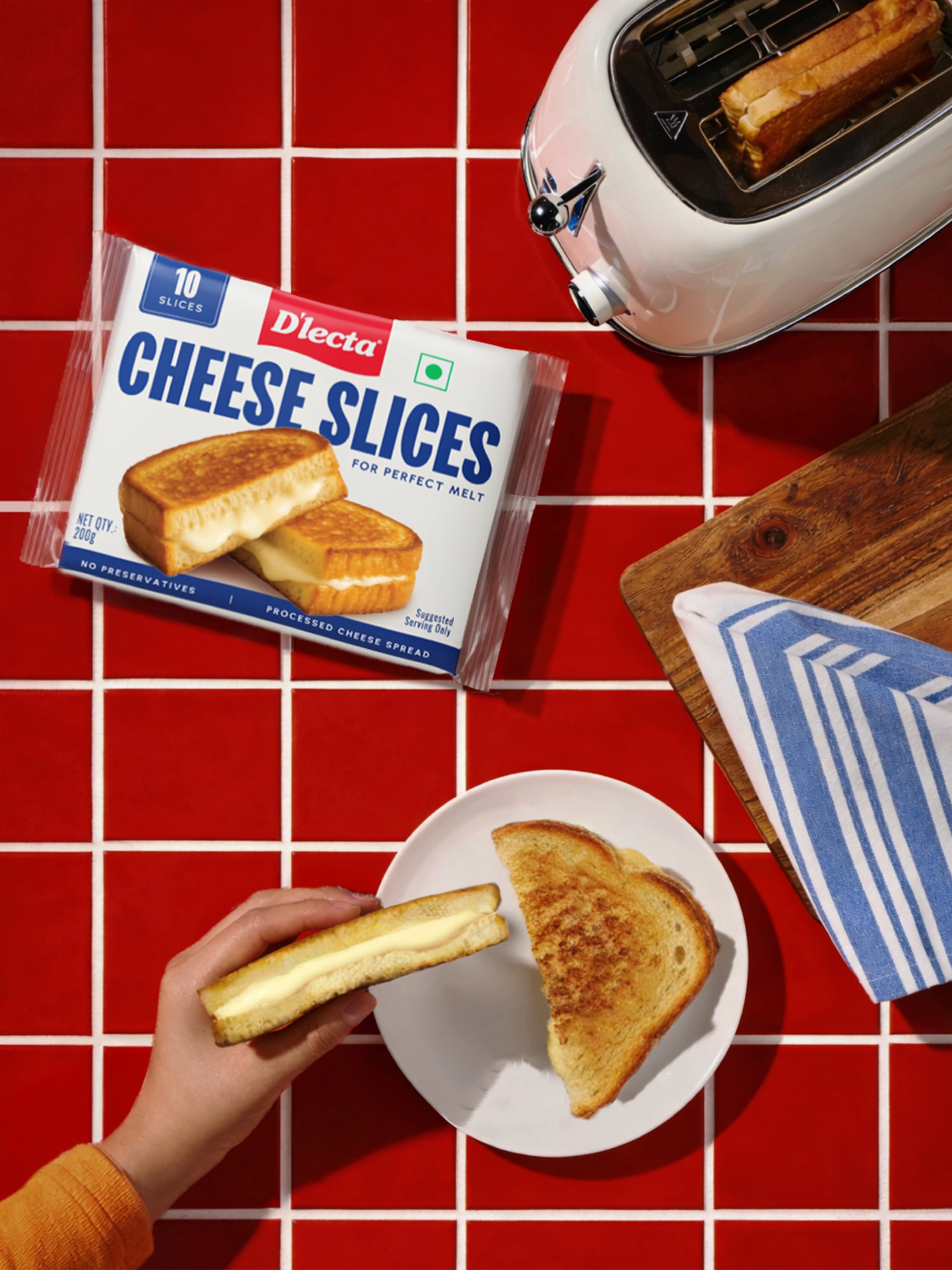
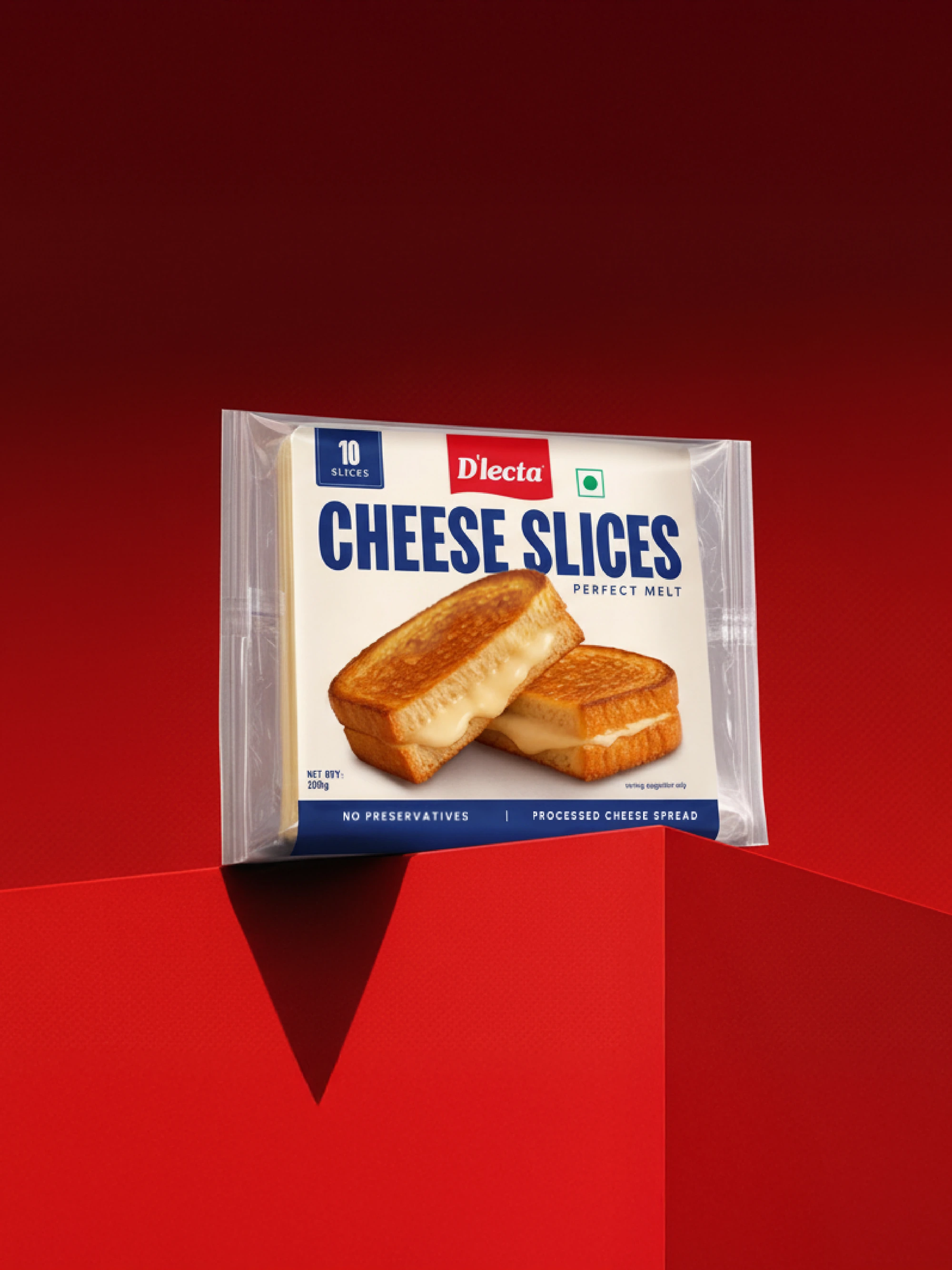
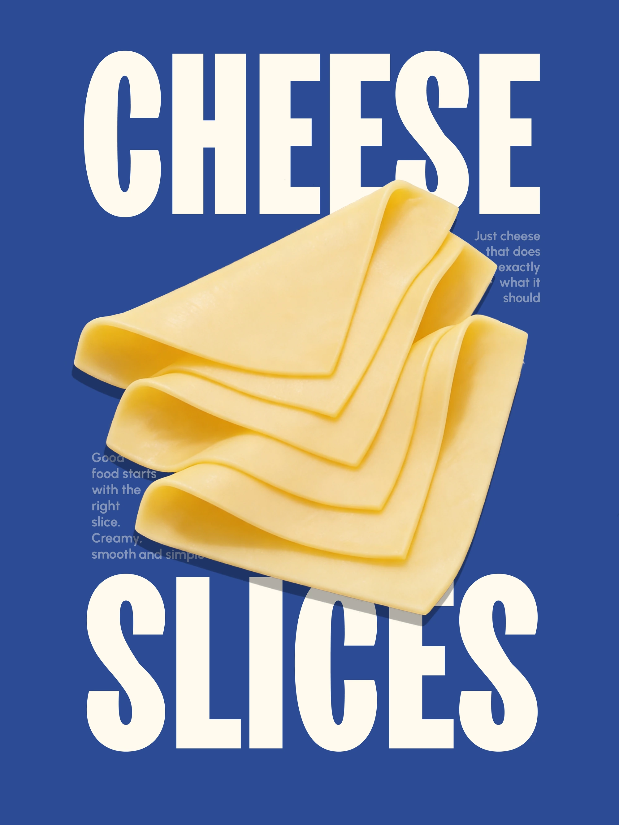
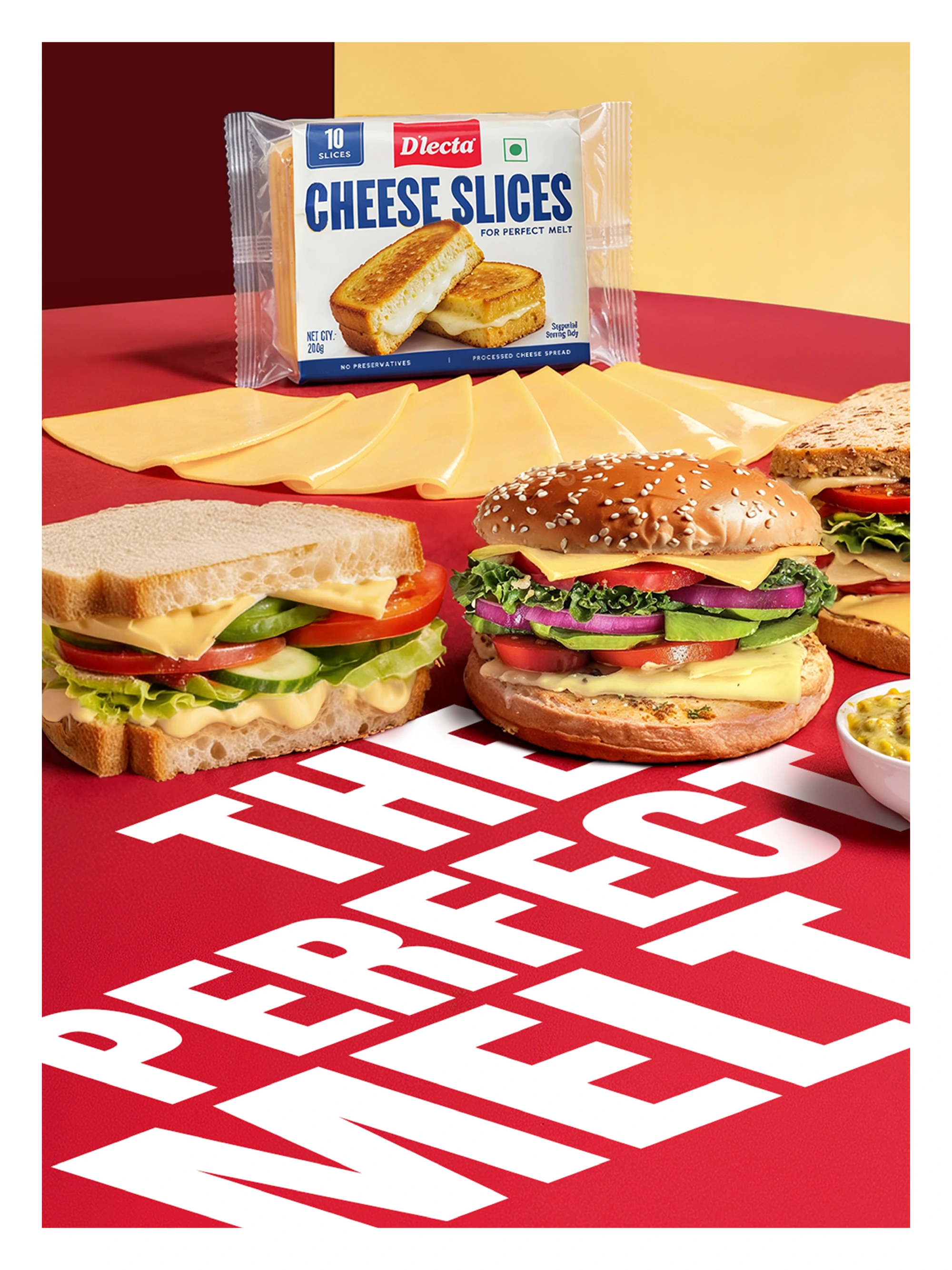
Redesigned for stronger appetite appeal and clearer product understanding on shelf. The new system highlights its perfect melt and everyday versatility — helping shoppers instantly picture it across sandwiches, burgers, toasties and more.
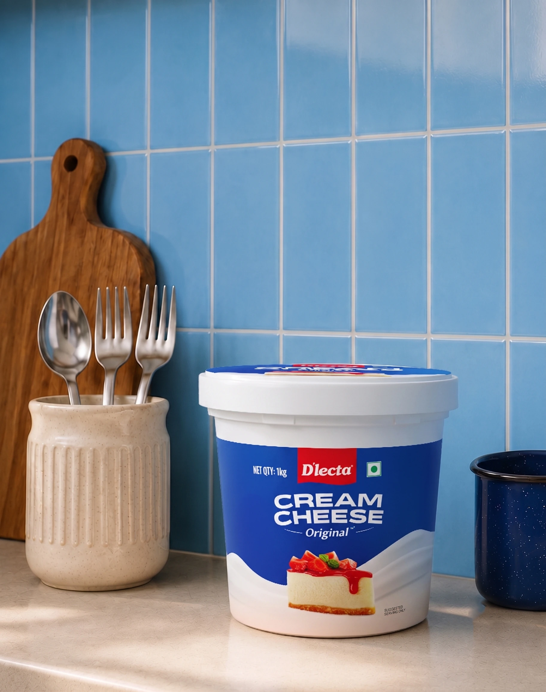
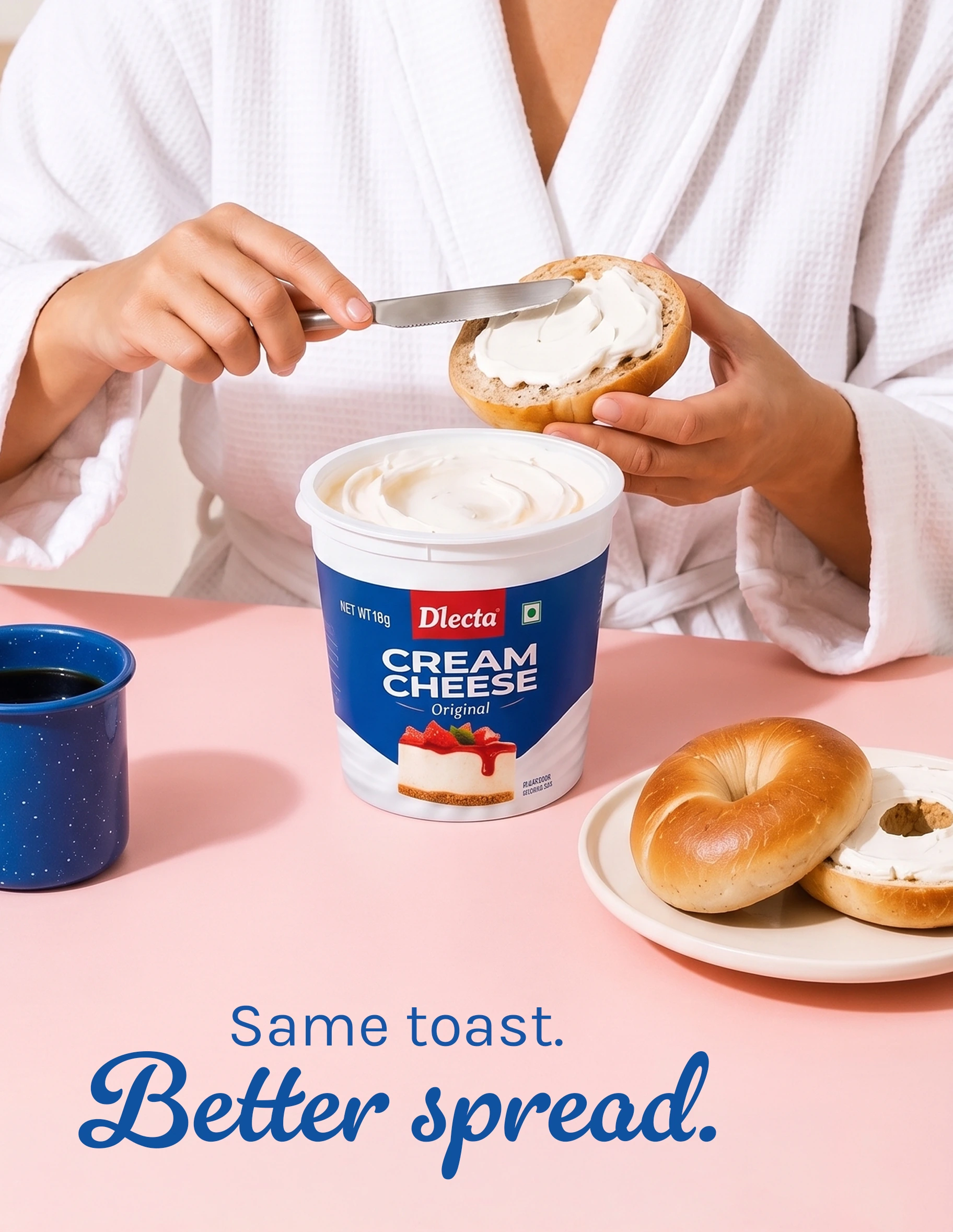
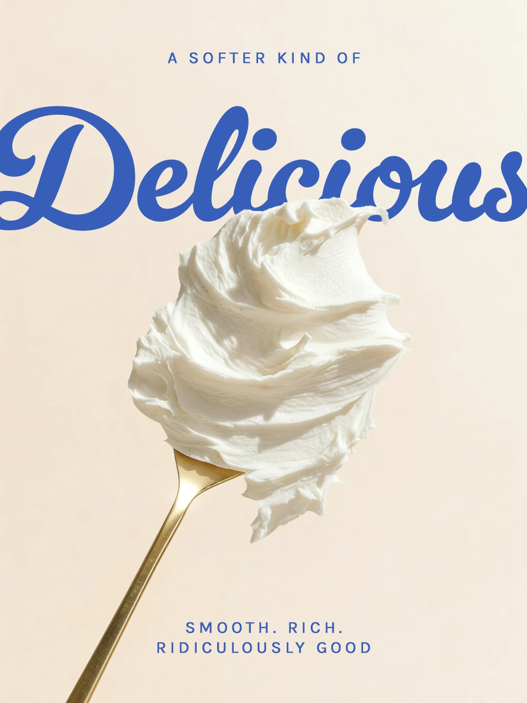
Inspired by the soft swirls and folds of cream cheese, the packaging uses flowing white forms for smoothness, indulgence and movement. Bold blue tones, clean typography and cheesecake-led imagery make it feel premium and easy to use across desserts, spreads and everyday recipes.
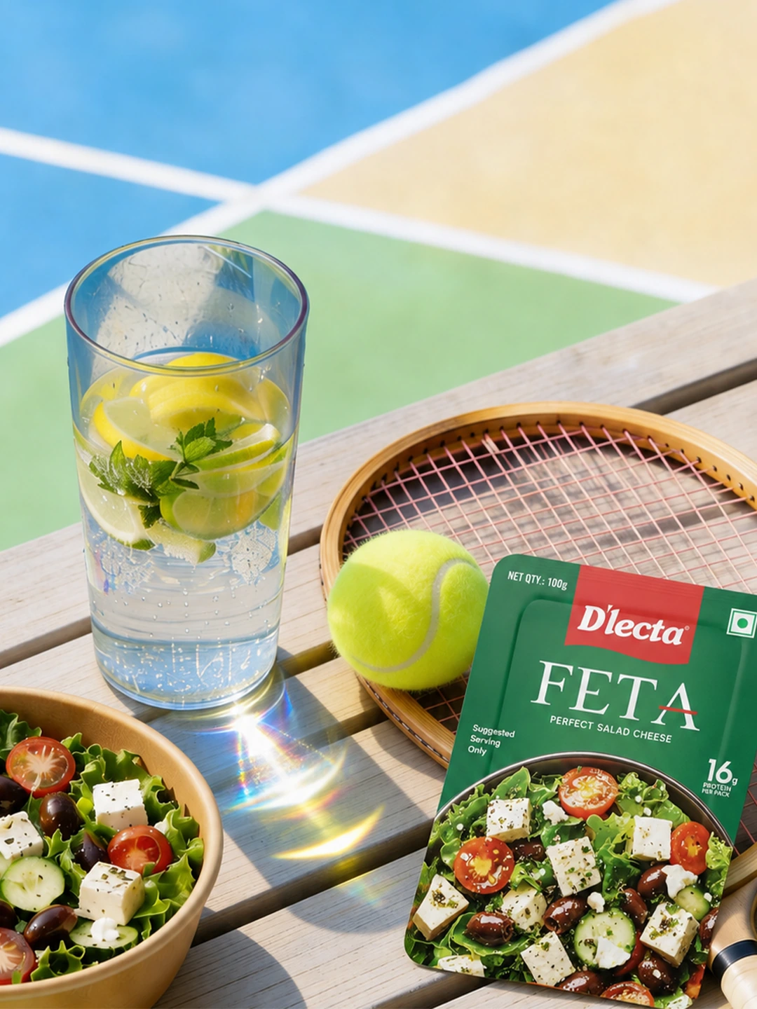
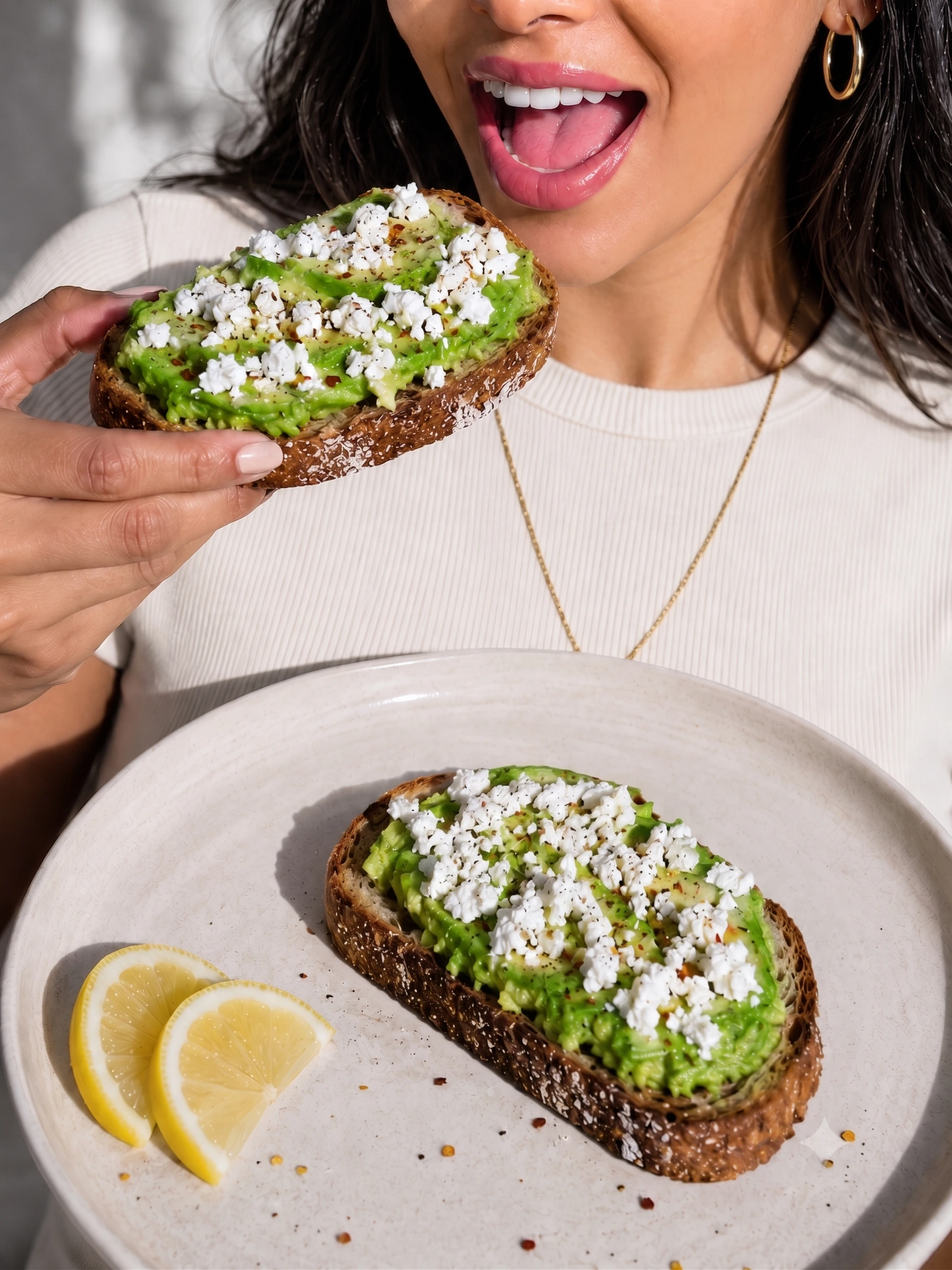
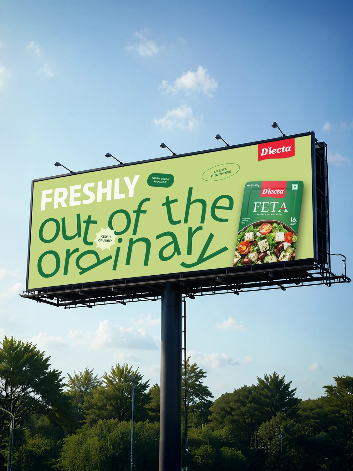
Redesigned to feel fresh, vibrant and rooted in Mediterranean-inspired eating. The deep green pack, Greek-style typography, salad-led imagery and protein cue make the product feel flavourful, versatile and easy to understand at a glance.
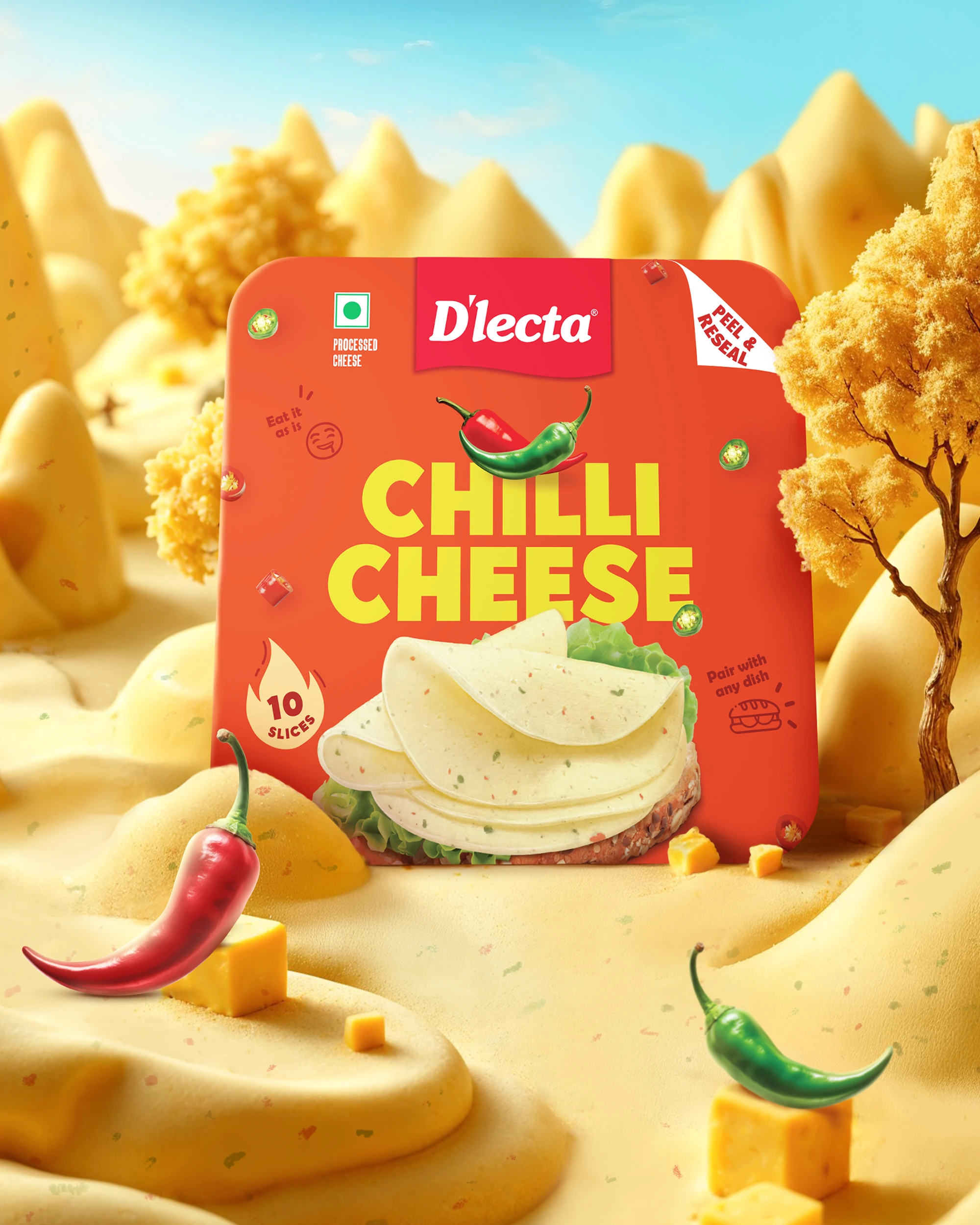
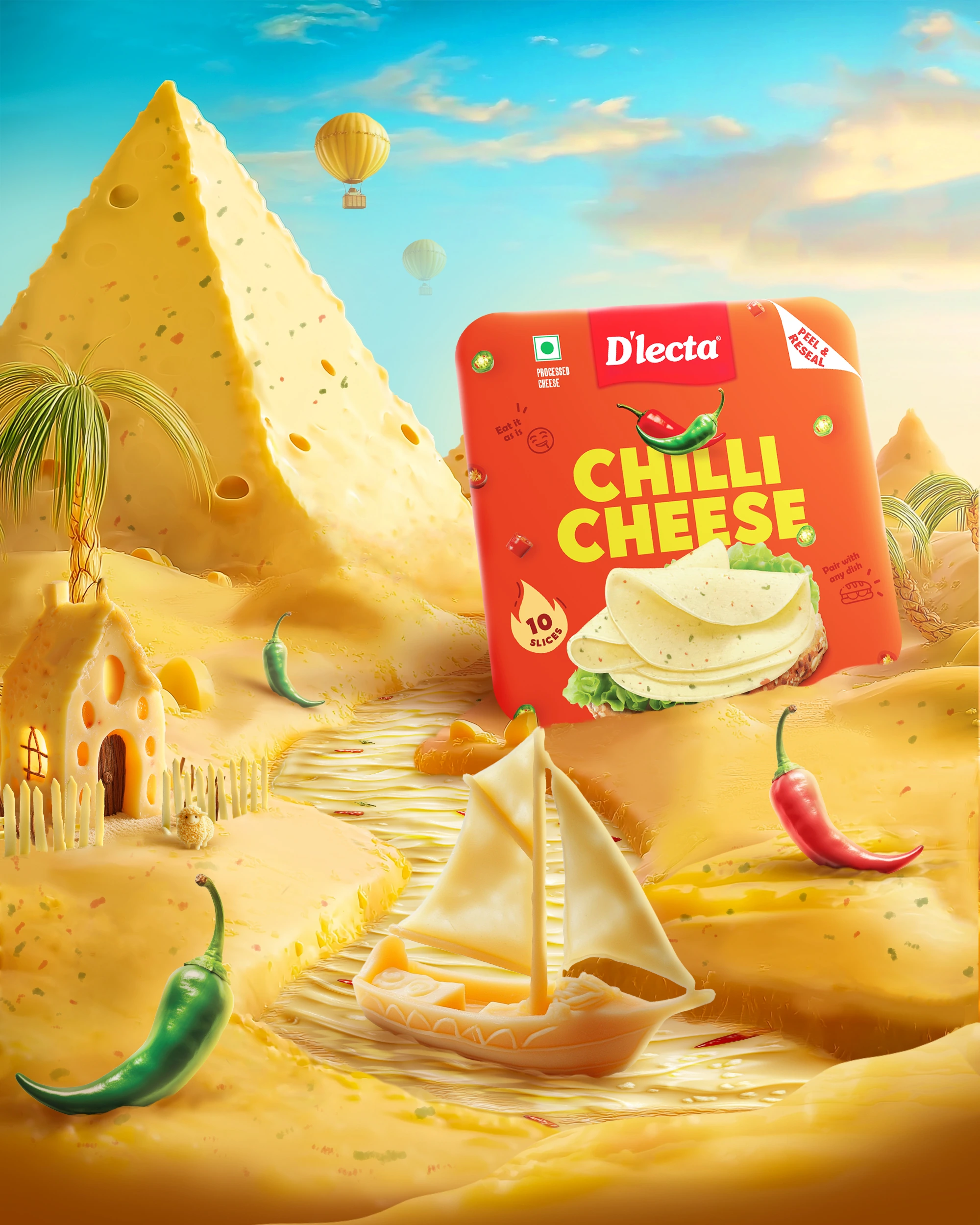
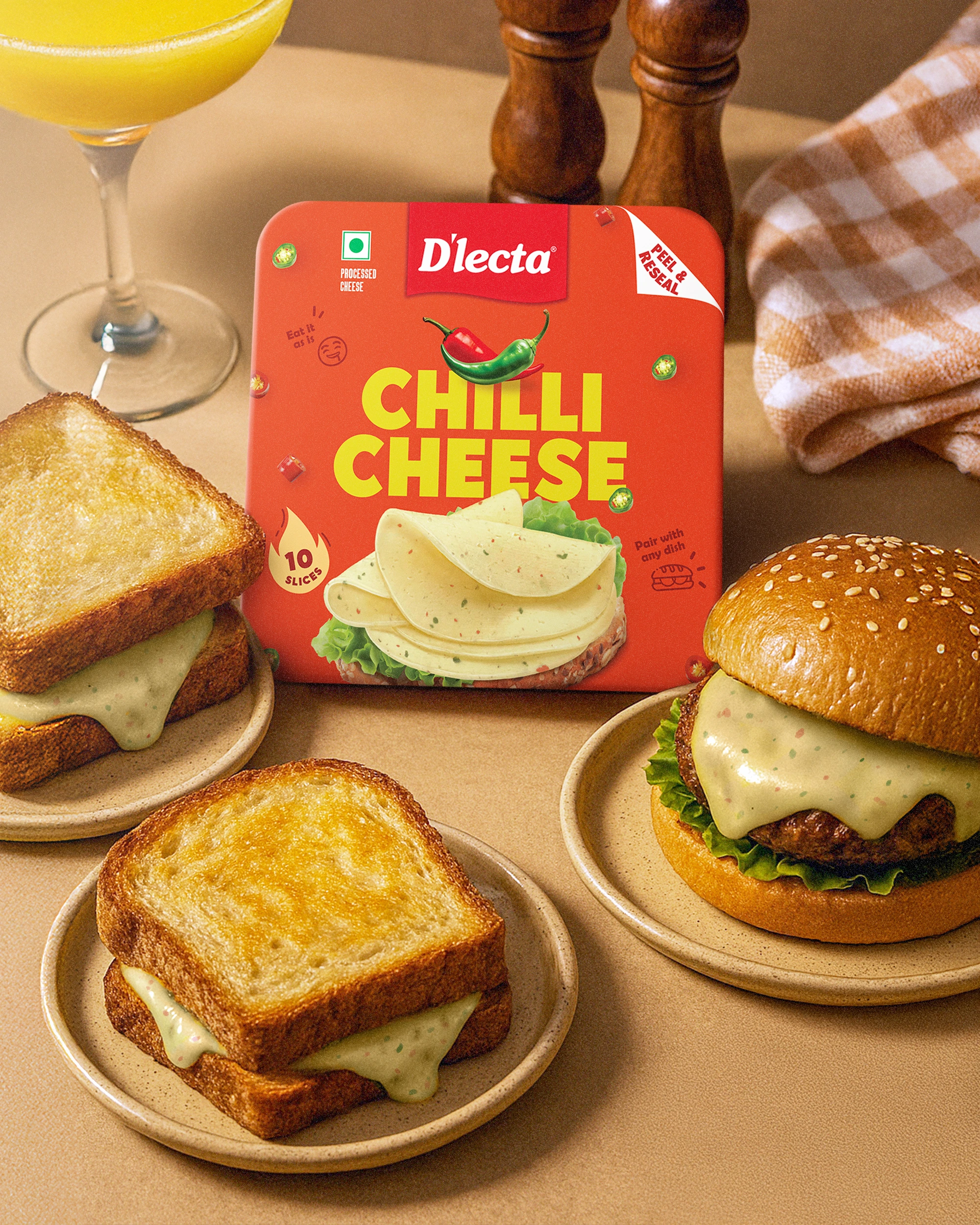
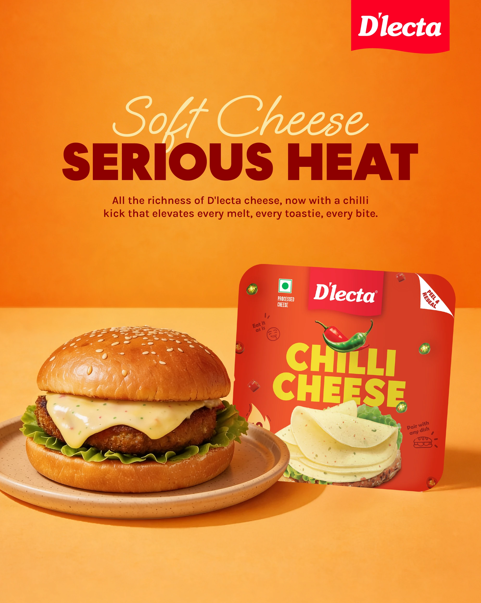
Built around one idea: the flavour is already in the slice. Chilli-inspired colours, expressive illustrations and usage prompts communicate heat, spice and everyday ease — a quick way to elevate simple meals.
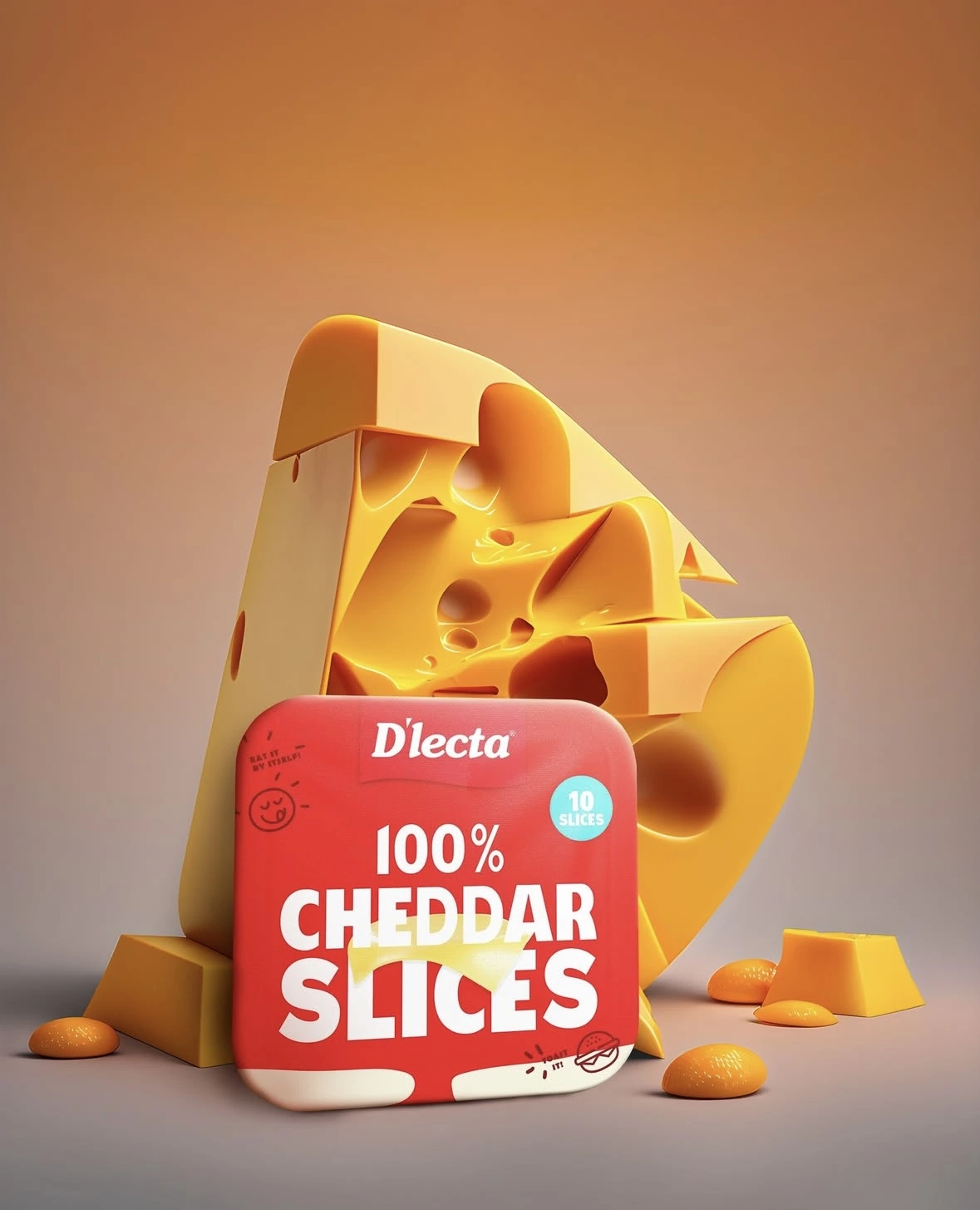
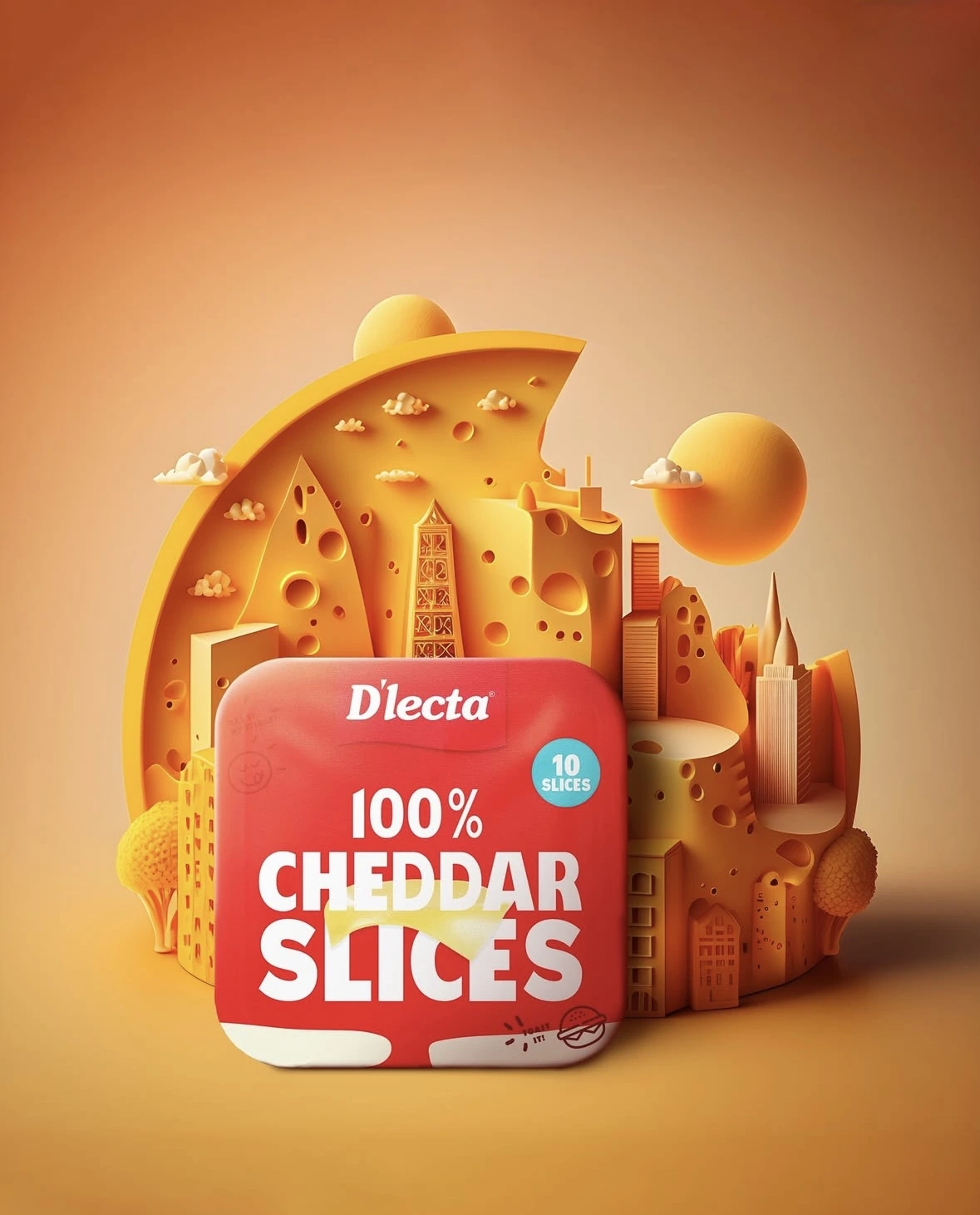
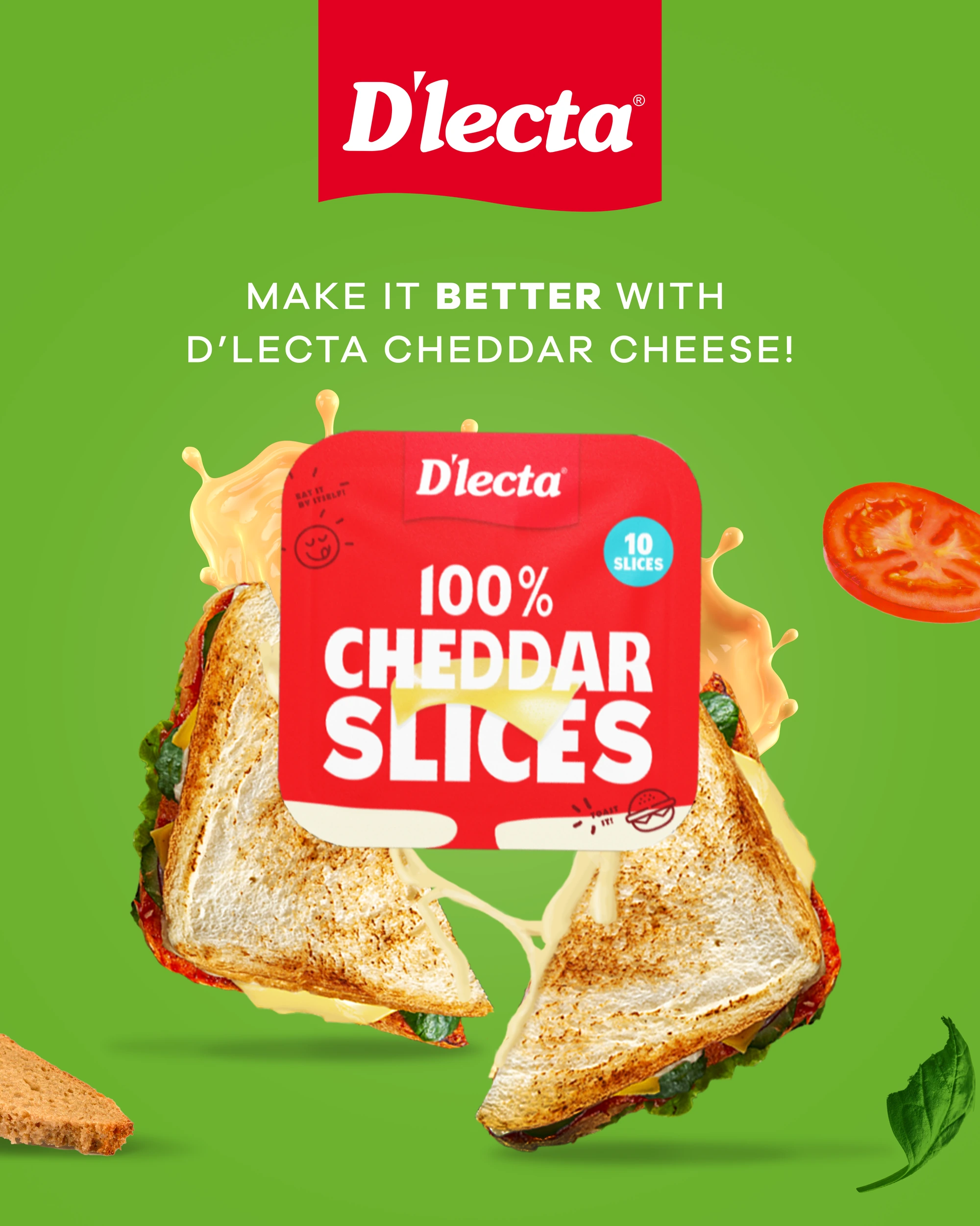
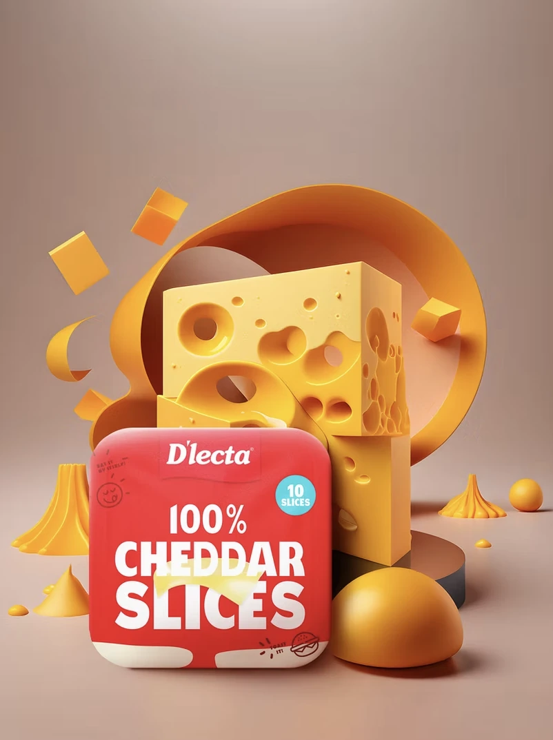
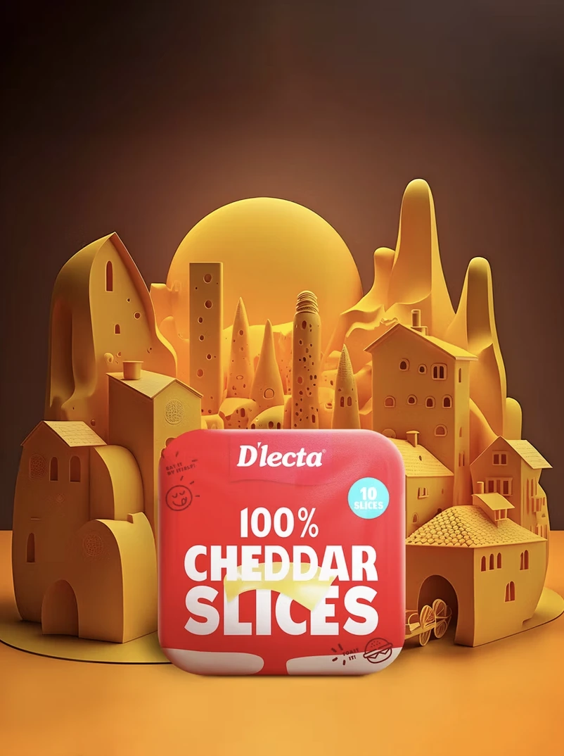
Built around cheddar’s sharp, standout flavour — bold red, strong typography and a melted-slice visual make it instantly appetising. Playful usage cues add everyday ease, positioning it as a ready-to-use slice for quick, flavourful bites.
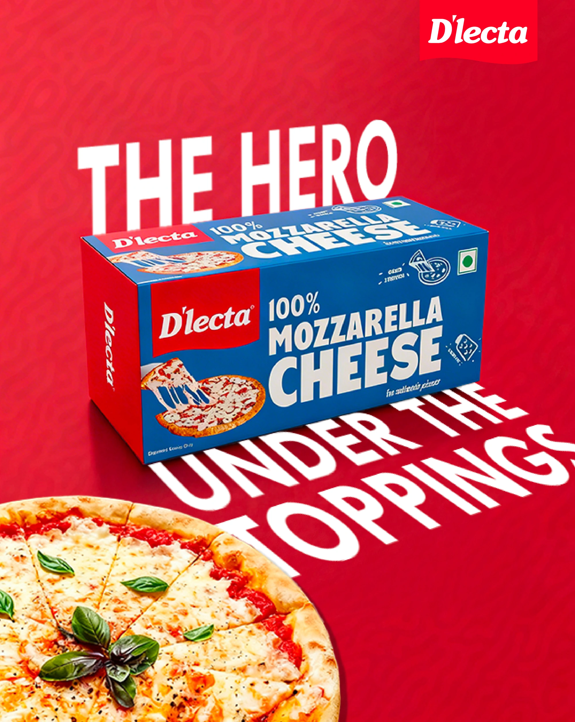
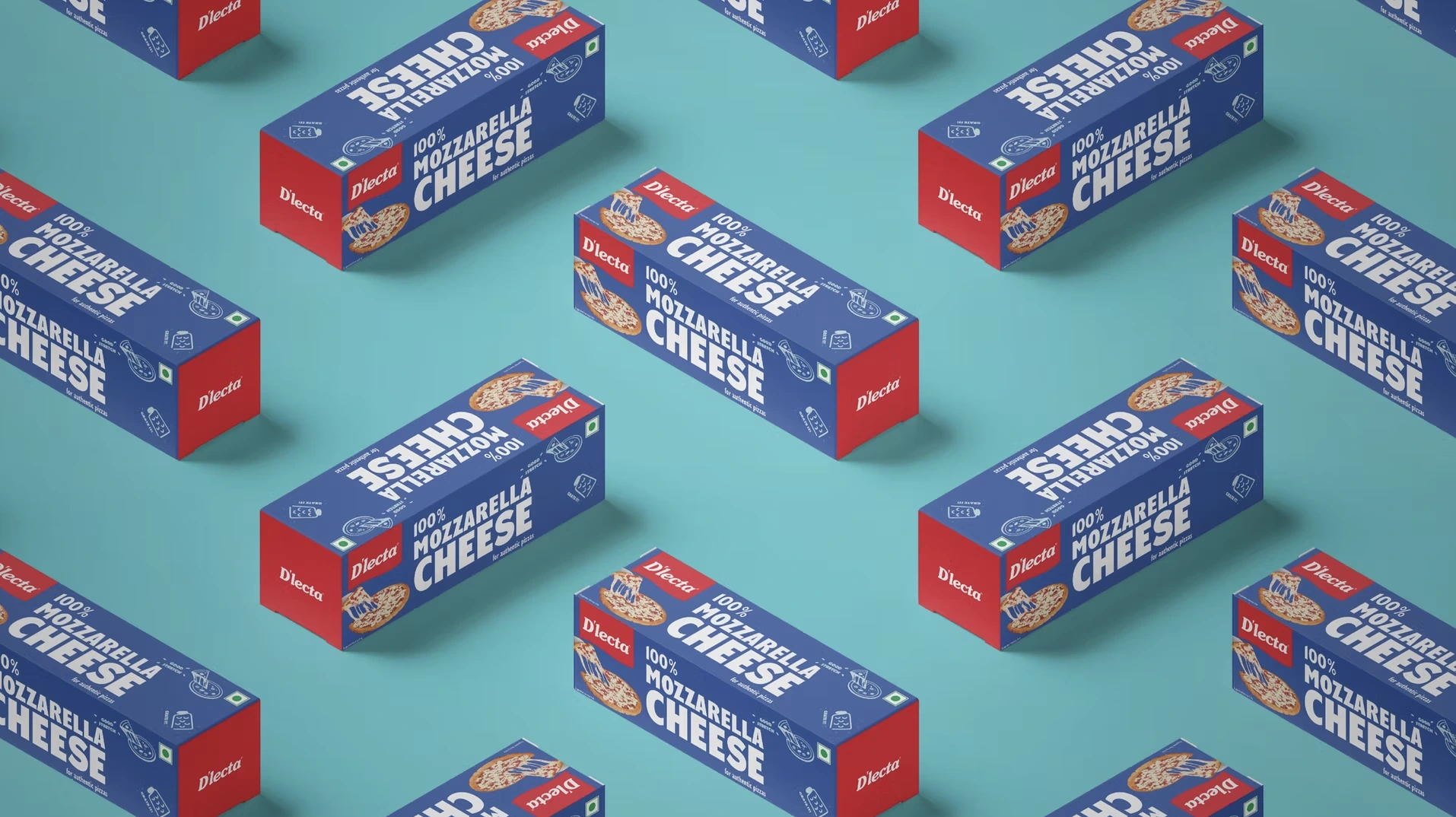
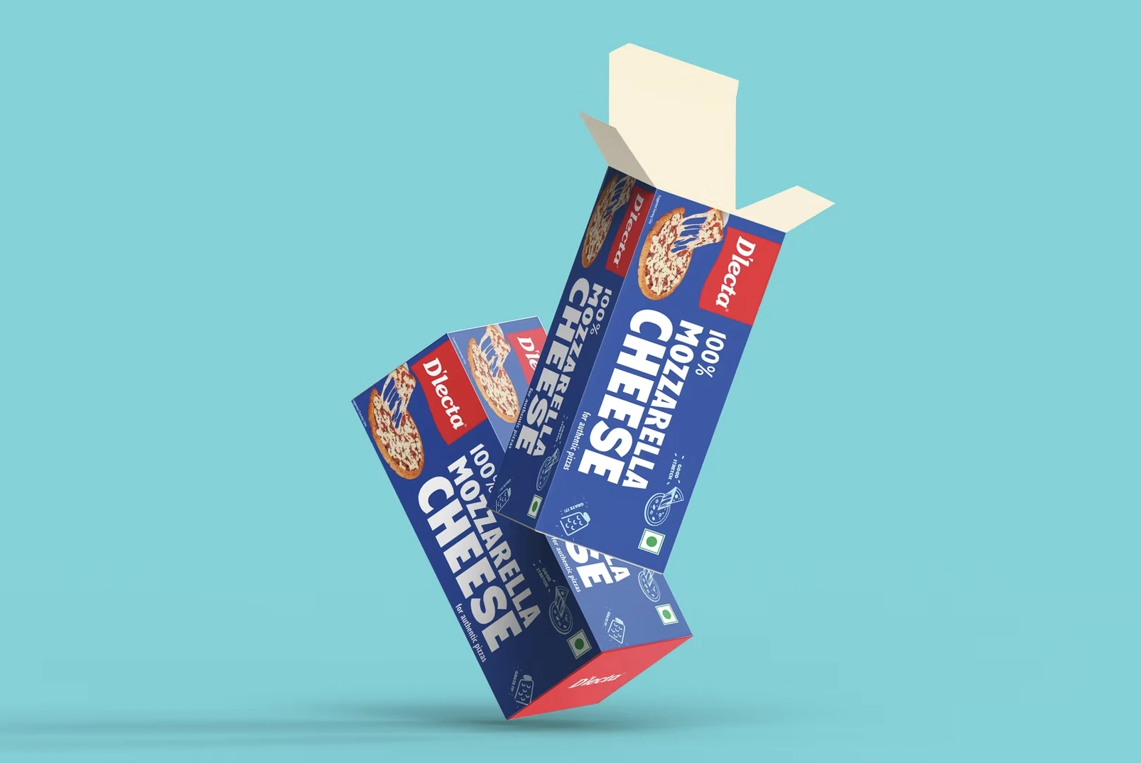
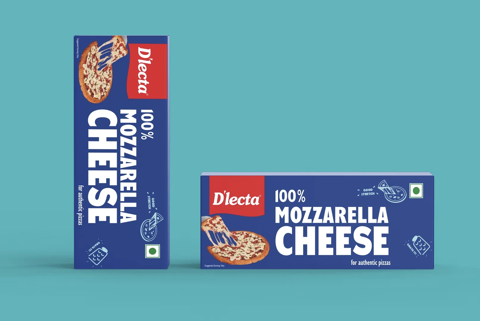
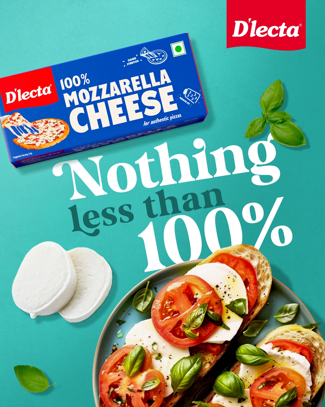
Takes cues from the world of pizzerias — bold type, playful illustrations and vibrant colour blocking give the pack instant personality. Callouts like “Good Stretch” and “Grate It!” bring its melt, stretch and versatility to life.